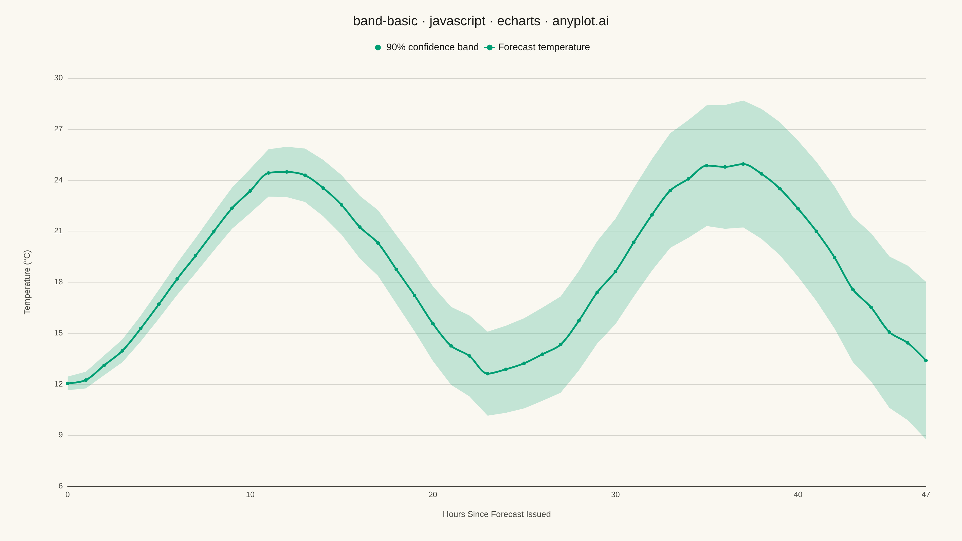
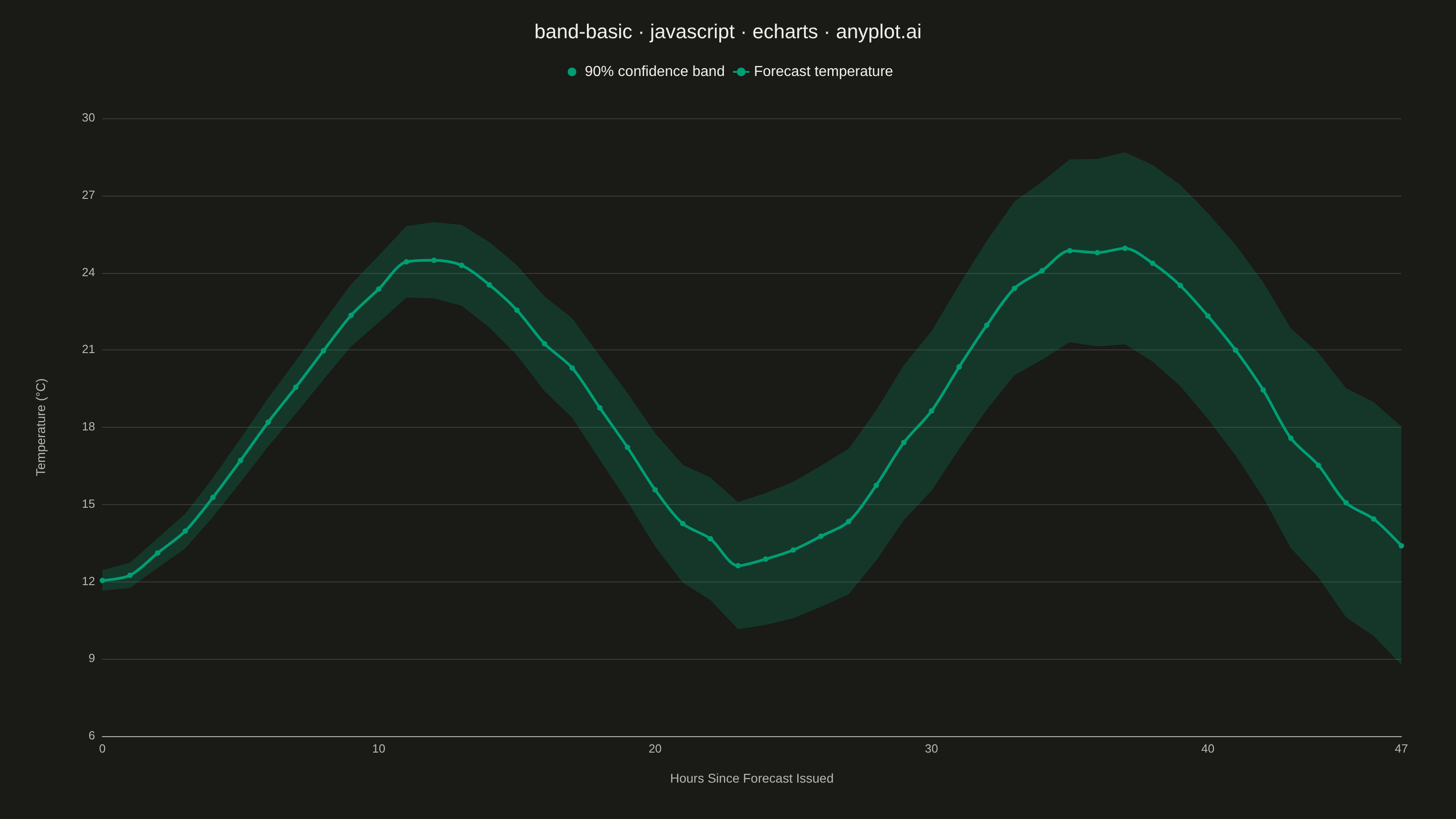
The same plot in 14 other libraries — JavaScript: Chart.js, D3.js, Highcharts, MUI X Charts; Python: Altair, Bokeh, lets-plot, Matplotlib, Plotly, plotnine, Pygal, Seaborn; R: ggplot2; Julia: Makie.jl. Compare all 15 side by side: Basic Band Plot in Python, R, Julia and JavaScript.
A band plot displays a filled region between two boundary lines, commonly used to show confidence intervals, prediction intervals, or ranges around a central trend line. The semi-transparent band provides visual representation of uncertainty or variability while maintaining visibility of underlying data or overlapping elements.
// anyplot.ai
// band-basic: Basic Band Plot
// Library: echarts 6.1.0 | JavaScript 22.23.2
// Quality: 90/100 | Created: 2026-08-24

const t = window.ANYPLOT_TOKENS;

// --- Data (in-memory, deterministic) ----------------------------------------
// Simple LCG so the sample data is reproducible without Math.random().
let seed = 42;
function rand() {
  seed = (seed * 1103515245 + 12345) & 0x7fffffff;
  return seed / 0x7fffffff;
}

// A 48-hour temperature forecast issued at hour 0. Uncertainty (the 90%
// confidence band) widens with lead time, the classic forecast-skill decay
// pattern, while the central estimate follows a diurnal cycle plus mild
// warming drift.
const HOURS = 48;
const hoursAhead = Array.from({ length: HOURS }, (_, i) => i);

const centerTemp = hoursAhead.map((h) => {
  const diurnal = 18 + 6 * Math.sin(((h - 6) / 24) * 2 * Math.PI);
  const drift = h * 0.03;
  const noise = (rand() - 0.5) * 0.6;
  return diurnal + drift + noise;
});
const halfWidth = hoursAhead.map((h) => 0.4 + h * 0.09);
const lowerBound = centerTemp.map((v, i) => v - halfWidth[i]);
const bandSpan = halfWidth.map((h) => h * 2);

// --- Init ---------------------------------------------------------------------
const chart = echarts.init(document.getElementById("container"));

// --- Option ---------------------------------------------------------------------
chart.setOption({
  animation: false,
  backgroundColor: "transparent",
  title: {
    text: "band-basic · javascript · echarts · anyplot.ai",
    left: "center",
    top: 20,
    textStyle: { color: t.ink, fontSize: 22, fontWeight: 500 },
  },
  tooltip: {
    trigger: "axis",
    formatter: (params) => {
      const i = params[0].dataIndex;
      return [
        `Hour +${hoursAhead[i]}`,
        `Forecast: ${centerTemp[i].toFixed(1)}°C`,
        `90% range: ${lowerBound[i].toFixed(1)}–${(lowerBound[i] + bandSpan[i]).toFixed(1)}°C`,
      ].join("<br/>");
    },
  },
  legend: {
    data: ["90% confidence band", "Forecast temperature"],
    top: 66,
    left: "center",
    textStyle: { color: t.ink, fontSize: 16 },
    itemWidth: 18,
    itemHeight: 12,
  },
  grid: {
    left: 90,
    right: 60,
    top: 130,
    bottom: 70,
    containLabel: true,
  },
  xAxis: {
    type: "value",
    name: "Hours Since Forecast Issued",
    nameLocation: "middle",
    nameGap: 40,
    nameTextStyle: { color: t.inkSoft, fontSize: 14 },
    min: 0,
    max: HOURS - 1,
    axisLabel: { color: t.inkSoft, fontSize: 13 },
    axisLine: { lineStyle: { color: t.inkSoft } },
    axisTick: { show: false },
    splitLine: { show: false },
  },
  yAxis: {
    type: "value",
    name: "Temperature (°C)",
    nameLocation: "middle",
    nameGap: 60,
    nameTextStyle: { color: t.inkSoft, fontSize: 14 },
    scale: true,
    axisLabel: { color: t.inkSoft, fontSize: 13 },
    axisLine: { show: false },
    axisTick: { show: false },
    splitLine: { lineStyle: { color: t.grid } },
  },
  series: [
    {
      name: "Lower bound",
      type: "line",
      // A value-type x-axis needs explicit [x, y] pairs — plain y-arrays
      // desync the two axes since echarts no longer indexes by category.
      data: hoursAhead.map((h, i) => [h, lowerBound[i]]),
      stack: "confidence-band",
      symbol: "none",
      lineStyle: { opacity: 0 },
      areaStyle: { opacity: 0 },
      silent: true,
      z: 1,
    },
    {
      name: "90% confidence band",
      type: "line",
      data: hoursAhead.map((h, i) => [h, bandSpan[i]]),
      stack: "confidence-band",
      symbol: "none",
      lineStyle: { opacity: 0 },
      areaStyle: { color: t.palette[0], opacity: 0.22 },
      itemStyle: { color: t.palette[0] },
      z: 1,
    },
    {
      name: "Forecast temperature",
      type: "line",
      data: hoursAhead.map((h, i) => [h, centerTemp[i]]),
      symbol: "circle",
      symbolSize: 6,
      smooth: 0.3,
      lineStyle: { width: 3, color: t.palette[0] },
      itemStyle: { color: t.palette[0] },
      z: 10,
    },
  ],
});
Runnable source as JSON, for any HTTP client: https://api.anyplot.ai/specs/band-basic/echarts/code. Any spec id and library id listed in llms-full.txt fit the same URL shape; every URL below is complete and callable.
{
  "spec_id": "band-basic",
  "language": "javascript",
  "library": "echarts",
  "page": "https://anyplot.ai/band-basic/javascript/echarts",
  "hub": "https://anyplot.ai/band-basic",
  "code_json": "https://api.anyplot.ai/specs/band-basic/echarts/code",
  "spec_json": "https://api.anyplot.ai/specs/band-basic",
  "render_light_png": "https://storage.googleapis.com/anyplot-images/plots/band-basic/javascript/echarts/plot-light.png",
  "render_dark_png": "https://storage.googleapis.com/anyplot-images/plots/band-basic/javascript/echarts/plot-dark.png",
  "interactive_light_html": "https://storage.googleapis.com/anyplot-images/plots/band-basic/javascript/echarts/plot-light.html",
  "interactive_dark_html": "https://storage.googleapis.com/anyplot-images/plots/band-basic/javascript/echarts/plot-dark.html",
  "quality_score": 90.0,
  "license": "MIT",
  "guide": "https://anyplot.ai/llms.txt"
}
Part of Basic Band Plot on anyplot.ai.