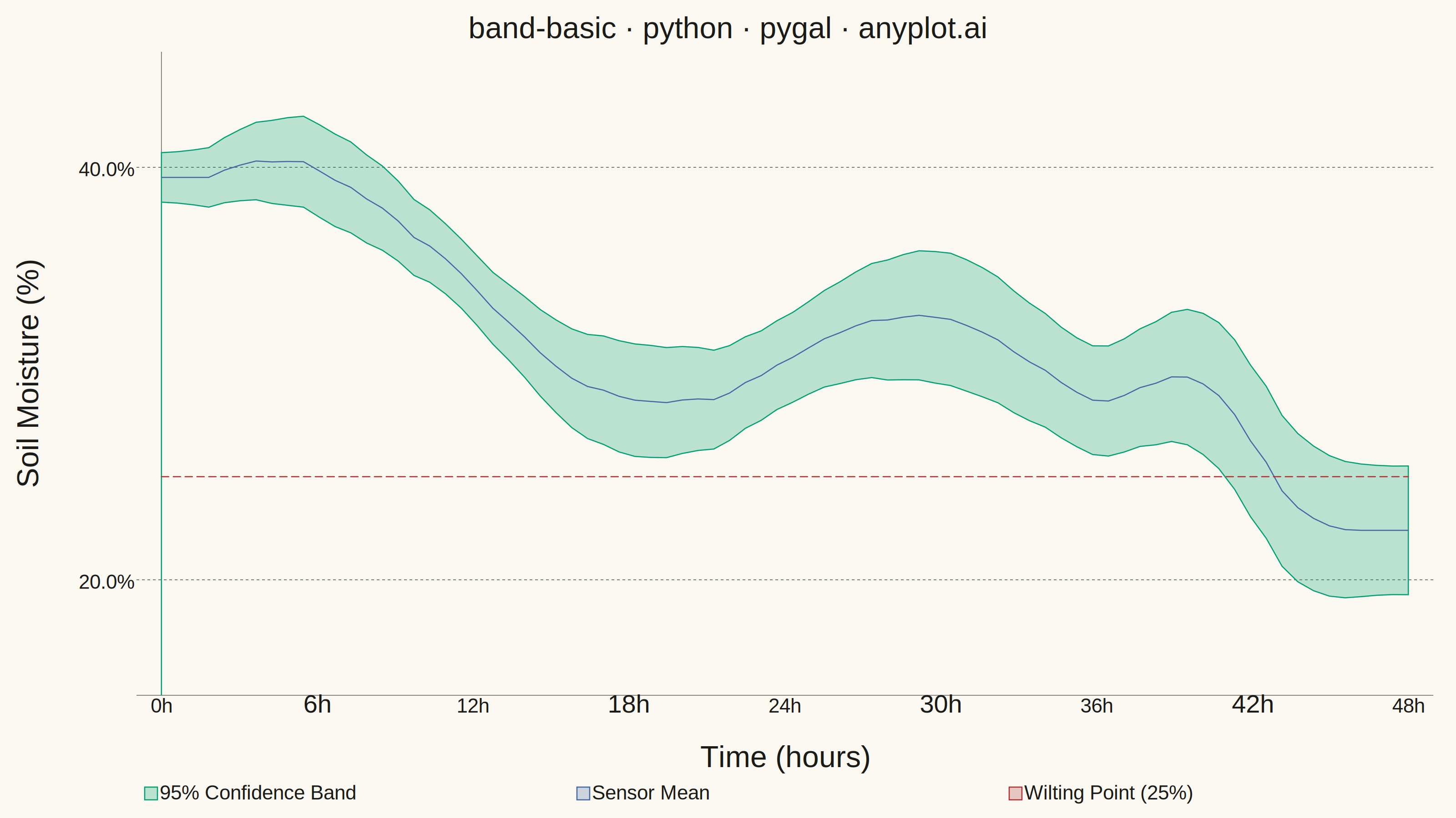
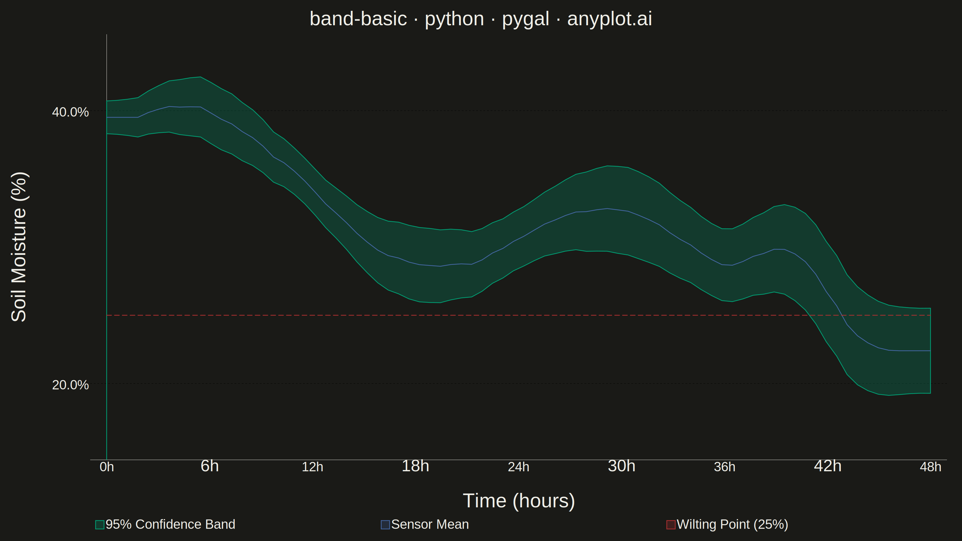
A band plot displays a filled region between two boundary lines, commonly used to show confidence intervals, prediction intervals, or ranges around a central trend line. The semi-transparent band provides visual representation of uncertainty or variability while maintaining visibility of underlying data or overlapping elements.
""" anyplot.ai
band-basic: Basic Band Plot
Library: pygal 3.1.0 | Python 3.13.13
Quality: 86/100 | Updated: 2026-05-29
"""

import os
import sys


# Prevent self-import: script named 'pygal.py' would shadow the real package
_here = os.path.dirname(os.path.abspath(__file__))
sys.path = [p for p in sys.path if os.path.abspath(p or ".") != _here]

import numpy as np
import pygal
from pygal.style import Style


# Theme tokens (Imprint palette — theme-adaptive chrome)
THEME = os.getenv("ANYPLOT_THEME", "light")
PAGE_BG = "#FAF8F1" if THEME == "light" else "#1A1A17"
ELEVATED_BG = "#FFFDF6" if THEME == "light" else "#242420"
INK = "#1A1A17" if THEME == "light" else "#F0EFE8"
INK_SOFT = "#4A4A44" if THEME == "light" else "#B8B7B0"
INK_MUTED = "#6B6A63" if THEME == "light" else "#A8A79F"

# Series order: band=green(0), center=blue(1) for contrast against green, wilting=red(2) semantic anchor
IMPRINT_PALETTE = ("#009E73", "#4467A3", "#AE3030", "#C475FD", "#BD8233", "#2ABCCD", "#954477", "#99B314")

# Data — soil moisture sensor readings with 95% confidence interval
np.random.seed(42)
n_points = 80
hours = np.linspace(0, 48, n_points)

# Realistic soil moisture pattern: starts high after rain, dips during dry spell,
# partially recovers at night, then drops before a second rain event
base_trend = 38 - 0.3 * hours + 4.0 * np.sin(2 * np.pi * hours / 24) + 8.0 * np.exp(-((hours - 40) ** 2) / 8)
noise = np.random.randn(n_points) * 0.6
y_raw = base_trend + noise

# Smooth with convolution, preserving array length with edge padding
kernel = np.ones(7) / 7
y_smooth = np.convolve(y_raw, kernel, mode="valid")
pad_left = (n_points - len(y_smooth)) // 2
pad_right = n_points - len(y_smooth) - pad_left
y_center = np.concatenate([np.full(pad_left, y_smooth[0]), y_smooth, np.full(pad_right, y_smooth[-1])])

# Confidence interval: wider during dry midday, narrower after rain
uncertainty = 1.2 + 0.8 * np.sin(2 * np.pi * hours / 24) ** 2 + 0.04 * hours
y_lower = y_center - uncertainty
y_upper = y_center + uncertainty

# Y-axis tick grid at clean 4% intervals
y_lo = 4 * (int(min(y_lower)) // 4)
y_hi = 4 * (int(max(y_upper)) // 4 + 1)
y_label_values = list(range(y_lo, y_hi + 1, 4))

# Custom style — Imprint palette, theme-adaptive chrome
custom_style = Style(
    background=PAGE_BG,
    plot_background=PAGE_BG,
    foreground=INK,
    foreground_strong=INK,
    foreground_subtle=INK_MUTED,
    colors=IMPRINT_PALETTE,
    opacity=".25",
    opacity_hover=".40",
    stroke_opacity="1",
    stroke_opacity_hover="1",
    stroke_width=2.5,
    title_font_size=66,
    label_font_size=56,
    major_label_font_size=44,
    legend_font_size=44,
    value_font_size=36,
    value_colors=("transparent",),
    tooltip_font_size=32,
    font_family='Helvetica, Arial, "DejaVu Sans", sans-serif',
)

title = "band-basic · python · pygal · anyplot.ai"

chart = pygal.XY(
    style=custom_style,
    width=3200,
    height=1800,
    explicit_size=True,
    title=title,
    x_title="Time (hours)",
    y_title="Soil Moisture (%)",
    show_dots=False,
    show_x_guides=False,
    show_y_guides=True,
    fill=True,
    stroke=True,
    legend_at_bottom=True,
    legend_at_bottom_columns=3,
    legend_box_size=28,
    truncate_legend=-1,
    x_label_rotation=0,
    range=(y_lo - 1, y_hi + 1),
    y_labels=y_label_values,
    x_labels=[0, 6, 12, 18, 24, 30, 36, 42, 48],
    x_labels_major=[0, 12, 24, 36, 48],
    show_minor_x_labels=True,
    show_minor_y_labels=False,
    print_values=False,
    x_value_formatter=lambda x: f"{x:.0f}h",
    value_formatter=lambda x: f"{x:.1f}%",
    tooltip_border_radius=8,
    margin_top=30,
    margin_bottom=50,
    margin_left=30,
    margin_right=50,
    spacing=18,
)


# Band as closed polygon: upper boundary forward, then lower boundary reversed
band_polygon = [(float(h), float(y)) for h, y in zip(hours, y_upper, strict=True)]
for h, y in zip(reversed(hours), reversed(y_lower), strict=True):
    band_polygon.append((float(h), float(y)))

chart.add("95% Confidence Band", band_polygon, stroke_style={"width": 0.5}, show_dots=False)

# Central trend line — blue (palette pos 1) for high contrast against green band, bold stroke
center_data = [(float(h), float(y)) for h, y in zip(hours, y_center, strict=True)]
chart.add(
    "Sensor Mean",
    center_data,
    fill=False,
    stroke=True,
    dots_size=0,
    stroke_style={"width": 10, "linecap": "round", "linejoin": "round"},
)

# Wilting point reference — semantic red for danger threshold
chart.add(
    "Wilting Point (25%)",
    [(0.0, 25.0), (48.0, 25.0)],
    fill=False,
    stroke=True,
    dots_size=0,
    formatter=lambda x: f"{x:.0f}%",
    stroke_style={"width": 5, "dasharray": "16,10", "linecap": "round"},
)

# Save PNG and interactive HTML
chart.render_to_png(f"plot-{THEME}.png")
with open(f"plot-{THEME}.html", "wb") as f:
    f.write(chart.render())
Runnable source as JSON, for any HTTP client: https://api.anyplot.ai/specs/band-basic/pygal/code. Any spec id and library id listed in llms-full.txt fit the same URL shape; every URL below is complete and callable.
{
  "spec_id": "band-basic",
  "language": "python",
  "library": "pygal",
  "page": "https://anyplot.ai/band-basic/python/pygal",
  "hub": "https://anyplot.ai/band-basic",
  "code_json": "https://api.anyplot.ai/specs/band-basic/pygal/code",
  "spec_json": "https://api.anyplot.ai/specs/band-basic",
  "render_light_png": "https://storage.googleapis.com/anyplot-images/plots/band-basic/python/pygal/plot-light.png",
  "render_dark_png": "https://storage.googleapis.com/anyplot-images/plots/band-basic/python/pygal/plot-dark.png",
  "interactive_light_html": "https://storage.googleapis.com/anyplot-images/plots/band-basic/python/pygal/plot-light.html",
  "interactive_dark_html": "https://storage.googleapis.com/anyplot-images/plots/band-basic/python/pygal/plot-dark.html",
  "quality_score": 86.0,
  "license": "MIT",
  "guide": "https://anyplot.ai/llms.txt"
}
Part of Basic Band Plot on anyplot.ai.