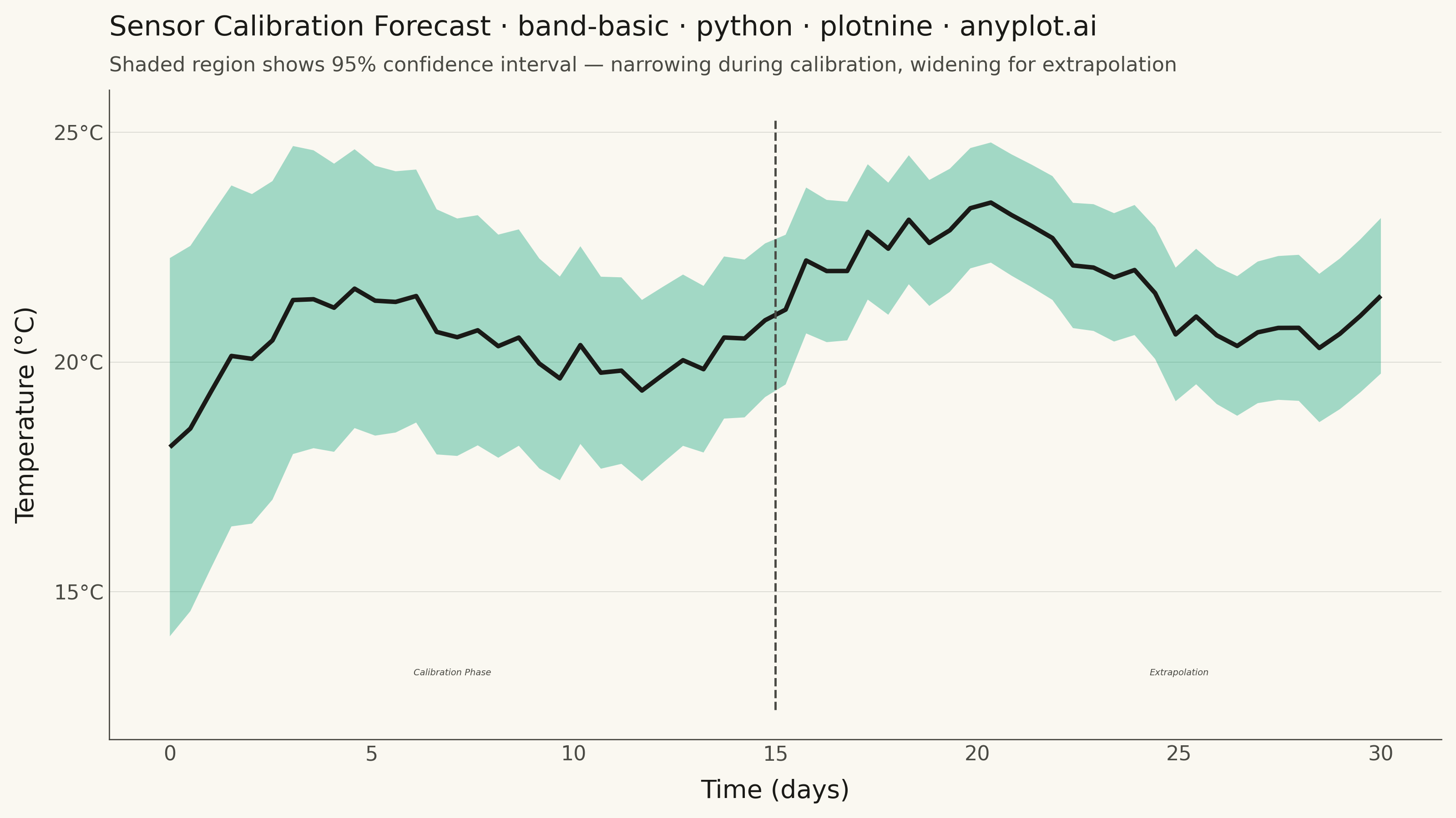
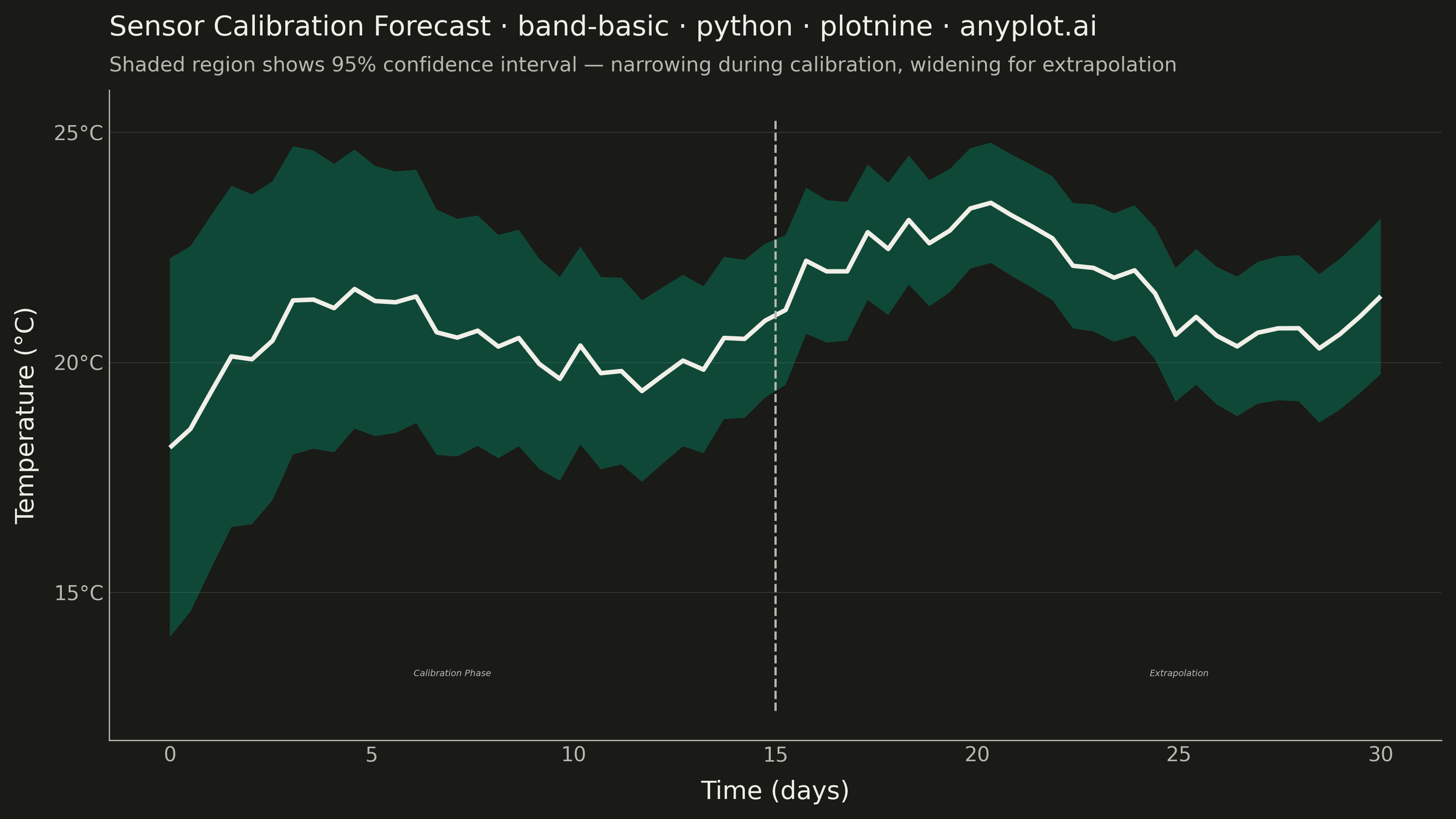
A band plot displays a filled region between two boundary lines, commonly used to show confidence intervals, prediction intervals, or ranges around a central trend line. The semi-transparent band provides visual representation of uncertainty or variability while maintaining visibility of underlying data or overlapping elements.
""" anyplot.ai
band-basic: Basic Band Plot
Library: plotnine 0.15.4 | Python 3.13.13
Quality: 92/100 | Updated: 2026-05-29
"""

import os
import sys


# Script is named plotnine.py — remove its directory from sys.path so the
# installed plotnine package is found instead of this file.
_this_dir = os.path.abspath(os.path.dirname(__file__))
sys.path = [p for p in sys.path if os.path.abspath(p or os.getcwd()) != _this_dir]

import numpy as np
import pandas as pd
from plotnine import (
    aes,
    annotate,
    coord_cartesian,
    element_blank,
    element_line,
    element_rect,
    element_text,
    geom_line,
    geom_ribbon,
    ggplot,
    labs,
    scale_x_continuous,
    scale_y_continuous,
    theme,
    theme_minimal,
)


# Theme-adaptive chrome tokens
THEME = os.getenv("ANYPLOT_THEME", "light")
PAGE_BG = "#FAF8F1" if THEME == "light" else "#1A1A17"
INK = "#1A1A17" if THEME == "light" else "#F0EFE8"
INK_SOFT = "#4A4A44" if THEME == "light" else "#B8B7B0"
INK_MUTED = "#6B6A63" if THEME == "light" else "#A8A79F"

# Imprint palette — first series is always #009E73
BRAND = "#009E73"

# Data: sensor readings with 95% confidence interval
np.random.seed(42)
n_points = 60
days = np.linspace(0, 30, n_points)

# Central trend: temperature rising then stabilizing (realistic sensor pattern)
temperature = 18 + 4 * (1 - np.exp(-0.15 * days)) + 1.5 * np.sin(0.4 * days)
temperature = temperature + np.random.normal(0, 0.3, n_points)

# Uncertainty narrows as model calibrates, then widens for extrapolation
uncertainty = 1.8 * np.exp(-0.08 * days) + 0.3 + 0.04 * np.maximum(days - 20, 0)

temp_lower = temperature - 1.96 * uncertainty
temp_upper = temperature + 1.96 * uncertainty

df = pd.DataFrame({"days": days, "temperature": temperature, "temp_lower": temp_lower, "temp_upper": temp_upper})

# Title length ~73 chars → scale down: round(12 × 67 / 73) = 11
plot = (
    ggplot(df, aes(x="days"))
    + geom_ribbon(aes(ymin="temp_lower", ymax="temp_upper"), fill=BRAND, alpha=0.35)
    + geom_line(aes(y="temperature"), color=INK, size=1.0)
    + annotate(
        "text", x=7, y=temp_lower.min() - 0.8, label="Calibration Phase", size=3.5, color=INK_SOFT, fontstyle="italic"
    )
    + annotate(
        "text", x=25, y=temp_lower.min() - 0.8, label="Extrapolation", size=3.5, color=INK_SOFT, fontstyle="italic"
    )
    + annotate(
        "segment",
        x=15,
        xend=15,
        y=temp_lower.min() - 1.6,
        yend=temp_upper.max() + 0.5,
        color=INK_SOFT,
        size=0.5,
        linetype="dashed",
    )
    + labs(
        x="Time (days)",
        y="Temperature (°C)",
        title="Sensor Calibration Forecast · band-basic · python · plotnine · anyplot.ai",
        subtitle="Shaded region shows 95% confidence interval — narrowing during calibration, widening for extrapolation",
    )
    + scale_x_continuous(breaks=range(0, 31, 5))
    + scale_y_continuous(labels=lambda lst: [f"{v:.0f}°C" for v in lst])
    + coord_cartesian(expand=True)
    + theme_minimal()
    + theme(
        figure_size=(8, 4.5),
        text=element_text(size=7),
        axis_title=element_text(size=10, color=INK),
        axis_text=element_text(size=8, color=INK_SOFT),
        plot_title=element_text(size=11, color=INK),
        plot_subtitle=element_text(size=8, color=INK_SOFT),
        panel_grid_major_y=element_line(color=INK, size=0.3, alpha=0.15),
        panel_grid_major_x=element_blank(),
        panel_grid_minor=element_blank(),
        panel_border=element_blank(),
        axis_line=element_line(color=INK_SOFT, size=0.5),
        plot_background=element_rect(fill=PAGE_BG, color=PAGE_BG),
        panel_background=element_rect(fill=PAGE_BG),
    )
)

plot.save(f"plot-{THEME}.png", dpi=400, width=8, height=4.5, units="in", verbose=False)
Runnable source as JSON, for any HTTP client: https://api.anyplot.ai/specs/band-basic/plotnine/code. Any spec id and library id listed in llms-full.txt fit the same URL shape; every URL below is complete and callable.
{
  "spec_id": "band-basic",
  "language": "python",
  "library": "plotnine",
  "page": "https://anyplot.ai/band-basic/python/plotnine",
  "hub": "https://anyplot.ai/band-basic",
  "code_json": "https://api.anyplot.ai/specs/band-basic/plotnine/code",
  "spec_json": "https://api.anyplot.ai/specs/band-basic",
  "render_light_png": "https://storage.googleapis.com/anyplot-images/plots/band-basic/python/plotnine/plot-light.png",
  "render_dark_png": "https://storage.googleapis.com/anyplot-images/plots/band-basic/python/plotnine/plot-dark.png",
  "quality_score": 92.0,
  "license": "MIT",
  "guide": "https://anyplot.ai/llms.txt"
}
Part of Basic Band Plot on anyplot.ai.