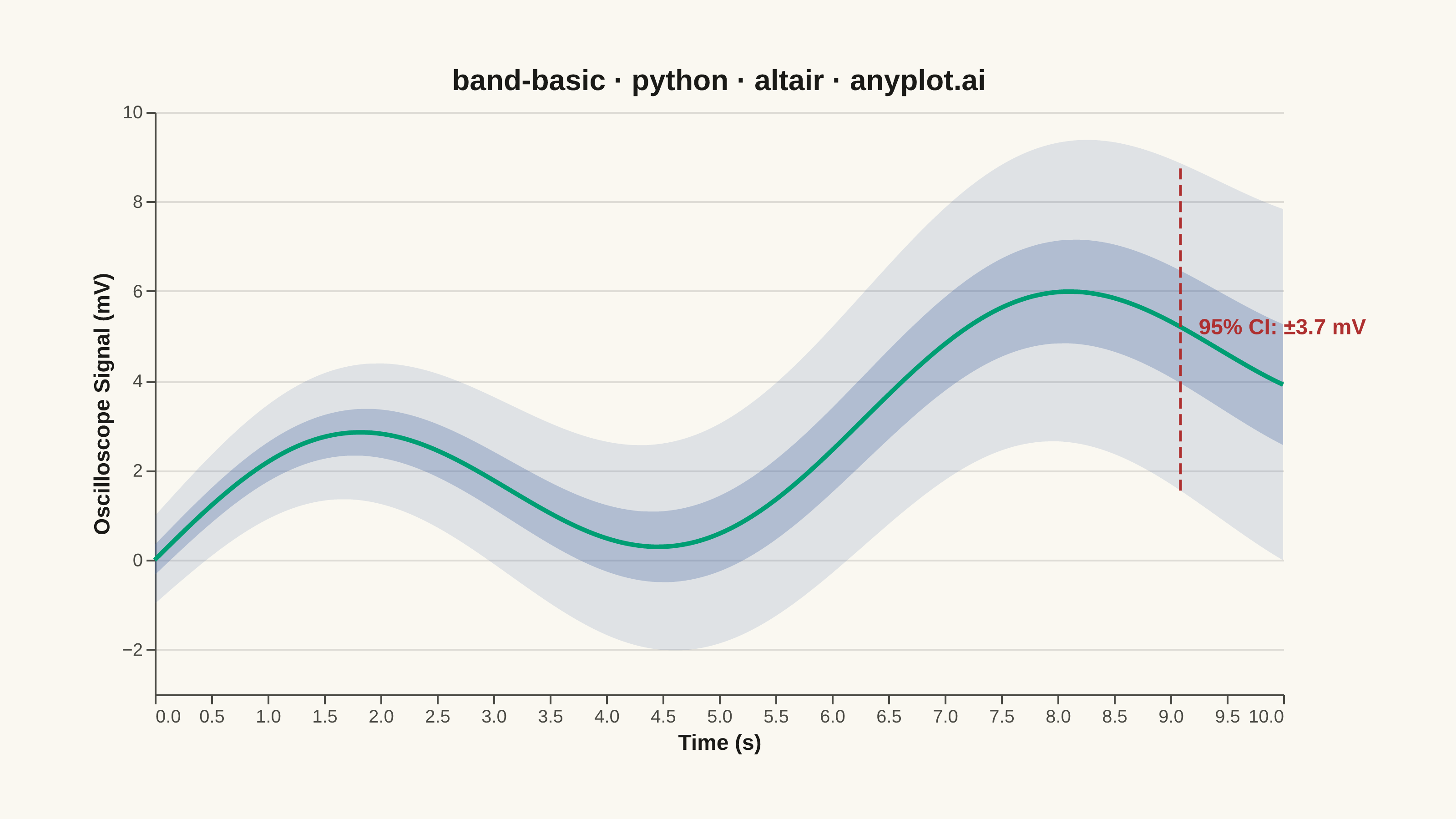
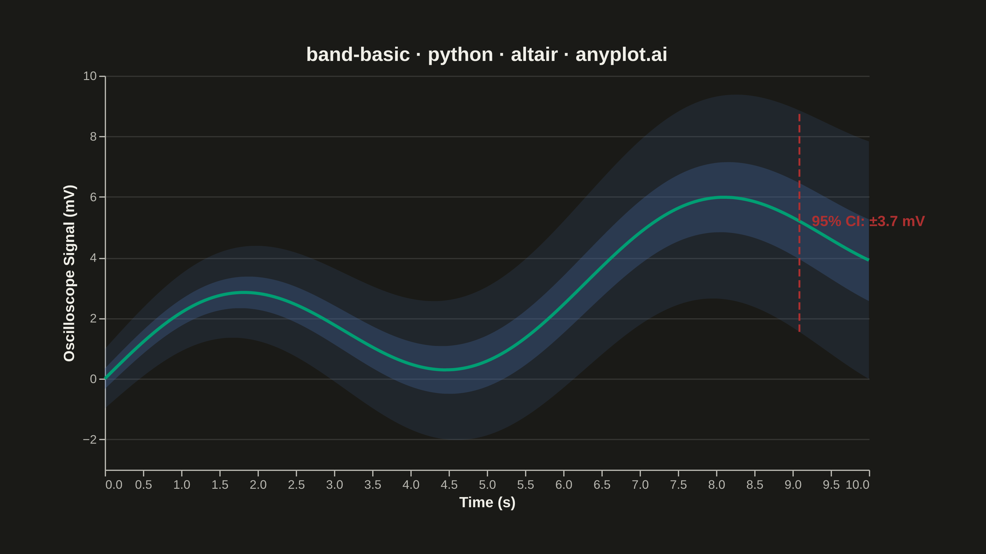
A band plot displays a filled region between two boundary lines, commonly used to show confidence intervals, prediction intervals, or ranges around a central trend line. The semi-transparent band provides visual representation of uncertainty or variability while maintaining visibility of underlying data or overlapping elements.
""" anyplot.ai
band-basic: Basic Band Plot
Library: altair 6.1.0 | Python 3.13.13
Quality: 91/100 | Updated: 2026-05-29
"""

import importlib
import os
import sys


# Drop script directory from sys.path so the `altair` package resolves, not this file
sys.path[:] = [p for p in sys.path if os.path.abspath(p or ".") != os.path.dirname(os.path.abspath(__file__))]
alt = importlib.import_module("altair")
np = importlib.import_module("numpy")
pd = importlib.import_module("pandas")
Image = importlib.import_module("PIL.Image")

# Theme tokens
THEME = os.getenv("ANYPLOT_THEME", "light")
PAGE_BG = "#FAF8F1" if THEME == "light" else "#1A1A17"
ELEVATED_BG = "#FFFDF6" if THEME == "light" else "#242420"
INK = "#1A1A17" if THEME == "light" else "#F0EFE8"
INK_SOFT = "#4A4A44" if THEME == "light" else "#B8B7B0"

# Imprint palette
BRAND = "#009E73"  # Imprint palette position 1 — ALWAYS first series
IMPRINT_BLUE = "#4467A3"  # Imprint palette position 3 — band fills
IMPRINT_RED = "#AE3030"  # Imprint palette position 5 — semantic callout anchor

# Data - oscilloscope voltage measurement with growing uncertainty
np.random.seed(42)
x = np.linspace(0, 10, 100)
y_center = 2 * np.sin(x) + 0.5 * x  # Sinusoidal signal with linear drift

# Confidence band widens over time (realistic sensor drift uncertainty)
uncertainty = 0.5 + 0.15 * x
y_lower = y_center - 1.96 * uncertainty
y_upper = y_center + 1.96 * uncertainty
y_inner_lower = y_center - 0.674 * uncertainty  # 50% CI inner band
y_inner_upper = y_center + 0.674 * uncertainty

df = pd.DataFrame(
    {
        "x": x,
        "y_center": y_center,
        "y_lower": y_lower,
        "y_upper": y_upper,
        "y_inner_lower": y_inner_lower,
        "y_inner_upper": y_inner_upper,
    }
)

# Annotation data — callout at x≈9.0 s where uncertainty is wide and clearly visible
ann_row = df.iloc[90]
ann_df = pd.DataFrame(
    {
        "x": [ann_row["x"]],
        "y_upper": [ann_row["y_upper"]],
        "y_lower": [ann_row["y_lower"]],
        "y_mid": [(ann_row["y_upper"] + ann_row["y_lower"]) / 2],
        "label": [f"95% CI: ±{(ann_row['y_upper'] - ann_row['y_lower']) / 2:.1f} mV"],
    }
)

# Nearest-point selection for interactive HTML export
nearest = alt.selection_point(nearest=True, on="pointerover", fields=["x"], empty=False)

# 95% confidence band (outer) — Imprint blue at low opacity for depth
band_outer = (
    alt.Chart(df)
    .mark_area(opacity=0.15, color=IMPRINT_BLUE, interpolate="monotone")
    .encode(
        x=alt.X("x:Q", title="Time (s)"), y=alt.Y("y_lower:Q", title="Oscilloscope Signal (mV)"), y2=alt.Y2("y_upper:Q")
    )
)

# 50% confidence band (inner) — Imprint blue at higher opacity for layered contrast
band_inner = (
    alt.Chart(df)
    .mark_area(opacity=0.30, color=IMPRINT_BLUE, interpolate="monotone")
    .encode(x="x:Q", y="y_inner_lower:Q", y2="y_inner_upper:Q")
)

# Central trend line — Imprint brand green (first/primary series)
line = alt.Chart(df).mark_line(strokeWidth=2.5, color=BRAND, interpolate="monotone").encode(x="x:Q", y="y_center:Q")

# Annotation: dashed vertical bracket showing uncertainty span
ann_rule = (
    alt.Chart(ann_df)
    .mark_rule(color=IMPRINT_RED, strokeWidth=1.5, strokeDash=[6, 3])
    .encode(x="x:Q", y="y_lower:Q", y2="y_upper:Q")
)

ann_text = (
    alt.Chart(ann_df)
    .mark_text(align="left", dx=10, fontSize=12, fontWeight="bold", color=IMPRINT_RED)
    .encode(x="x:Q", y="y_mid:Q", text="label:N")
)

# Interactive tooltip points — visible on hover in HTML, hidden in static PNG
tooltip_points = (
    alt.Chart(df)
    .mark_point(color=BRAND, size=80)
    .encode(
        x="x:Q",
        y="y_center:Q",
        opacity=alt.condition(nearest, alt.value(1), alt.value(0)),
        tooltip=[
            alt.Tooltip("x:Q", title="Time (s)", format=".1f"),
            alt.Tooltip("y_center:Q", title="Signal (mV)", format=".2f"),
            alt.Tooltip("y_lower:Q", title="95% CI Lower", format=".2f"),
            alt.Tooltip("y_upper:Q", title="95% CI Upper", format=".2f"),
        ],
    )
    .add_params(nearest)
)

# Vertical guide rule — visible on hover in HTML only
guide_rule = (
    alt.Chart(df)
    .mark_rule(color=INK_SOFT, strokeDash=[4, 4])
    .encode(x="x:Q", opacity=alt.condition(nearest, alt.value(0.5), alt.value(0)))
)

title = "band-basic · python · altair · anyplot.ai"
n = len(title)
ratio = 67 / n if n > 67 else 1.0
title_fs = max(11, round(16 * ratio))

# Combine layers with theme-adaptive chrome
chart = (
    (band_outer + band_inner + line + ann_rule + ann_text + tooltip_points + guide_rule)
    .properties(width=620, height=320, background=PAGE_BG, title=alt.Title(title, fontSize=title_fs, color=INK))
    .configure_view(fill=PAGE_BG, stroke=None)
    .configure_axis(
        labelFontSize=10,
        titleFontSize=12,
        labelColor=INK_SOFT,
        titleColor=INK,
        domainColor=INK_SOFT,
        tickColor=INK_SOFT,
        gridColor=INK,
        gridOpacity=0.12,
    )
    .configure_axisX(grid=False)
)

# Save PNG
chart.save(f"plot-{THEME}.png", scale_factor=4.0)

# Pad PNG to exact 3200×1800 target (vl-convert may land slightly short)
TW, TH = 3200, 1800
_img = Image.open(f"plot-{THEME}.png").convert("RGB")
_w, _h = _img.size
if _w > TW or _h > TH:
    raise SystemExit(
        f"altair vl-convert produced {_w}×{_h}, exceeds target {TW}×{TH}. "
        f"Shrink chart .properties(width=, height=) values and re-render."
    )
if _w < TW or _h < TH:
    _canvas = Image.new("RGB", (TW, TH), PAGE_BG)
    _canvas.paste(_img, ((TW - _w) // 2, (TH - _h) // 2))
    _canvas.save(f"plot-{THEME}.png")

# Save HTML
chart.save(f"plot-{THEME}.html")
Runnable source as JSON, for any HTTP client: https://api.anyplot.ai/specs/band-basic/altair/code. Any spec id and library id listed in llms-full.txt fit the same URL shape; every URL below is complete and callable.
{
  "spec_id": "band-basic",
  "language": "python",
  "library": "altair",
  "page": "https://anyplot.ai/band-basic/python/altair",
  "hub": "https://anyplot.ai/band-basic",
  "code_json": "https://api.anyplot.ai/specs/band-basic/altair/code",
  "spec_json": "https://api.anyplot.ai/specs/band-basic",
  "render_light_png": "https://storage.googleapis.com/anyplot-images/plots/band-basic/python/altair/plot-light.png",
  "render_dark_png": "https://storage.googleapis.com/anyplot-images/plots/band-basic/python/altair/plot-dark.png",
  "interactive_light_html": "https://storage.googleapis.com/anyplot-images/plots/band-basic/python/altair/plot-light.html",
  "interactive_dark_html": "https://storage.googleapis.com/anyplot-images/plots/band-basic/python/altair/plot-dark.html",
  "quality_score": 91.0,
  "license": "MIT",
  "guide": "https://anyplot.ai/llms.txt"
}
Part of Basic Band Plot on anyplot.ai.