The same plot in 14 other libraries — JavaScript: Chart.js, D3.js, Apache ECharts, MUI X Charts; Python: Altair, Bokeh, lets-plot, Matplotlib, Plotly, plotnine, Pygal, Seaborn; R: ggplot2; Julia: Makie.jl. Compare all 15 side by side: Basic Band Plot in Python, R, Julia and JavaScript.
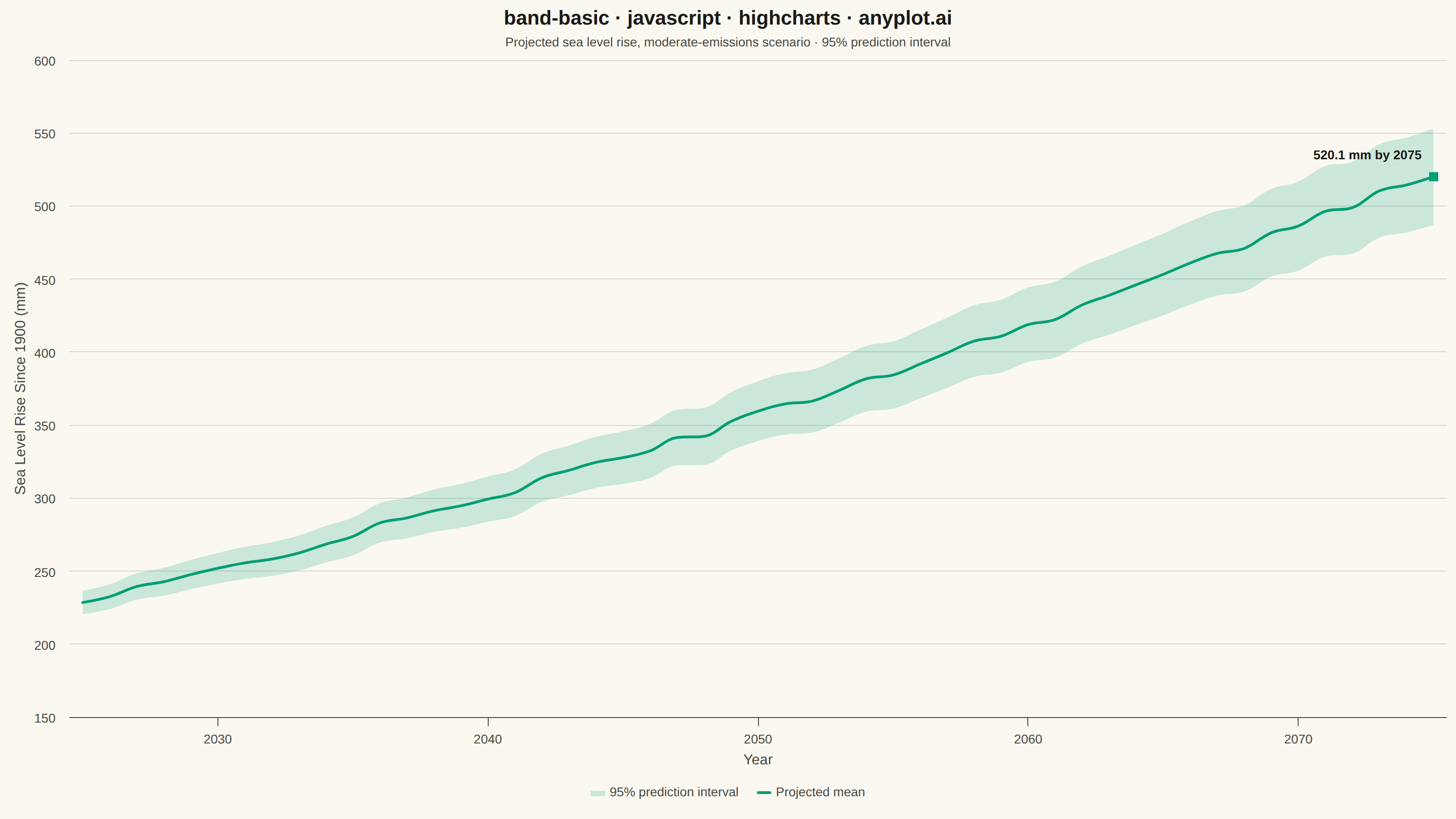
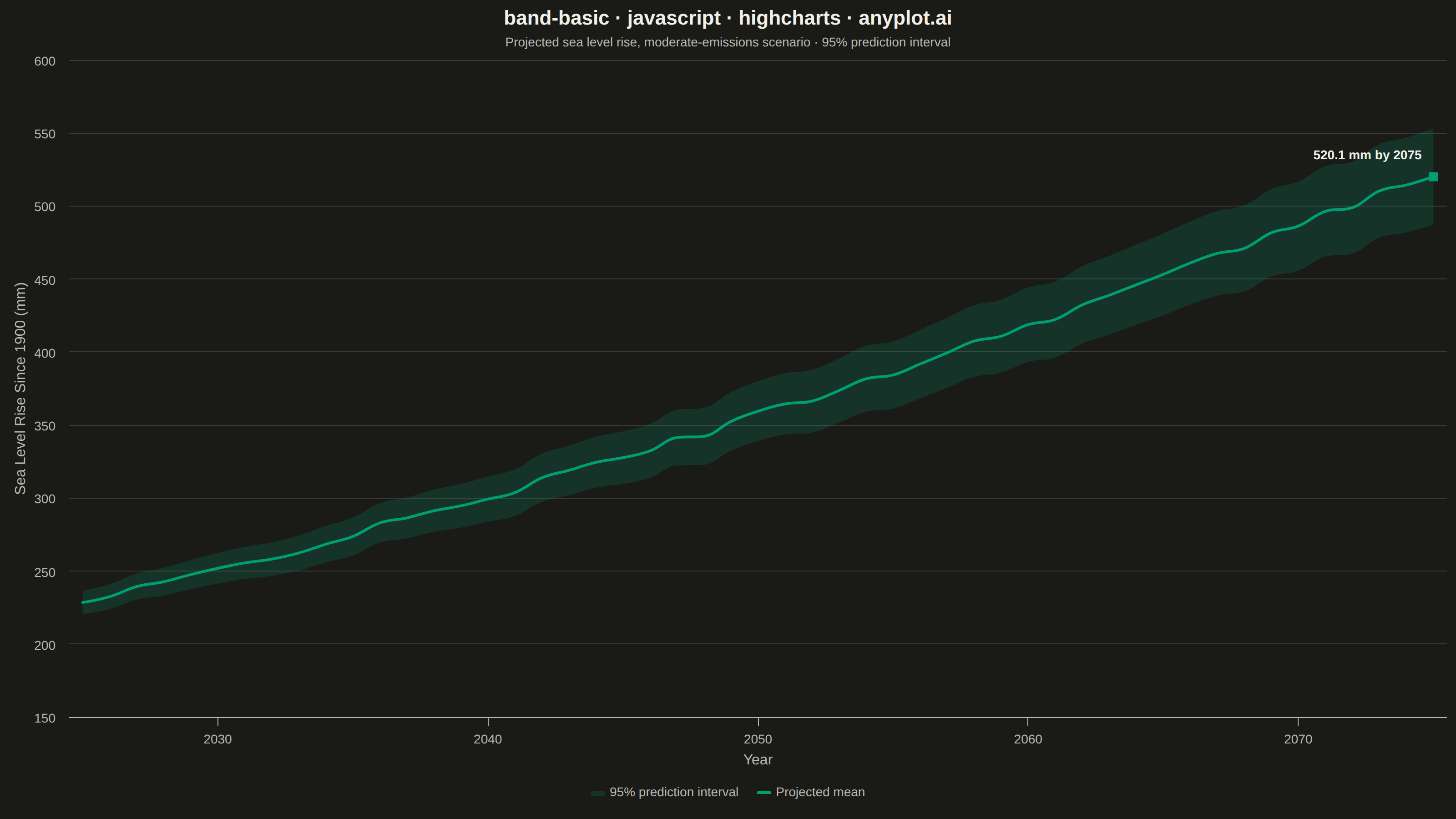
A band plot displays a filled region between two boundary lines, commonly used to show confidence intervals, prediction intervals, or ranges around a central trend line. The semi-transparent band provides visual representation of uncertainty or variability while maintaining visibility of underlying data or overlapping elements.
// anyplot.ai
// band-basic: Basic Band Plot
// Library: highcharts 12.6.0 | JavaScript 22.23.2
// Quality: 91/100 | Created: 2026-08-24

const t = window.ANYPLOT_TOKENS;

// --- Data (in-memory, deterministic) ----------------------------------------
// Projected global mean sea level rise since a 1900 baseline, moderate-emissions
// scenario. The 95% prediction interval widens with the forecast horizon, as is
// typical for cumulative climate projections.
let seed = 42;
function nextRandom() {
  seed = (seed * 1103515245 + 12345) % 2147483648;
  return seed / 2147483648;
}

const years = [];
const lowerBase = []; // invisible stack base = y_lower
const bandHeight = []; // stacked on top of lowerBase to reach y_upper
const centerLine = []; // y_center trend

for (let t_yr = 0; t_yr <= 50; t_yr += 1) {
  const year = 2025 + t_yr;
  const trend = 228 + 4.4 * t_yr + 0.03 * t_yr * t_yr; // mm since 1900
  const wobble = (nextRandom() - 0.5) * 6; // year-to-year natural variability
  const center = trend + wobble;
  const halfWidth = 8 + 0.5 * t_yr; // widening 95% prediction interval

  years.push(year);
  lowerBase.push(Math.round((center - halfWidth) * 10) / 10);
  bandHeight.push(Math.round(halfWidth * 2 * 10) / 10);
  centerLine.push(Math.round(center * 10) / 10);
}

const bandFill = Highcharts.color(t.palette[0]).setOpacity(0.25).get();

// --- Chart -------------------------------------------------------------------
Highcharts.chart("container", {
  chart: {
    backgroundColor: "transparent",
    animation: false,
    style: { fontFamily: "inherit" },
  },
  credits: { enabled: false },
  colors: t.palette,
  title: {
    text: "band-basic · javascript · highcharts · anyplot.ai",
    style: { color: t.ink, fontSize: "22px", fontWeight: "600" },
  },
  subtitle: {
    text: "Projected sea level rise, moderate-emissions scenario · 95% prediction interval",
    style: { color: t.inkSoft, fontSize: "14px" },
  },
  xAxis: {
    title: { text: "Year", style: { color: t.inkSoft, fontSize: "16px" } },
    lineColor: t.inkSoft,
    tickColor: t.inkSoft,
    gridLineColor: t.grid,
    tickInterval: 10,
    labels: { style: { color: t.inkSoft, fontSize: "14px" } },
  },
  yAxis: {
    title: {
      text: "Sea Level Rise Since 1900 (mm)",
      style: { color: t.inkSoft, fontSize: "16px" },
    },
    // The stacking trick anchors the invisible spacer series at 0, which would
    // otherwise force the axis to start at 0 and waste ~40% of the canvas below
    // the data (~220-550mm). Cropping to a tighter min is safe: the spacer stays
    // fully transparent, so the stacking math is unaffected — only the visible
    // viewport tightens.
    min: 150,
    gridLineColor: t.grid,
    labels: { style: { color: t.inkSoft, fontSize: "14px" } },
  },
  legend: {
    itemStyle: { color: t.inkSoft, fontSize: "14px" },
    itemHoverStyle: { color: t.ink },
  },
  tooltip: { shared: true, valueSuffix: " mm" },
  plotOptions: {
    series: { animation: false, marker: { enabled: false } },
  },
  series: [
    // Stacking order matters: Highcharts stacks the FIRST series in this array
    // as the cumulative top of the stack, and the LAST as the base at 0. So the
    // visible band goes first (rendering from y_lower to y_upper) and the
    // invisible spacer goes second (rendering from 0 to y_lower, hidden).
    {
      name: "95% prediction interval",
      type: "areaspline",
      data: years.map((year, i) => [year, bandHeight[i]]),
      stacking: "normal",
      color: bandFill,
      lineWidth: 0,
      enableMouseTracking: false,
      showInLegend: true,
    },
    {
      name: "Lower bound",
      type: "areaspline",
      data: years.map((year, i) => [year, lowerBase[i]]),
      stacking: "normal",
      color: "transparent",
      fillOpacity: 0,
      lineWidth: 0,
      enableMouseTracking: false,
      showInLegend: false,
    },
    {
      name: "Projected mean",
      type: "spline",
      data: years.map((year, i) => {
        const point = [year, centerLine[i]];
        if (i !== years.length - 1) return point;
        // Callout on the final projected value gives the trend line a clear
        // focal point instead of just trailing off at the plot edge.
        return {
          x: year,
          y: centerLine[i],
          dataLabels: {
            enabled: true,
            format: `${centerLine[i]} mm by ${year}`,
            align: "right",
            x: -8,
            y: -12,
            style: {
              color: t.ink,
              fontSize: "14px",
              fontWeight: "600",
              textOutline: "none",
            },
          },
          marker: { enabled: true, radius: 5, fillColor: t.palette[0] },
        };
      }),
      color: t.palette[0],
      lineWidth: 3,
      showInLegend: true,
    },
  ],
});
Runnable source as JSON, for any HTTP client: https://api.anyplot.ai/specs/band-basic/highcharts/code. Any spec id and library id listed in llms-full.txt fit the same URL shape; every URL below is complete and callable.
{
  "spec_id": "band-basic",
  "language": "javascript",
  "library": "highcharts",
  "page": "https://anyplot.ai/band-basic/javascript/highcharts",
  "hub": "https://anyplot.ai/band-basic",
  "code_json": "https://api.anyplot.ai/specs/band-basic/highcharts/code",
  "spec_json": "https://api.anyplot.ai/specs/band-basic",
  "render_light_png": "https://storage.googleapis.com/anyplot-images/plots/band-basic/javascript/highcharts/plot-light.png",
  "render_dark_png": "https://storage.googleapis.com/anyplot-images/plots/band-basic/javascript/highcharts/plot-dark.png",
  "interactive_light_html": "https://storage.googleapis.com/anyplot-images/plots/band-basic/javascript/highcharts/plot-light.html",
  "interactive_dark_html": "https://storage.googleapis.com/anyplot-images/plots/band-basic/javascript/highcharts/plot-dark.html",
  "quality_score": 91.0,
  "license": "MIT",
  "guide": "https://anyplot.ai/llms.txt"
}
Part of Basic Band Plot on anyplot.ai.