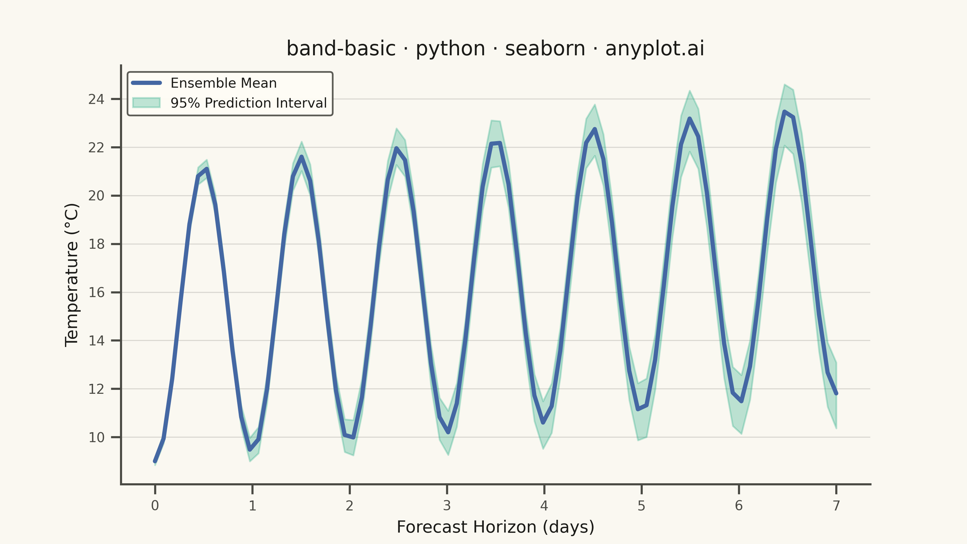
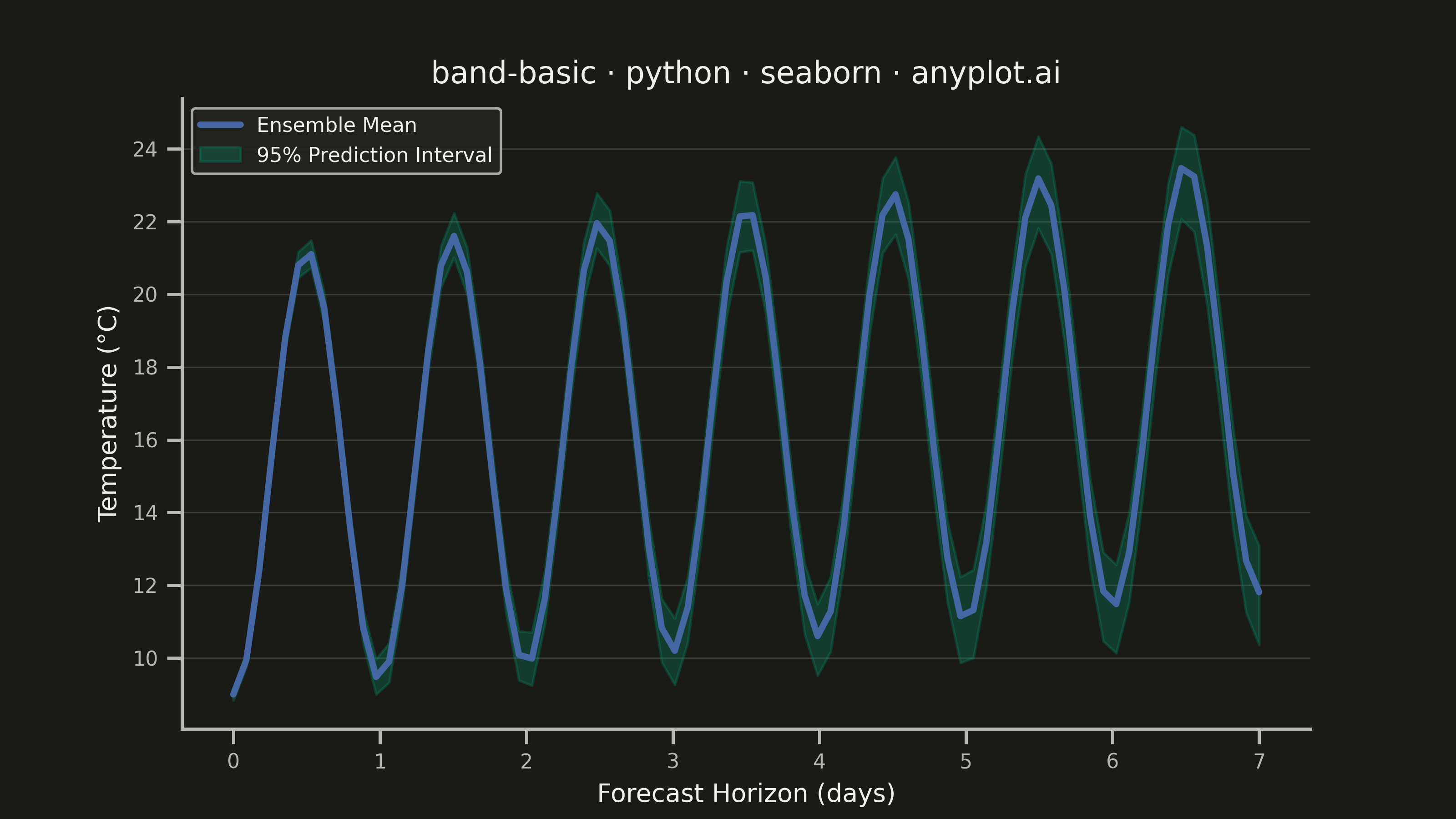
A band plot displays a filled region between two boundary lines, commonly used to show confidence intervals, prediction intervals, or ranges around a central trend line. The semi-transparent band provides visual representation of uncertainty or variability while maintaining visibility of underlying data or overlapping elements.
""" anyplot.ai
band-basic: Basic Band Plot
Library: seaborn 0.13.2 | Python 3.13.13
Quality: 90/100 | Updated: 2026-05-29
"""

import os
import sys


# Fix sys.path to avoid importing local matplotlib.py file
if sys.path and sys.path[0] == os.path.dirname(os.path.abspath(__file__)):
    sys.path.pop(0)

import matplotlib.pyplot as plt
import numpy as np
import pandas as pd
import seaborn as sns


# Theme tokens — Imprint palette, theme-adaptive chrome
THEME = os.getenv("ANYPLOT_THEME", "light")
PAGE_BG = "#FAF8F1" if THEME == "light" else "#1A1A17"
ELEVATED_BG = "#FFFDF6" if THEME == "light" else "#242420"
INK = "#1A1A17" if THEME == "light" else "#F0EFE8"
INK_SOFT = "#4A4A44" if THEME == "light" else "#B8B7B0"

# Imprint palette: first series #009E73 (band fill), position 3 #4467A3 (center line)
BRAND = "#009E73"
CONTRAST = "#4467A3"

# Data: 7-day temperature forecast from 200-member ensemble weather model
np.random.seed(42)
n_points = 80
n_ensemble = 200
days = np.linspace(0, 7, n_points)

# Base forecast: diurnal temperature cycle with gradual warming trend
base = 15 + 6 * np.sin(2 * np.pi * days - np.pi / 2) + 0.4 * days

# Ensemble members diverge via cumulative random drift (uncertainty grows with horizon)
drifts = np.cumsum(np.random.normal(0, 0.08, (n_ensemble, n_points)), axis=1)
all_temps = base + drifts

df = pd.DataFrame({"Forecast Day": np.tile(days, n_ensemble), "Temperature (°C)": all_temps.ravel()})

# Scale context then apply theme-adaptive chrome
sns.set_context("notebook", font_scale=1.0)
sns.set_theme(
    style="ticks",
    rc={
        "figure.facecolor": PAGE_BG,
        "axes.facecolor": PAGE_BG,
        "axes.edgecolor": INK_SOFT,
        "axes.labelcolor": INK,
        "text.color": INK,
        "xtick.color": INK_SOFT,
        "ytick.color": INK_SOFT,
        "grid.color": INK,
        "grid.alpha": 0.15,
        "legend.facecolor": ELEVATED_BG,
        "legend.edgecolor": INK_SOFT,
    },
)

# Canvas — 3200×1800 px (landscape 16:9); no bbox_inches='tight' per seaborn hard rule
fig, ax = plt.subplots(figsize=(8, 4.5), dpi=400, facecolor=PAGE_BG)
ax.set_facecolor(PAGE_BG)

# sns.lineplot natively computes mean + 95% prediction interval from long-format ensemble
sns.lineplot(
    data=df,
    x="Forecast Day",
    y="Temperature (°C)",
    estimator="mean",
    errorbar=("pi", 95),
    color=BRAND,
    linewidth=2.5,
    err_kws={"alpha": 0.25},
    ax=ax,
)

# Contrasting center line (Imprint blue) for visual hierarchy; z-ordered above band
ax.lines[0].set_color(CONTRAST)
ax.lines[0].set_zorder(10)

ax.lines[0].set_label("Ensemble Mean")
ax.collections[0].set_label("95% Prediction Interval")

title = "band-basic · python · seaborn · anyplot.ai"
ax.set_title(title, fontsize=12, fontweight="medium", color=INK)
ax.set_xlabel("Forecast Horizon (days)", fontsize=10, color=INK)
ax.set_ylabel("Temperature (°C)", fontsize=10, color=INK)
ax.tick_params(axis="both", labelsize=8)

sns.despine(ax=ax)
ax.yaxis.grid(True, alpha=0.15, linewidth=0.6, color=INK)

ax.legend(fontsize=8, loc="upper left", framealpha=0.9, facecolor=ELEVATED_BG, edgecolor=INK_SOFT)

plt.savefig(f"plot-{THEME}.png", dpi=400, facecolor=PAGE_BG)
Runnable source as JSON, for any HTTP client: https://api.anyplot.ai/specs/band-basic/seaborn/code. Any spec id and library id listed in llms-full.txt fit the same URL shape; every URL below is complete and callable.
{
  "spec_id": "band-basic",
  "language": "python",
  "library": "seaborn",
  "page": "https://anyplot.ai/band-basic/python/seaborn",
  "hub": "https://anyplot.ai/band-basic",
  "code_json": "https://api.anyplot.ai/specs/band-basic/seaborn/code",
  "spec_json": "https://api.anyplot.ai/specs/band-basic",
  "render_light_png": "https://storage.googleapis.com/anyplot-images/plots/band-basic/python/seaborn/plot-light.png",
  "render_dark_png": "https://storage.googleapis.com/anyplot-images/plots/band-basic/python/seaborn/plot-dark.png",
  "quality_score": 90.0,
  "license": "MIT",
  "guide": "https://anyplot.ai/llms.txt"
}
Part of Basic Band Plot on anyplot.ai.