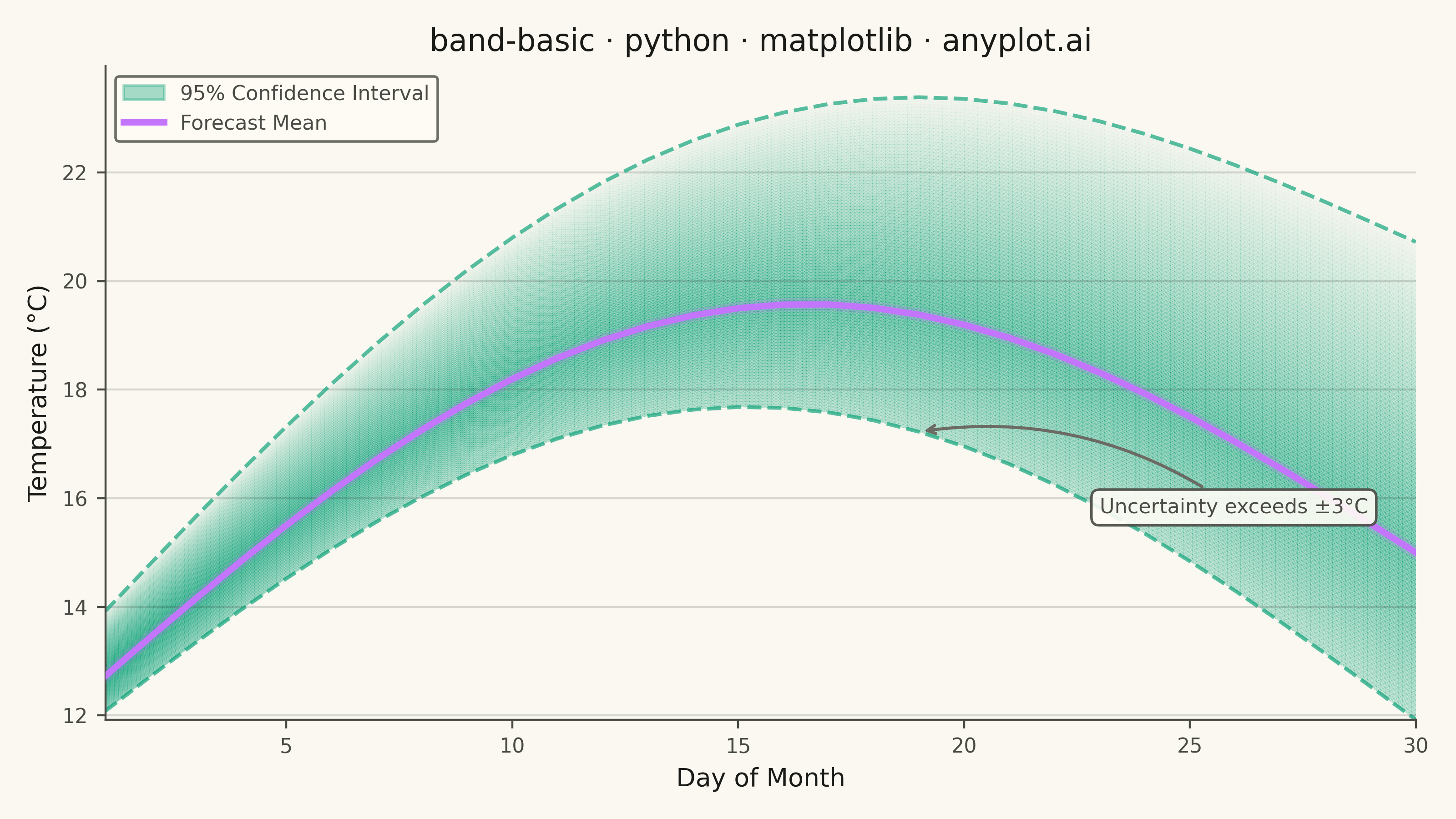
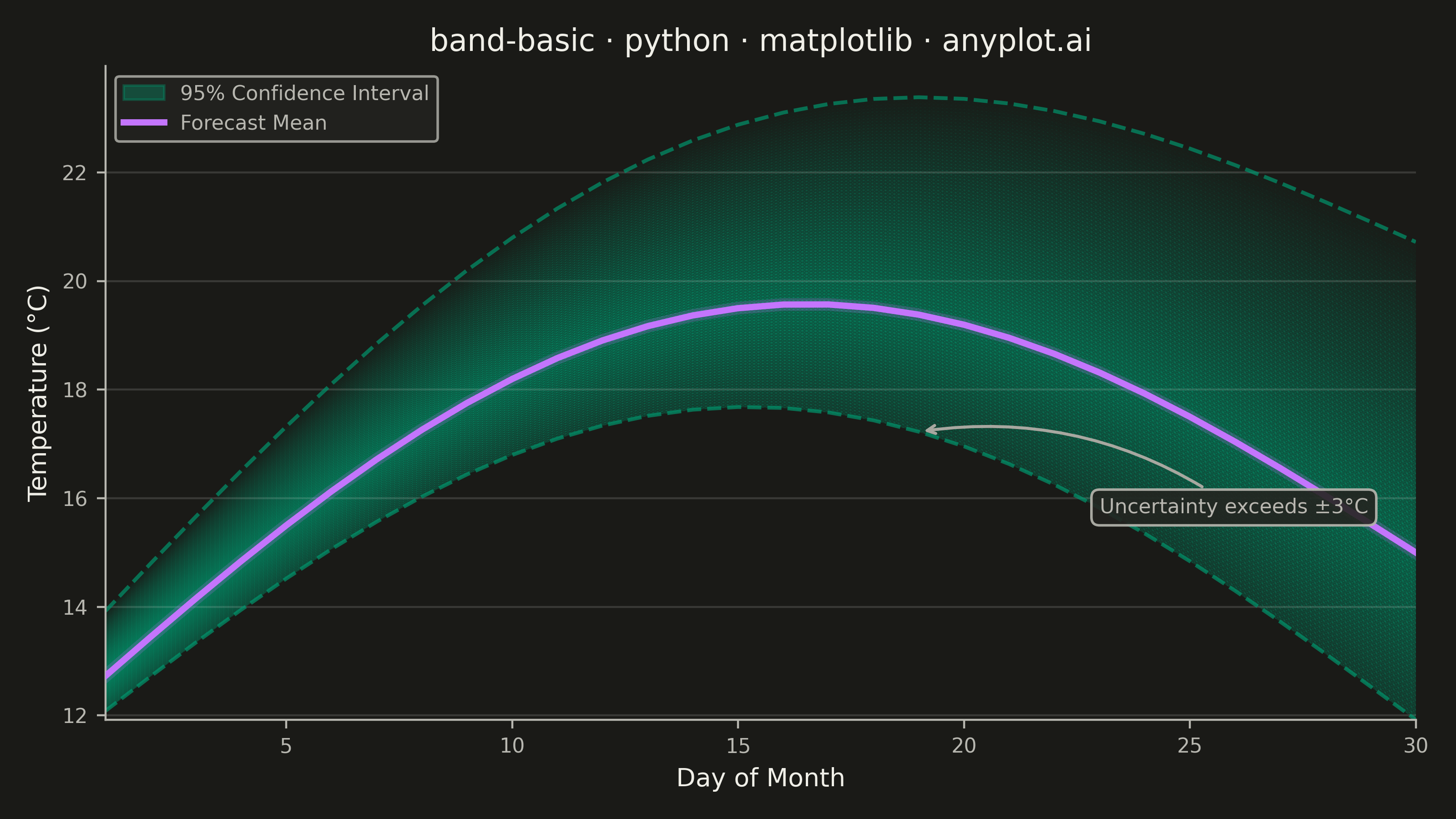
A band plot displays a filled region between two boundary lines, commonly used to show confidence intervals, prediction intervals, or ranges around a central trend line. The semi-transparent band provides visual representation of uncertainty or variability while maintaining visibility of underlying data or overlapping elements.
""" anyplot.ai
band-basic: Basic Band Plot
Library: matplotlib 3.10.9 | Python 3.13.13
Quality: 90/100 | Updated: 2026-05-29
"""

import os

import matplotlib.colors as mcolors
import matplotlib.patheffects as pe
import matplotlib.pyplot as plt
import numpy as np
from matplotlib.patches import Patch


# Theme tokens (Imprint palette + theme-adaptive chrome)
THEME = os.getenv("ANYPLOT_THEME", "light")
PAGE_BG = "#FAF8F1" if THEME == "light" else "#1A1A17"
ELEVATED_BG = "#FFFDF6" if THEME == "light" else "#242420"
INK = "#1A1A17" if THEME == "light" else "#F0EFE8"
INK_SOFT = "#4A4A44" if THEME == "light" else "#B8B7B0"
INK_MUTED = "#6B6A63" if THEME == "light" else "#A8A79F"

# Imprint palette — first series always #009E73
BAND_COLOR = "#009E73"  # Imprint position 1 — confidence band
LINE_COLOR = "#C475FD"  # Imprint position 2 — center forecast line

# Data - 30-day temperature forecast with asymmetric 95% confidence interval
np.random.seed(42)
days = np.arange(1, 31)

# Central forecast: seasonal warming with slight upward trend
temp_forecast = 12 + 6 * np.sin(np.pi * days / 30) + 0.1 * days

# Asymmetric uncertainty: upper tail wider (warm-bias in extended-range forecasts)
uncertainty_base = 0.8 + 0.12 * days
temp_lower = temp_forecast - uncertainty_base * 0.7  # narrower lower tail
temp_upper = temp_forecast + uncertainty_base * 1.3  # wider upper tail

# Plot
fig, ax = plt.subplots(figsize=(8, 4.5), dpi=400, facecolor=PAGE_BG)
ax.set_facecolor(PAGE_BG)

# Gradient band using pcolormesh with gouraud shading
band_rgb = mcolors.to_rgb(BAND_COLOR)
x_fine = np.linspace(days[0], days[-1], 300)
c_fine = np.interp(x_fine, days, temp_forecast)
lo_fine = np.interp(x_fine, days, temp_lower)
hi_fine = np.interp(x_fine, days, temp_upper)

n_vert = 100
X = np.tile(x_fine, (n_vert, 1))
Y = np.zeros((n_vert, len(x_fine)))
C = np.zeros((n_vert, len(x_fine)))

for j in range(len(x_fine)):
    Y[:, j] = np.linspace(lo_fine[j], hi_fine[j], n_vert)
    hw = (hi_fine[j] - lo_fine[j]) / 2
    C[:, j] = 1 - np.abs(Y[:, j] - c_fine[j]) / hw

cmap = mcolors.LinearSegmentedColormap.from_list("ci", [(*band_rgb, 0.02), (*band_rgb, 0.22), (*band_rgb, 0.45)])
ax.pcolormesh(X, Y, C, cmap=cmap, shading="gouraud", rasterized=True, zorder=1)

# Boundary dashed lines
ax.plot(days, temp_lower, color=BAND_COLOR, lw=1.5, ls="--", alpha=0.65, zorder=2)
ax.plot(days, temp_upper, color=BAND_COLOR, lw=1.5, ls="--", alpha=0.65, zorder=2)

# Center forecast line with glow effect
ax.plot(
    days,
    temp_forecast,
    color=LINE_COLOR,
    linewidth=2.5,
    zorder=3,
    path_effects=[pe.Stroke(linewidth=5, foreground=LINE_COLOR, alpha=0.2), pe.Normal()],
)

# Annotation: threshold where forecast uncertainty becomes large
threshold_idx = int(np.argmax(uncertainty_base > 3.0))
ax.annotate(
    "Uncertainty exceeds ±3°C",
    xy=(days[threshold_idx], temp_lower[threshold_idx]),
    xytext=(days[threshold_idx] + 4, temp_lower[threshold_idx] - 1.5),
    fontsize=8,
    color=INK_SOFT,
    arrowprops={"arrowstyle": "->", "color": INK_MUTED, "lw": 1.2, "connectionstyle": "arc3,rad=0.2"},
    bbox={"boxstyle": "round,pad=0.4", "facecolor": ELEVATED_BG, "edgecolor": INK_SOFT, "alpha": 0.9},
    zorder=4,
)

# Legend
legend_handles = [
    Patch(facecolor=BAND_COLOR, alpha=0.35, edgecolor=BAND_COLOR, label="95% Confidence Interval"),
    plt.Line2D([0], [0], color=LINE_COLOR, linewidth=2.5, label="Forecast Mean"),
]
leg = ax.legend(handles=legend_handles, fontsize=8, loc="upper left")
if leg:
    leg.get_frame().set_facecolor(ELEVATED_BG)
    leg.get_frame().set_edgecolor(INK_SOFT)
    plt.setp(leg.get_texts(), color=INK_SOFT)

# Style
title = "band-basic · python · matplotlib · anyplot.ai"
n = len(title)
title_fontsize = max(8, round(12 * 67 / n)) if n > 67 else 12

ax.set_xlabel("Day of Month", fontsize=10, color=INK)
ax.set_ylabel("Temperature (°C)", fontsize=10, color=INK)
ax.set_title(title, fontsize=title_fontsize, fontweight="medium", color=INK)
ax.tick_params(axis="both", labelsize=8, colors=INK_SOFT, labelcolor=INK_SOFT)
for s in ("left", "bottom"):
    ax.spines[s].set_color(INK_SOFT)
ax.spines["top"].set_visible(False)
ax.spines["right"].set_visible(False)
ax.yaxis.grid(True, alpha=0.15, linewidth=0.8, color=INK)

plt.tight_layout()
plt.savefig(f"plot-{THEME}.png", dpi=400, facecolor=PAGE_BG)
Runnable source as JSON, for any HTTP client: https://api.anyplot.ai/specs/band-basic/matplotlib/code. Any spec id and library id listed in llms-full.txt fit the same URL shape; every URL below is complete and callable.
{
  "spec_id": "band-basic",
  "language": "python",
  "library": "matplotlib",
  "page": "https://anyplot.ai/band-basic/python/matplotlib",
  "hub": "https://anyplot.ai/band-basic",
  "code_json": "https://api.anyplot.ai/specs/band-basic/matplotlib/code",
  "spec_json": "https://api.anyplot.ai/specs/band-basic",
  "render_light_png": "https://storage.googleapis.com/anyplot-images/plots/band-basic/python/matplotlib/plot-light.png",
  "render_dark_png": "https://storage.googleapis.com/anyplot-images/plots/band-basic/python/matplotlib/plot-dark.png",
  "quality_score": 90.0,
  "license": "MIT",
  "guide": "https://anyplot.ai/llms.txt"
}
Part of Basic Band Plot on anyplot.ai.