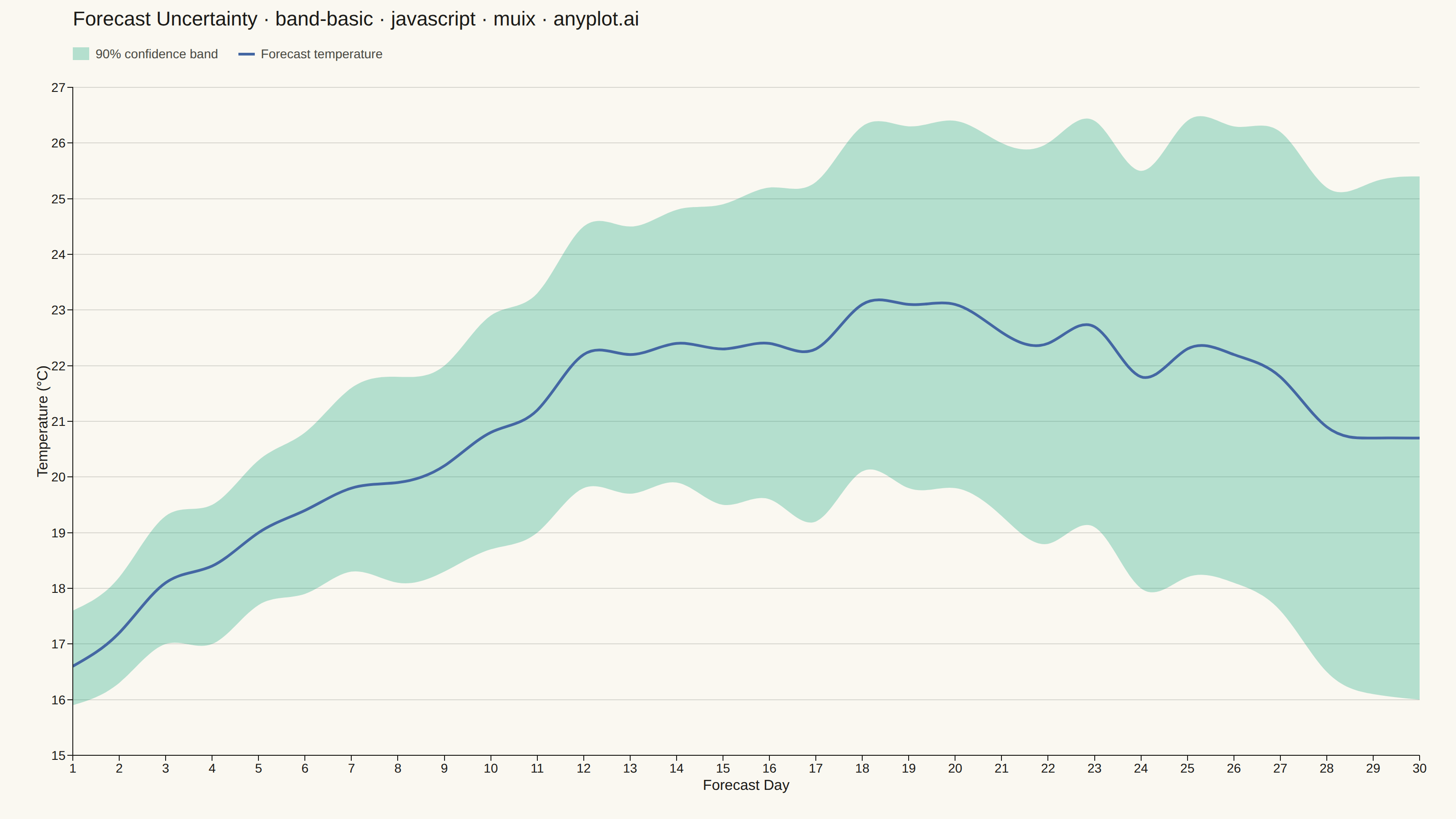
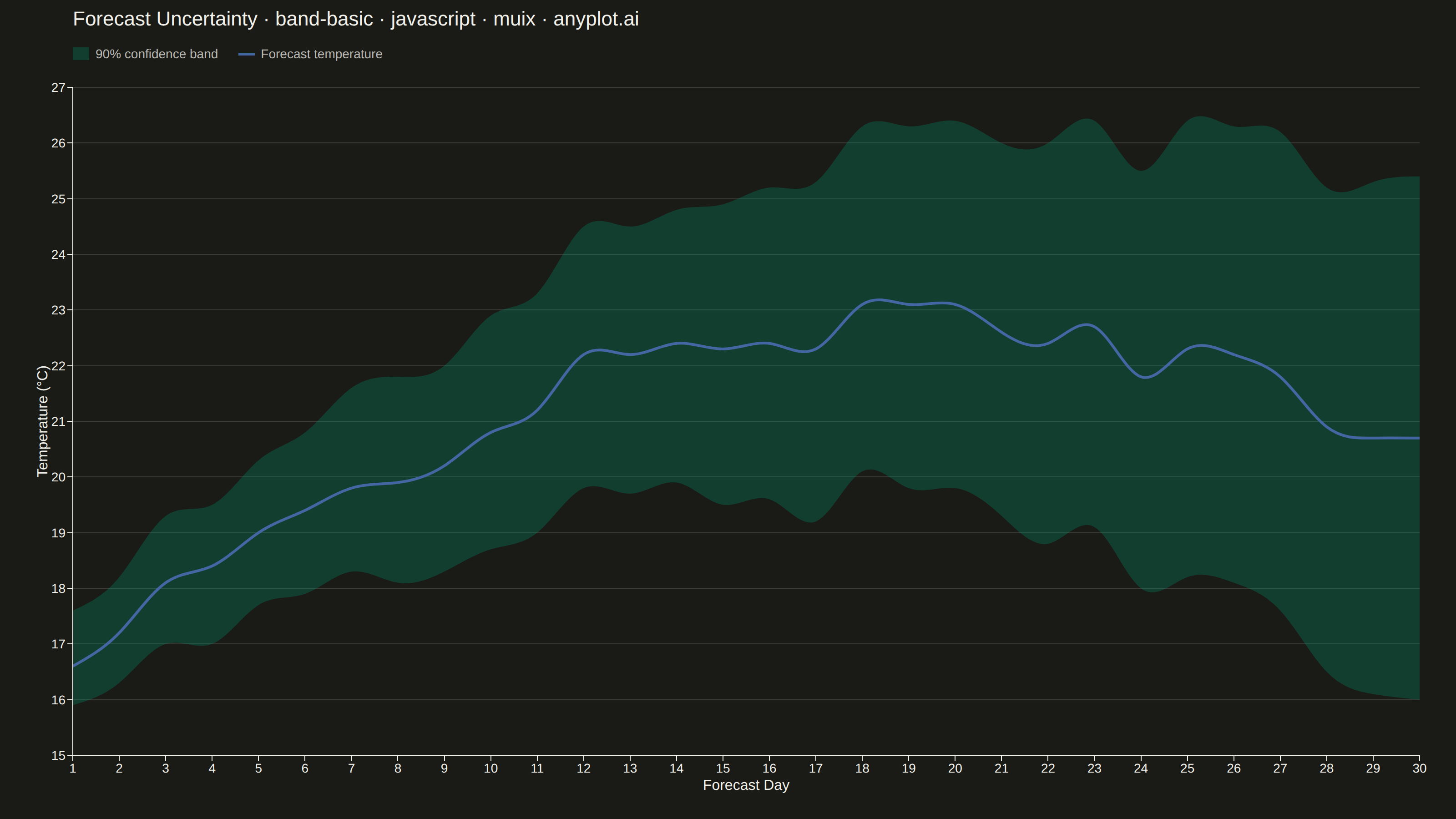
The same plot in 14 other libraries — JavaScript: Chart.js, D3.js, Apache ECharts, Highcharts; Python: Altair, Bokeh, lets-plot, Matplotlib, Plotly, plotnine, Pygal, Seaborn; R: ggplot2; Julia: Makie.jl. Compare all 15 side by side: Basic Band Plot in Python, R, Julia and JavaScript.
A band plot displays a filled region between two boundary lines, commonly used to show confidence intervals, prediction intervals, or ranges around a central trend line. The semi-transparent band provides visual representation of uncertainty or variability while maintaining visibility of underlying data or overlapping elements.
// anyplot.ai
// band-basic: Basic Band Plot
// Library: muix 7.29.1 | JavaScript 22.23.2
// Quality: 91/100 | Created: 2026-08-24
import { LineChart } from "@mui/x-charts/LineChart";

const t = window.ANYPLOT_TOKENS;

// --- Data: 30-day temperature forecast with widening uncertainty -----------
// A short-range weather forecast: the further out the prediction, the wider
// the 90% confidence band around the forecast temperature — the growing
// uncertainty is the story, no annotations needed to make the point.
function lcg(seed) {
  let state = seed;
  return () => {
    state = (state * 1103515245 + 12345) % 2147483648;
    return state / 2147483648;
  };
}
const random = lcg(42);

const forecastDays = Array.from({ length: 30 }, (_, i) => i + 1);

const forecastTemp = forecastDays.map((day) => {
  const seasonalDrift = 16 + 5 * Math.sin((day / 30) * Math.PI * 0.9);
  const warmingTrend = day * 0.1;
  const noise = (random() - 0.5) * 0.9;
  return Math.round((seasonalDrift + warmingTrend + noise) * 10) / 10;
});

const lowerBound = forecastTemp.map((value, i) => {
  const halfWidth = 0.6 + forecastDays[i] * 0.13 + random() * 0.3;
  return Math.round((value - halfWidth) * 10) / 10;
});

const upperBound = forecastTemp.map((value, i) => {
  const halfWidth = 0.6 + forecastDays[i] * 0.13 + random() * 0.3;
  return Math.round((value + halfWidth) * 10) / 10;
});

// Stacked-area trick: an invisible "lower" series carries the offset, and
// "band" (the visible fill) is stacked on top of it with only its own width
// (upper - lower) — the rendered area then spans exactly [lower, upper].
const bandWidth = upperBound.map((value, i) => Math.round((value - lowerBound[i]) * 10) / 10);

// --- Title + legend chrome ---------------------------------------------------
// The built-in <ChartsLegend> anchors to the SVG's own total height rather
// than reserving extra space for itself, so it gets clipped at the canvas
// edge instead of pushing the plot up — a hand-rolled legend row in normal
// flex flow (like arc-basic/muix.tsx) guarantees it fits.
const TITLE = "Forecast Uncertainty · band-basic · javascript · muix · anyplot.ai";
const TITLE_FONT_DEFAULT = 22;
const titleFontSize =
  TITLE.length > 67 ? Math.round(TITLE_FONT_DEFAULT * (67 / TITLE.length)) : TITLE_FONT_DEFAULT;
const TITLE_H = 42;
const LEGEND_H = 34;

function Legend() {
  return (
    <div style={{ height: LEGEND_H, display: "flex", alignItems: "center", gap: "22px" }}>
      <div style={{ display: "flex", alignItems: "center", gap: "7px" }}>
        <span
          style={{
            width: "18px",
            height: "14px",
            backgroundColor: t.palette[0],
            opacity: 0.28,
            display: "inline-block",
          }}
        />
        <span style={{ fontSize: "14px", color: t.inkSoft }}>90% confidence band</span>
      </div>
      <div style={{ display: "flex", alignItems: "center", gap: "7px" }}>
        <span style={{ width: "18px", height: "3px", backgroundColor: t.palette[2], display: "inline-block" }} />
        <span style={{ fontSize: "14px", color: t.inkSoft }}>Forecast temperature</span>
      </div>
    </div>
  );
}

// --- Chart (default-exported component — the harness mounts it) ------------
export default function Chart() {
  const { width, height } = window.ANYPLOT_SIZE;
  const chartHeight = height - TITLE_H - LEGEND_H;

  return (
    <div style={{ width, height, display: "flex", flexDirection: "column" }}>
      <div style={{ paddingLeft: "80px" }}>
        <div
          style={{
            height: `${TITLE_H}px`,
            lineHeight: `${TITLE_H}px`,
            fontSize: `${titleFontSize}px`,
            fontWeight: 500,
            color: t.ink,
          }}
        >
          {TITLE}
        </div>
        <Legend />
      </div>
      <LineChart
        width={width}
        height={chartHeight}
        skipAnimation
        grid={{ horizontal: true }}
        xAxis={[
          {
            data: forecastDays,
            scaleType: "linear",
            label: "Forecast Day",
            labelStyle: { fontSize: 16 },
            tickLabelStyle: { fontSize: 14 },
          },
        ]}
        yAxis={[
          {
            label: "Temperature (°C)",
            labelStyle: { fontSize: 16 },
            tickLabelStyle: { fontSize: 14 },
          },
        ]}
        series={[
          {
            id: "lower",
            data: lowerBound,
            stack: "band",
            showMark: false,
            color: t.pageBg,
            curve: "natural",
          },
          {
            id: "band",
            data: bandWidth,
            stack: "band",
            area: true,
            showMark: false,
            color: t.palette[0],
            curve: "natural",
          },
          {
            id: "center",
            data: forecastTemp,
            showMark: false,
            color: t.palette[2],
            curve: "natural",
          },
        ]}
        margin={{ top: 20, right: 40, bottom: 70, left: 80 }}
        sx={{
          "& .MuiLineElement-series-lower": { display: "none" },
          "& .MuiAreaElement-series-band": { fill: t.palette[0], fillOpacity: 0.28 },
          "& .MuiLineElement-series-band": { stroke: "none" },
          "& .MuiLineElement-series-center": { strokeWidth: 3 },
        }}
      />
    </div>
  );
}
Runnable source as JSON, for any HTTP client: https://api.anyplot.ai/specs/band-basic/muix/code. Any spec id and library id listed in llms-full.txt fit the same URL shape; every URL below is complete and callable.
{
  "spec_id": "band-basic",
  "language": "javascript",
  "library": "muix",
  "page": "https://anyplot.ai/band-basic/javascript/muix",
  "hub": "https://anyplot.ai/band-basic",
  "code_json": "https://api.anyplot.ai/specs/band-basic/muix/code",
  "spec_json": "https://api.anyplot.ai/specs/band-basic",
  "render_light_png": "https://storage.googleapis.com/anyplot-images/plots/band-basic/javascript/muix/plot-light.png",
  "render_dark_png": "https://storage.googleapis.com/anyplot-images/plots/band-basic/javascript/muix/plot-dark.png",
  "interactive_light_html": "https://storage.googleapis.com/anyplot-images/plots/band-basic/javascript/muix/plot-light.html",
  "interactive_dark_html": "https://storage.googleapis.com/anyplot-images/plots/band-basic/javascript/muix/plot-dark.html",
  "quality_score": 91.0,
  "license": "MIT",
  "guide": "https://anyplot.ai/llms.txt"
}
Part of Basic Band Plot on anyplot.ai.