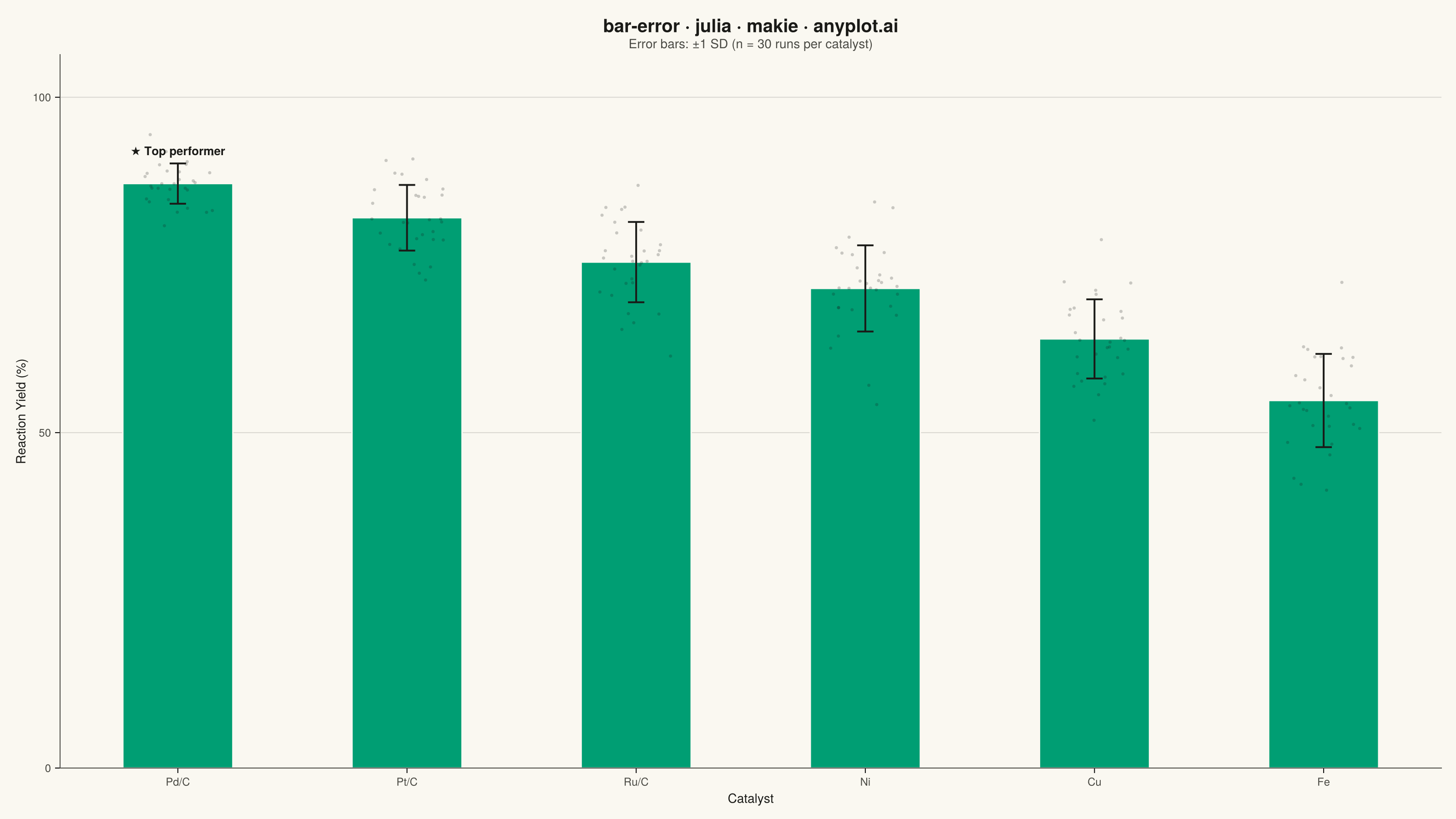
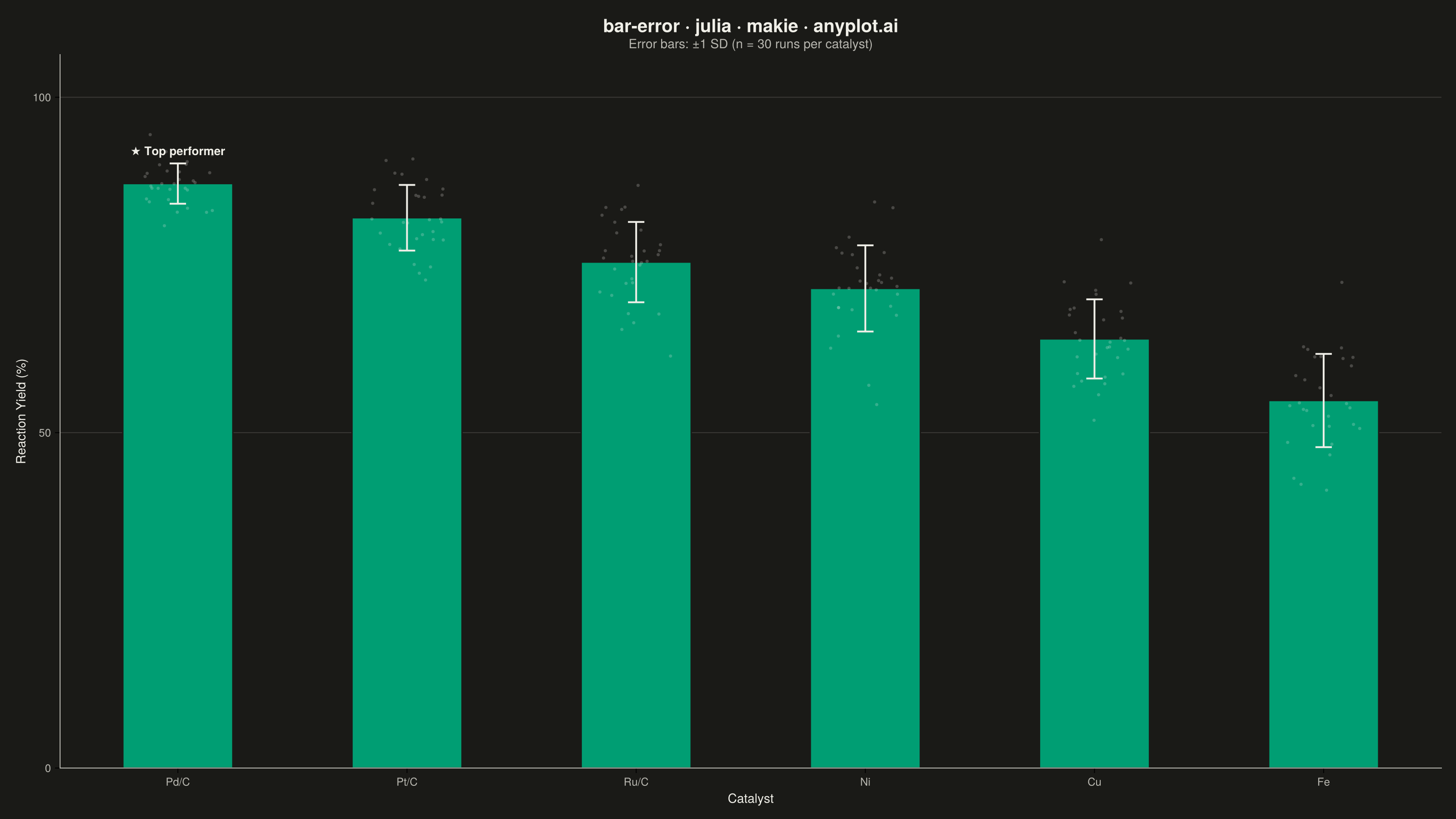
The same plot in 14 other libraries — Python: Altair, Bokeh, lets-plot, Matplotlib, Plotly, plotnine, Pygal, Seaborn; R: ggplot2; JavaScript: Chart.js, D3.js, Apache ECharts, Highcharts, MUI X Charts. Compare all 15 side by side: Bar Chart with Error Bars in Python, R, Julia and JavaScript.
A bar chart with error bars displays categorical data as rectangular bars with vertical (or horizontal) lines extending from each bar to indicate uncertainty or variability. Error bars typically represent standard deviation, standard error, confidence intervals, or min/max ranges. This visualization is essential for comparing group means while communicating the reliability and precision of each measurement.
# anyplot.ai
# bar-error: Bar Chart with Error Bars
# Library: makie 0.21.9 | Julia 1.11.9
# Quality: 81/100 | Updated: 2026-09-27

using CairoMakie
using Colors
using Random
using Statistics

Random.seed!(42)

# Theme tokens (see prompts/default-style-guide.md "Theme-adaptive Chrome")
THEME    = get(ENV, "ANYPLOT_THEME", "light")
PAGE_BG  = THEME == "light" ? colorant"#FAF8F1" : colorant"#1A1A17"
INK      = THEME == "light" ? colorant"#1A1A17" : colorant"#F0EFE8"
INK_SOFT = THEME == "light" ? colorant"#4A4A44" : colorant"#B8B7B0"
BRAND    = colorant"#009E73"  # Imprint palette position 1 — ALWAYS first series

# Data — 30 simulated runs per catalyst, drawn from each catalyst's known
# reaction-yield distribution. Yield is bounded by a 100% ceiling, so the
# upside spread compresses relative to the downside the closer the mean
# sits to that ceiling — modeled here as an asymmetric half-normal mixture
# rather than a symmetric SD, giving genuinely asymmetric error bars that
# are derived from the runs themselves (not hardcoded).
catalysts     = ["Pd/C", "Pt/C", "Ru/C", "Ni", "Cu", "Fe"]
true_mean     = [87.4, 82.1, 74.9, 71.6, 63.8, 54.2]
true_std_low  = [3.6, 5.2, 5.8, 6.3, 7.3, 8.4]   # downside spread
true_std_high = [2.1, 3.4, 4.2, 5.0, 6.2, 7.6]   # upside spread, ceiling-compressed
n_runs = 30

runs = [
    tm .+ ifelse.(rand(n_runs) .< 0.5, -tsl .* abs.(randn(n_runs)), tsh .* abs.(randn(n_runs)))
    for (tm, tsl, tsh) in zip(true_mean, true_std_low, true_std_high)
]
mean_yield = mean.(runs)
lower_err  = mean_yield .- quantile.(runs, 0.16)
upper_err  = quantile.(runs, 0.84) .- mean_yield
x = 1:length(catalysts)
best = argmax(mean_yield)
runner_up = partialsortperm(mean_yield, 2, rev = true)

# Bar stroke: the top performer gets a bolder ink-colored outline so the
# eye lands on it before reading the bracket callout below.
bar_strokecolors = [i == best ? INK : PAGE_BG for i in 1:length(catalysts)]
bar_strokewidths = [i == best ? 3.0 : 1.5 for i in 1:length(catalysts)]

# Plot — see default-style-guide.md "Visual Sizing Defaults" and prompts/library/makie.md
fig = Figure(
    size            = (1600, 900),
    fontsize        = 14,
    backgroundcolor = PAGE_BG,
)

ax = Axis(
    fig[1, 1];
    title             = "bar-error · julia · makie · anyplot.ai",
    titlesize         = 20,
    titlecolor        = INK,
    subtitle          = "Error bars: 16th–84th percentile range (n = 30 runs per catalyst)",
    subtitlesize      = 14,
    subtitlecolor     = INK_SOFT,
    xlabel            = "Catalyst",
    ylabel            = "Reaction Yield (%)",
    xlabelsize        = 14,
    ylabelsize        = 14,
    xlabelcolor       = INK,
    ylabelcolor       = INK,
    xticklabelsize    = 12,
    yticklabelsize    = 12,
    xticklabelcolor   = INK_SOFT,
    yticklabelcolor   = INK_SOFT,
    xticks            = (x, catalysts),
    backgroundcolor   = PAGE_BG,
    topspinevisible   = false,
    rightspinevisible = false,
    leftspinecolor    = INK_SOFT,
    bottomspinecolor  = INK_SOFT,
    xgridvisible      = false,
    ygridcolor        = RGBAf(INK.r, INK.g, INK.b, 0.15),
    xminorgridvisible = false,
    yminorgridvisible = false,
)

barplot!(ax, x, mean_yield;
    color       = BRAND,
    strokecolor = bar_strokecolors,
    strokewidth = bar_strokewidths,
    width       = 0.6,
)

# Raincloud-style overlay: jittered individual runs, hinting at the
# per-catalyst distribution the bar+error-bar summary is drawn from.
jitter_x = vcat([fill(xi, n_runs) .+ (rand(n_runs) .- 0.5) .* 0.32 for xi in x]...)
jitter_y = vcat(runs...)
scatter!(ax, jitter_x, jitter_y;
    color       = (INK, 0.22),
    markersize  = 5,
    strokewidth = 0,
)

errorbars!(ax, x, mean_yield, lower_err, upper_err;
    color        = INK,
    linewidth    = 2,
    whiskerwidth = 18,
)

# Makie-specific `bracket!` recipe: a curly brace spanning the top two
# catalysts' error-bar caps, labeled with the actual yield gap between
# them — a distinctive Makie primitive (no direct matplotlib/plotly
# equivalent) that doubles as the chart's data-storytelling focal point.
gap = round(mean_yield[best] - mean_yield[runner_up]; digits = 1)
bracket!(ax,
    x[best], mean_yield[best] + upper_err[best],
    x[runner_up], mean_yield[runner_up] + upper_err[runner_up];
    text        = "+$(gap) pts vs runner-up",
    style       = :curly,
    orientation = :up,
    offset      = 14,
    width       = 20,
    rotation    = 0,
    align       = (:center, :bottom),
    color       = INK_SOFT,
    textcolor   = INK,
    fontsize    = 13,
    linewidth   = 1.5,
)

ylims!(ax, 0, maximum(mean_yield .+ upper_err) * 1.22)

# Save
save("plot-$(THEME).png", fig; px_per_unit = 2)
Runnable source as JSON, for any HTTP client: https://api.anyplot.ai/specs/bar-error/makie/code. Any spec id and library id listed in llms-full.txt fit the same URL shape; every URL below is complete and callable.
{
  "spec_id": "bar-error",
  "language": "julia",
  "library": "makie",
  "page": "https://anyplot.ai/bar-error/julia/makie",
  "hub": "https://anyplot.ai/bar-error",
  "code_json": "https://api.anyplot.ai/specs/bar-error/makie/code",
  "spec_json": "https://api.anyplot.ai/specs/bar-error",
  "render_light_png": "https://storage.googleapis.com/anyplot-images/plots/bar-error/julia/makie/plot-light.png",
  "render_dark_png": "https://storage.googleapis.com/anyplot-images/plots/bar-error/julia/makie/plot-dark.png",
  "quality_score": 81.0,
  "license": "MIT",
  "guide": "https://anyplot.ai/llms.txt"
}
Part of Bar Chart with Error Bars on anyplot.ai.