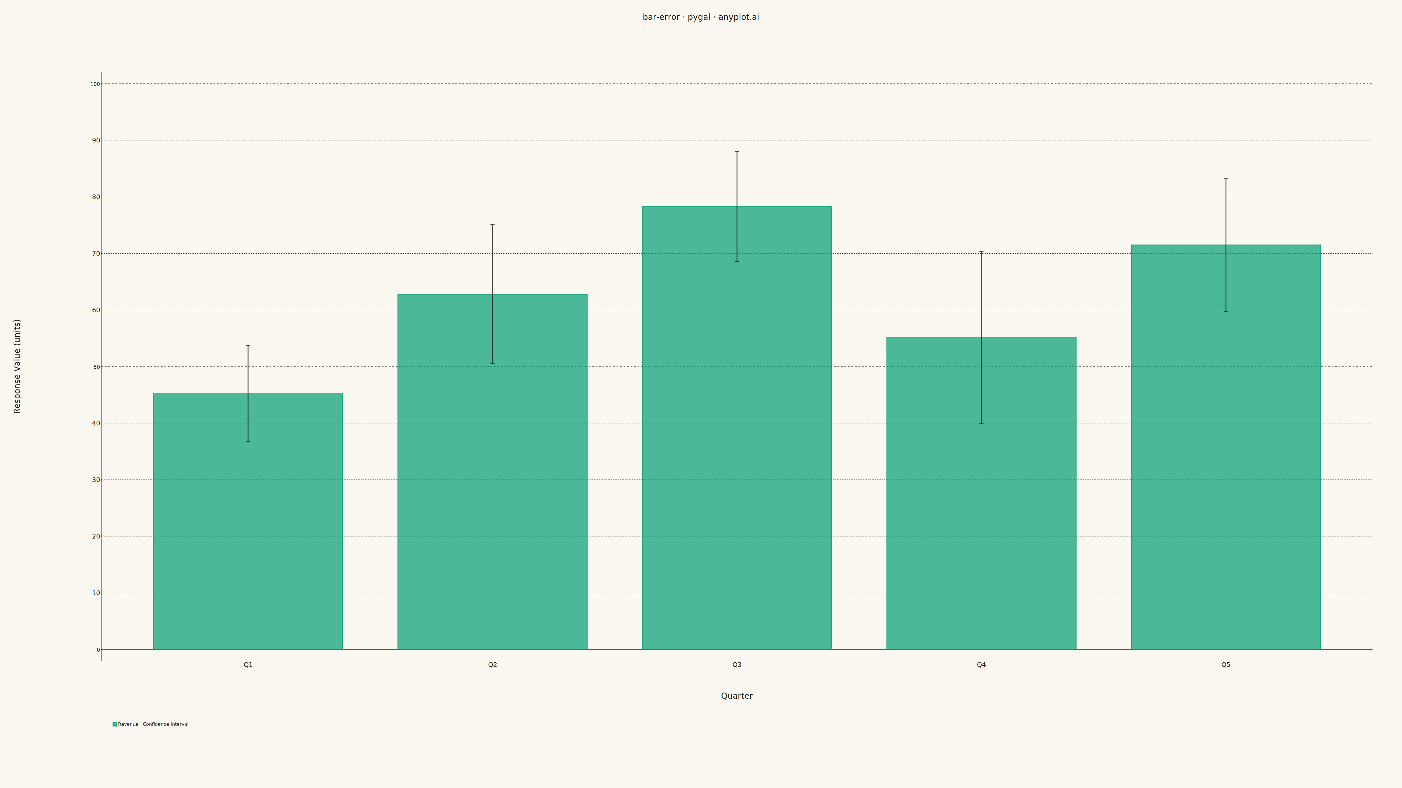
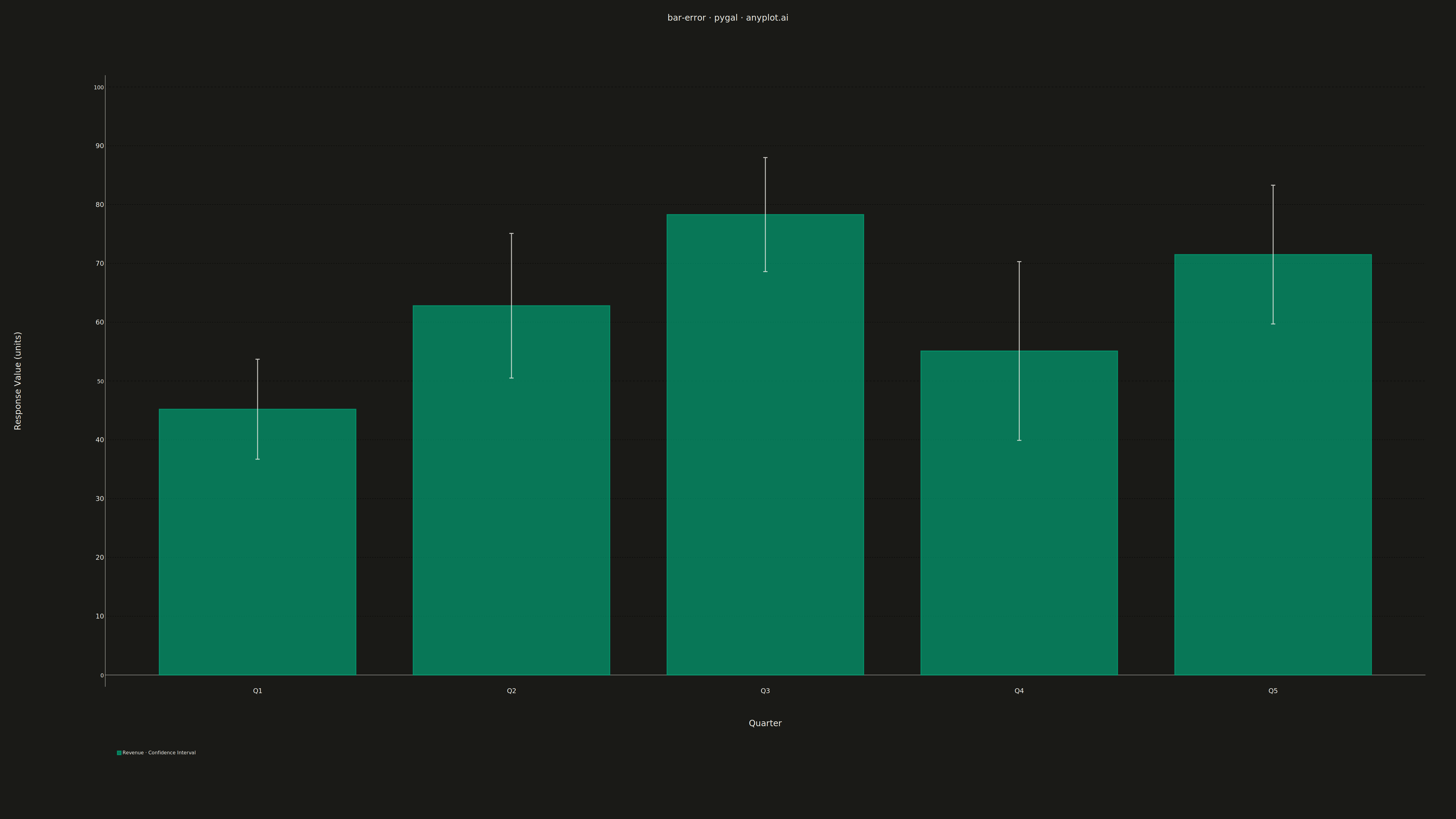
A bar chart with error bars displays categorical data as rectangular bars with vertical (or horizontal) lines extending from each bar to indicate uncertainty or variability. Error bars typically represent standard deviation, standard error, confidence intervals, or min/max ranges. This visualization is essential for comparing group means while communicating the reliability and precision of each measurement.
""" anyplot.ai
bar-error: Bar Chart with Error Bars
Library: pygal 3.1.0 | Python 3.13.13
Quality: 83/100 | Updated: 2026-05-10
"""

import pygal
from pygal.style import Style


# Data: Experimental results comparing treatment effectiveness
# Mean values with standard deviations (±1 SD)
categories = ["Control", "Treatment A", "Treatment B", "Treatment C", "Treatment D"]
values = [45.2, 62.8, 78.3, 55.1, 71.5]
errors = [8.5, 12.3, 9.7, 15.2, 11.8]

# Custom style for 4800x2700 canvas
custom_style = Style(
    background="white",
    plot_background="white",
    foreground="#333333",
    foreground_strong="#333333",
    foreground_subtle="#666666",
    colors=("#306998", "#FFD43B", "#4CAF50", "#E91E63", "#9C27B0"),
    font_family="DejaVu Sans, Verdana, sans-serif",
    title_font_size=72,
    label_font_size=48,
    major_label_font_size=48,
    legend_font_size=48,
    value_font_size=36,
    value_label_font_size=36,
    tooltip_font_size=36,
)

# Create bar chart with error bars (confidence intervals)
chart = pygal.Bar(
    width=4800,
    height=2700,
    style=custom_style,
    title="bar-error \u00b7 pygal \u00b7 pyplots.ai",
    x_title="Treatment Group",
    y_title="Response Value (units)",
    show_legend=True,
    legend_at_bottom=True,
    legend_at_bottom_columns=1,
    show_y_guides=True,
    show_x_guides=False,
    print_values=False,
    range=(0, 100),
    spacing=40,
    margin=100,
    margin_bottom=250,
    margin_left=200,
    margin_top=180,
    dots_size=8,
    stroke_style={"width": 4},
)

# X-axis labels
chart.x_labels = categories

# Add data with confidence intervals (error bars)
# Each value is a dict with 'value' and 'ci' containing 'low' and 'high'
data_with_errors = []
for val, err in zip(values, errors, strict=True):
    data_with_errors.append({"value": val, "ci": {"low": val - err, "high": val + err}})

chart.add("Mean \u00b1 1 SD", data_with_errors)

# Save as PNG and HTML (interactive)
chart.render_to_png("plot.png")
chart.render_to_file("plot.html")
Runnable source as JSON, for any HTTP client: https://api.anyplot.ai/specs/bar-error/pygal/code. Any spec id and library id listed in llms-full.txt fit the same URL shape; every URL below is complete and callable.
{
  "spec_id": "bar-error",
  "language": "python",
  "library": "pygal",
  "page": "https://anyplot.ai/bar-error/python/pygal",
  "hub": "https://anyplot.ai/bar-error",
  "code_json": "https://api.anyplot.ai/specs/bar-error/pygal/code",
  "spec_json": "https://api.anyplot.ai/specs/bar-error",
  "render_light_png": "https://storage.googleapis.com/anyplot-images/plots/bar-error/python/pygal/plot-light.png",
  "render_dark_png": "https://storage.googleapis.com/anyplot-images/plots/bar-error/python/pygal/plot-dark.png",
  "interactive_light_html": "https://storage.googleapis.com/anyplot-images/plots/bar-error/python/pygal/plot-light.html",
  "interactive_dark_html": "https://storage.googleapis.com/anyplot-images/plots/bar-error/python/pygal/plot-dark.html",
  "quality_score": 83.0,
  "license": "MIT",
  "guide": "https://anyplot.ai/llms.txt"
}
Part of Bar Chart with Error Bars on anyplot.ai.