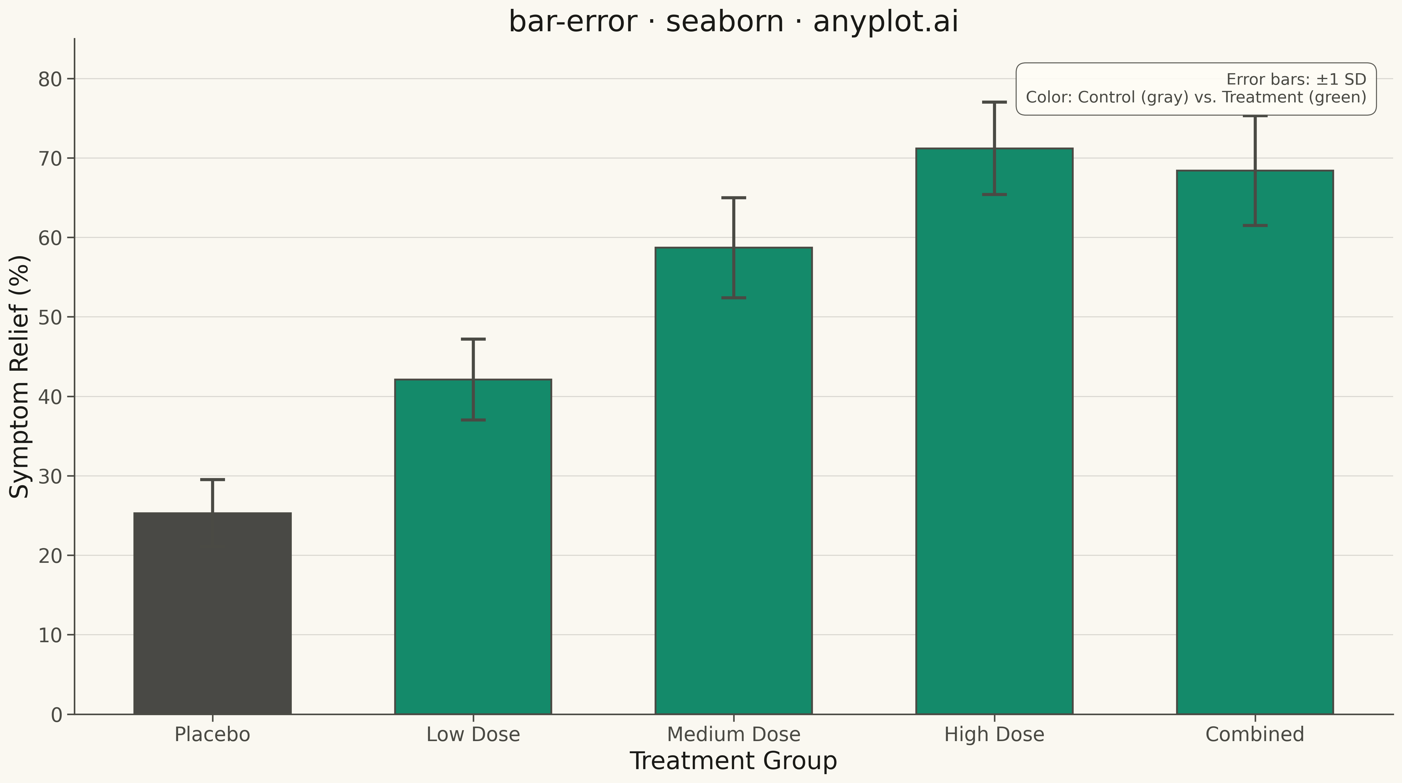
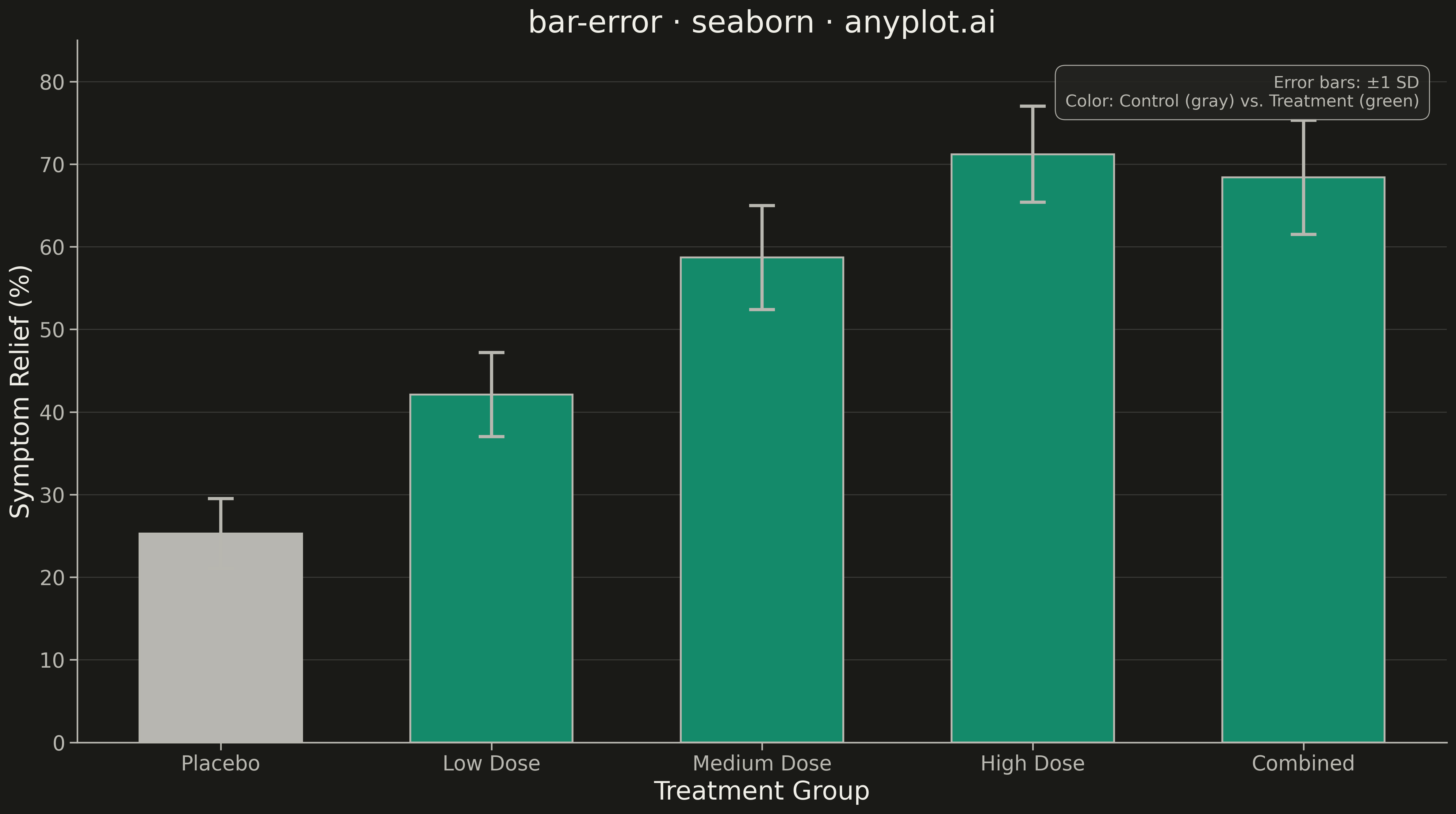
A bar chart with error bars displays categorical data as rectangular bars with vertical (or horizontal) lines extending from each bar to indicate uncertainty or variability. Error bars typically represent standard deviation, standard error, confidence intervals, or min/max ranges. This visualization is essential for comparing group means while communicating the reliability and precision of each measurement.
""" anyplot.ai
bar-error: Bar Chart with Error Bars
Library: seaborn 0.13.2 | Python 3.13.13
Quality: 92/100 | Updated: 2026-05-10
"""

import os

import matplotlib.pyplot as plt
import numpy as np
import pandas as pd
import seaborn as sns


# Theme tokens
THEME = os.getenv("ANYPLOT_THEME", "light")
PAGE_BG = "#FAF8F1" if THEME == "light" else "#1A1A17"
ELEVATED_BG = "#FFFDF6" if THEME == "light" else "#242420"
INK = "#1A1A17" if THEME == "light" else "#F0EFE8"
INK_SOFT = "#4A4A44" if THEME == "light" else "#B8B7B0"

BRAND = "#009E73"  # Okabe-Ito position 1

# Set theme
sns.set_theme(
    style="ticks",
    rc={
        "figure.facecolor": PAGE_BG,
        "axes.facecolor": PAGE_BG,
        "axes.edgecolor": INK_SOFT,
        "axes.labelcolor": INK,
        "text.color": INK,
        "xtick.color": INK_SOFT,
        "ytick.color": INK_SOFT,
        "grid.color": INK,
        "grid.alpha": 0.10,
        "legend.facecolor": ELEVATED_BG,
        "legend.edgecolor": INK_SOFT,
    },
)

# Data - Medical trial: treatment effects on symptom relief (%)
np.random.seed(42)
categories = ["Placebo", "Low Dose", "Medium Dose", "High Dose", "Combined"]
values = [25.3, 42.1, 58.7, 71.2, 68.4]
errors = [4.2, 5.1, 6.3, 5.8, 6.9]  # Standard deviations (±1 SD)

df = pd.DataFrame({"Treatment": categories, "Relief (%)": values, "Std Dev": errors})

# Create figure and plot
fig, ax = plt.subplots(figsize=(16, 9), facecolor=PAGE_BG)

# Bar plot with error bars
sns.barplot(data=df, x="Treatment", y="Relief (%)", color=BRAND, ax=ax, edgecolor=INK_SOFT, linewidth=1.5, width=0.6)

# Add error bars with caps
x_positions = np.arange(len(categories))
ax.errorbar(x_positions, values, yerr=errors, fmt="none", ecolor=INK_SOFT, elinewidth=2.5, capsize=10, capthick=2.5)

# Labels and title
ax.set_xlabel("Treatment Group", fontsize=20, color=INK)
ax.set_ylabel("Symptom Relief (%)", fontsize=20, color=INK)
ax.set_title("bar-error · seaborn · anyplot.ai", fontsize=24, fontweight="medium", color=INK)
ax.tick_params(axis="both", labelsize=16, colors=INK_SOFT)

# Grid (y-axis only)
ax.yaxis.grid(True, alpha=0.15, linewidth=0.8)
ax.set_axisbelow(True)

# Remove top and right spines
ax.spines["top"].set_visible(False)
ax.spines["right"].set_visible(False)
for s in ("left", "bottom"):
    ax.spines[s].set_color(INK_SOFT)

# Set y-axis limits
ax.set_ylim(0, 85)

# Add annotation explaining error bars
ax.text(
    0.98,
    0.95,
    "Error bars: ±1 SD",
    transform=ax.transAxes,
    fontsize=14,
    color=INK_SOFT,
    ha="right",
    va="top",
    bbox={"boxstyle": "round,pad=0.5", "facecolor": ELEVATED_BG, "edgecolor": INK_SOFT, "linewidth": 0.8, "alpha": 0.9},
)

plt.tight_layout()
plt.savefig(f"plot-{THEME}.png", dpi=300, bbox_inches="tight", facecolor=PAGE_BG)
Runnable source as JSON, for any HTTP client: https://api.anyplot.ai/specs/bar-error/seaborn/code. Any spec id and library id listed in llms-full.txt fit the same URL shape; every URL below is complete and callable.
{
  "spec_id": "bar-error",
  "language": "python",
  "library": "seaborn",
  "page": "https://anyplot.ai/bar-error/python/seaborn",
  "hub": "https://anyplot.ai/bar-error",
  "code_json": "https://api.anyplot.ai/specs/bar-error/seaborn/code",
  "spec_json": "https://api.anyplot.ai/specs/bar-error",
  "render_light_png": "https://storage.googleapis.com/anyplot-images/plots/bar-error/python/seaborn/plot-light.png",
  "render_dark_png": "https://storage.googleapis.com/anyplot-images/plots/bar-error/python/seaborn/plot-dark.png",
  "quality_score": 92.0,
  "license": "MIT",
  "guide": "https://anyplot.ai/llms.txt"
}
Part of Bar Chart with Error Bars on anyplot.ai.