The same plot in 14 other libraries — JavaScript: D3.js, Apache ECharts, Highcharts, MUI X Charts; Python: Altair, Bokeh, lets-plot, Matplotlib, Plotly, plotnine, Pygal, Seaborn; R: ggplot2; Julia: Makie.jl. Compare all 15 side by side: 100% Stacked Bar Chart in Python, R, Julia and JavaScript.
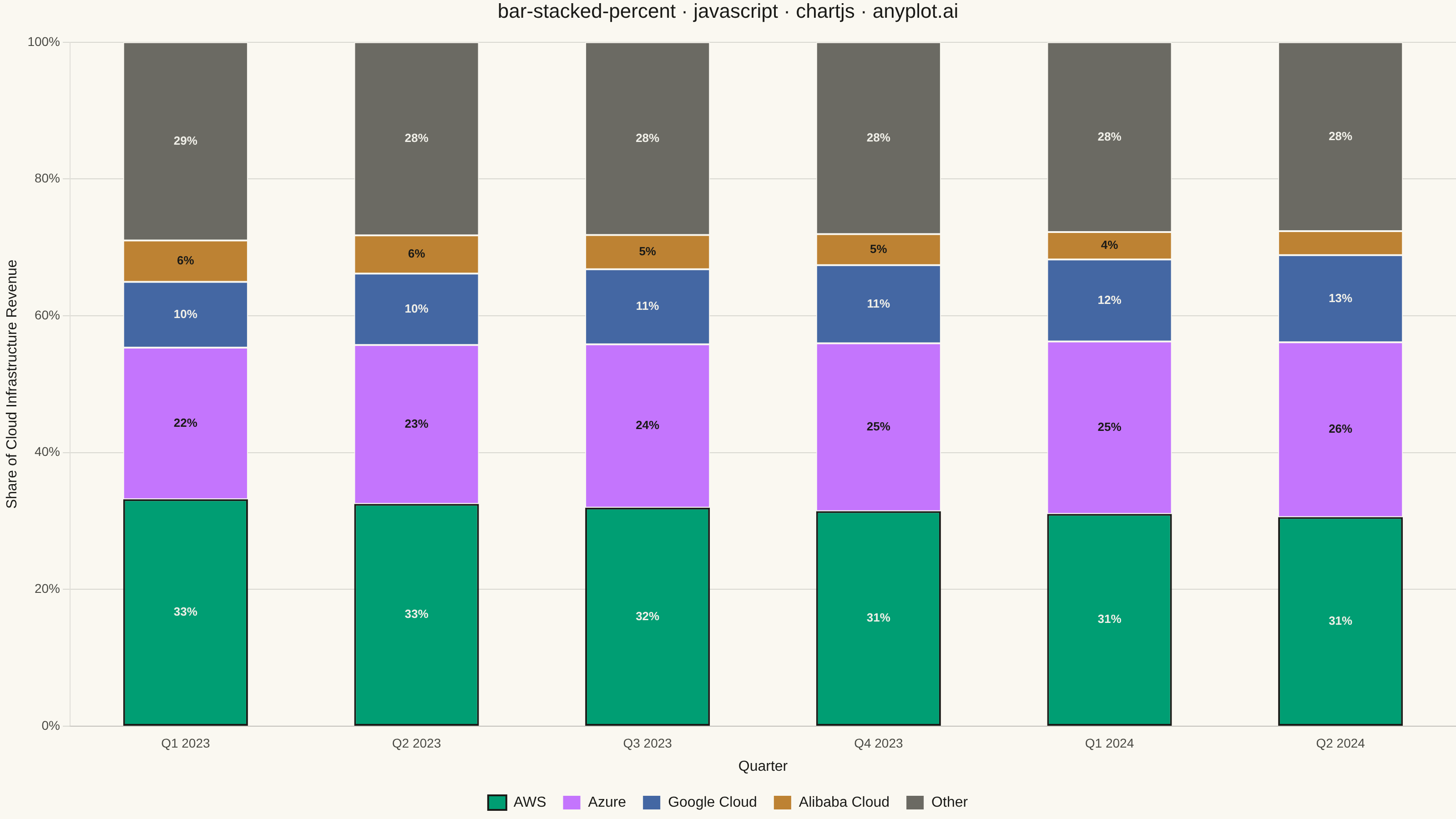
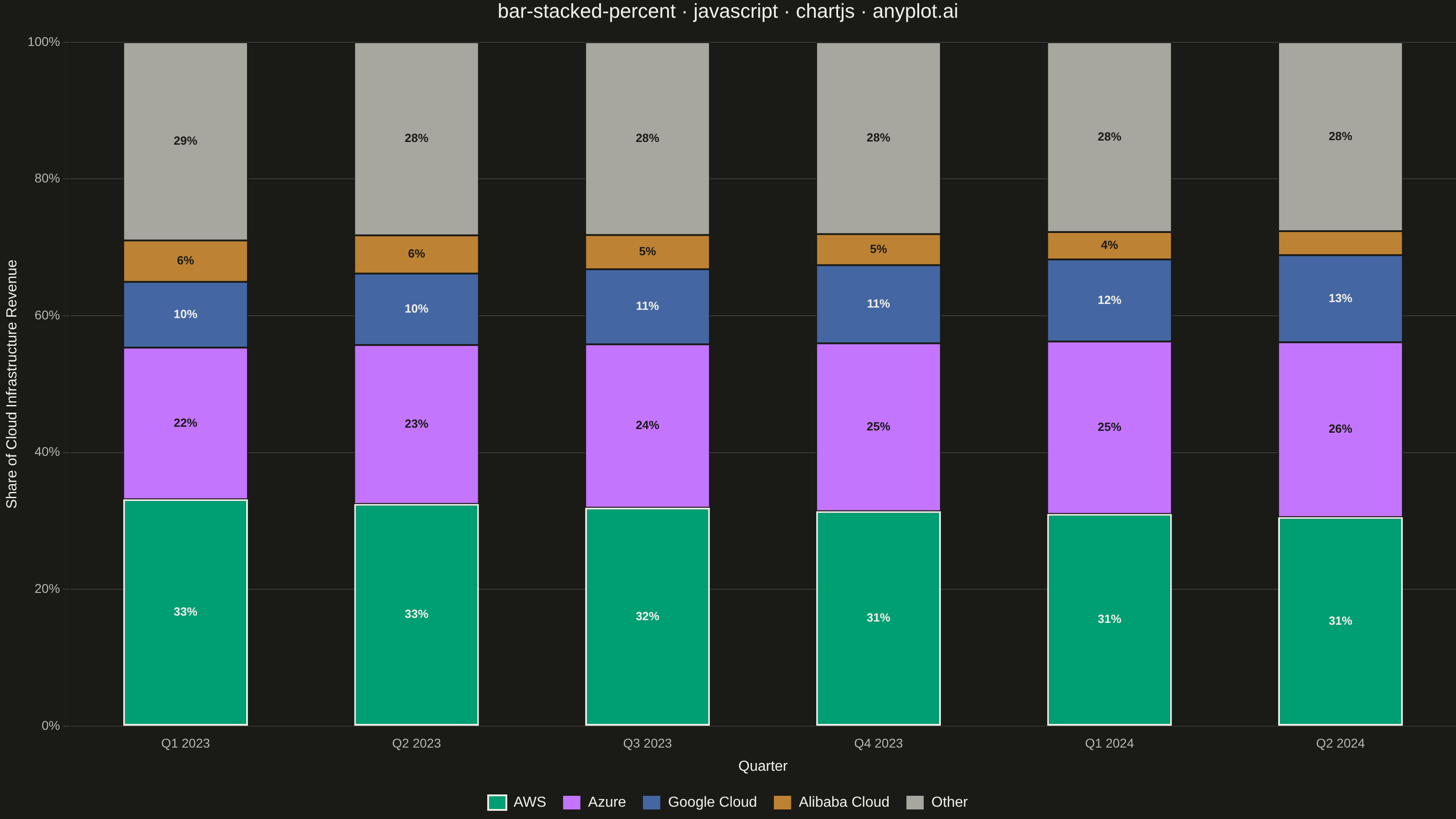
A 100% stacked bar chart displays multiple data series as proportional segments within each bar, where every bar is normalized to sum to 100%. This visualization emphasizes composition and relative proportions rather than absolute values, making it ideal for comparing how different components contribute to a whole across categories. It reveals patterns in distribution and share that might be obscured when absolute values vary significantly between categories.
// anyplot.ai
// bar-stacked-percent: 100% Stacked Bar Chart
// Library: chartjs 4.4.7 | JavaScript 22.23.2
// Quality: 95/100 | Created: 2026-08-18

const t = window.ANYPLOT_TOKENS;
// "muted" anchor (other / rest) isn't in ANYPLOT_TOKENS — theme-adaptive per default-style-guide.md
const MUTED = window.ANYPLOT_THEME === "light" ? "#6B6A63" : "#A8A79F";

// --- Data (in-memory, deterministic) ----------------------------------------
// Quarterly public-cloud infrastructure revenue by provider, $ billions.
// Each bar normalizes its own row to 100% so quarter-over-quarter share
// shifts are comparable even though the total market is growing.
const quarters = ["Q1 2023", "Q2 2023", "Q3 2023", "Q4 2023", "Q1 2024", "Q2 2024"];
const providers = ["AWS", "Azure", "Google Cloud", "Alibaba Cloud", "Other"];
const revenueByQuarter = [
  [21.4, 14.3, 6.2, 3.9, 18.7],
  [22.1, 15.8, 7.1, 3.8, 19.2],
  [23.0, 17.2, 7.9, 3.6, 20.3],
  [24.2, 18.9, 8.8, 3.5, 21.6],
  [25.6, 20.8, 9.9, 3.3, 22.9],
  [26.9, 22.5, 11.2, 3.1, 24.3],
];

const shareByQuarter = revenueByQuarter.map((row) => {
  const total = row.reduce((sum, value) => sum + value, 0);
  return row.map((value) => (value / total) * 100);
});
const totalByQuarter = revenueByQuarter.map((row) => row.reduce((sum, value) => sum + value, 0));

const datasets = providers.map((provider, i) => {
  const isLeader = provider === "AWS";
  return {
    label: provider,
    data: shareByQuarter.map((row) => row[i]),
    backgroundColor: provider === "Other" ? MUTED : t.palette[i],
    // Subtle page-bg seam between stacked segments (style guide "Bar edges"); the
    // leader series gets an ink outline instead, calling out AWS's persistent lead.
    borderColor: isLeader ? t.ink : t.pageBg,
    borderWidth: isLeader ? 2 : 1,
    borderSkipped: false,
    categoryPercentage: 0.6,
    barPercentage: 0.9,
  };
});

// --- Segment percentage labels (custom Chart.js plugin) ---------------------
// Draws a rounded percentage label centered in every segment tall enough to
// hold it legibly, picking dark/light text per-segment from fill luminance
// (YIQ) so labels stay readable across the whole palette in both themes.
const DARK_TEXT = "#1A1A17";
const LIGHT_TEXT = "#F0EFE8";
const MIN_LABEL_HEIGHT = 28; // px; smaller segments skip the label to avoid clutter/overflow

function textColorFor(hex) {
  const r = parseInt(hex.slice(1, 3), 16);
  const g = parseInt(hex.slice(3, 5), 16);
  const b = parseInt(hex.slice(5, 7), 16);
  const yiq = (r * 299 + g * 587 + b * 114) / 1000;
  return yiq >= 128 ? DARK_TEXT : LIGHT_TEXT;
}

const segmentPercentLabels = {
  id: "segmentPercentLabels",
  afterDatasetsDraw(chart) {
    const { ctx } = chart;
    ctx.save();
    ctx.font = "600 13px sans-serif";
    ctx.textAlign = "center";
    ctx.textBaseline = "middle";
    chart.data.datasets.forEach((dataset, datasetIndex) => {
      const meta = chart.getDatasetMeta(datasetIndex);
      const labelColor = textColorFor(dataset.backgroundColor);
      meta.data.forEach((bar, index) => {
        const segmentHeight = Math.abs(bar.base - bar.y);
        if (segmentHeight < MIN_LABEL_HEIGHT) return;
        ctx.fillStyle = labelColor;
        ctx.fillText(`${Math.round(dataset.data[index])}%`, bar.x, (bar.base + bar.y) / 2);
      });
    });
    ctx.restore();
  },
};

// --- Mount -------------------------------------------------------------------
const canvas = document.createElement("canvas");
document.getElementById("container").appendChild(canvas);

// --- Chart ---------------------------------------------------------------
new Chart(canvas, {
  type: "bar",
  data: { labels: quarters, datasets },
  plugins: [segmentPercentLabels],
  options: {
    responsive: true,
    maintainAspectRatio: false,
    animation: false,
    plugins: {
      title: {
        display: true,
        text: "bar-stacked-percent · javascript · chartjs · anyplot.ai",
        color: t.ink,
        font: { size: 22, weight: "500" },
        padding: { bottom: 20 },
      },
      legend: {
        position: "bottom",
        labels: { color: t.ink, font: { size: 16 }, boxWidth: 20, padding: 18 },
      },
      tooltip: {
        callbacks: {
          title: (items) => `${items[0].label} — Total: $${totalByQuarter[items[0].dataIndex].toFixed(1)}B`,
          label: (ctx) => `${ctx.dataset.label}: ${ctx.parsed.y.toFixed(1)}%`,
        },
      },
    },
    scales: {
      x: {
        stacked: true,
        ticks: { color: t.inkSoft, font: { size: 14 } },
        grid: { display: false },
        title: { display: true, text: "Quarter", color: t.ink, font: { size: 16 } },
      },
      y: {
        stacked: true,
        min: 0,
        max: 100,
        ticks: {
          color: t.inkSoft,
          font: { size: 14 },
          stepSize: 20,
          callback: (value) => `${value}%`,
        },
        grid: { color: t.grid },
        title: {
          display: true,
          text: "Share of Cloud Infrastructure Revenue",
          color: t.ink,
          font: { size: 16 },
        },
      },
    },
  },
});
Runnable source as JSON, for any HTTP client: https://api.anyplot.ai/specs/bar-stacked-percent/chartjs/code. Any spec id and library id listed in llms-full.txt fit the same URL shape; every URL below is complete and callable.
{
  "spec_id": "bar-stacked-percent",
  "language": "javascript",
  "library": "chartjs",
  "page": "https://anyplot.ai/bar-stacked-percent/javascript/chartjs",
  "hub": "https://anyplot.ai/bar-stacked-percent",
  "code_json": "https://api.anyplot.ai/specs/bar-stacked-percent/chartjs/code",
  "spec_json": "https://api.anyplot.ai/specs/bar-stacked-percent",
  "render_light_png": "https://storage.googleapis.com/anyplot-images/plots/bar-stacked-percent/javascript/chartjs/plot-light.png",
  "render_dark_png": "https://storage.googleapis.com/anyplot-images/plots/bar-stacked-percent/javascript/chartjs/plot-dark.png",
  "interactive_light_html": "https://storage.googleapis.com/anyplot-images/plots/bar-stacked-percent/javascript/chartjs/plot-light.html",
  "interactive_dark_html": "https://storage.googleapis.com/anyplot-images/plots/bar-stacked-percent/javascript/chartjs/plot-dark.html",
  "quality_score": 95.0,
  "license": "MIT",
  "guide": "https://anyplot.ai/llms.txt"
}
Part of 100% Stacked Bar Chart on anyplot.ai.