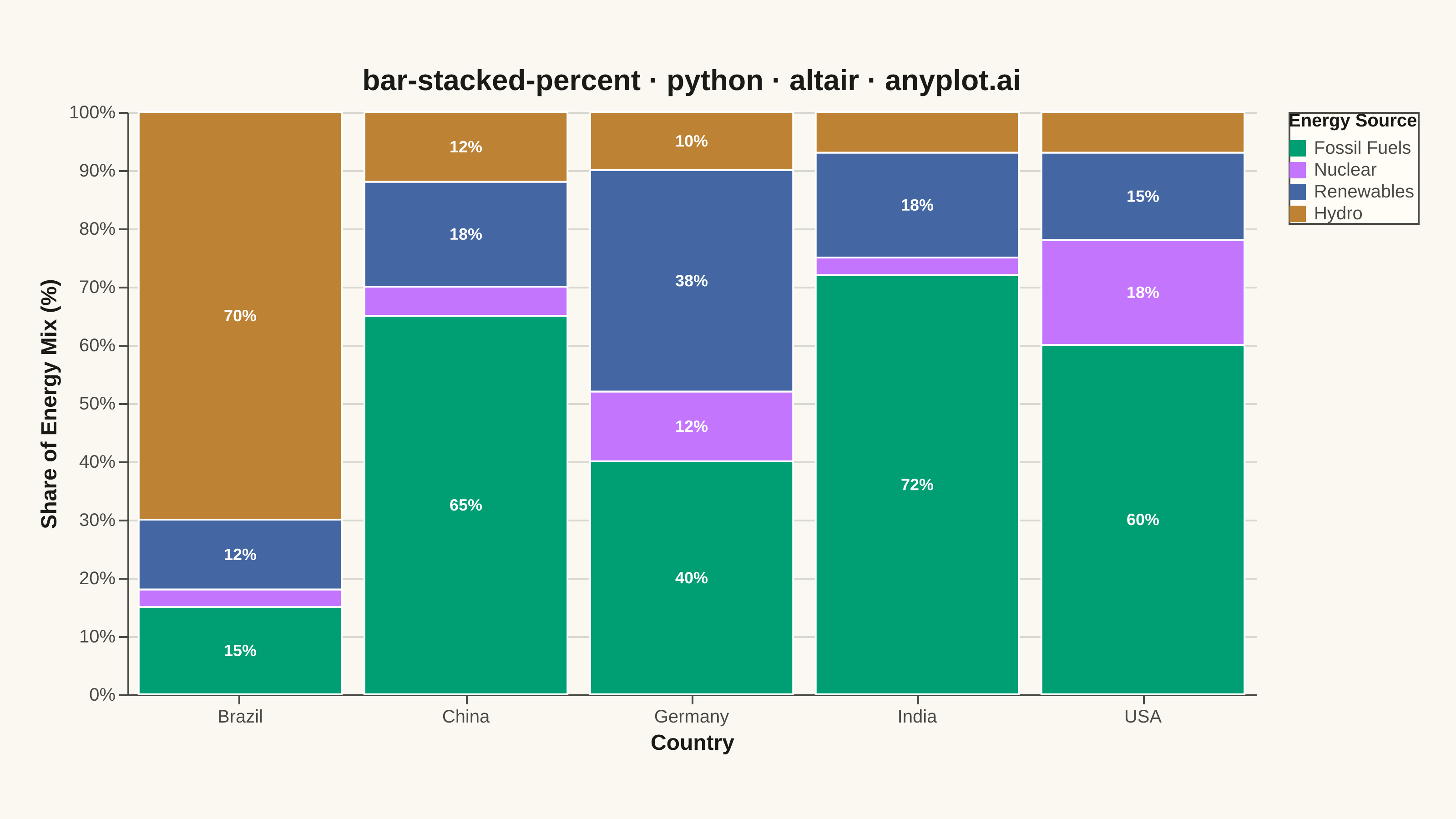
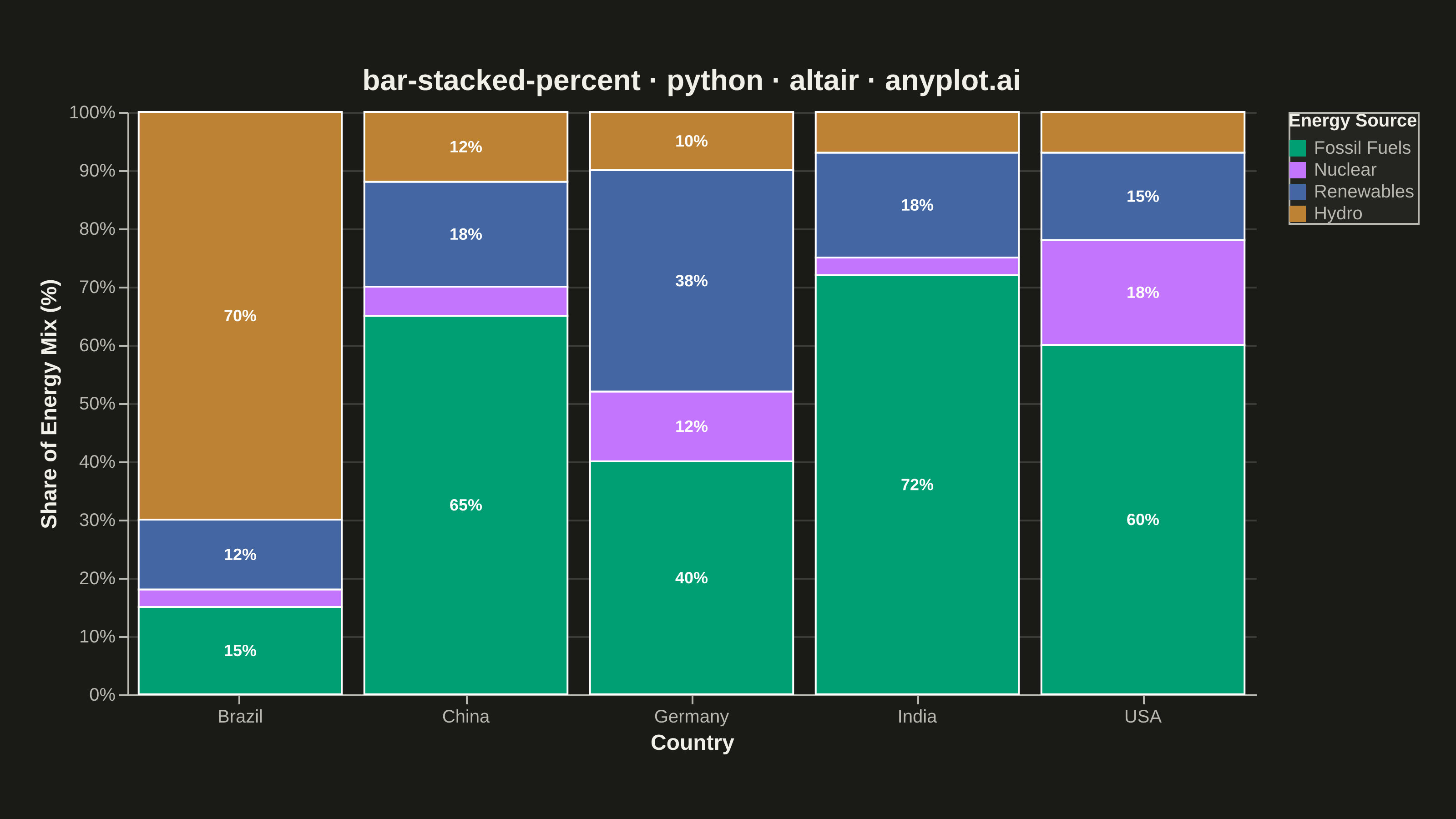
A 100% stacked bar chart displays multiple data series as proportional segments within each bar, where every bar is normalized to sum to 100%. This visualization emphasizes composition and relative proportions rather than absolute values, making it ideal for comparing how different components contribute to a whole across categories. It reveals patterns in distribution and share that might be obscured when absolute values vary significantly between categories.
""" anyplot.ai
bar-stacked-percent: 100% Stacked Bar Chart
Library: altair 6.2.2 | Python 3.13.15
Quality: 93/100 | Updated: 2026-08-18
"""

import os

import altair as alt
import pandas as pd
from PIL import Image


# Theme tokens
THEME = os.getenv("ANYPLOT_THEME", "light")
PAGE_BG = "#FAF8F1" if THEME == "light" else "#1A1A17"
ELEVATED_BG = "#FFFDF6" if THEME == "light" else "#242420"
INK = "#1A1A17" if THEME == "light" else "#F0EFE8"
INK_SOFT = "#4A4A44" if THEME == "light" else "#B8B7B0"

# Imprint palette (first series is always #009E73)
IMPRINT = ["#009E73", "#C475FD", "#4467A3", "#BD8233"]

# Stack/legend order (must match the color domain so segment position is
# traceable to the legend swatch above it)
SOURCE_ORDER = ["Fossil Fuels", "Nuclear", "Renewables", "Hydro"]

# Data - Energy mix by country
data = pd.DataFrame(
    {
        "Country": [
            "USA",
            "USA",
            "USA",
            "USA",
            "China",
            "China",
            "China",
            "China",
            "Germany",
            "Germany",
            "Germany",
            "Germany",
            "Brazil",
            "Brazil",
            "Brazil",
            "Brazil",
            "India",
            "India",
            "India",
            "India",
        ],
        "Source": ["Fossil Fuels", "Nuclear", "Renewables", "Hydro"] * 5,
        "Value": [
            60,
            18,
            15,
            7,  # USA
            65,
            5,
            18,
            12,  # China
            40,
            12,
            38,
            10,  # Germany
            15,
            3,
            12,
            70,  # Brazil
            72,
            3,
            18,
            7,
        ],  # India
    }
)

# Rank each source to match the legend's domain order, so the stack reads
# bottom-to-top in the same sequence as the legend top-to-bottom.
order_map = {source: i for i, source in enumerate(SOURCE_ORDER)}
data["SourceOrder"] = data["Source"].map(order_map)

# In-segment percentage labels for segments wide enough to hold text;
# narrow slivers (e.g. Nuclear at 3-5%) are left unlabeled.
data["Label"] = data["Value"].apply(lambda v: f"{v:.0f}%" if v >= 10 else "")

# Segment midpoint (as a 0-1 fraction of the stack) for centering labels;
# rows are already ordered Fossil Fuels/Nuclear/Renewables/Hydro per country,
# matching SOURCE_ORDER, so a plain cumsum reproduces the bars' stack order.
group_total = data.groupby("Country")["Value"].transform("sum")
cum_end = data.groupby("Country")["Value"].cumsum() / group_total
cum_start = cum_end - data["Value"] / group_total
data["Mid"] = (cum_start + cum_end) / 2

# 100% stacked bars
bars = (
    alt.Chart(data)
    .mark_bar(stroke="white", strokeWidth=1)
    .encode(
        x=alt.X("Country:N", axis=alt.Axis(labelFontSize=10, titleFontSize=12, labelAngle=0), title="Country"),
        y=alt.Y(
            "Value:Q",
            stack="normalize",
            axis=alt.Axis(labelFontSize=10, titleFontSize=12, format="%"),
            title="Share of Energy Mix (%)",
        ),
        color=alt.Color(
            "Source:N",
            scale=alt.Scale(domain=SOURCE_ORDER, range=IMPRINT),
            legend=alt.Legend(
                title="Energy Source",
                titleFontSize=10,
                labelFontSize=10,
                orient="right",
                symbolSize=80,
                symbolStrokeWidth=0,
            ),
        ),
        order=alt.Order("SourceOrder:Q", sort="ascending"),
        tooltip=[
            alt.Tooltip("Country:N", title="Country"),
            alt.Tooltip("Source:N", title="Source"),
            alt.Tooltip("Value:Q", title="Value", format=".1f"),
        ],
    )
)

# Percentage labels centered within each segment via the precomputed midpoint
labels = (
    alt.Chart(data)
    .mark_text(fontSize=9, fontWeight="bold", color="#FFFFFF")
    .encode(
        x=alt.X("Country:N"),
        y=alt.Y("Mid:Q", title="Share of Energy Mix (%)", scale=alt.Scale(domain=[0, 1])),
        text=alt.Text("Label:N"),
    )
)

# Create 100% stacked bar chart
chart = (
    (bars + labels)
    .properties(
        width=620,
        height=320,
        background=PAGE_BG,
        title=alt.Title("bar-stacked-percent · python · altair · anyplot.ai", fontSize=16, anchor="middle", color=INK),
    )
    .configure_view(fill=PAGE_BG, stroke=INK_SOFT, strokeWidth=0)
    .configure_axis(
        domainColor=INK_SOFT, tickColor=INK_SOFT, gridColor=INK, gridOpacity=0.15, labelColor=INK_SOFT, titleColor=INK
    )
    .configure_legend(fillColor=ELEVATED_BG, strokeColor=INK_SOFT, labelColor=INK_SOFT, titleColor=INK)
)

# Save PNG and HTML
chart.save(f"plot-{THEME}.png", scale_factor=4.0)
chart.save(f"plot-{THEME}.html")

# Pad the saved PNG up to the canonical landscape canvas (3200x1800).
# vl-convert pads the view with title/axis/legend extents outside width/height,
# so the raw save rarely lands exactly on target - never crop, only pad.
TW, TH = 3200, 1800
_img = Image.open(f"plot-{THEME}.png").convert("RGB")
_w, _h = _img.size
if _w > TW or _h > TH:
    raise SystemExit(
        f"altair vl-convert produced {_w}x{_h}, exceeds target {TW}x{TH}. "
        f"Shrink chart .properties(width=, height=) values and re-render."
    )
if _w < TW or _h < TH:
    _canvas = Image.new("RGB", (TW, TH), PAGE_BG)
    _canvas.paste(_img, ((TW - _w) // 2, (TH - _h) // 2))
    _canvas.save(f"plot-{THEME}.png")
Runnable source as JSON, for any HTTP client: https://api.anyplot.ai/specs/bar-stacked-percent/altair/code. Any spec id and library id listed in llms-full.txt fit the same URL shape; every URL below is complete and callable.
{
  "spec_id": "bar-stacked-percent",
  "language": "python",
  "library": "altair",
  "page": "https://anyplot.ai/bar-stacked-percent/python/altair",
  "hub": "https://anyplot.ai/bar-stacked-percent",
  "code_json": "https://api.anyplot.ai/specs/bar-stacked-percent/altair/code",
  "spec_json": "https://api.anyplot.ai/specs/bar-stacked-percent",
  "render_light_png": "https://storage.googleapis.com/anyplot-images/plots/bar-stacked-percent/python/altair/plot-light.png",
  "render_dark_png": "https://storage.googleapis.com/anyplot-images/plots/bar-stacked-percent/python/altair/plot-dark.png",
  "interactive_light_html": "https://storage.googleapis.com/anyplot-images/plots/bar-stacked-percent/python/altair/plot-light.html",
  "interactive_dark_html": "https://storage.googleapis.com/anyplot-images/plots/bar-stacked-percent/python/altair/plot-dark.html",
  "quality_score": 93.0,
  "license": "MIT",
  "guide": "https://anyplot.ai/llms.txt"
}
Part of 100% Stacked Bar Chart on anyplot.ai.