The same plot in 14 other libraries — Python: Altair, Bokeh, lets-plot, Matplotlib, Plotly, plotnine, Pygal, Seaborn; R: ggplot2; JavaScript: Chart.js, D3.js, Apache ECharts, Highcharts, MUI X Charts. Compare all 15 side by side: 100% Stacked Bar Chart in Python, R, Julia and JavaScript.
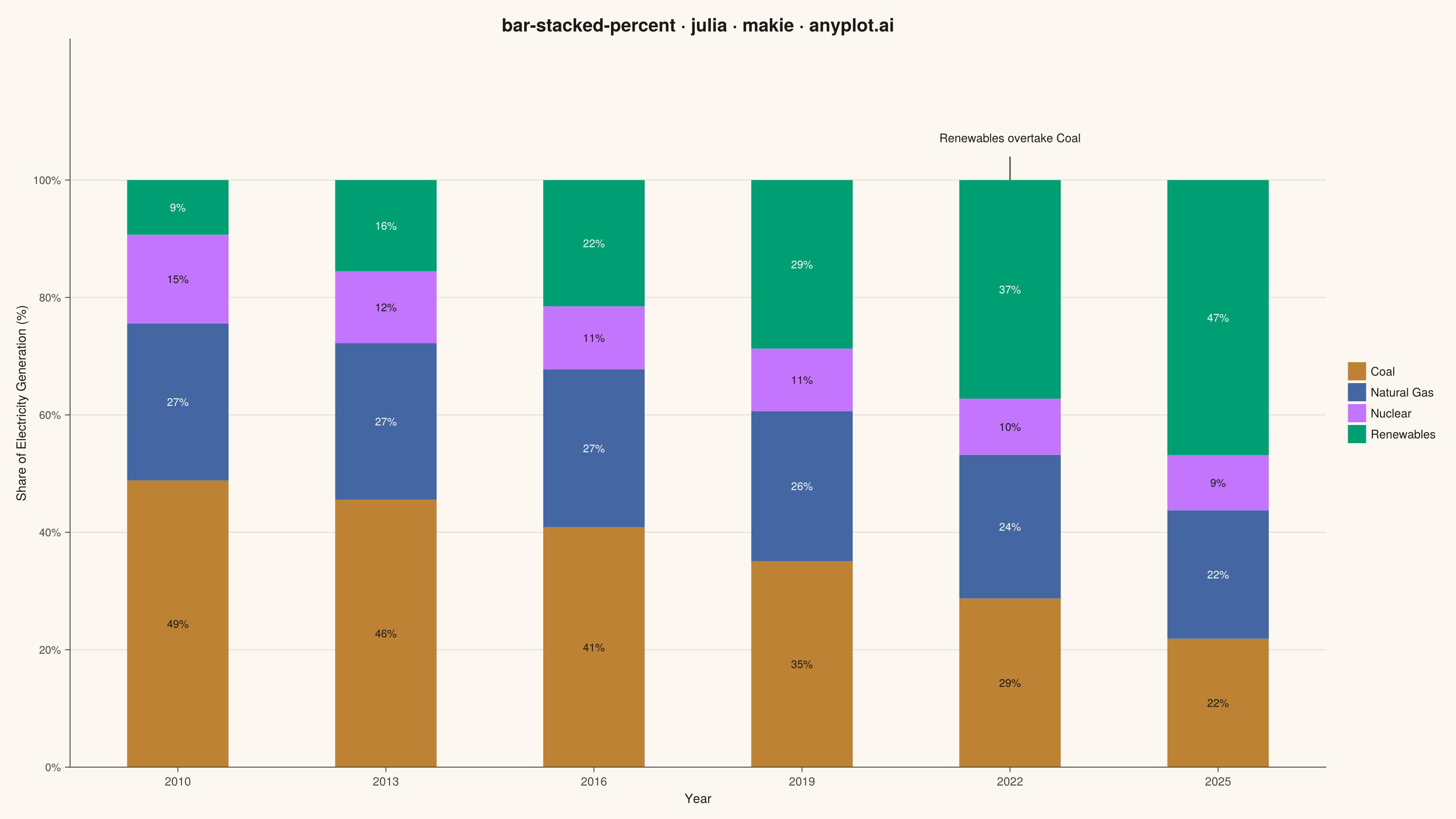
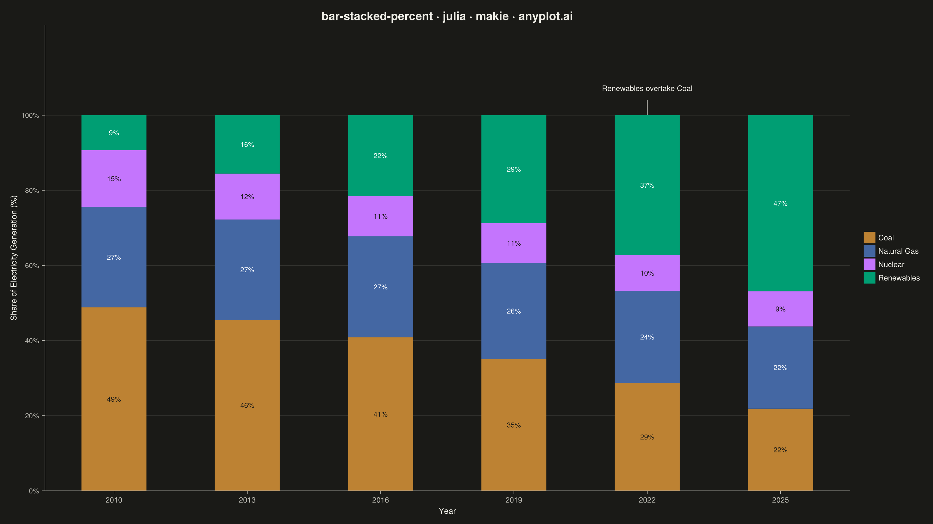
A 100% stacked bar chart displays multiple data series as proportional segments within each bar, where every bar is normalized to sum to 100%. This visualization emphasizes composition and relative proportions rather than absolute values, making it ideal for comparing how different components contribute to a whole across categories. It reveals patterns in distribution and share that might be obscured when absolute values vary significantly between categories.
# anyplot.ai
# bar-stacked-percent: 100% Stacked Bar Chart
# Library: makie 0.21.9 | Julia 1.11.9
# Quality: 92/100 | Created: 2026-08-18

using CairoMakie
using Colors

# --- Theme tokens -------------------------------------------------------
const THEME    = get(ENV, "ANYPLOT_THEME", "light")
const PAGE_BG  = THEME == "light" ? colorant"#FAF8F1" : colorant"#1A1A17"
const INK      = THEME == "light" ? colorant"#1A1A17" : colorant"#F0EFE8"
const INK_SOFT = THEME == "light" ? colorant"#4A4A44" : colorant"#B8B7B0"

const IMPRINT_PALETTE = [
    colorant"#009E73", colorant"#C475FD", colorant"#4467A3", colorant"#BD8233",
    colorant"#AE3030", colorant"#2ABCCD", colorant"#954477", colorant"#99B314",
]

# Fixed (non-theme-adaptive) dark ink for segment labels drawn on the lighter
# Imprint hues — the underlying fill color never changes between themes, so
# the label color that contrasts against it shouldn't either.
const LABEL_DARK  = colorant"#1A1A17"
const LABEL_LIGHT = colorant"#FFFFFF"

# --- Data -----------------------------------------------------------------
# Global electricity generation mix (TWh, illustrative) — rows are years,
# columns are sources. Coal share erodes as renewables scale up.
years   = ["2010", "2013", "2016", "2019", "2022", "2025"]
sources = ["Coal", "Natural Gas", "Nuclear", "Renewables"]

# Semantic-exception color mapping (style guide "Semantic exception"):
# renewables carries a strong reader expectation of green, so brand green is
# reassigned from the ordinal-first series to Renewables, and the remaining
# canonical hues (positions 2-4) reflow by their own semantic fit — ochre
# (earth/commodity) for Coal, blue (gas-flame association) for Natural Gas,
# lavender left for Nuclear.
source_colors = IMPRINT_PALETTE[[4, 3, 2, 1]]
label_colors  = [LABEL_DARK, LABEL_LIGHT, LABEL_DARK, LABEL_LIGHT]

generation = [
    42.0 23.0 13.0  8.0
    41.0 24.0 11.0 14.0
    38.0 25.0 10.0 20.0
    33.0 24.0 10.0 27.0
    27.0 23.0  9.0 35.0
    21.0 21.0  9.0 45.0
]

n_year   = length(years)
n_source = length(sources)

# Normalize each year's row so segments sum to exactly 100%.
row_totals = sum(generation, dims = 2)
shares     = 100 .* generation ./ row_totals

x      = repeat(1:n_year, inner = n_source)
stack  = repeat(1:n_source, outer = n_year)
height = vec(permutedims(shares))
colors = source_colors[repeat(1:n_source, outer = n_year)]

# --- Plot -------------------------------------------------------------------
fig = Figure(
    size            = (1600, 900),
    fontsize        = 14,
    backgroundcolor = PAGE_BG,
)

ax = Axis(
    fig[1, 1];
    title             = "bar-stacked-percent · julia · makie · anyplot.ai",
    titlesize         = 20,
    titlecolor        = INK,
    xlabel            = "Year",
    ylabel            = "Share of Electricity Generation (%)",
    xlabelsize        = 14,
    ylabelsize        = 14,
    xlabelcolor       = INK,
    ylabelcolor       = INK,
    xticklabelsize    = 13,
    yticklabelsize    = 12,
    xticklabelcolor   = INK_SOFT,
    yticklabelcolor   = INK_SOFT,
    xtickcolor        = INK_SOFT,
    ytickcolor        = INK_SOFT,
    backgroundcolor   = PAGE_BG,
    topspinevisible   = false,
    rightspinevisible = false,
    leftspinecolor    = INK_SOFT,
    bottomspinecolor  = INK_SOFT,
    xgridvisible      = false,
    ygridvisible      = true,
    ygridcolor        = RGBAf(INK.r, INK.g, INK.b, 0.12),
    yminorgridvisible = false,
)

barplot!(
    ax, x, height;
    stack       = stack,
    color       = colors,
    width       = 0.65,
    gap         = 0.25,
    strokewidth = 0,
)

ax.xticks = (1:n_year, years)
ax.yticks = (0:20:100, ["$(t)%" for t in 0:20:100])

# --- Segment labels: percentage text where the segment has room -----------
for j in 1:n_year, i in 1:n_source
    pct = shares[j, i]
    pct < 6.0 && continue
    y_top    = sum(shares[j, 1:i])
    y_center = y_top - pct / 2
    text!(
        ax, Point2f(j, y_center);
        text     = "$(round(Int, pct))%",
        align    = (:center, :center),
        fontsize = 12,
        color    = label_colors[i],
    )
end

# --- Callout: mark where renewables overtake coal --------------------------
crossover_x = 5  # 2022 — first year Renewables' share exceeds Coal's
lines!(ax, [crossover_x, crossover_x], [100.0, 104.0]; color = INK_SOFT, linewidth = 1.5)
text!(
    ax, Point2f(crossover_x, 106);
    text     = "Renewables overtake Coal",
    align    = (:center, :bottom),
    fontsize = 13,
    color    = INK,
)

Legend(
    fig[1, 2], [PolyElement(color = c) for c in source_colors], sources;
    labelcolor  = INK,
    labelsize   = 13,
    framevisible = false,
    backgroundcolor = PAGE_BG,
)

# Fix the y-range last so no later plot/legend call can reset it via autolimits.
ylims!(ax, 0, 124)

# --- Save -------------------------------------------------------------------
save("plot-$(THEME).png", fig; px_per_unit = 2)
Runnable source as JSON, for any HTTP client: https://api.anyplot.ai/specs/bar-stacked-percent/makie/code. Any spec id and library id listed in llms-full.txt fit the same URL shape; every URL below is complete and callable.
{
  "spec_id": "bar-stacked-percent",
  "language": "julia",
  "library": "makie",
  "page": "https://anyplot.ai/bar-stacked-percent/julia/makie",
  "hub": "https://anyplot.ai/bar-stacked-percent",
  "code_json": "https://api.anyplot.ai/specs/bar-stacked-percent/makie/code",
  "spec_json": "https://api.anyplot.ai/specs/bar-stacked-percent",
  "render_light_png": "https://storage.googleapis.com/anyplot-images/plots/bar-stacked-percent/julia/makie/plot-light.png",
  "render_dark_png": "https://storage.googleapis.com/anyplot-images/plots/bar-stacked-percent/julia/makie/plot-dark.png",
  "quality_score": 92.0,
  "license": "MIT",
  "guide": "https://anyplot.ai/llms.txt"
}
Part of 100% Stacked Bar Chart on anyplot.ai.