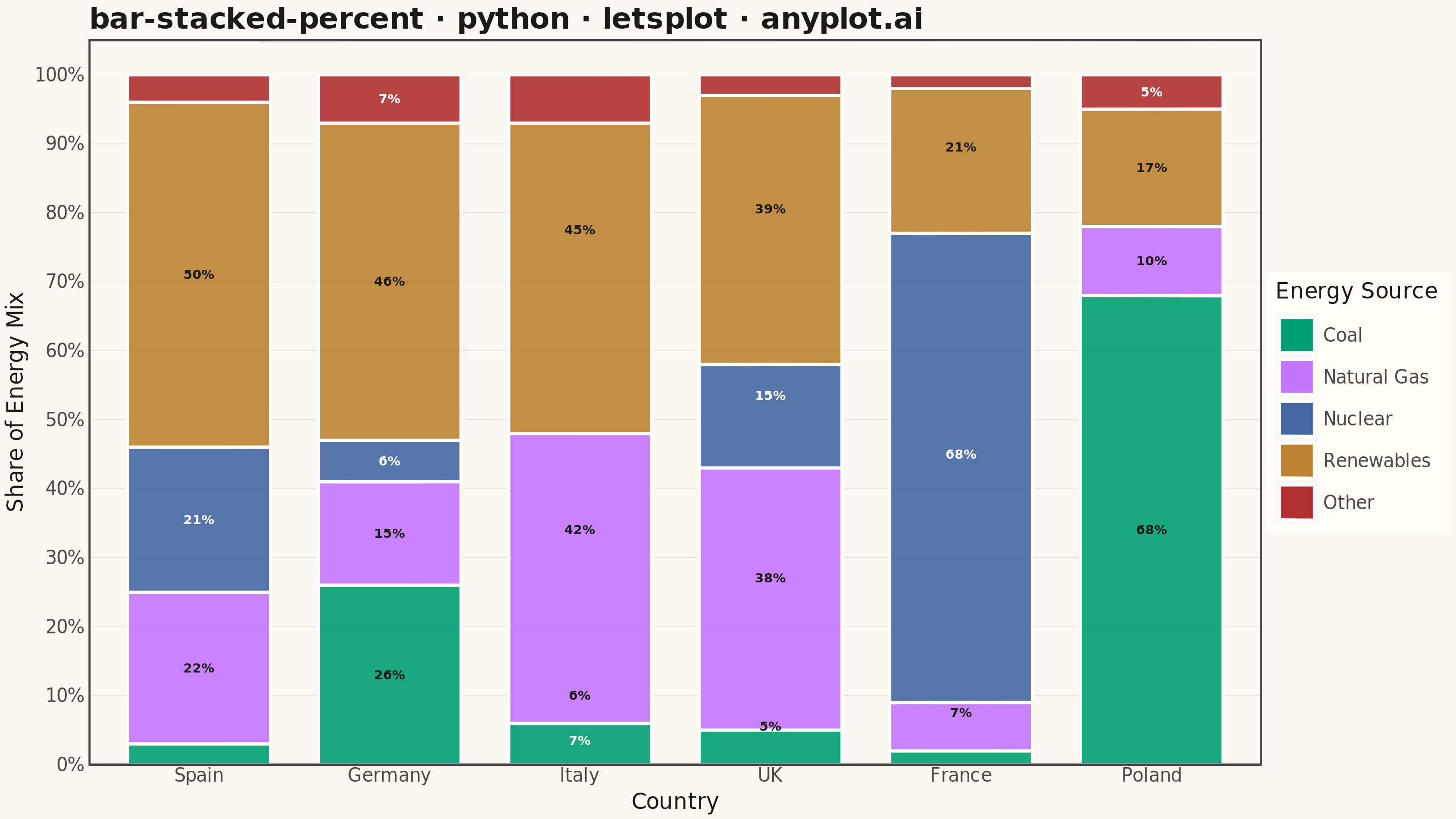
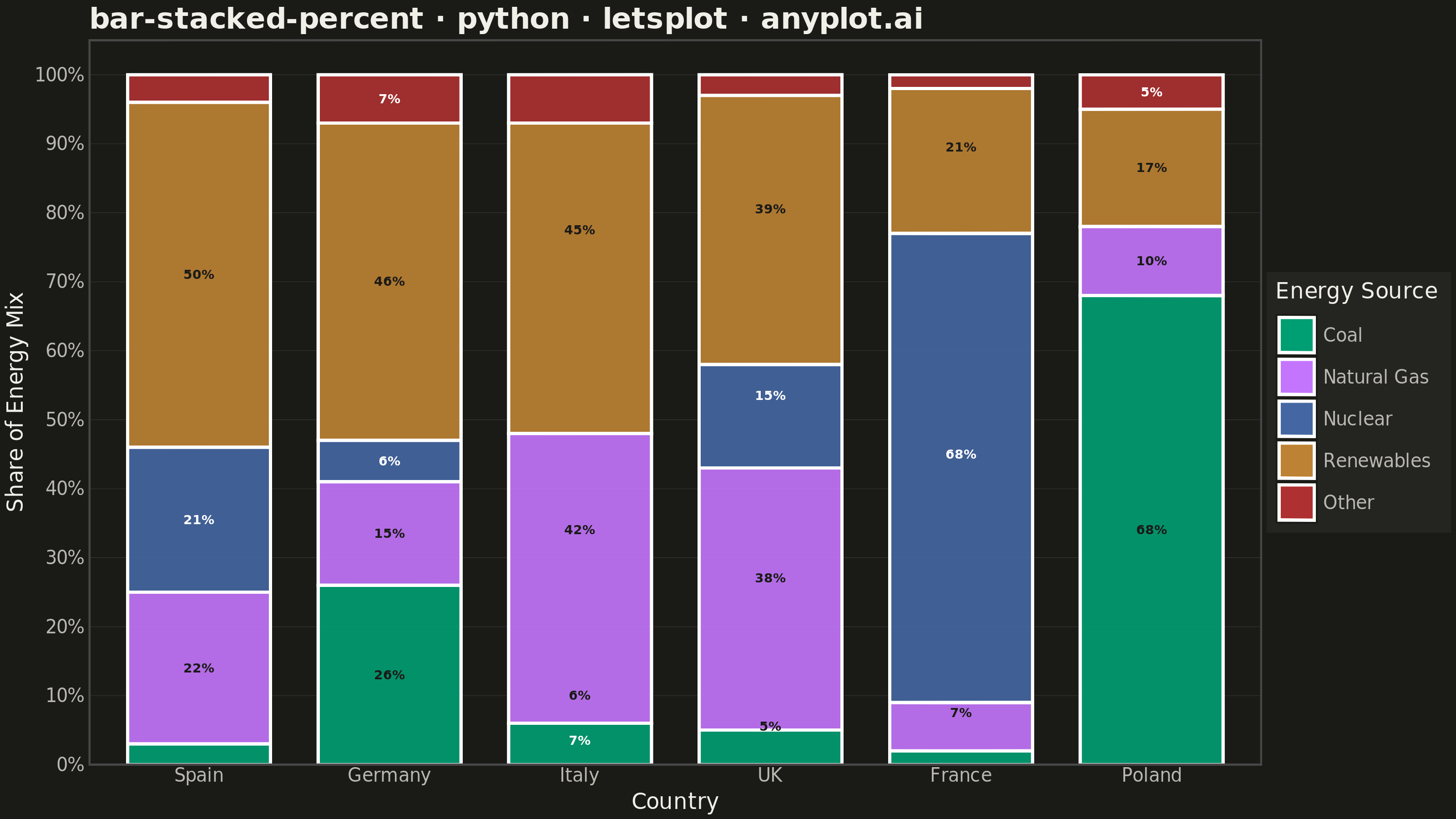
A 100% stacked bar chart displays multiple data series as proportional segments within each bar, where every bar is normalized to sum to 100%. This visualization emphasizes composition and relative proportions rather than absolute values, making it ideal for comparing how different components contribute to a whole across categories. It reveals patterns in distribution and share that might be obscured when absolute values vary significantly between categories.
""" anyplot.ai
bar-stacked-percent: 100% Stacked Bar Chart
Library: letsplot 4.11.0 | Python 3.13.15
Quality: 90/100 | Updated: 2026-08-18
"""

import os

import pandas as pd
from lets_plot import (
    LetsPlot,
    aes,
    element_blank,
    element_line,
    element_rect,
    element_text,
    geom_bar,
    geom_text,
    ggplot,
    ggsave,
    ggsize,
    labs,
    position_fill,
    scale_color_identity,
    scale_fill_manual,
    scale_y_continuous,
    theme,
    theme_minimal,
)


LetsPlot.setup_html()

# Theme tokens
THEME = os.getenv("ANYPLOT_THEME", "light")
PAGE_BG = "#FAF8F1" if THEME == "light" else "#1A1A17"
ELEVATED_BG = "#FFFDF6" if THEME == "light" else "#242420"
INK = "#1A1A17" if THEME == "light" else "#F0EFE8"
INK_SOFT = "#4A4A44" if THEME == "light" else "#B8B7B0"
GRID_COLOR = "rgba(26,26,23,0.15)" if THEME == "light" else "rgba(240,239,232,0.15)"

# Imprint palette (first series always #009E73)
IMPRINT = ["#009E73", "#C475FD", "#4467A3", "#BD8233", "#AE3030"]

# Data: Energy source mix by country, ranked by renewable share (descending)
data = {
    "country": ["Spain"] * 5 + ["Germany"] * 5 + ["Italy"] * 5 + ["UK"] * 5 + ["France"] * 5 + ["Poland"] * 5,
    "source": ["Coal", "Natural Gas", "Nuclear", "Renewables", "Other"] * 6,
    "value": [
        # Spain
        3,
        22,
        21,
        50,
        4,
        # Germany
        26,
        15,
        6,
        46,
        7,
        # Italy
        6,
        42,
        0,
        45,
        7,
        # UK
        5,
        38,
        15,
        39,
        3,
        # France
        2,
        7,
        68,
        21,
        2,
        # Poland
        68,
        10,
        0,
        17,
        5,
    ],
}

df = pd.DataFrame(data)

# Set category order for proper stacking (ranked by renewable share, descending)
df["country"] = pd.Categorical(
    df["country"], categories=["Spain", "Germany", "Italy", "UK", "France", "Poland"], ordered=True
)
df["source"] = pd.Categorical(
    df["source"], categories=["Coal", "Natural Gas", "Nuclear", "Renewables", "Other"], ordered=True
)

# In-segment percentage labels (values already sum to 100 per country); suppress
# labels on slivers too narrow to hold text cleanly
df["label"] = df["value"].apply(lambda v: f"{v}%" if v >= 5 else "")

# Per-segment label ink chosen for WCAG AA contrast against each fill color
LABEL_INK = {
    "Coal": "#1A1A17",
    "Natural Gas": "#1A1A17",
    "Nuclear": "#FFFFFF",
    "Renewables": "#1A1A17",
    "Other": "#FFFFFF",
}
df["label_color"] = df["source"].map(LABEL_INK)

# Create 100% stacked bar chart with position="fill"
plot = (
    ggplot(df, aes(x="country", y="value", fill="source"))
    + geom_bar(stat="identity", position="fill", width=0.75, alpha=0.9)
    + geom_text(aes(label="label", color="label_color"), position=position_fill(vjust=0.5), size=3.5, fontface="bold")
    + scale_color_identity()
    + scale_fill_manual(values=IMPRINT)
    + scale_y_continuous(format=".0%")
    + labs(
        title="bar-stacked-percent · python · letsplot · anyplot.ai",
        x="Country",
        y="Share of Energy Mix",
        fill="Energy Source",
    )
    + theme_minimal()
    + theme(
        plot_background=element_rect(fill=PAGE_BG, color=PAGE_BG),
        panel_background=element_rect(fill=PAGE_BG),
        panel_border=element_blank(),
        panel_grid_major=element_line(color=GRID_COLOR, size=0.2),
        panel_grid_minor=element_blank(),
        axis_title=element_text(size=12, color=INK),
        axis_text=element_text(size=10, color=INK_SOFT),
        plot_title=element_text(size=16, face="bold", color=INK),
        legend_background=element_rect(fill=ELEVATED_BG, color=ELEVATED_BG),
        legend_title=element_text(size=12, color=INK),
        legend_text=element_text(size=10, color=INK_SOFT),
        legend_position="right",
        panel_grid_major_x=element_blank(),
    )
    + ggsize(800, 450)
)

# Save as PNG (scale 4x for 3200 x 1800 px) and HTML
ggsave(plot, f"plot-{THEME}.png", path=".", scale=4)
ggsave(plot, f"plot-{THEME}.html", path=".")
Runnable source as JSON, for any HTTP client: https://api.anyplot.ai/specs/bar-stacked-percent/letsplot/code. Any spec id and library id listed in llms-full.txt fit the same URL shape; every URL below is complete and callable.
{
  "spec_id": "bar-stacked-percent",
  "language": "python",
  "library": "letsplot",
  "page": "https://anyplot.ai/bar-stacked-percent/python/letsplot",
  "hub": "https://anyplot.ai/bar-stacked-percent",
  "code_json": "https://api.anyplot.ai/specs/bar-stacked-percent/letsplot/code",
  "spec_json": "https://api.anyplot.ai/specs/bar-stacked-percent",
  "render_light_png": "https://storage.googleapis.com/anyplot-images/plots/bar-stacked-percent/python/letsplot/plot-light.png",
  "render_dark_png": "https://storage.googleapis.com/anyplot-images/plots/bar-stacked-percent/python/letsplot/plot-dark.png",
  "interactive_light_html": "https://storage.googleapis.com/anyplot-images/plots/bar-stacked-percent/python/letsplot/plot-light.html",
  "interactive_dark_html": "https://storage.googleapis.com/anyplot-images/plots/bar-stacked-percent/python/letsplot/plot-dark.html",
  "quality_score": 90.0,
  "license": "MIT",
  "guide": "https://anyplot.ai/llms.txt"
}
Part of 100% Stacked Bar Chart on anyplot.ai.