The same plot in 14 other libraries — JavaScript: Chart.js, D3.js, Highcharts, MUI X Charts; Python: Altair, Bokeh, lets-plot, Matplotlib, Plotly, plotnine, Pygal, Seaborn; R: ggplot2; Julia: Makie.jl. Compare all 15 side by side: 100% Stacked Bar Chart in Python, R, Julia and JavaScript.
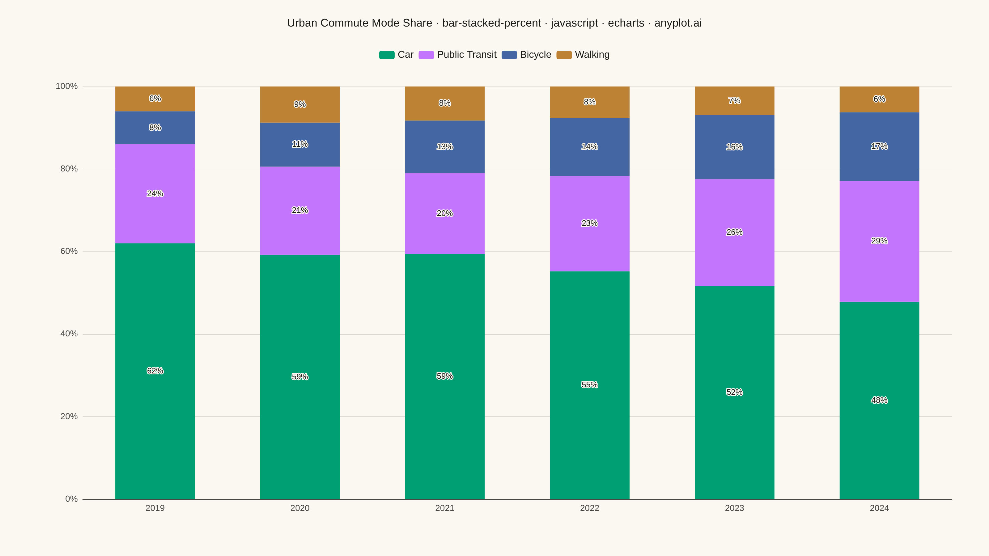
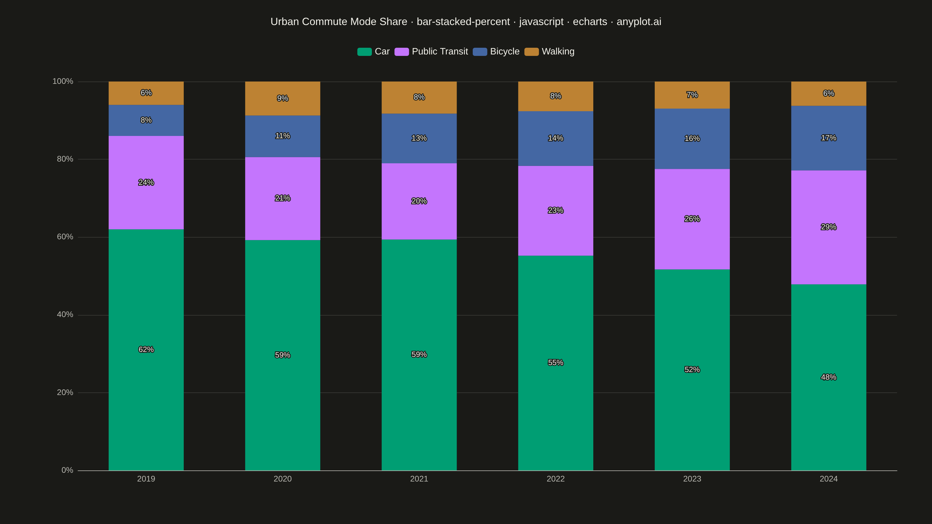
A 100% stacked bar chart displays multiple data series as proportional segments within each bar, where every bar is normalized to sum to 100%. This visualization emphasizes composition and relative proportions rather than absolute values, making it ideal for comparing how different components contribute to a whole across categories. It reveals patterns in distribution and share that might be obscured when absolute values vary significantly between categories.
// anyplot.ai
// bar-stacked-percent: 100% Stacked Bar Chart
// Library: echarts 6.1.0 | JavaScript 22.23.2
// Quality: 90/100 | Created: 2026-08-18

const t = window.ANYPLOT_TOKENS;

// --- Data (in-memory, deterministic) ----------------------------------------
// Urban commute mode share, thousands of commuters per year. Yearly totals
// drift (500 -> 512), which is exactly why a 100% stacked view is useful here:
// it isolates the share shift from the underlying volume growth.
const years = ["2019", "2020", "2021", "2022", "2023", "2024"];
const components = ["Car", "Public Transit", "Bicycle", "Walking"];
const rawByComponent = [
  [310, 305, 288, 275, 260, 245], // Car
  [120, 110, 95, 115, 130, 150], // Public Transit
  [40, 55, 62, 70, 78, 85], // Bicycle
  [30, 45, 40, 38, 35, 32], // Walking
];

const totalsByYear = years.map((_, yearIdx) =>
  rawByComponent.reduce((sum, series) => sum + series[yearIdx], 0)
);
const percentByComponent = rawByComponent.map((series) =>
  series.map((value, yearIdx) => (value / totalsByYear[yearIdx]) * 100)
);

// --- Init --------------------------------------------------------------------
const chart = echarts.init(document.getElementById("container"));

// --- Option --------------------------------------------------------------------
const title = "Urban Commute Mode Share · bar-stacked-percent · javascript · echarts · anyplot.ai";

chart.setOption({
  animation: false,
  color: t.palette,
  backgroundColor: "transparent",
  title: {
    text: title,
    left: "center",
    top: 24,
    textStyle: { color: t.ink, fontSize: 18, fontWeight: 500 },
  },
  tooltip: {
    trigger: "axis",
    axisPointer: { type: "shadow" },
    valueFormatter: (value) => `${value.toFixed(1)}%`,
  },
  legend: {
    data: components,
    top: 76,
    textStyle: { color: t.ink, fontSize: 16 },
  },
  grid: { left: 90, right: 60, top: 140, bottom: 70, containLabel: true },
  xAxis: {
    type: "category",
    data: years,
    axisLabel: { color: t.inkSoft, fontSize: 14 },
    axisLine: { lineStyle: { color: t.inkSoft } },
    axisTick: { show: false },
    splitLine: { show: false },
  },
  yAxis: {
    type: "value",
    min: 0,
    max: 100,
    interval: 20,
    axisLabel: { color: t.inkSoft, fontSize: 14, formatter: "{value}%" },
    axisLine: { show: false },
    axisTick: { show: false },
    splitLine: { lineStyle: { color: t.grid } },
  },
  series: components.map((name, i) => ({
    name,
    type: "bar",
    stack: "total",
    barWidth: "55%",
    data: percentByComponent[i],
    itemStyle: { color: t.palette[i] },
    label: {
      show: true,
      position: "inside",
      formatter: (params) => (params.value >= 6 ? `${Math.round(params.value)}%` : ""),
      color: t.ink,
      textBorderColor: t.pageBg,
      textBorderWidth: 3,
      fontSize: 13,
    },
  })),
});
Runnable source as JSON, for any HTTP client: https://api.anyplot.ai/specs/bar-stacked-percent/echarts/code. Any spec id and library id listed in llms-full.txt fit the same URL shape; every URL below is complete and callable.
{
  "spec_id": "bar-stacked-percent",
  "language": "javascript",
  "library": "echarts",
  "page": "https://anyplot.ai/bar-stacked-percent/javascript/echarts",
  "hub": "https://anyplot.ai/bar-stacked-percent",
  "code_json": "https://api.anyplot.ai/specs/bar-stacked-percent/echarts/code",
  "spec_json": "https://api.anyplot.ai/specs/bar-stacked-percent",
  "render_light_png": "https://storage.googleapis.com/anyplot-images/plots/bar-stacked-percent/javascript/echarts/plot-light.png",
  "render_dark_png": "https://storage.googleapis.com/anyplot-images/plots/bar-stacked-percent/javascript/echarts/plot-dark.png",
  "interactive_light_html": "https://storage.googleapis.com/anyplot-images/plots/bar-stacked-percent/javascript/echarts/plot-light.html",
  "interactive_dark_html": "https://storage.googleapis.com/anyplot-images/plots/bar-stacked-percent/javascript/echarts/plot-dark.html",
  "quality_score": 90.0,
  "license": "MIT",
  "guide": "https://anyplot.ai/llms.txt"
}
Part of 100% Stacked Bar Chart on anyplot.ai.