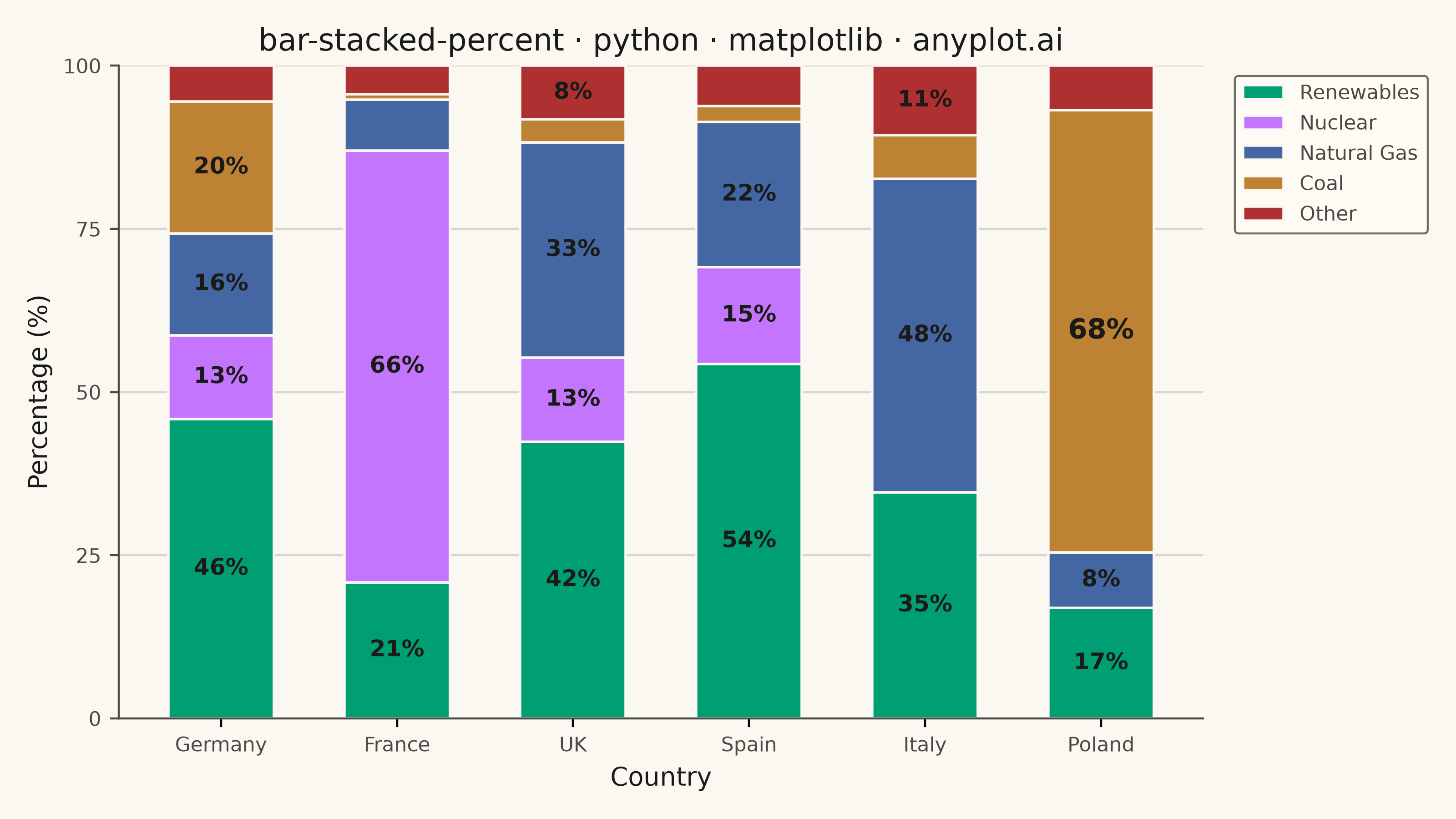
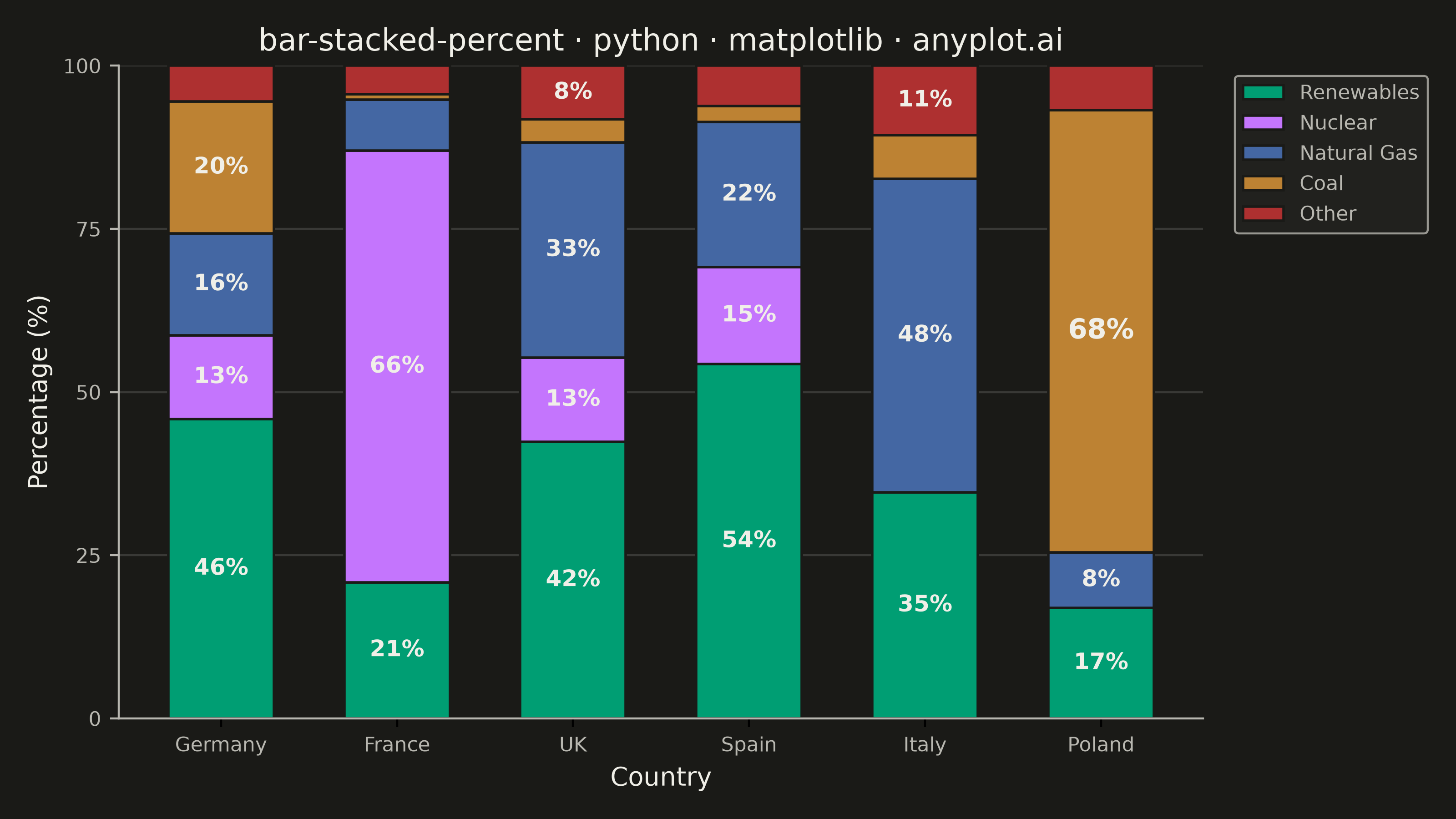
A 100% stacked bar chart displays multiple data series as proportional segments within each bar, where every bar is normalized to sum to 100%. This visualization emphasizes composition and relative proportions rather than absolute values, making it ideal for comparing how different components contribute to a whole across categories. It reveals patterns in distribution and share that might be obscured when absolute values vary significantly between categories.
""" anyplot.ai
bar-stacked-percent: 100% Stacked Bar Chart
Library: matplotlib 3.11.1 | Python 3.13.15
Quality: 90/100 | Updated: 2026-08-18
"""

import os

import matplotlib.pyplot as plt
import numpy as np


# Theme tokens
THEME = os.getenv("ANYPLOT_THEME", "light")
PAGE_BG = "#FAF8F1" if THEME == "light" else "#1A1A17"
ELEVATED_BG = "#FFFDF6" if THEME == "light" else "#242420"
INK = "#1A1A17" if THEME == "light" else "#F0EFE8"
INK_SOFT = "#4A4A44" if THEME == "light" else "#B8B7B0"

# Imprint palette (first series is ALWAYS position 1)
IMPRINT = ["#009E73", "#C475FD", "#4467A3", "#BD8233", "#AE3030"]

# Data: Energy mix by country (percentage of total electricity generation)
categories = ["Germany", "France", "UK", "Spain", "Italy", "Poland"]
components = ["Renewables", "Nuclear", "Natural Gas", "Coal", "Other"]

# Raw values (TWh) - will be normalized to 100%
data = np.array(
    [
        [250, 70, 85, 110, 30],  # Germany
        [120, 380, 45, 5, 25],  # France
        [180, 55, 140, 15, 35],  # UK
        [220, 60, 90, 10, 25],  # Spain
        [130, 0, 180, 25, 40],  # Italy
        [50, 0, 25, 200, 20],  # Poland
    ]
)

# Normalize to percentages
percentages = data / data.sum(axis=1, keepdims=True) * 100

# Standout segment (largest single share) gets a subtle size emphasis
standout_row, standout_col = np.unravel_index(np.argmax(percentages), percentages.shape)

# Plot
fig, ax = plt.subplots(figsize=(8, 4.5), dpi=400, facecolor=PAGE_BG)
ax.set_facecolor(PAGE_BG)

# Calculate cumulative percentages for stacking
x = np.arange(len(categories))
bar_width = 0.6
bottom = np.zeros(len(categories))

# Create stacked bars
for i, (component, color) in enumerate(zip(components, IMPRINT, strict=True)):
    bars = ax.bar(
        x, percentages[:, i], bar_width, bottom=bottom, label=component, color=color, edgecolor=PAGE_BG, linewidth=1.0
    )

    # In-segment percentage labels, suppressed below an 8% visibility threshold
    labels = [f"{pct:.0f}%" if pct >= 8 else "" for pct in percentages[:, i]]
    label_artists = ax.bar_label(bars, labels=labels, label_type="center", fontsize=9, fontweight="bold", color=INK)

    # Emphasize the single largest segment in the whole chart (data storytelling focal point)
    if i == standout_col:
        label_artists[standout_row].set_fontsize(11)

    bottom += percentages[:, i]

# Style
ax.set_xlabel("Country", fontsize=10, color=INK)
ax.set_ylabel("Percentage (%)", fontsize=10, color=INK)
ax.set_title("bar-stacked-percent · python · matplotlib · anyplot.ai", fontsize=12, color=INK, fontweight="medium")

ax.set_xticks(x)
ax.set_xticklabels(categories, fontsize=8, color=INK_SOFT)
ax.tick_params(axis="y", labelsize=8, colors=INK_SOFT)

ax.set_ylim(0, 100)
ax.set_yticks([0, 25, 50, 75, 100])

# Legend
leg = ax.legend(fontsize=8, loc="upper left", bbox_to_anchor=(1.02, 1))
if leg:
    leg.get_frame().set_facecolor(ELEVATED_BG)
    leg.get_frame().set_edgecolor(INK_SOFT)
    leg.get_frame().set_linewidth(0.8)
    plt.setp(leg.get_texts(), color=INK_SOFT)

# Grid
ax.yaxis.grid(True, alpha=0.15, linewidth=0.8, color=INK)
ax.set_axisbelow(True)

# Spines
ax.spines["top"].set_visible(False)
ax.spines["right"].set_visible(False)
for s in ("left", "bottom"):
    ax.spines[s].set_color(INK_SOFT)

plt.tight_layout()
plt.savefig(f"plot-{THEME}.png", dpi=400, facecolor=PAGE_BG)
Runnable source as JSON, for any HTTP client: https://api.anyplot.ai/specs/bar-stacked-percent/matplotlib/code. Any spec id and library id listed in llms-full.txt fit the same URL shape; every URL below is complete and callable.
{
  "spec_id": "bar-stacked-percent",
  "language": "python",
  "library": "matplotlib",
  "page": "https://anyplot.ai/bar-stacked-percent/python/matplotlib",
  "hub": "https://anyplot.ai/bar-stacked-percent",
  "code_json": "https://api.anyplot.ai/specs/bar-stacked-percent/matplotlib/code",
  "spec_json": "https://api.anyplot.ai/specs/bar-stacked-percent",
  "render_light_png": "https://storage.googleapis.com/anyplot-images/plots/bar-stacked-percent/python/matplotlib/plot-light.png",
  "render_dark_png": "https://storage.googleapis.com/anyplot-images/plots/bar-stacked-percent/python/matplotlib/plot-dark.png",
  "quality_score": 90.0,
  "license": "MIT",
  "guide": "https://anyplot.ai/llms.txt"
}
Part of 100% Stacked Bar Chart on anyplot.ai.