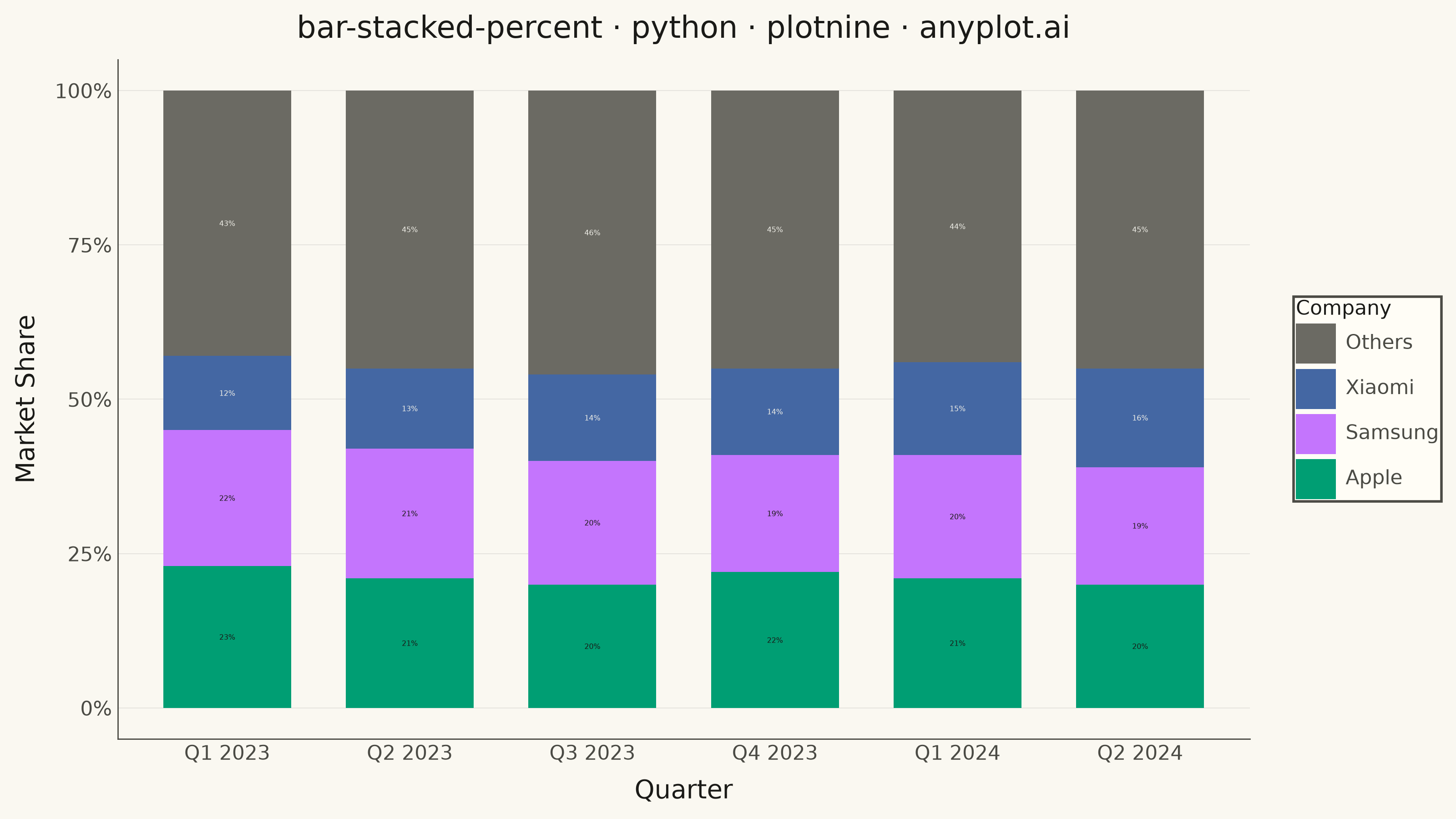
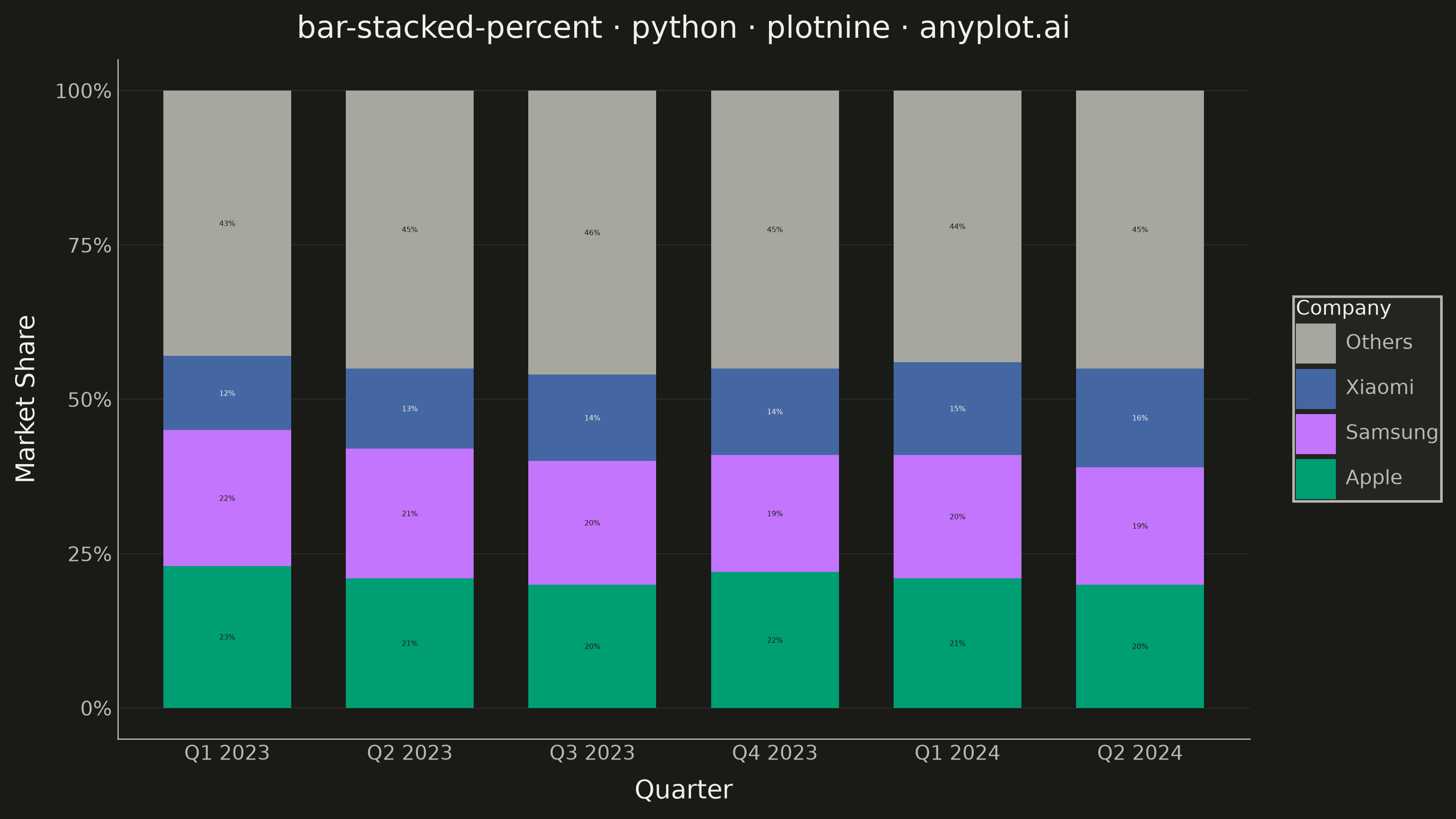
A 100% stacked bar chart displays multiple data series as proportional segments within each bar, where every bar is normalized to sum to 100%. This visualization emphasizes composition and relative proportions rather than absolute values, making it ideal for comparing how different components contribute to a whole across categories. It reveals patterns in distribution and share that might be obscured when absolute values vary significantly between categories.
""" anyplot.ai
bar-stacked-percent: 100% Stacked Bar Chart
Library: plotnine 0.15.8 | Python 3.13.15
Quality: 88/100 | Updated: 2026-08-18
"""

import os
import sys


sys.path = [p for p in sys.path if os.path.abspath(p) != os.getcwd()]

import pandas as pd
from mizani.formatters import percent_format
from plotnine import (
    aes,
    element_blank,
    element_line,
    element_rect,
    element_text,
    geom_bar,
    geom_text,
    ggplot,
    labs,
    position_fill,
    scale_color_identity,
    scale_fill_manual,
    scale_y_continuous,
    theme,
    theme_minimal,
)


# Theme tokens (see prompts/default-style-guide.md "Background" + "Theme-adaptive Chrome")
THEME = os.getenv("ANYPLOT_THEME", "light")
PAGE_BG = "#FAF8F1" if THEME == "light" else "#1A1A17"
ELEVATED_BG = "#FFFDF6" if THEME == "light" else "#242420"
INK = "#1A1A17" if THEME == "light" else "#F0EFE8"
INK_SOFT = "#4A4A44" if THEME == "light" else "#B8B7B0"
MUTED = "#6B6A63" if THEME == "light" else "#A8A79F"  # Imprint semantic anchor: other/rest

# Imprint palette — named competitors take positions 1-3 in canonical order;
# "Others" uses the muted semantic anchor since it is literally the aggregate
# rest-of-market bucket, not a distinct company.
IMPRINT = ["#009E73", "#C475FD", "#4467A3"]

# Data - smartphone market share by quarter
quarters = ["Q1 2023", "Q2 2023", "Q3 2023", "Q4 2023", "Q1 2024", "Q2 2024"]
companies_ordered = ["Others", "Xiaomi", "Samsung", "Apple"]
apple_share = [23, 21, 20, 22, 21, 20]
samsung_share = [22, 21, 20, 19, 20, 19]
xiaomi_share = [12, 13, 14, 14, 15, 16]
others_share = [43, 45, 46, 45, 44, 45]
data = {
    "Quarter": quarters * 4,
    "Company": (["Apple"] * 6 + ["Samsung"] * 6 + ["Xiaomi"] * 6 + ["Others"] * 6),
    "Share": apple_share + samsung_share + xiaomi_share + others_share,
}
df = pd.DataFrame(data)

# Set categorical ordering for proper display
df["Quarter"] = pd.Categorical(df["Quarter"], categories=quarters, ordered=True)
df["Company"] = pd.Categorical(df["Company"], categories=companies_ordered, ordered=True)

# Color mapping: Apple/Samsung/Xiaomi in canonical Imprint order, Others muted
color_map = {"Others": MUTED, "Xiaomi": IMPRINT[2], "Samsung": IMPRINT[1], "Apple": IMPRINT[0]}

# In-segment percentage labels (DE-03): pick whichever ink extreme has higher
# WCAG contrast against each segment's own fill color, so labels stay legible
# on both the mid-tone brand hues and the theme-adaptive "Others" gray.
LIGHT_INK = "#F0EFE8"
DARK_INK = "#1A1A17"


def _relative_luminance(hex_color):
    r, g, b = (int(hex_color[i : i + 2], 16) / 255 for i in (1, 3, 5))

    def _linearize(c):
        return c / 12.92 if c <= 0.03928 else ((c + 0.055) / 1.055) ** 2.4

    r, g, b = _linearize(r), _linearize(g), _linearize(b)
    return 0.2126 * r + 0.7152 * g + 0.0722 * b


def _contrast_ratio(l1, l2):
    lighter, darker = max(l1, l2), min(l1, l2)
    return (lighter + 0.05) / (darker + 0.05)


def _label_color(fill_hex):
    fill_l = _relative_luminance(fill_hex)
    light_contrast = _contrast_ratio(fill_l, _relative_luminance(LIGHT_INK))
    dark_contrast = _contrast_ratio(fill_l, _relative_luminance(DARK_INK))
    return LIGHT_INK if light_contrast >= dark_contrast else DARK_INK


df["Label"] = df["Share"].astype(str) + "%"
df["LabelColor"] = df["Company"].map(color_map).map(_label_color)

# Precompute label y-positions explicitly (SC-03/VQ-02 fix): geom_bar and
# geom_text each calling their own independent position_fill() can derive
# mismatched per-group cumulative offsets when the source rows are grouped
# by company rather than interleaved per quarter. Instead, compute the exact
# fill-stack midpoint per (Quarter, Company) ourselves -- stacked bottom-to-top
# as Apple/Samsung/Xiaomi/Others, i.e. the reverse of the legend/factor order,
# matching plotnine's default stacking -- and feed it to geom_text via
# position="identity" so both layers are guaranteed to agree.
stack_order_bottom_to_top = ["Apple", "Samsung", "Xiaomi", "Others"]
stack_rank = {company: rank for rank, company in enumerate(stack_order_bottom_to_top)}
# .map() on a Categorical column returns a Categorical result that inherits
# the *original* category order, so sorting by it would sort by category
# position rather than by the mapped rank value -- cast to plain strings
# first so the mapped ranks are ordinary integers.
df["StackRank"] = df["Company"].astype(str).map(stack_rank)
df = df.sort_values(["Quarter", "StackRank"]).reset_index(drop=True)
df["Fraction"] = df["Share"] / 100
cum_top = df.groupby("Quarter", observed=True)["Fraction"].cumsum()
cum_bottom = cum_top - df["Fraction"]
df["LabelY"] = (cum_top + cum_bottom) / 2

# Theme-adaptive chrome
anyplot_theme = theme(
    plot_background=element_rect(fill=PAGE_BG, color=PAGE_BG),
    panel_background=element_rect(fill=PAGE_BG, color=PAGE_BG),
    panel_border=element_blank(),
    panel_grid_major_x=element_blank(),
    panel_grid_major_y=element_line(color=INK, size=0.3, alpha=0.10),
    panel_grid_minor=element_blank(),
    axis_title=element_text(color=INK, size=10),
    axis_text=element_text(color=INK_SOFT, size=8),
    axis_line=element_line(color=INK_SOFT, size=0.5),
    plot_title=element_text(color=INK, size=12),
    legend_background=element_rect(fill=ELEVATED_BG, color=INK_SOFT),
    legend_title=element_text(color=INK, size=8),
    legend_text=element_text(color=INK_SOFT, size=8),
    legend_position="right",
    figure_size=(8, 4.5),
)

# Create 100% stacked bar chart with in-segment percentage labels
plot = (
    ggplot(df, aes(x="Quarter", y="Share", fill="Company"))
    + geom_bar(stat="identity", position=position_fill(), width=0.7)
    + geom_text(aes(y="LabelY", label="Label", color="LabelColor"), position="identity", size=2.8, show_legend=False)
    + scale_fill_manual(values=color_map)
    + scale_color_identity()
    + scale_y_continuous(labels=percent_format())
    + labs(title="bar-stacked-percent · python · plotnine · anyplot.ai", x="Quarter", y="Market Share", fill="Company")
    + theme_minimal()
    + anyplot_theme
)

# Save
plot.save(f"plot-{THEME}.png", dpi=400, width=8, height=4.5, units="in", verbose=False)
Runnable source as JSON, for any HTTP client: https://api.anyplot.ai/specs/bar-stacked-percent/plotnine/code. Any spec id and library id listed in llms-full.txt fit the same URL shape; every URL below is complete and callable.
{
  "spec_id": "bar-stacked-percent",
  "language": "python",
  "library": "plotnine",
  "page": "https://anyplot.ai/bar-stacked-percent/python/plotnine",
  "hub": "https://anyplot.ai/bar-stacked-percent",
  "code_json": "https://api.anyplot.ai/specs/bar-stacked-percent/plotnine/code",
  "spec_json": "https://api.anyplot.ai/specs/bar-stacked-percent",
  "render_light_png": "https://storage.googleapis.com/anyplot-images/plots/bar-stacked-percent/python/plotnine/plot-light.png",
  "render_dark_png": "https://storage.googleapis.com/anyplot-images/plots/bar-stacked-percent/python/plotnine/plot-dark.png",
  "quality_score": 88.0,
  "license": "MIT",
  "guide": "https://anyplot.ai/llms.txt"
}
Part of 100% Stacked Bar Chart on anyplot.ai.