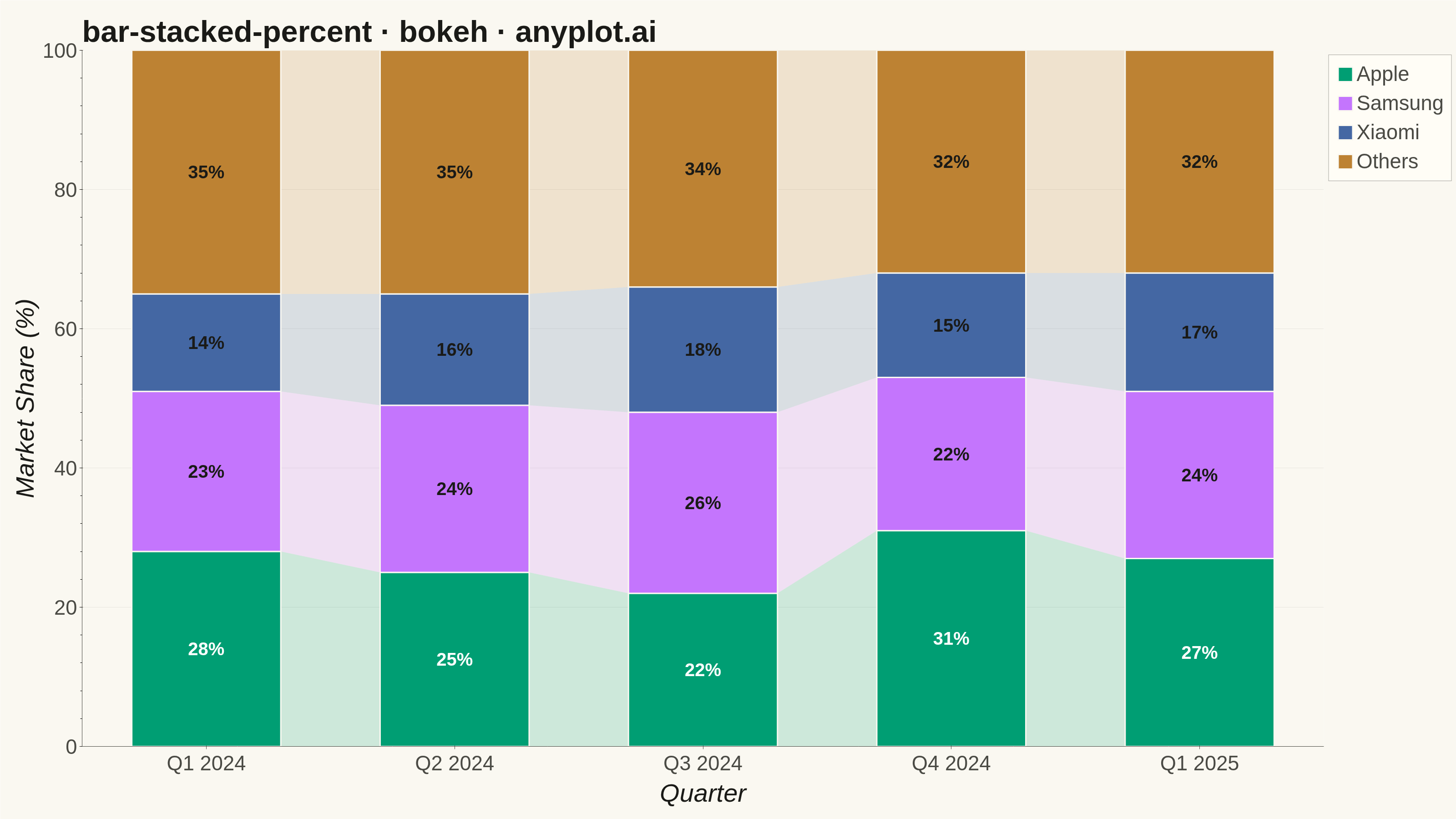
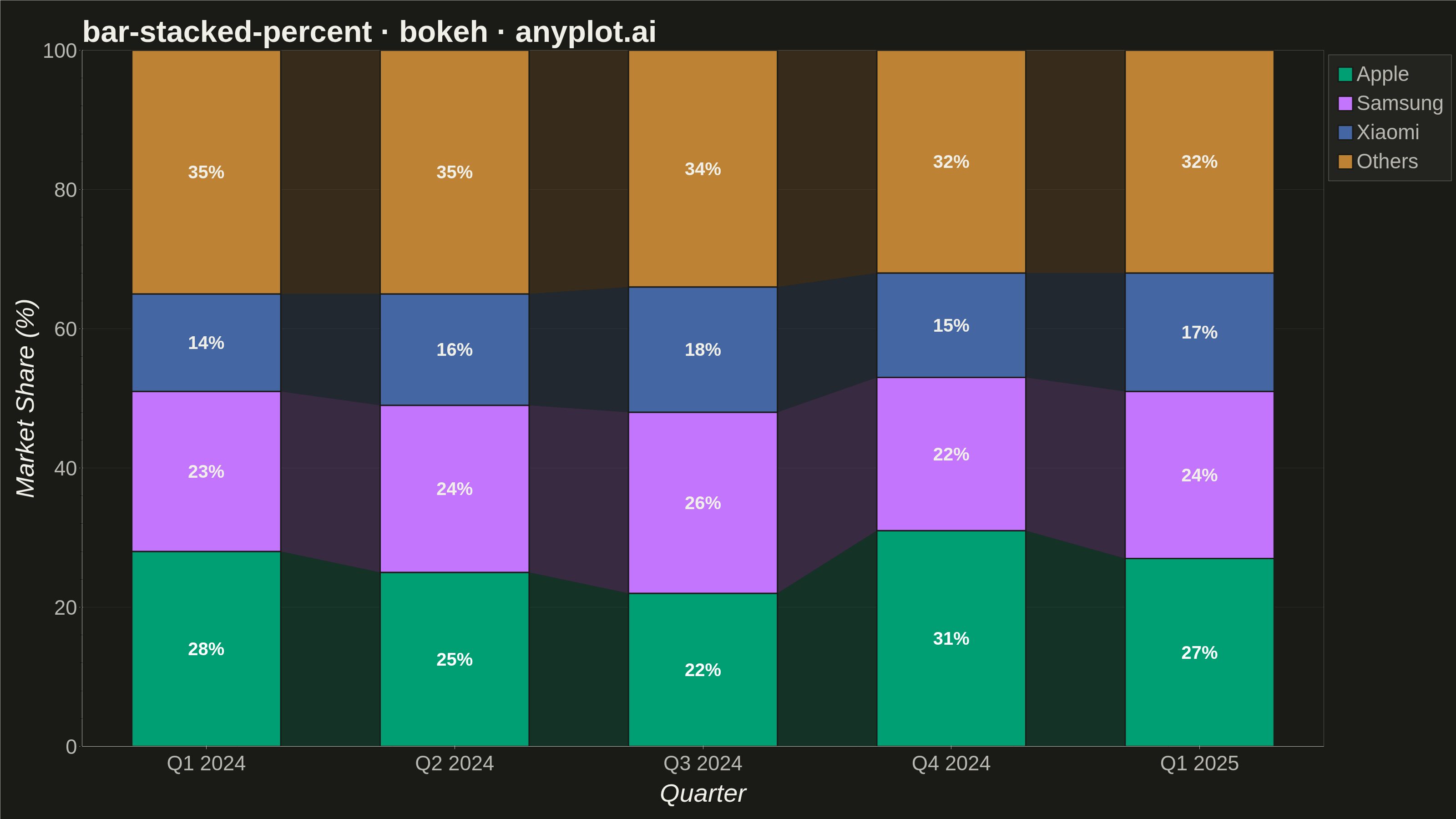
A 100% stacked bar chart displays multiple data series as proportional segments within each bar, where every bar is normalized to sum to 100%. This visualization emphasizes composition and relative proportions rather than absolute values, making it ideal for comparing how different components contribute to a whole across categories. It reveals patterns in distribution and share that might be obscured when absolute values vary significantly between categories.
""" anyplot.ai
bar-stacked-percent: 100% Stacked Bar Chart
Library: bokeh 3.9.2 | Python 3.13.15
Quality: 94/100 | Updated: 2026-08-18
"""

import os
import sys
import time
from pathlib import Path


# Workaround: Remove current directory from import path to avoid circular import
# when the file bokeh.py conflicts with the bokeh package name
original_path = sys.path.copy()
sys.path = [p for p in sys.path if p != "" and not (os.path.isfile(os.path.join(p, "bokeh.py")) if p else False)]

try:
    import pandas as pd
    from bokeh.io import output_file, save
    from bokeh.models import ColumnDataSource, FixedTicker, LabelSet
    from bokeh.plotting import figure
    from selenium import webdriver
    from selenium.webdriver.chrome.options import Options
finally:
    sys.path = original_path

# Theme tokens
THEME = os.getenv("ANYPLOT_THEME", "light")
PAGE_BG = "#FAF8F1" if THEME == "light" else "#1A1A17"
ELEVATED_BG = "#FFFDF6" if THEME == "light" else "#242420"
INK = "#1A1A17" if THEME == "light" else "#F0EFE8"
INK_SOFT = "#4A4A44" if THEME == "light" else "#B8B7B0"

# Imprint palette (first series is always #009E73)
IMPRINT = ["#009E73", "#C475FD", "#4467A3", "#BD8233"]

# Data: Market share of smartphone brands over quarters
categories = ["Q1 2024", "Q2 2024", "Q3 2024", "Q4 2024", "Q1 2025"]
components = ["Apple", "Samsung", "Xiaomi", "Others"]

raw_data = {
    "Apple": [28, 25, 22, 31, 27],
    "Samsung": [23, 24, 26, 22, 24],
    "Xiaomi": [14, 16, 18, 15, 17],
    "Others": [35, 35, 34, 32, 32],
}

# Calculate percentages (already sum to 100, but normalize for safety)
df = pd.DataFrame(raw_data, index=categories)
totals = df.sum(axis=1)
df_percent = df.div(totals, axis=0) * 100

# Calculate bottom positions for stacking
bottoms = {}
cumulative = [0.0] * len(categories)
for comp in components:
    bottoms[comp] = cumulative.copy()
    cumulative = [c + v for c, v in zip(cumulative, df_percent[comp], strict=True)]

# Numeric x positions (not a categorical FactorRange) so the flow ribbons
# below can interpolate between bar edges with real coordinates.
x_positions = list(range(len(categories)))
BAR_WIDTH = 0.6

# Create figure — `width`/`height` are the TOTAL canvas; min_border_* reserves
# room for the 34-42pt tick/axis-label stack so nothing clips at the edges.
p = figure(
    width=3200,
    height=1800,
    x_range=(-0.5, len(categories) - 0.5),
    y_range=(0, 100),
    title="bar-stacked-percent · bokeh · anyplot.ai",
    toolbar_location=None,  # default toolbar shrinks the saved PNG below target height
    min_border_bottom=160,
    min_border_left=180,
    min_border_top=110,
    min_border_right=50,
)
p.xaxis.ticker = FixedTicker(ticks=x_positions)
p.xaxis.major_label_overrides = dict(zip(x_positions, categories, strict=True))

# Flow ribbons between adjacent bars: a low-alpha quad tracing each
# component's segment boundary from one bar's right edge to the next bar's
# left edge. Drawn *before* the bars so the bars sit on top and the ribbons
# only show in the inter-bar gaps — this turns the quarter-to-quarter share
# change into a visible continuity cue instead of four disconnected columns,
# without adding any spec-unrequested text annotation.
for i, comp in enumerate(components):
    for j in range(len(categories) - 1):
        left_x = x_positions[j] + BAR_WIDTH / 2
        right_x = x_positions[j + 1] - BAR_WIDTH / 2
        left_bottom, left_top = bottoms[comp][j], bottoms[comp][j] + df_percent[comp].iloc[j]
        right_bottom, right_top = bottoms[comp][j + 1], bottoms[comp][j + 1] + df_percent[comp].iloc[j + 1]
        p.patch(
            x=[left_x, right_x, right_x, left_x],
            y=[left_bottom, right_bottom, right_top, left_top],
            fill_color=IMPRINT[i],
            fill_alpha=0.18,
            line_color=None,
        )

# Draw stacked bars
renderers = []
for i, comp in enumerate(components):
    source = ColumnDataSource(
        data={
            "x": x_positions,
            "top": [b + v for b, v in zip(bottoms[comp], df_percent[comp], strict=True)],
            "bottom": bottoms[comp],
            "value": df_percent[comp].tolist(),
        }
    )
    r = p.vbar(
        x="x",
        top="top",
        bottom="bottom",
        source=source,
        width=BAR_WIDTH,
        color=IMPRINT[i],
        legend_label=comp,
        line_color=PAGE_BG,
        line_width=3,
    )
    renderers.append(r)

# Move the auto-built legend outside the plot frame (dedicated right column)
# so it never overlaps the rightmost bar's segment labels — with 5 categories
# the "top_right" in-frame position sat directly on top of the Q1 2025 bar.
p.add_layout(p.legend[0], "right")

# Add percentage labels inside each segment
for i, comp in enumerate(components):
    values = df_percent[comp].tolist()
    mids = [(b + b + v) / 2 for b, v in zip(bottoms[comp], values, strict=True)]

    # Only show labels for segments >= 10%
    labels = [f"{v:.0f}%" if v >= 10 else "" for v in values]

    label_source = ColumnDataSource(data={"x": x_positions, "y": mids, "text": labels})

    # Text color: white on dark colors (first series), INK on light colors
    text_color = "white" if i == 0 else INK

    label_set = LabelSet(
        x="x",
        y="y",
        text="text",
        source=label_source,
        text_align="center",
        text_baseline="middle",
        text_font_size="30pt",
        text_color=text_color,
        text_font_style="bold",
    )
    p.add_layout(label_set)

# Styling for 3200x1800 canvas — see prompts/library/bokeh.md "Sizing"
p.title.text_font_size = "50pt"
p.title.text_color = INK
p.xaxis.axis_label = "Quarter"
p.yaxis.axis_label = "Market Share (%)"
p.xaxis.axis_label_text_font_size = "42pt"
p.yaxis.axis_label_text_font_size = "42pt"
p.xaxis.axis_label_text_color = INK
p.yaxis.axis_label_text_color = INK
p.xaxis.major_label_text_font_size = "34pt"
p.yaxis.major_label_text_font_size = "34pt"
p.xaxis.major_label_text_color = INK_SOFT
p.yaxis.major_label_text_color = INK_SOFT

# Axis colors
p.xaxis.axis_line_color = INK_SOFT
p.yaxis.axis_line_color = INK_SOFT
p.xaxis.major_tick_line_color = INK_SOFT
p.yaxis.major_tick_line_color = INK_SOFT

# Grid styling
p.xgrid.grid_line_color = None
p.ygrid.grid_line_color = INK_SOFT
p.ygrid.grid_line_alpha = 0.10

# Background and border
p.background_fill_color = PAGE_BG
p.border_fill_color = PAGE_BG
p.outline_line_color = None

# Legend styling (positioned in the dedicated right column via add_layout above)
p.legend.label_text_font_size = "34pt"
p.legend.label_text_color = INK_SOFT
p.legend.background_fill_color = ELEVATED_BG
p.legend.background_fill_alpha = 0.95
p.legend.border_line_color = INK_SOFT
p.legend.glyph_width = 40
p.legend.glyph_height = 40
p.legend.spacing = 12
p.legend.padding = 16

# Save HTML
output_file(f"plot-{THEME}.html")
save(p)

# Screenshot with headless Chrome via Selenium
W, H = 3200, 1800
opts = Options()
for arg in (
    "--headless=new",
    "--no-sandbox",
    "--disable-dev-shm-usage",
    "--disable-gpu",
    f"--window-size={W},{H}",
    "--hide-scrollbars",
):
    opts.add_argument(arg)
driver = webdriver.Chrome(options=opts)
driver.set_window_size(W, H)
driver.get(f"file://{Path(f'plot-{THEME}.html').resolve()}")
# Headless Chrome's --window-size sets the OUTER window, which still reserves
# a phantom title-bar height even headless — pin the viewport exactly via CDP.
driver.execute_cdp_cmd(
    "Emulation.setDeviceMetricsOverride", {"width": W, "height": H, "deviceScaleFactor": 1, "mobile": False}
)
time.sleep(3)
driver.save_screenshot(f"plot-{THEME}.png")
driver.quit()
Runnable source as JSON, for any HTTP client: https://api.anyplot.ai/specs/bar-stacked-percent/bokeh/code. Any spec id and library id listed in llms-full.txt fit the same URL shape; every URL below is complete and callable.
{
  "spec_id": "bar-stacked-percent",
  "language": "python",
  "library": "bokeh",
  "page": "https://anyplot.ai/bar-stacked-percent/python/bokeh",
  "hub": "https://anyplot.ai/bar-stacked-percent",
  "code_json": "https://api.anyplot.ai/specs/bar-stacked-percent/bokeh/code",
  "spec_json": "https://api.anyplot.ai/specs/bar-stacked-percent",
  "render_light_png": "https://storage.googleapis.com/anyplot-images/plots/bar-stacked-percent/python/bokeh/plot-light.png",
  "render_dark_png": "https://storage.googleapis.com/anyplot-images/plots/bar-stacked-percent/python/bokeh/plot-dark.png",
  "interactive_light_html": "https://storage.googleapis.com/anyplot-images/plots/bar-stacked-percent/python/bokeh/plot-light.html",
  "interactive_dark_html": "https://storage.googleapis.com/anyplot-images/plots/bar-stacked-percent/python/bokeh/plot-dark.html",
  "quality_score": 94.0,
  "license": "MIT",
  "guide": "https://anyplot.ai/llms.txt"
}
Part of 100% Stacked Bar Chart on anyplot.ai.