The same plot in 14 other libraries — JavaScript: Chart.js, D3.js, Apache ECharts, Highcharts; Python: Altair, Bokeh, lets-plot, Matplotlib, Plotly, plotnine, Pygal, Seaborn; R: ggplot2; Julia: Makie.jl. Compare all 15 side by side: 100% Stacked Bar Chart in Python, R, Julia and JavaScript.
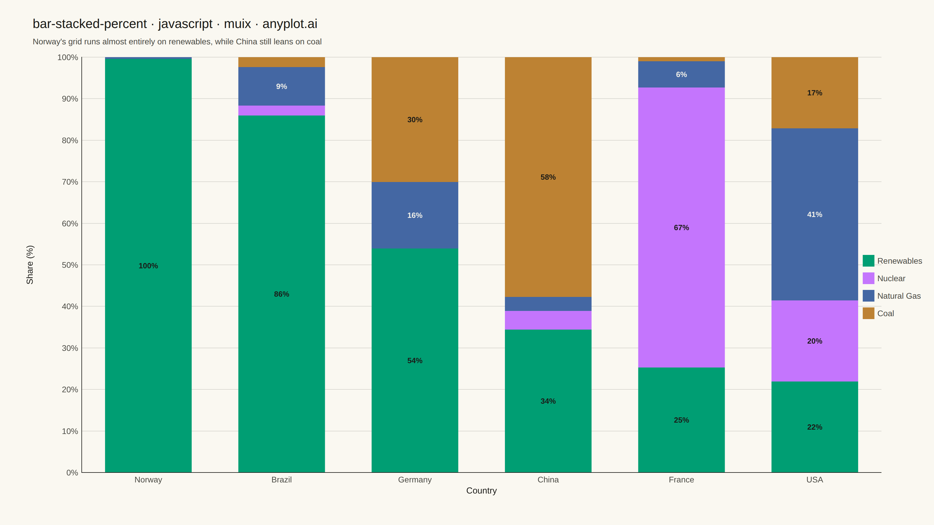
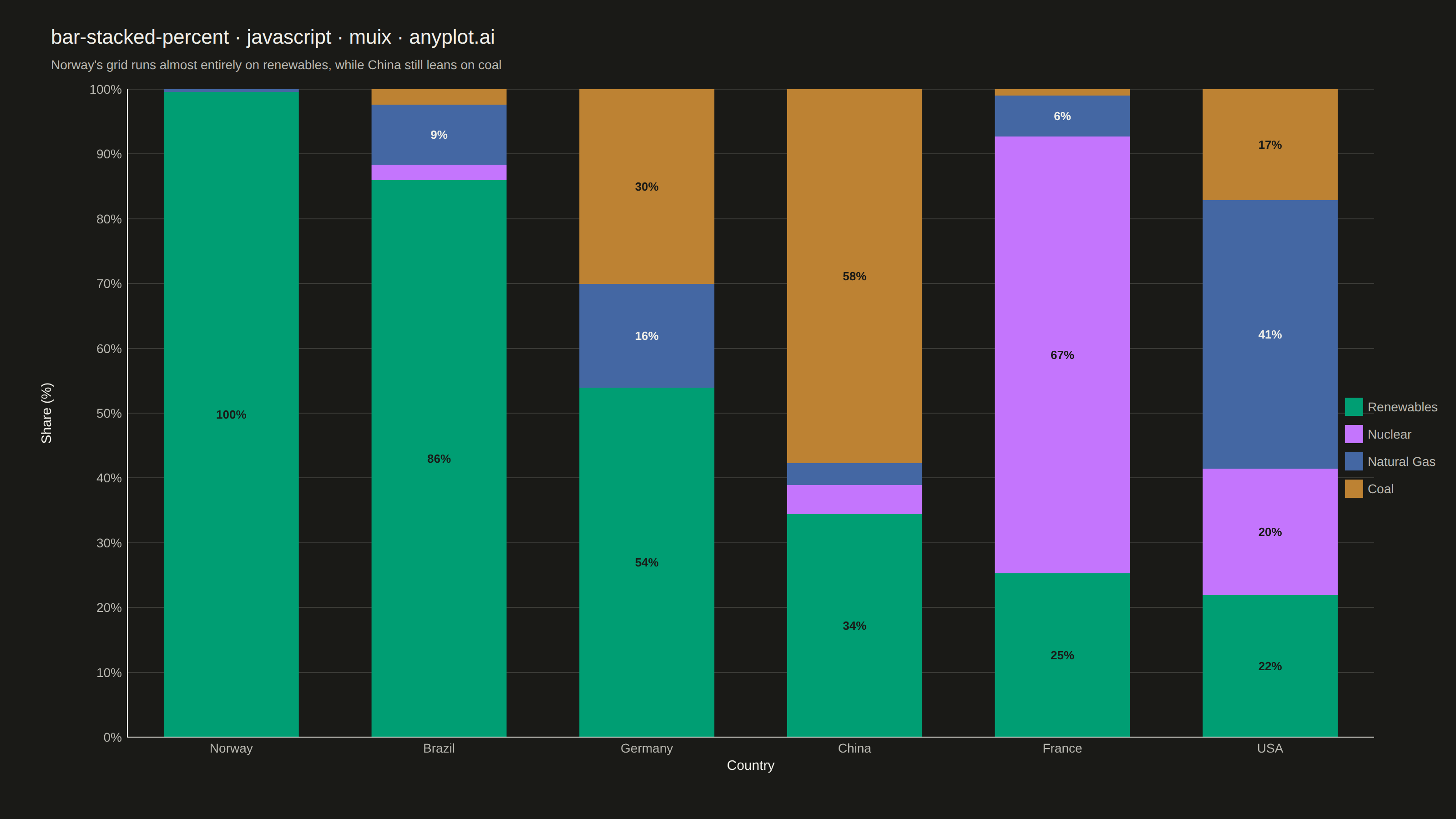
A 100% stacked bar chart displays multiple data series as proportional segments within each bar, where every bar is normalized to sum to 100%. This visualization emphasizes composition and relative proportions rather than absolute values, making it ideal for comparing how different components contribute to a whole across categories. It reveals patterns in distribution and share that might be obscured when absolute values vary significantly between categories.
// anyplot.ai
// bar-stacked-percent: 100% Stacked Bar Chart
// Library: muix 7.29.1 | JavaScript 22.23.2
// Quality: 94/100 | Created: 2026-08-18
import { BarChart } from "@mui/x-charts/BarChart";
import Box from "@mui/material/Box";
import Typography from "@mui/material/Typography";

const t = window.ANYPLOT_TOKENS;

// Fixed (non-theme-flipping) text colors for in-bar percentage labels — the
// segment fills stay the same hex in both themes, so label contrast is chosen
// per series color rather than following t.ink/t.inkSoft.
const LABEL_ON_LIGHT_FILL = "#1A1A17"; // dark ink — for the green/lavender/ochre segments
const LABEL_ON_DARK_FILL = "#F0EFE8"; // light ink — for the darker blue segment

// --- Data (in-memory, deterministic) ----------------------------------------
// Electricity generation mix (TWh/year, illustrative) for six grids whose
// total output spans two orders of magnitude — China dwarfs Norway in raw
// terawatt-hours, which is exactly why a percent-stacked view (composition)
// tells a clearer story here than a raw stacked view (dominated by scale).
const rawByCountry = {
  China: { renewables: 3100, nuclear: 400, gas: 300, coal: 5200 },
  USA: { renewables: 900, nuclear: 800, gas: 1700, coal: 700 },
  Germany: { renewables: 270, nuclear: 0, gas: 80, coal: 150 },
  France: { renewables: 120, nuclear: 320, gas: 30, coal: 5 },
  Brazil: { renewables: 550, nuclear: 15, gas: 60, coal: 15 },
  Norway: { renewables: 150, nuclear: 0, gas: 0.5, coal: 0.1 },
};

// Sorted descending by renewables share so the bars themselves form a visual
// gradient (all-renewable Norway -> coal-heavy China) that reinforces the
// subtitle's contrast, rather than an arbitrary country ordering.
const renewablesShare = (country) => {
  const raw = rawByCountry[country];
  const total = raw.renewables + raw.nuclear + raw.gas + raw.coal;
  return raw.renewables / total;
};
const countries = Object.keys(rawByCountry).sort((a, b) => renewablesShare(b) - renewablesShare(a));

// Renewables listed first so it lands on Imprint position 1 (brand green) —
// a natural semantic fit (growth/nature). Order stays fixed across every bar.
const components = [
  { id: "renewables", label: "Renewables", labelFill: LABEL_ON_LIGHT_FILL },
  { id: "nuclear", label: "Nuclear", labelFill: LABEL_ON_LIGHT_FILL },
  { id: "gas", label: "Natural Gas", labelFill: LABEL_ON_DARK_FILL },
  { id: "coal", label: "Coal", labelFill: LABEL_ON_LIGHT_FILL },
];
const labelFillById = Object.fromEntries(components.map((c) => [c.id, c.labelFill]));

const totalsByCountry = countries.map((country) =>
  components.reduce((sum, c) => sum + rawByCountry[country][c.id], 0),
);
const series = components.map((c) => ({
  id: c.id,
  label: c.label,
  stack: "total",
  data: countries.map((country, i) => (rawByCountry[country][c.id] / totalsByCountry[i]) * 100),
}));

export default function Chart() {
  const W = window.ANYPLOT_SIZE.width; // 1600 CSS px (landscape mount)
  const H = window.ANYPLOT_SIZE.height; // 900 CSS px
  const CHART_TOP = 84;

  return (
    <Box sx={{ position: "relative", width: W, height: H, bgcolor: t.pageBg }}>
      {/* Title + subtitle */}
      <Box sx={{ position: "absolute", top: 24, left: 56, right: 56 }}>
        <Typography sx={{ color: t.ink, fontSize: 22, fontWeight: 500 }}>
          bar-stacked-percent · javascript · muix · anyplot.ai
        </Typography>
        <Typography sx={{ color: t.inkSoft, fontSize: 14, mt: 0.5 }}>
          Norway's grid runs almost entirely on renewables, while China still leans on coal
        </Typography>
      </Box>

      {/* Bar chart */}
      <Box
        sx={{
          position: "absolute",
          top: CHART_TOP,
          left: 0,
          right: 0,
          bottom: 0,
        }}
      >
        <BarChart
          width={W}
          height={H - CHART_TOP}
          colors={t.palette}
          skipAnimation
          xAxis={[
            {
              scaleType: "band",
              data: countries,
              label: "Country",
              disableTicks: true,
              labelStyle: { fontSize: 15, fill: t.ink },
              tickLabelStyle: { fontSize: 14, fill: t.inkSoft },
              categoryGapRatio: 0.35,
            },
          ]}
          yAxis={[
            {
              label: "Share (%)",
              labelStyle: { fontSize: 15, fill: t.ink },
              // tickFontSize (unlike tickLabelStyle.fontSize) drives the axis
              // label's offset from the tick labels — pushed wide to clear
              // the "100%" tick text without inflating its visual size.
              tickFontSize: 70,
              tickLabelStyle: { fontSize: 14, fill: t.inkSoft },
              disableTicks: true,
              min: 0,
              max: 100,
              valueFormatter: (v) => `${v}%`,
            },
          ]}
          series={series.map((s) => ({
            ...s,
            valueFormatter: (v) => `${v.toFixed(1)}%`,
          }))}
          barLabel={(item) => (item.value != null && item.value >= 6 ? `${item.value.toFixed(0)}%` : null)}
          margin={{ top: 14, right: 90, bottom: 90, left: 140 }}
          grid={{ horizontal: true }}
          slotProps={{
            legend: {
              position: { vertical: "middle", horizontal: "right" },
              direction: "column",
              labelStyle: { fontSize: 14, fill: t.inkSoft },
            },
            barLabel: (ownerState) => ({
              style: {
                fontSize: 13,
                fontWeight: 600,
                fill: labelFillById[ownerState.seriesId] ?? LABEL_ON_LIGHT_FILL,
              },
            }),
          }}
          sx={{
            // Lighter, grid-weight axis line instead of the default full-ink
            // stroke — a more refined chrome treatment than the library default.
            "& .MuiChartsAxis-line": { stroke: t.grid },
            "& .MuiChartsGrid-line": { stroke: t.grid },
          }}
        />
      </Box>
    </Box>
  );
}
Runnable source as JSON, for any HTTP client: https://api.anyplot.ai/specs/bar-stacked-percent/muix/code. Any spec id and library id listed in llms-full.txt fit the same URL shape; every URL below is complete and callable.
{
  "spec_id": "bar-stacked-percent",
  "language": "javascript",
  "library": "muix",
  "page": "https://anyplot.ai/bar-stacked-percent/javascript/muix",
  "hub": "https://anyplot.ai/bar-stacked-percent",
  "code_json": "https://api.anyplot.ai/specs/bar-stacked-percent/muix/code",
  "spec_json": "https://api.anyplot.ai/specs/bar-stacked-percent",
  "render_light_png": "https://storage.googleapis.com/anyplot-images/plots/bar-stacked-percent/javascript/muix/plot-light.png",
  "render_dark_png": "https://storage.googleapis.com/anyplot-images/plots/bar-stacked-percent/javascript/muix/plot-dark.png",
  "interactive_light_html": "https://storage.googleapis.com/anyplot-images/plots/bar-stacked-percent/javascript/muix/plot-light.html",
  "interactive_dark_html": "https://storage.googleapis.com/anyplot-images/plots/bar-stacked-percent/javascript/muix/plot-dark.html",
  "quality_score": 94.0,
  "license": "MIT",
  "guide": "https://anyplot.ai/llms.txt"
}
Part of 100% Stacked Bar Chart on anyplot.ai.