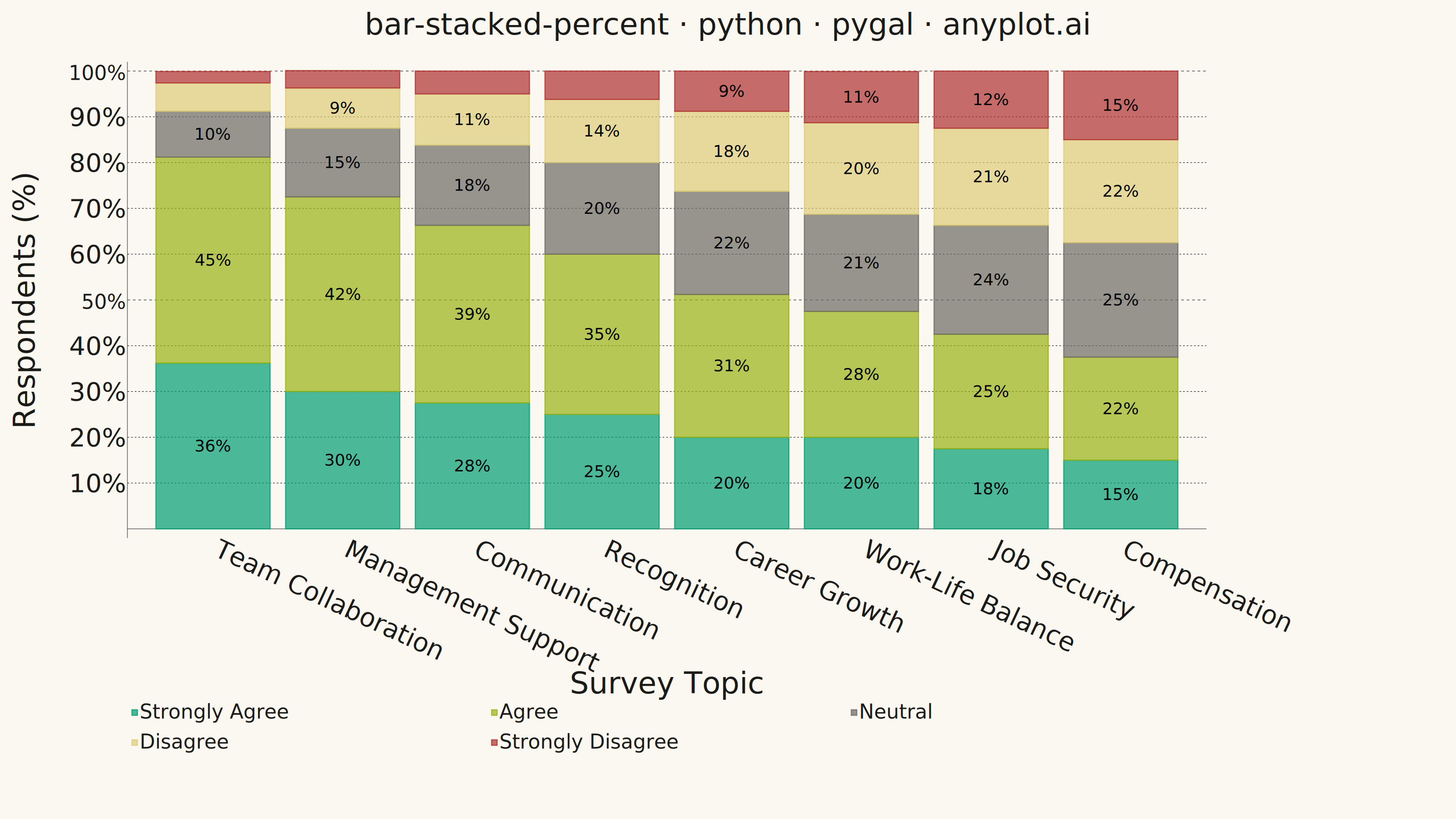
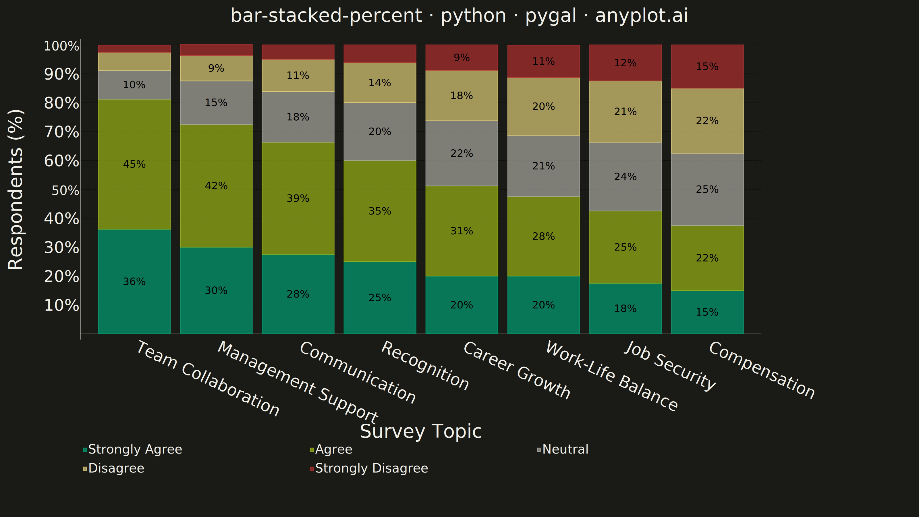
A 100% stacked bar chart displays multiple data series as proportional segments within each bar, where every bar is normalized to sum to 100%. This visualization emphasizes composition and relative proportions rather than absolute values, making it ideal for comparing how different components contribute to a whole across categories. It reveals patterns in distribution and share that might be obscured when absolute values vary significantly between categories.
""" anyplot.ai
bar-stacked-percent: 100% Stacked Bar Chart
Library: pygal 3.1.3 | Python 3.13.15
Quality: 88/100 | Updated: 2026-08-18
"""

import os

import pygal
from pygal.style import Style


THEME = os.getenv("ANYPLOT_THEME", "light")
PAGE_BG = "#FAF8F1" if THEME == "light" else "#1A1A17"
INK = "#1A1A17" if THEME == "light" else "#F0EFE8"
INK_MUTED = "#6B6A63" if THEME == "light" else "#A8A79F"

# Sentiment semantic exception (Imprint palette + anchors) — a Likert-scale
# response is a diverging polarity, not an abstract category, so we map it
# green (positive) -> lime -> muted (neutral) -> amber (warning) -> red (negative)
# instead of the canonical 1..N ordinal order. #009E73 stays series 1.
SENTIMENT_COLORS = ("#009E73", "#99B314", INK_MUTED, "#DDCC77", "#AE3030")

custom_style = Style(
    background=PAGE_BG,
    plot_background=PAGE_BG,
    foreground=INK,
    foreground_strong=INK,
    foreground_subtle=INK_MUTED,
    colors=SENTIMENT_COLORS,
    font_family="'Helvetica Neue', Helvetica, Arial, sans-serif",
    title_font_size=66,
    label_font_size=56,
    major_label_font_size=44,
    legend_font_size=44,
    value_font_size=36,
    stroke_width=2.5,
)

# Employee engagement survey, 400 respondents per topic, response counts per
# Likert level. Topics are listed in descending order of favorable response
# (Agree + Strongly Agree share) so the chart reads as a ranked story from
# the org's strongest area to its weakest.
topics = [
    "Team Collaboration",
    "Management Support",
    "Communication",
    "Recognition",
    "Career Growth",
    "Work-Life Balance",
    "Job Security",
    "Compensation",
]
strongly_disagree = [10, 15, 20, 25, 35, 45, 50, 60]
disagree = [25, 35, 45, 55, 70, 80, 85, 90]
neutral = [40, 60, 70, 80, 90, 85, 95, 100]
agree = [180, 170, 155, 140, 125, 110, 100, 90]
strongly_agree = [145, 120, 110, 100, 80, 80, 70, 60]

percent_strongly_agree = []
percent_agree = []
percent_neutral = []
percent_disagree = []
percent_strongly_disagree = []

for i in range(len(topics)):
    total = strongly_disagree[i] + disagree[i] + neutral[i] + agree[i] + strongly_agree[i]
    percent_strongly_agree.append(round(strongly_agree[i] / total * 100, 1))
    percent_agree.append(round(agree[i] / total * 100, 1))
    percent_neutral.append(round(neutral[i] / total * 100, 1))
    percent_disagree.append(round(disagree[i] / total * 100, 1))
    percent_strongly_disagree.append(round(strongly_disagree[i] / total * 100, 1))

chart = pygal.StackedBar(
    width=3200,
    height=1800,
    style=custom_style,
    title="bar-stacked-percent · python · pygal · anyplot.ai",
    x_title="Survey Topic",
    y_title="Respondents (%)",
    show_y_guides=True,
    show_x_guides=False,
    legend_at_bottom=True,
    print_values=True,
    print_values_position="center",
    # Segments below ~7% are shorter than value_font_size can render without
    # spilling outside their own colored band, so those labels are suppressed
    # rather than printed (their share is still visible from the band + legend).
    value_formatter=lambda x: f"{x:.0f}%" if x >= 7 else "",
    x_label_rotation=25,
    truncate_label=-1,
    margin=60,
    margin_bottom=90,
)

chart.x_labels = topics
chart.add("Strongly Agree", percent_strongly_agree)
chart.add("Agree", percent_agree)
chart.add("Neutral", percent_neutral)
chart.add("Disagree", percent_disagree)
chart.add("Strongly Disagree", percent_strongly_disagree)

chart.range = (0, 100)

chart.render_to_png(f"plot-{THEME}.png")
with open(f"plot-{THEME}.html", "wb") as f:
    f.write(chart.render())
Runnable source as JSON, for any HTTP client: https://api.anyplot.ai/specs/bar-stacked-percent/pygal/code. Any spec id and library id listed in llms-full.txt fit the same URL shape; every URL below is complete and callable.
{
  "spec_id": "bar-stacked-percent",
  "language": "python",
  "library": "pygal",
  "page": "https://anyplot.ai/bar-stacked-percent/python/pygal",
  "hub": "https://anyplot.ai/bar-stacked-percent",
  "code_json": "https://api.anyplot.ai/specs/bar-stacked-percent/pygal/code",
  "spec_json": "https://api.anyplot.ai/specs/bar-stacked-percent",
  "render_light_png": "https://storage.googleapis.com/anyplot-images/plots/bar-stacked-percent/python/pygal/plot-light.png",
  "render_dark_png": "https://storage.googleapis.com/anyplot-images/plots/bar-stacked-percent/python/pygal/plot-dark.png",
  "interactive_light_html": "https://storage.googleapis.com/anyplot-images/plots/bar-stacked-percent/python/pygal/plot-light.html",
  "interactive_dark_html": "https://storage.googleapis.com/anyplot-images/plots/bar-stacked-percent/python/pygal/plot-dark.html",
  "quality_score": 88.0,
  "license": "MIT",
  "guide": "https://anyplot.ai/llms.txt"
}
Part of 100% Stacked Bar Chart on anyplot.ai.