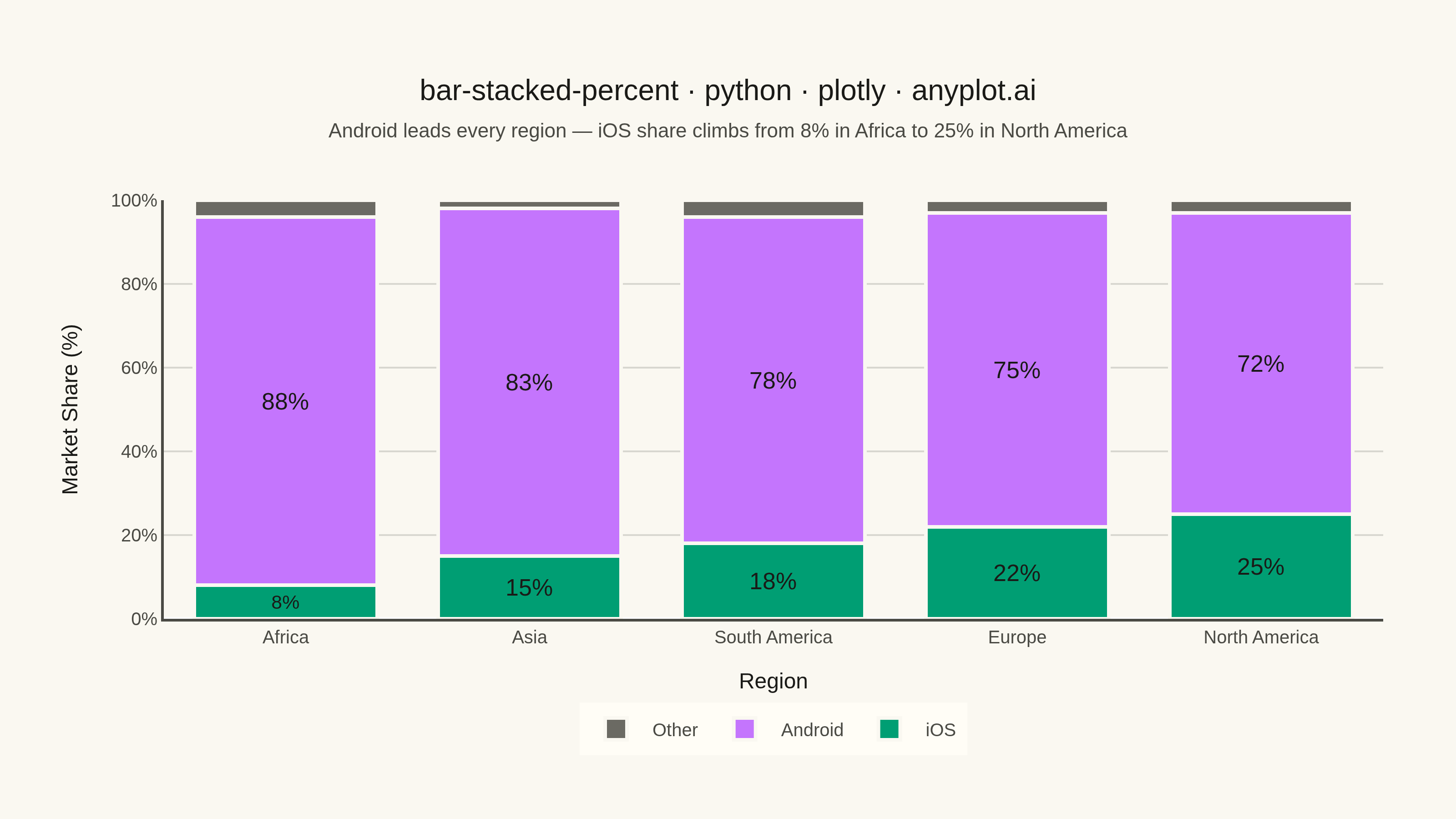
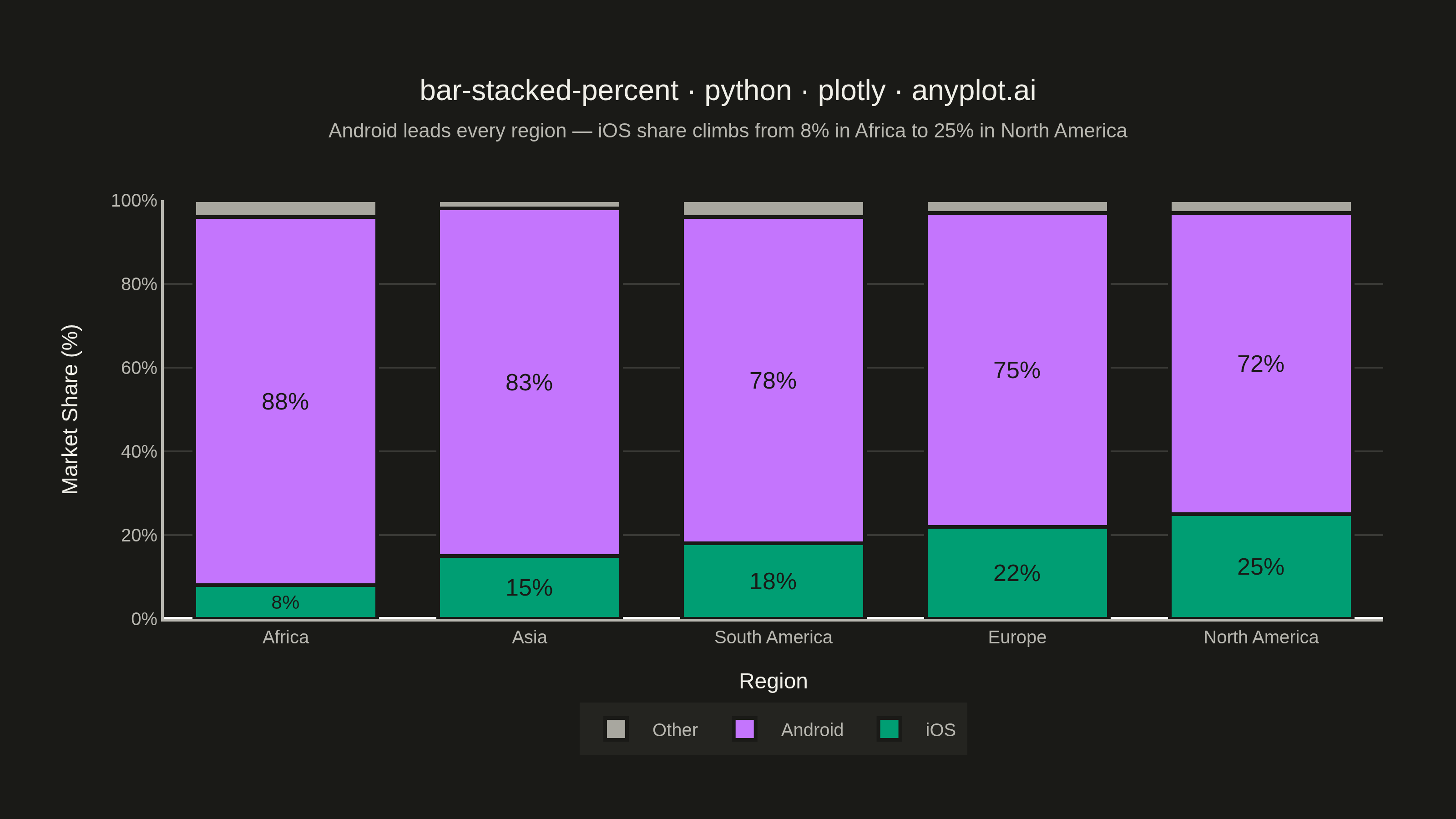
A 100% stacked bar chart displays multiple data series as proportional segments within each bar, where every bar is normalized to sum to 100%. This visualization emphasizes composition and relative proportions rather than absolute values, making it ideal for comparing how different components contribute to a whole across categories. It reveals patterns in distribution and share that might be obscured when absolute values vary significantly between categories.
""" anyplot.ai
bar-stacked-percent: 100% Stacked Bar Chart
Library: plotly 6.9.0 | Python 3.13.15
Quality: 90/100 | Updated: 2026-08-18
"""

import os

import plotly.graph_objects as go


# Theme tokens (see prompts/default-style-guide.md "Background" + "Theme-adaptive Chrome")
THEME = os.getenv("ANYPLOT_THEME", "light")
PAGE_BG = "#FAF8F1" if THEME == "light" else "#1A1A17"
ELEVATED_BG = "#FFFDF6" if THEME == "light" else "#242420"
INK = "#1A1A17" if THEME == "light" else "#F0EFE8"
INK_SOFT = "#4A4A44" if THEME == "light" else "#B8B7B0"
GRID = "rgba(26,26,23,0.15)" if THEME == "light" else "rgba(240,239,232,0.15)"

# Imprint categorical palette — first series is always #009E73
IMPRINT_PALETTE = ["#009E73", "#C475FD", "#4467A3", "#BD8233", "#AE3030", "#2ABCCD", "#954477", "#99B314"]
# "Other" is a semantic rest/remainder bucket — use the theme-adaptive muted anchor, not the next ordinal hue
ANYPLOT_MUTED = "#6B6A63" if THEME == "light" else "#A8A79F"


def _srgb_channel(c):
    return c / 12.92 if c <= 0.03928 else ((c + 0.055) / 1.055) ** 2.4


def contrast_text_color(bg_hex):
    """Pick white or ink label text — whichever clears WCAG contrast against bg_hex."""
    r, g, b = (int(bg_hex.lstrip("#")[i : i + 2], 16) / 255 for i in (0, 2, 4))
    lum = 0.2126 * _srgb_channel(r) + 0.7152 * _srgb_channel(g) + 0.0722 * _srgb_channel(b)
    contrast_white = 1.05 / (lum + 0.05)
    contrast_ink = (lum + 0.05) / 0.06  # ink (#1A1A17) luminance ≈ 0.01
    return "#FFFFFF" if contrast_white >= contrast_ink else "#1A1A17"


# Data: raw device shipments (millions) by OS and region, sorted ascending by
# iOS share so the bars read left-to-right as a rising narrative. Each region's
# shipment total differs (reflecting real market size) — percentages below are
# normalized from these raw counts, not hardcoded.
components = ["iOS", "Android", "Other"]
raw_shipments = {
    "Africa": [4, 44, 2],
    "Asia": [45, 249, 6],
    "South America": [27, 117, 6],
    "Europe": [44, 150, 6],
    "North America": [100, 288, 12],
}
categories = list(raw_shipments.keys())
data = {cat: [v / sum(values) * 100 for v in values] for cat, values in raw_shipments.items()}
colors = [IMPRINT_PALETTE[0], IMPRINT_PALETTE[1], ANYPLOT_MUTED]

# Plot — see default-style-guide.md "Visual Sizing Defaults" for the canvas + sizing values
fig = go.Figure()

for i, component in enumerate(components):
    values = [data[cat][i] for cat in categories]
    fig.add_trace(
        go.Bar(
            name=component,
            x=categories,
            y=values,
            marker=dict(color=colors[i], line=dict(color=PAGE_BG, width=2)),
            text=[f"{v:.0f}%" if v >= 6 else "" for v in values],
            textposition="inside",
            insidetextanchor="middle",
            textfont=dict(size=13, color=contrast_text_color(colors[i])),
            hovertemplate="<b>%{x}</b><br>%{fullData.name}: %{y:.0f}%<extra></extra>",
        )
    )

fig.update_layout(
    autosize=False,
    barmode="stack",
    bargap=0.25,
    title=dict(
        text="bar-stacked-percent · python · plotly · anyplot.ai",
        font=dict(size=16, color=INK),
        subtitle=dict(
            text="Android leads every region — iOS share climbs from 8% in Africa to 25% in North America",
            font=dict(size=11, color=INK_SOFT),
        ),
        x=0.5,
        xanchor="center",
    ),
    xaxis=dict(
        title=dict(text="Region", font=dict(size=12, color=INK)),
        tickfont=dict(size=10, color=INK_SOFT),
        showgrid=False,
        showline=True,
        linecolor=INK_SOFT,
        linewidth=1.5,
    ),
    yaxis=dict(
        title=dict(text="Market Share (%)", font=dict(size=12, color=INK)),
        tickfont=dict(size=10, color=INK_SOFT),
        range=[0, 100],
        ticksuffix="%",
        showgrid=True,
        gridcolor=GRID,
        showline=True,
        linecolor=INK_SOFT,
        linewidth=1.5,
    ),
    legend=dict(
        orientation="h",
        yanchor="top",
        y=-0.2,
        xanchor="center",
        x=0.5,
        font=dict(size=10, color=INK_SOFT),
        bgcolor=ELEVATED_BG,
        borderwidth=0,
    ),
    paper_bgcolor=PAGE_BG,
    plot_bgcolor=PAGE_BG,
    font=dict(color=INK),
    margin=dict(l=90, r=40, t=110, b=110),
    hovermode="x unified",
)

# Save — hard target 3200×1800 (landscape), see prompts/library/plotly.md "Canvas"
fig.write_image(f"plot-{THEME}.png", width=800, height=450, scale=4)
fig.write_html(f"plot-{THEME}.html", include_plotlyjs="cdn")
Runnable source as JSON, for any HTTP client: https://api.anyplot.ai/specs/bar-stacked-percent/plotly/code. Any spec id and library id listed in llms-full.txt fit the same URL shape; every URL below is complete and callable.
{
  "spec_id": "bar-stacked-percent",
  "language": "python",
  "library": "plotly",
  "page": "https://anyplot.ai/bar-stacked-percent/python/plotly",
  "hub": "https://anyplot.ai/bar-stacked-percent",
  "code_json": "https://api.anyplot.ai/specs/bar-stacked-percent/plotly/code",
  "spec_json": "https://api.anyplot.ai/specs/bar-stacked-percent",
  "render_light_png": "https://storage.googleapis.com/anyplot-images/plots/bar-stacked-percent/python/plotly/plot-light.png",
  "render_dark_png": "https://storage.googleapis.com/anyplot-images/plots/bar-stacked-percent/python/plotly/plot-dark.png",
  "interactive_light_html": "https://storage.googleapis.com/anyplot-images/plots/bar-stacked-percent/python/plotly/plot-light.html",
  "interactive_dark_html": "https://storage.googleapis.com/anyplot-images/plots/bar-stacked-percent/python/plotly/plot-dark.html",
  "quality_score": 90.0,
  "license": "MIT",
  "guide": "https://anyplot.ai/llms.txt"
}
Part of 100% Stacked Bar Chart on anyplot.ai.