The same plot in 14 other libraries — JavaScript: Chart.js, D3.js, Highcharts, MUI X Charts; Python: Altair, Bokeh, lets-plot, Matplotlib, Plotly, plotnine, Pygal, Seaborn; R: ggplot2; Julia: Makie.jl. Compare all 15 side by side: Basic Box Plot in Python, R, Julia and JavaScript.
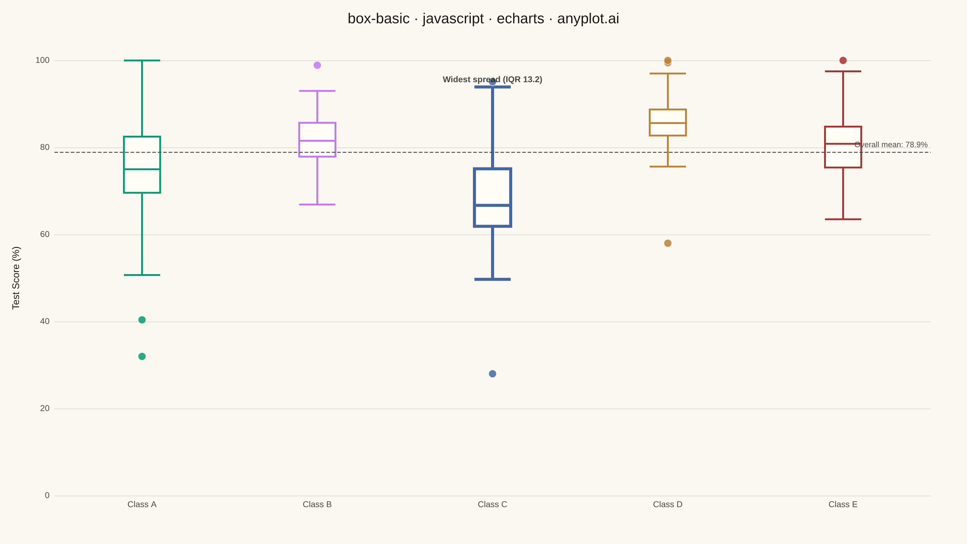
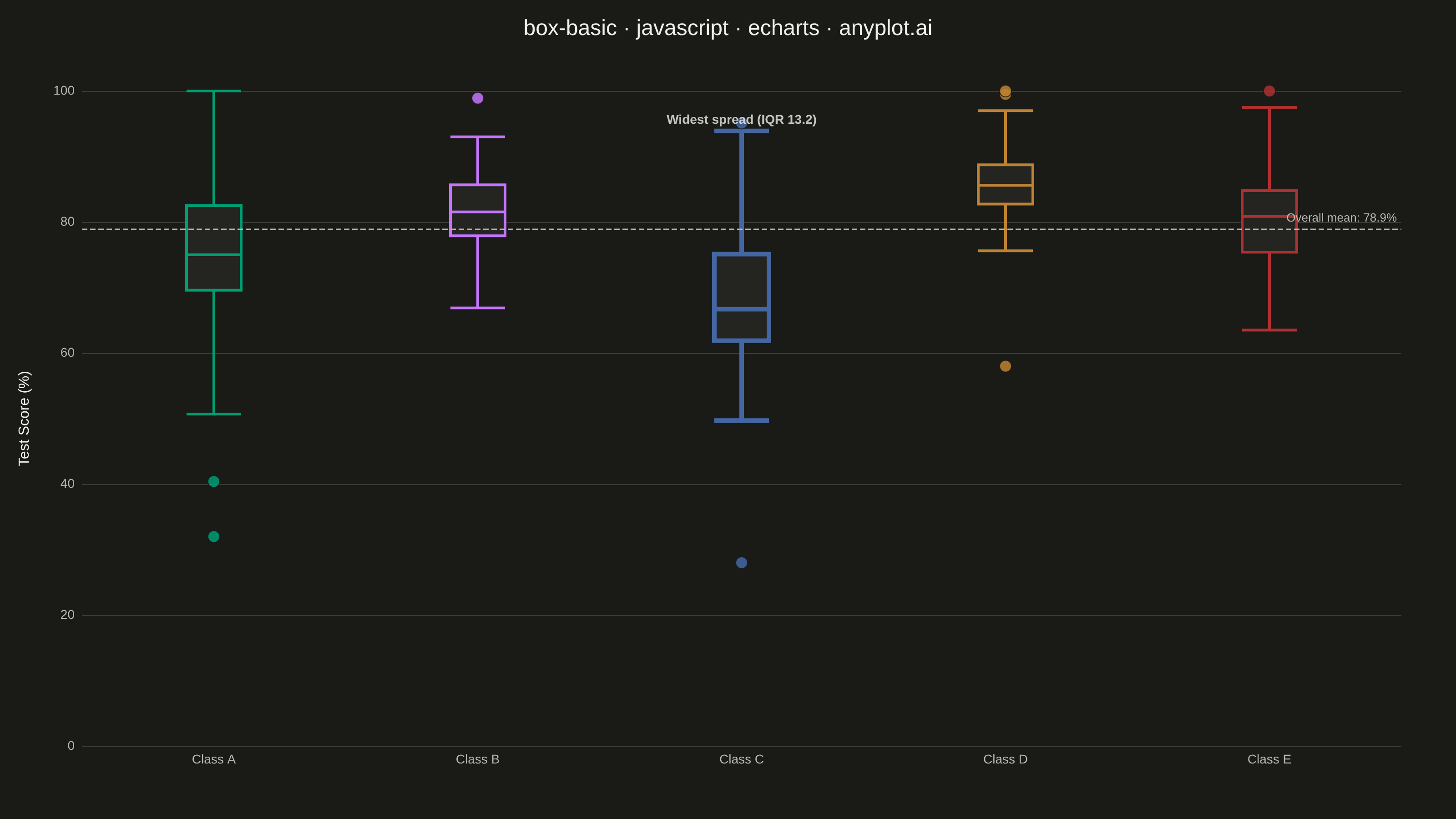
A box plot (box-and-whisker plot) showing the distribution of numerical data through quartiles. Displays the median, first and third quartiles as a box, with whiskers extending to show the data range. Essential for comparing distributions across categories and identifying outliers.
// anyplot.ai
// box-basic: Basic Box Plot
// Library: echarts 6.1.0 | JavaScript 22.23.2
// Quality: 88/100 | Created: 2026-08-24

const t = window.ANYPLOT_TOKENS;

// --- Data (in-memory, deterministic) ----------------------------------------
// Test scores (%) across 5 classes — Imprint palette positions 1-5, canonical
// order (abstract class labels carry no semantic color cue).
function makeLcg(seed) {
  let state = seed % 2147483647;
  if (state <= 0) state += 2147483646;
  return function uniform() {
    state = (state * 16807) % 2147483647;
    return (state - 1) / 2147483646;
  };
}
const rand = makeLcg(42);

function randNormal(mean, std) {
  const u1 = rand();
  const u2 = rand();
  const z = Math.sqrt(-2 * Math.log(u1)) * Math.cos(2 * Math.PI * u2);
  return mean + z * std;
}

const classes = [
  { name: "Class A", n: 65, mean: 76, std: 9, extra: [32, 99] },
  { name: "Class B", n: 72, mean: 83, std: 6, extra: [] },
  { name: "Class C", n: 60, mean: 71, std: 11, extra: [28] },
  { name: "Class D", n: 88, mean: 85, std: 5.5, extra: [58, 99.5] },
  { name: "Class E", n: 68, mean: 79, std: 8.5, extra: [] },
];

function percentile(sorted, p) {
  const idx = (sorted.length - 1) * p;
  const lo = Math.floor(idx);
  const hi = Math.ceil(idx);
  if (lo === hi) return sorted[lo];
  return sorted[lo] + (sorted[hi] - sorted[lo]) * (idx - lo);
}

const categoryNames = classes.map((c) => c.name);
const boxData = [];
const outlierData = [];
const allScores = [];
const iqrByClass = [];
const upperWhiskerByClass = [];

classes.forEach((cls, catIndex) => {
  const scores = [];
  for (let i = 0; i < cls.n; i++) {
    scores.push(Math.round(Math.min(100, Math.max(0, randNormal(cls.mean, cls.std))) * 10) / 10);
  }
  cls.extra.forEach((v) => scores.push(v));
  scores.sort((a, b) => a - b);
  allScores.push(...scores);

  const q1 = percentile(scores, 0.25);
  const median = percentile(scores, 0.5);
  const q3 = percentile(scores, 0.75);
  const iqr = q3 - q1;
  const lowerFence = q1 - 1.5 * iqr;
  const upperFence = q3 + 1.5 * iqr;

  const inliers = scores.filter((v) => v >= lowerFence && v <= upperFence);
  const outliers = scores.filter((v) => v < lowerFence || v > upperFence);

  iqrByClass.push(iqr);
  upperWhiskerByClass.push(inliers[inliers.length - 1]);

  const color = t.palette[catIndex];
  boxData.push({
    value: [inliers[0], q1, median, q3, inliers[inliers.length - 1]],
    itemStyle: { color: t.elevatedBg, borderColor: color, borderWidth: 3 },
  });
  outliers.forEach((v) => {
    outlierData.push({
      value: [catIndex, v],
      itemStyle: { color: color, opacity: 0.85, borderColor: t.pageBg, borderWidth: 1 },
    });
  });
});

// Data storytelling: call out the class with the widest spread (largest IQR)
// with a bolder border plus an annotation, and add an ECharts markLine
// referencing the overall mean across all classes.
const widestIdx = iqrByClass.indexOf(Math.max(...iqrByClass));
boxData[widestIdx].itemStyle.borderWidth = 5;
const overallMean = allScores.reduce((sum, v) => sum + v, 0) / allScores.length;
const calloutData = [
  {
    value: [widestIdx, upperWhiskerByClass[widestIdx]],
    label: {
      show: true,
      formatter: `Widest spread (IQR ${iqrByClass[widestIdx].toFixed(1)})`,
      position: "top",
      color: t.ink,
      fontSize: 14,
      fontWeight: 600,
    },
  },
];

// --- Init ---------------------------------------------------------------
const chart = echarts.init(document.getElementById("container"));

// --- Option ---------------------------------------------------------------
chart.setOption({
  animation: false,
  color: t.palette,
  backgroundColor: "transparent",
  title: {
    text: "box-basic · javascript · echarts · anyplot.ai",
    left: "center",
    textStyle: { color: t.ink, fontSize: 24, fontWeight: 500 },
  },
  grid: { left: 90, right: 60, top: 100, bottom: 80 },
  xAxis: {
    type: "category",
    data: categoryNames,
    boundaryGap: true,
    axisLabel: { color: t.inkSoft, fontSize: 14 },
    axisLine: { show: false },
    axisTick: { show: false },
    splitLine: { show: false },
  },
  yAxis: {
    type: "value",
    name: "Test Score (%)",
    nameLocation: "middle",
    nameGap: 55,
    nameTextStyle: { color: t.ink, fontSize: 16 },
    min: 0,
    max: 100,
    axisLabel: { color: t.inkSoft, fontSize: 14 },
    axisLine: { show: false },
    splitLine: { lineStyle: { color: t.grid } },
  },
  series: [
    {
      name: "Score distribution",
      type: "boxplot",
      data: boxData,
      boxWidth: [24, 60],
      markLine: {
        silent: true,
        symbol: "none",
        lineStyle: { color: t.inkSoft, type: "dashed", width: 1.5 },
        label: {
          formatter: `Overall mean: ${overallMean.toFixed(1)}%`,
          color: t.inkSoft,
          fontSize: 13,
          position: "insideEndTop",
        },
        data: [{ yAxis: overallMean }],
      },
    },
    {
      name: "Outliers",
      type: "scatter",
      data: outlierData,
      symbolSize: 13,
    },
    {
      name: "Spread callout",
      type: "scatter",
      data: calloutData,
      symbolSize: 0,
      silent: true,
      tooltip: { show: false },
    },
  ],
});
Runnable source as JSON, for any HTTP client: https://api.anyplot.ai/specs/box-basic/echarts/code. Any spec id and library id listed in llms-full.txt fit the same URL shape; every URL below is complete and callable.
{
  "spec_id": "box-basic",
  "language": "javascript",
  "library": "echarts",
  "page": "https://anyplot.ai/box-basic/javascript/echarts",
  "hub": "https://anyplot.ai/box-basic",
  "code_json": "https://api.anyplot.ai/specs/box-basic/echarts/code",
  "spec_json": "https://api.anyplot.ai/specs/box-basic",
  "render_light_png": "https://storage.googleapis.com/anyplot-images/plots/box-basic/javascript/echarts/plot-light.png",
  "render_dark_png": "https://storage.googleapis.com/anyplot-images/plots/box-basic/javascript/echarts/plot-dark.png",
  "interactive_light_html": "https://storage.googleapis.com/anyplot-images/plots/box-basic/javascript/echarts/plot-light.html",
  "interactive_dark_html": "https://storage.googleapis.com/anyplot-images/plots/box-basic/javascript/echarts/plot-dark.html",
  "quality_score": 88.0,
  "license": "MIT",
  "guide": "https://anyplot.ai/llms.txt"
}
Part of Basic Box Plot on anyplot.ai.