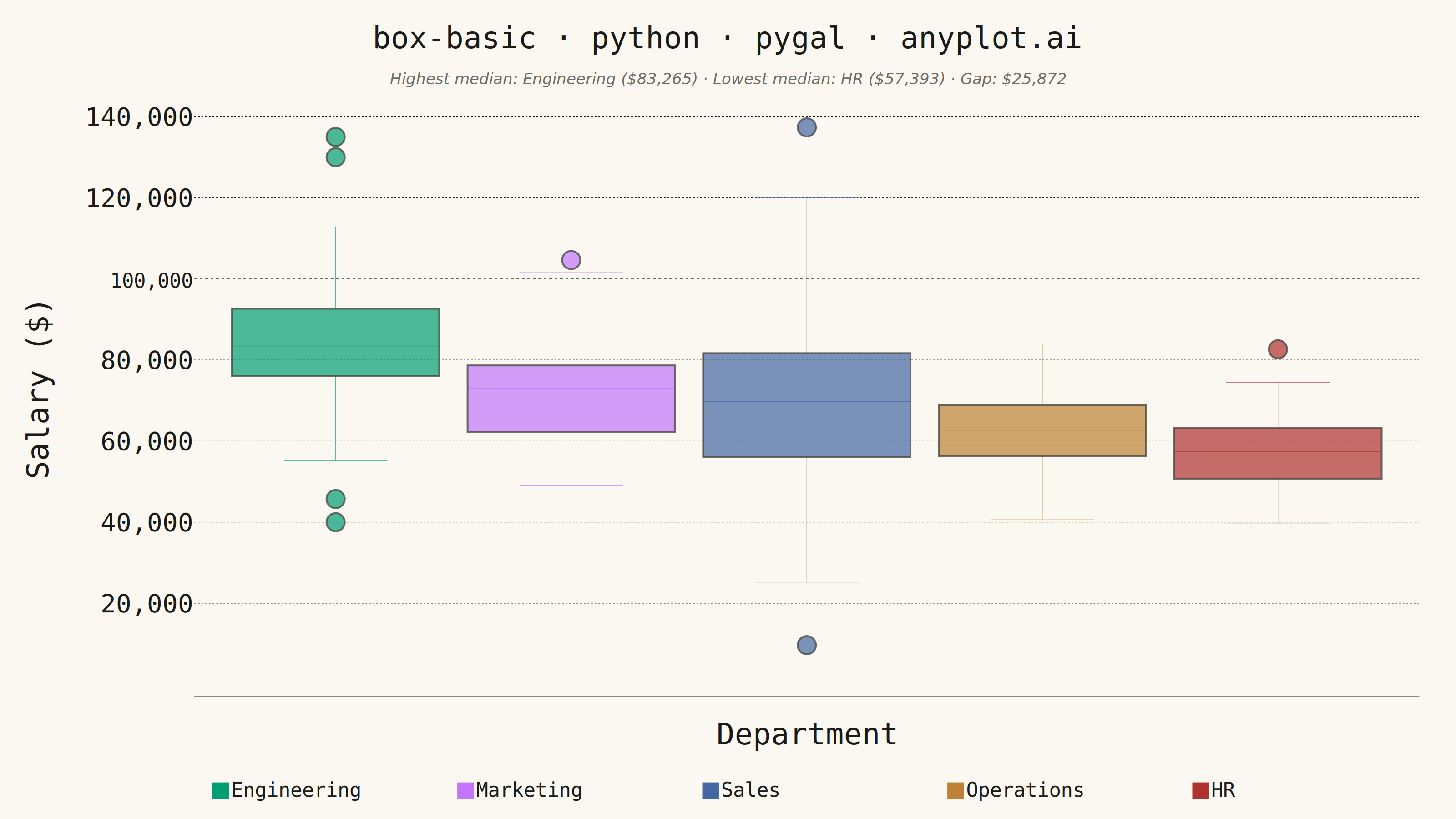
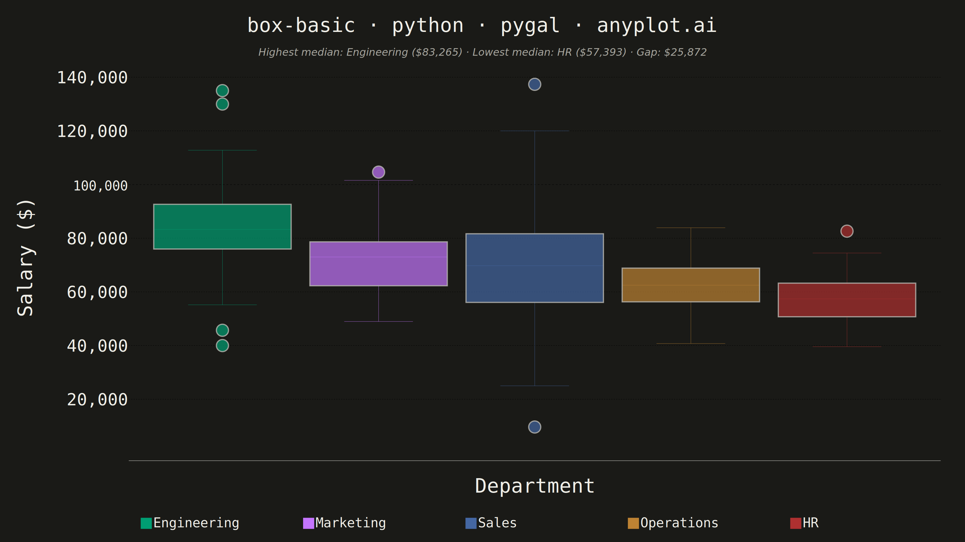
A box plot (box-and-whisker plot) showing the distribution of numerical data through quartiles. Displays the median, first and third quartiles as a box, with whiskers extending to show the data range. Essential for comparing distributions across categories and identifying outliers.
""" anyplot.ai
box-basic: Basic Box Plot
Library: pygal 3.1.0 | Python 3.13.13
Quality: 92/100 | Updated: 2026-05-28
"""

import os
import sys


# Remove this script's directory from sys.path so 'import pygal' finds the
# installed package rather than this file itself (same-name collision).
_here = os.path.dirname(os.path.abspath(__file__))
sys.path = [p for p in sys.path if os.path.abspath(p or ".") != _here]

import re

import cairosvg
import numpy as np
import pygal
from pygal.style import Style


THEME = os.getenv("ANYPLOT_THEME", "light")
PAGE_BG = "#FAF8F1" if THEME == "light" else "#1A1A17"
INK = "#1A1A17" if THEME == "light" else "#F0EFE8"
INK_SOFT = "#4A4A44" if THEME == "light" else "#B8B7B0"
INK_MUTED = "#6B6A63" if THEME == "light" else "#A8A79F"

IMPRINT_PALETTE = ("#009E73", "#C475FD", "#4467A3", "#BD8233", "#AE3030", "#2ABCCD", "#954477", "#99B314")

# Data
np.random.seed(42)
categories = ["Engineering", "Marketing", "Sales", "Operations", "HR"]
data = {
    "Engineering": np.random.normal(85000, 15000, 100),
    "Marketing": np.random.normal(72000, 12000, 100),
    "Sales": np.random.normal(68000, 18000, 100),
    "Operations": np.random.normal(62000, 10000, 100),
    "HR": np.random.normal(58000, 8000, 100),
}

data["Engineering"] = np.append(data["Engineering"], [130000, 135000, 40000])
data["Sales"] = np.append(data["Sales"], [120000, 25000])

medians = {cat: float(np.median(data[cat])) for cat in categories}
highest_dept = max(medians, key=medians.get)
lowest_dept = min(medians, key=medians.get)

title = "box-basic · python · pygal · anyplot.ai"
title_len = len(title)
title_font_size = round(66 * 67 / title_len) if title_len > 67 else 66

custom_style = Style(
    background=PAGE_BG,
    plot_background=PAGE_BG,
    foreground=INK,
    foreground_strong=INK,
    foreground_subtle=INK_MUTED,
    colors=IMPRINT_PALETTE,
    title_font_size=title_font_size,
    label_font_size=56,
    major_label_font_size=44,
    legend_font_size=44,
    value_font_size=36,
    opacity=1.0,
    opacity_hover=1.0,
)

# Plot
chart = pygal.Box(
    width=3200,
    height=1800,
    style=custom_style,
    title=title,
    x_title="Department",
    y_title="Salary ($)",
    show_legend=True,
    legend_at_bottom=True,
    legend_at_bottom_columns=5,
    legend_box_size=36,
    truncate_legend=-1,
    truncate_label=-1,
    show_y_guides=True,
    show_x_guides=False,
    margin=80,
    spacing=40,
    box_mode="tukey",
    range=(20000, 145000),
    y_labels=[20000, 40000, 60000, 80000, 100000, 120000, 140000],
)

for category in categories:
    chart.add(category, data[category].tolist())

svg_string = chart.render().decode("utf-8")

# Increase box fill opacity (pygal hardcodes subtle-fill at 0.2)
# Also add ink-colored border stroke to each box for publication-ready borders
svg_string = svg_string.replace(
    ".subtle-fill{fill-opacity:.2}", f".subtle-fill{{fill-opacity:.7;stroke:{INK_SOFT};stroke-width:4}}"
)

# Thicken series lines (whiskers + median) and remove heavy chart border
extra_css = ".series line{stroke-width:5}.background{stroke:none}"
svg_string = svg_string.replace("</style>", extra_css + "</style>", 1)

# Enlarge outlier dots (pygal hardcodes r=3 for box outliers)
svg_string = re.sub(r'(<circle[^>]*) r="3" (class="subtle-fill)', r'\1 r="20" \2', svg_string)

# Format y-axis tick labels with comma separators (e.g. 80000 → 80,000)
svg_string = re.sub(r">(\d{5,})<", lambda m: f">{int(m.group(1)):,}<", svg_string)

# Add storytelling subtitle annotation
annotation_svg = (
    f'<text x="1600" y="185" text-anchor="middle" '
    f'font-size="34" fill="{INK_MUTED}" font-family="sans-serif" font-style="italic">'
    f"Highest median: {highest_dept} (${medians[highest_dept]:,.0f})"
    f"  ·  Lowest median: {lowest_dept} (${medians[lowest_dept]:,.0f})"
    f"  ·  Gap: ${medians[highest_dept] - medians[lowest_dept]:,.0f}"
    f"</text>"
)
svg_string = svg_string.replace("</svg>", f"{annotation_svg}</svg>")

# Save
with open(f"plot-{THEME}.html", "w") as f:
    f.write(svg_string)

cairosvg.svg2png(bytestring=svg_string.encode("utf-8"), write_to=f"plot-{THEME}.png")
Runnable source as JSON, for any HTTP client: https://api.anyplot.ai/specs/box-basic/pygal/code. Any spec id and library id listed in llms-full.txt fit the same URL shape; every URL below is complete and callable.
{
  "spec_id": "box-basic",
  "language": "python",
  "library": "pygal",
  "page": "https://anyplot.ai/box-basic/python/pygal",
  "hub": "https://anyplot.ai/box-basic",
  "code_json": "https://api.anyplot.ai/specs/box-basic/pygal/code",
  "spec_json": "https://api.anyplot.ai/specs/box-basic",
  "render_light_png": "https://storage.googleapis.com/anyplot-images/plots/box-basic/python/pygal/plot-light.png",
  "render_dark_png": "https://storage.googleapis.com/anyplot-images/plots/box-basic/python/pygal/plot-dark.png",
  "interactive_light_html": "https://storage.googleapis.com/anyplot-images/plots/box-basic/python/pygal/plot-light.html",
  "interactive_dark_html": "https://storage.googleapis.com/anyplot-images/plots/box-basic/python/pygal/plot-dark.html",
  "quality_score": 92.0,
  "license": "MIT",
  "guide": "https://anyplot.ai/llms.txt"
}
Part of Basic Box Plot on anyplot.ai.