The same plot in 14 other libraries — Python: Altair, Bokeh, lets-plot, Matplotlib, Plotly, plotnine, Pygal, Seaborn; R: ggplot2; JavaScript: Chart.js, D3.js, Apache ECharts, Highcharts, MUI X Charts. Compare all 15 side by side: Basic Box Plot in Python, R, Julia and JavaScript.
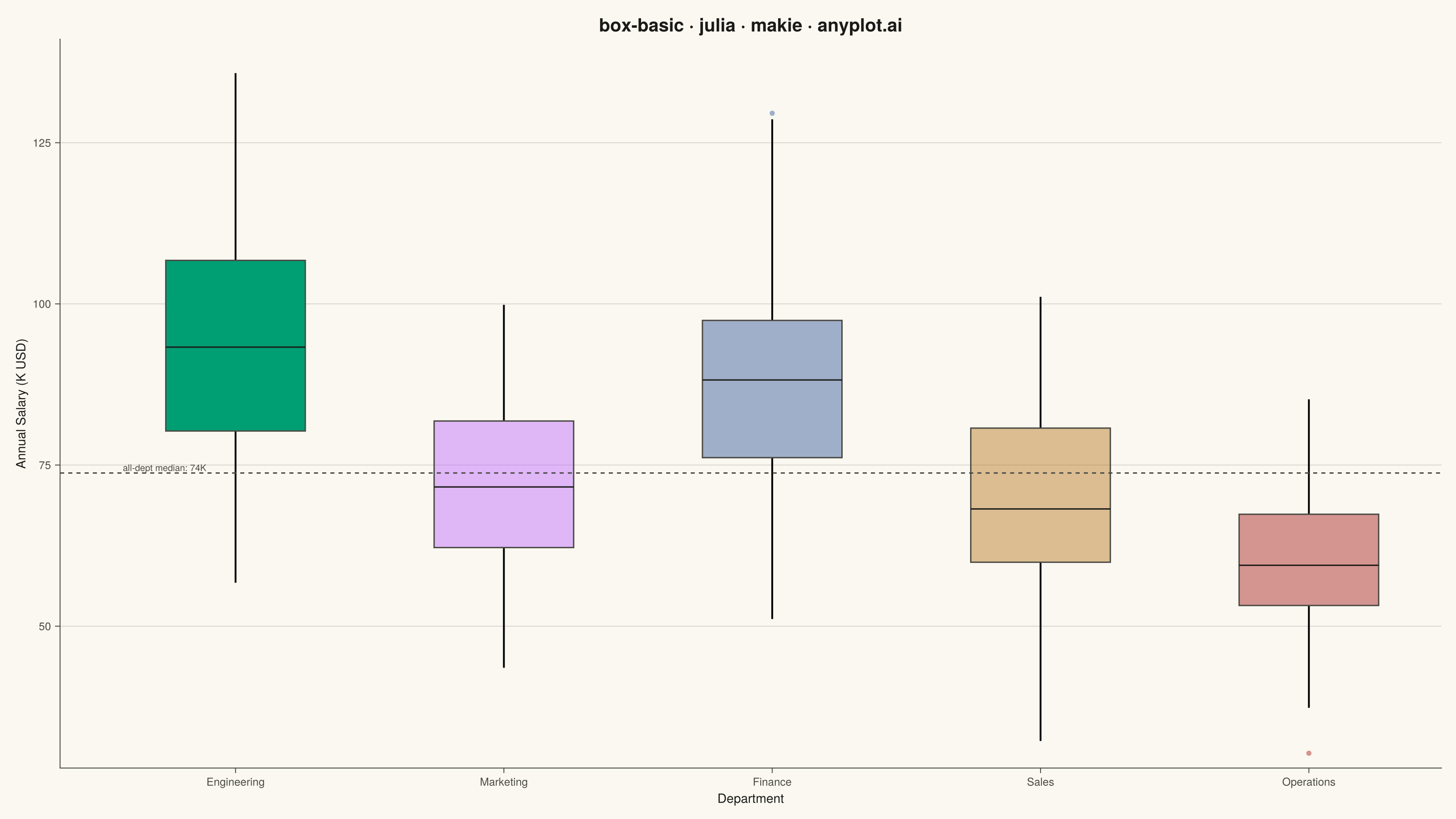
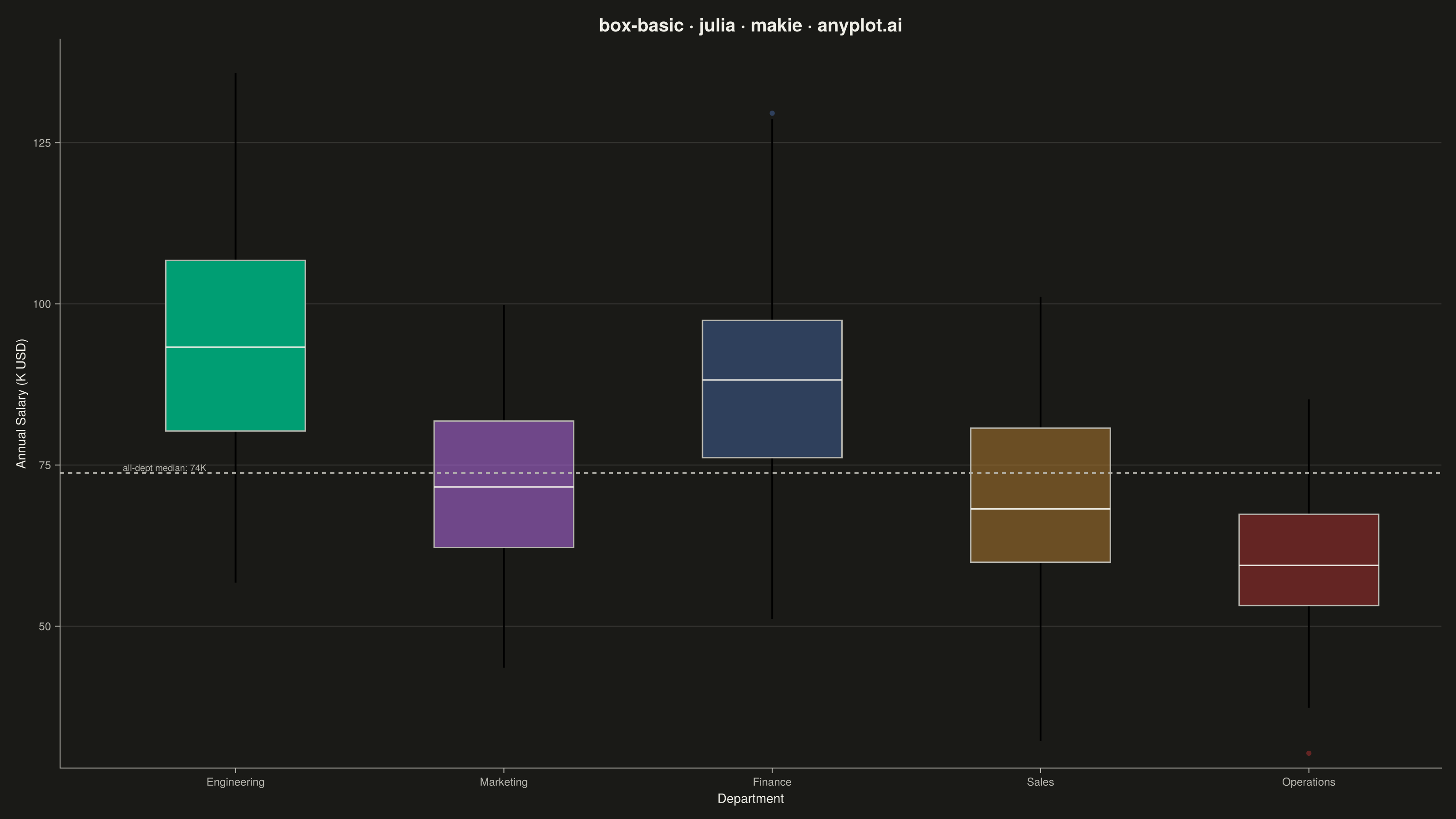
A box plot (box-and-whisker plot) showing the distribution of numerical data through quartiles. Displays the median, first and third quartiles as a box, with whiskers extending to show the data range. Essential for comparing distributions across categories and identifying outliers.
# anyplot.ai
# box-basic: Basic Box Plot
# Library: makie 0.22.10 | Julia 1.11.9
# Quality: 83/100 | Created: 2026-05-28

using CairoMakie
using Colors
using Random
using Statistics

Random.seed!(42)

# Theme tokens
const THEME    = get(ENV, "ANYPLOT_THEME", "light")
const PAGE_BG  = THEME == "light" ? colorant"#FAF8F1" : colorant"#1A1A17"
const INK      = THEME == "light" ? colorant"#1A1A17" : colorant"#F0EFE8"
const INK_SOFT = THEME == "light" ? colorant"#4A4A44" : colorant"#B8B7B0"
const IMPRINT_PALETTE = [
    colorant"#009E73",
    colorant"#C475FD",
    colorant"#4467A3",
    colorant"#BD8233",
    colorant"#AE3030",
]

# Data: annual salaries (K USD) across 5 company departments
dept_names = ["Engineering", "Marketing", "Finance", "Sales", "Operations"]
n_per_dept = [120, 80, 90, 100, 110]
dept_means = [95.0, 72.0, 88.0, 68.0, 62.0]
dept_stds  = [18.0, 14.0, 16.0, 15.0, 10.0]

groups   = Int[]
salaries = Float64[]
for i in 1:5
    append!(groups, fill(i, n_per_dept[i]))
    raw = randn(n_per_dept[i]) .* dept_stds[i] .+ dept_means[i]
    append!(salaries, max.(raw, 30.0))
end

all_median = median(salaries)

# Engineering (group 1) at full opacity; others dimmed to highlight highest-paid dept
box_colors = [
    RGBAf(red(IMPRINT_PALETTE[g]), green(IMPRINT_PALETTE[g]), blue(IMPRINT_PALETTE[g]),
          g == 1 ? 1.0 : 0.5)
    for g in groups
]

# Figure
fig = Figure(
    size            = (1600, 900),
    fontsize        = 14,
    backgroundcolor = PAGE_BG,
)

ax = Axis(
    fig[1, 1];
    title              = "box-basic · julia · makie · anyplot.ai",
    titlesize          = 20,
    titlecolor         = INK,
    xlabel             = "Department",
    ylabel             = "Annual Salary (K USD)",
    xlabelsize         = 14,
    ylabelsize         = 14,
    xlabelcolor        = INK,
    ylabelcolor        = INK,
    xticklabelsize     = 12,
    yticklabelsize     = 12,
    xticklabelcolor    = INK_SOFT,
    yticklabelcolor    = INK_SOFT,
    xtickcolor         = INK_SOFT,
    ytickcolor         = INK_SOFT,
    backgroundcolor    = PAGE_BG,
    topspinevisible    = false,
    rightspinevisible  = false,
    leftspinecolor     = INK_SOFT,
    bottomspinecolor   = INK_SOFT,
    xgridvisible       = false,
    ygridcolor         = RGBAf(red(INK), green(INK), blue(INK), 0.15),
    yminorgridvisible  = false,
    xminorgridvisible  = false,
)

boxplot!(ax, groups, salaries;
    color            = box_colors,
    strokecolor      = INK_SOFT,
    strokewidth      = 1.5,
    mediancolor      = INK,
    whiskerlinewidth = 2.0,
    width            = 0.65,
    markersize       = 8,
)

ax.xticks = (1:5, dept_names)

# Tighten y-axis to remove dead canvas space at bottom
ylims!(ax, 28, nothing)

# Dashed reference line at cross-department median
hlines!(ax, [all_median]; color = INK_SOFT, linestyle = :dash, linewidth = 1.5)
text!(ax, 0.58, all_median;
    text  = "all-dept median: $(round(Int, all_median))K",
    color = INK_SOFT,
    fontsize = 10,
    align = (:left, :bottom),
)

# Save
save("plot-$(THEME).png", fig; px_per_unit = 2)
Runnable source as JSON, for any HTTP client: https://api.anyplot.ai/specs/box-basic/makie/code. Any spec id and library id listed in llms-full.txt fit the same URL shape; every URL below is complete and callable.
{
  "spec_id": "box-basic",
  "language": "julia",
  "library": "makie",
  "page": "https://anyplot.ai/box-basic/julia/makie",
  "hub": "https://anyplot.ai/box-basic",
  "code_json": "https://api.anyplot.ai/specs/box-basic/makie/code",
  "spec_json": "https://api.anyplot.ai/specs/box-basic",
  "render_light_png": "https://storage.googleapis.com/anyplot-images/plots/box-basic/julia/makie/plot-light.png",
  "render_dark_png": "https://storage.googleapis.com/anyplot-images/plots/box-basic/julia/makie/plot-dark.png",
  "quality_score": 83.0,
  "license": "MIT",
  "guide": "https://anyplot.ai/llms.txt"
}
Part of Basic Box Plot on anyplot.ai.