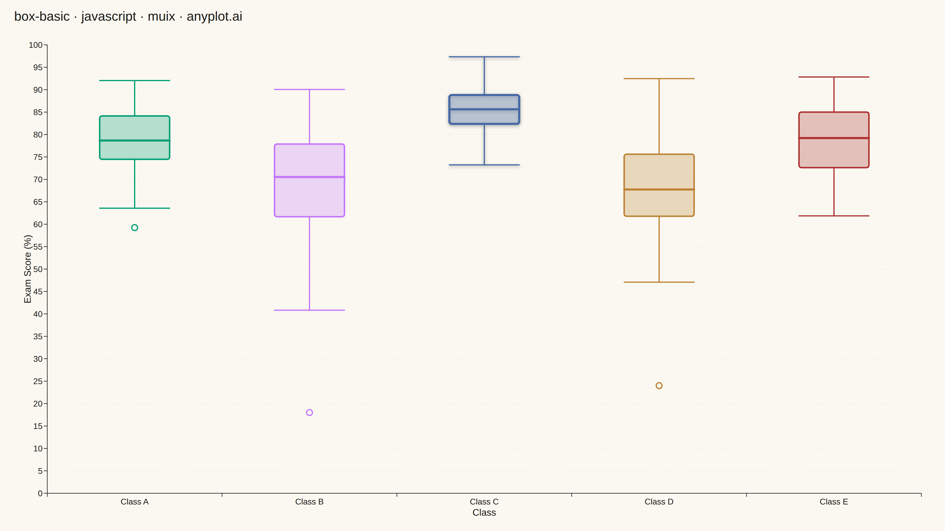
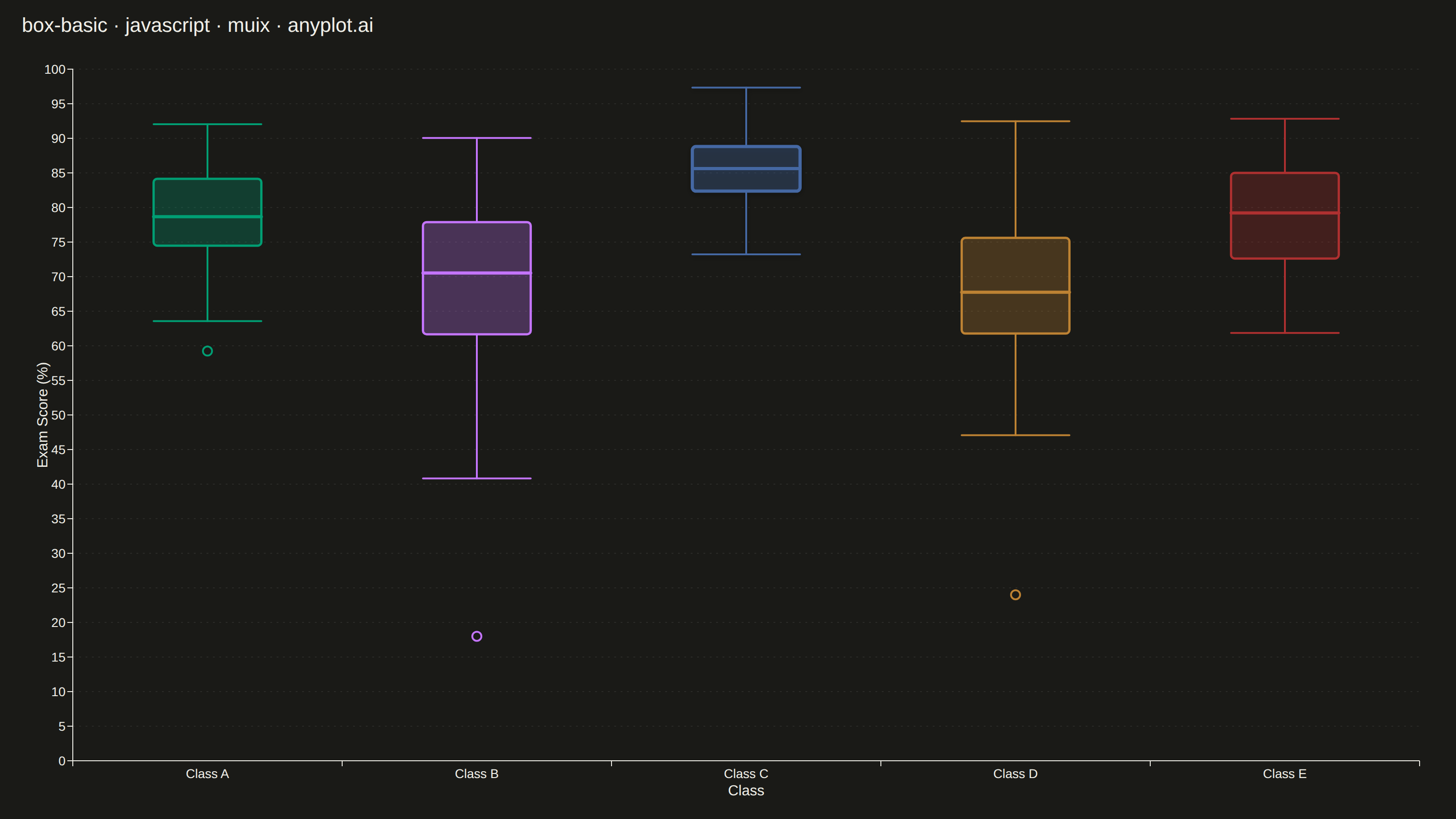
The same plot in 14 other libraries — JavaScript: Chart.js, D3.js, Apache ECharts, Highcharts; Python: Altair, Bokeh, lets-plot, Matplotlib, Plotly, plotnine, Pygal, Seaborn; R: ggplot2; Julia: Makie.jl. Compare all 15 side by side: Basic Box Plot in Python, R, Julia and JavaScript.
A box plot (box-and-whisker plot) showing the distribution of numerical data through quartiles. Displays the median, first and third quartiles as a box, with whiskers extending to show the data range. Essential for comparing distributions across categories and identifying outliers.
// anyplot.ai
// box-basic: Basic Box Plot
// Library: muix 7.29.1 | JavaScript 22.23.2
// Quality: 89/100 | Created: 2026-08-24
import { ChartContainer } from "@mui/x-charts/ChartContainer";
import { ChartsGrid } from "@mui/x-charts/ChartsGrid";
import { ChartsXAxis } from "@mui/x-charts/ChartsXAxis";
import { ChartsYAxis } from "@mui/x-charts/ChartsYAxis";
import { useXScale, useYScale } from "@mui/x-charts/hooks";

const t = window.ANYPLOT_TOKENS;
const TITLE = "box-basic · javascript · muix · anyplot.ai";
const TITLE_HEIGHT = 56;

// --- Data (in-memory, deterministic LCG — no seeded RNG in the browser) -----
function lcg(seed) {
  let state = seed;
  return () => {
    state = (state * 1664525 + 1013904223) % 4294967296;
    return state / 4294967296;
  };
}

function randomNormal(rand, mean, stdDev) {
  const u1 = Math.max(rand(), 1e-9);
  const u2 = rand();
  const z = Math.sqrt(-2 * Math.log(u1)) * Math.cos(2 * Math.PI * u2);
  return mean + z * stdDev;
}

// Exam scores across 5 classes — deliberately different spreads so the
// distributions read differently at a glance.
const classes = [
  { name: "Class A", mean: 78, std: 7, size: 62 },
  { name: "Class B", mean: 71, std: 13, size: 58 },
  { name: "Class C", mean: 85, std: 5, size: 74 },
  { name: "Class D", mean: 68, std: 11, size: 55 },
  { name: "Class E", mean: 80, std: 9, size: 66 },
];

const rand = lcg(42);

function quantile(sorted, q) {
  const pos = (sorted.length - 1) * q;
  const base = Math.floor(pos);
  const rest = pos - base;
  return base + 1 < sorted.length
    ? sorted[base] + rest * (sorted[base + 1] - sorted[base])
    : sorted[base];
}

// A couple of classes get one deliberate, deterministic extreme score on top
// of the random draws (e.g. a single struggling or exceptional student) so
// the outlier-marker feature is demonstrated in more than one class instead
// of relying on chance alone.
const injectedOutliers = { "Class B": 18, "Class D": 24 };

const boxStats = classes.map(({ name, mean, std, size }) => {
  const scores = Array.from({ length: size }, () =>
    Math.min(100, Math.max(0, randomNormal(rand, mean, std))),
  );
  if (name in injectedOutliers) scores.push(injectedOutliers[name]);
  scores.sort((a, b) => a - b);

  const q1 = quantile(scores, 0.25);
  const median = quantile(scores, 0.5);
  const q3 = quantile(scores, 0.75);
  const iqr = q3 - q1;
  const lowerFence = q1 - 1.5 * iqr;
  const upperFence = q3 + 1.5 * iqr;
  const inliers = scores.filter((s) => s >= lowerFence && s <= upperFence);
  const outliers = scores.filter((s) => s < lowerFence || s > upperFence);

  return {
    name,
    q1,
    median,
    q3,
    whiskerLow: inliers.length ? Math.min(...inliers) : q1,
    whiskerHigh: inliers.length ? Math.max(...inliers) : q3,
    outliers,
  };
});

const categories = boxStats.map((s) => s.name);

// The tightest, highest-scoring distribution is the clearest "best in class"
// story the data tells on its own — give it a subtle visual focal point
// (bolder stroke + soft shadow) rather than a text callout.
const focalClass = boxStats.reduce((best, s) =>
  s.q3 - s.q1 < best.q3 - best.q1 ? s : best,
).name;

// --- Box-and-whisker overlay -------------------------------------------------
// The community package (7.29.1) has no BoxPlot component (Pro-only in other
// charting suites is irrelevant here — @mui/x-charts community simply doesn't
// ship one). A custom SVG layer positioned via the chart's own band/linear
// scale hooks reproduces it while staying entirely within the community
// ChartContainer surface — the same technique used for span overlays.
function BoxWhiskers() {
  const xScale = useXScale();
  const yScale = useYScale();
  const bandwidth = xScale.bandwidth();
  const boxWidth = bandwidth * 0.5;

  return (
    <g>
      <defs>
        <filter id="box-focal-shadow" x="-40%" y="-40%" width="180%" height="180%">
          <feDropShadow dx="0" dy="2" stdDeviation="3" floodOpacity={0.35} />
        </filter>
      </defs>
      {boxStats.map((s, i) => {
        const center = xScale(s.name) + bandwidth / 2;
        const left = center - boxWidth / 2;
        const right = center + boxWidth / 2;
        const color = t.palette[i % t.palette.length];
        const isFocal = s.name === focalClass;
        const boxStroke = isFocal ? 3.5 : 2.5;

        return (
          <g
            key={s.name}
            filter={isFocal ? "url(#box-focal-shadow)" : undefined}
          >
            <line
              x1={center}
              x2={center}
              y1={yScale(s.whiskerHigh)}
              y2={yScale(s.q3)}
              stroke={color}
              strokeWidth={2}
              strokeLinecap="round"
            />
            <line
              x1={center}
              x2={center}
              y1={yScale(s.q1)}
              y2={yScale(s.whiskerLow)}
              stroke={color}
              strokeWidth={2}
              strokeLinecap="round"
            />
            <line
              x1={left}
              x2={right}
              y1={yScale(s.whiskerHigh)}
              y2={yScale(s.whiskerHigh)}
              stroke={color}
              strokeWidth={2}
              strokeLinecap="round"
            />
            <line
              x1={left}
              x2={right}
              y1={yScale(s.whiskerLow)}
              y2={yScale(s.whiskerLow)}
              stroke={color}
              strokeWidth={2}
              strokeLinecap="round"
            />
            <rect
              x={left}
              y={yScale(s.q3)}
              width={boxWidth}
              height={Math.max(1, yScale(s.q1) - yScale(s.q3))}
              rx={4}
              ry={4}
              fill={color}
              fillOpacity={0.28}
              stroke={color}
              strokeWidth={boxStroke}
            />
            <line
              x1={left}
              x2={right}
              y1={yScale(s.median)}
              y2={yScale(s.median)}
              stroke={color}
              strokeWidth={3.5}
              strokeLinecap="round"
            />
            {s.outliers.map((v, j) => (
              <circle
                key={j}
                cx={center}
                cy={yScale(v)}
                r={5}
                fill={t.pageBg}
                stroke={color}
                strokeWidth={2}
              />
            ))}
          </g>
        );
      })}
    </g>
  );
}

export default function Chart() {
  const chartHeight = window.ANYPLOT_SIZE.height - TITLE_HEIGHT;

  return (
    <div
      style={{
        width: window.ANYPLOT_SIZE.width,
        height: window.ANYPLOT_SIZE.height,
      }}
    >
      <div
        style={{
          height: TITLE_HEIGHT,
          lineHeight: `${TITLE_HEIGHT}px`,
          paddingLeft: 24,
          fontSize: 22,
          fontWeight: 500,
          color: t.ink,
        }}
      >
        {TITLE}
      </div>
      <ChartContainer
        width={window.ANYPLOT_SIZE.width}
        height={chartHeight}
        series={[]}
        skipAnimation
        margin={{ top: 20, right: 40, bottom: 64, left: 80 }}
        xAxis={[
          {
            id: "classes",
            data: categories,
            scaleType: "band",
            label: "Class",
            labelStyle: { fontSize: 16 },
            tickLabelStyle: { fontSize: 14 },
          },
        ]}
        yAxis={[
          {
            id: "scores",
            min: 0,
            max: 100,
            label: "Exam Score (%)",
            labelStyle: { fontSize: 16 },
            tickLabelStyle: { fontSize: 14 },
          },
        ]}
      >
        <ChartsGrid
          horizontal
          sx={{
            "& .MuiChartsGrid-line": {
              opacity: 0.55,
              strokeDasharray: "2 5",
            },
          }}
        />
        <BoxWhiskers />
        <ChartsXAxis axisId="classes" />
        <ChartsYAxis axisId="scores" />
      </ChartContainer>
    </div>
  );
}
Runnable source as JSON, for any HTTP client: https://api.anyplot.ai/specs/box-basic/muix/code. Any spec id and library id listed in llms-full.txt fit the same URL shape; every URL below is complete and callable.
{
  "spec_id": "box-basic",
  "language": "javascript",
  "library": "muix",
  "page": "https://anyplot.ai/box-basic/javascript/muix",
  "hub": "https://anyplot.ai/box-basic",
  "code_json": "https://api.anyplot.ai/specs/box-basic/muix/code",
  "spec_json": "https://api.anyplot.ai/specs/box-basic",
  "render_light_png": "https://storage.googleapis.com/anyplot-images/plots/box-basic/javascript/muix/plot-light.png",
  "render_dark_png": "https://storage.googleapis.com/anyplot-images/plots/box-basic/javascript/muix/plot-dark.png",
  "interactive_light_html": "https://storage.googleapis.com/anyplot-images/plots/box-basic/javascript/muix/plot-light.html",
  "interactive_dark_html": "https://storage.googleapis.com/anyplot-images/plots/box-basic/javascript/muix/plot-dark.html",
  "quality_score": 89.0,
  "license": "MIT",
  "guide": "https://anyplot.ai/llms.txt"
}
Part of Basic Box Plot on anyplot.ai.