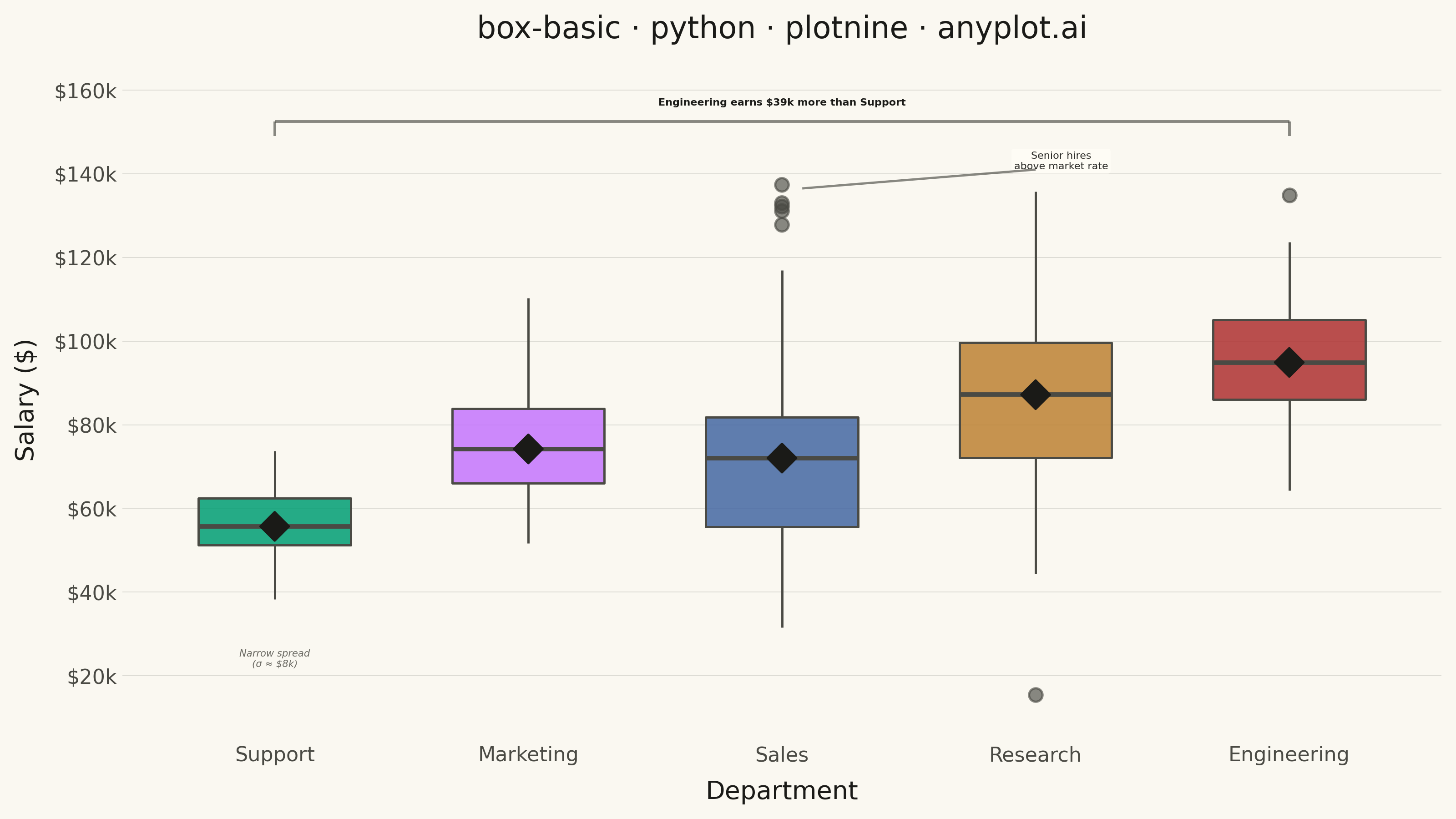
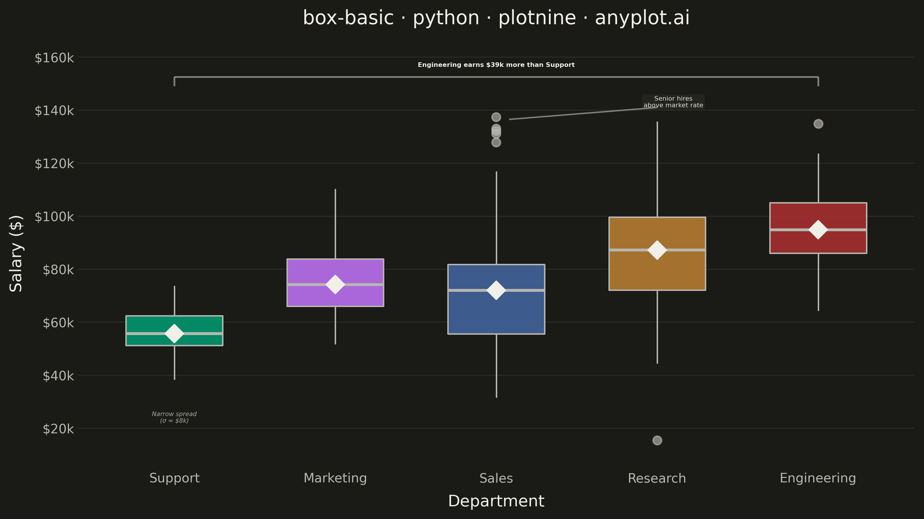
A box plot (box-and-whisker plot) showing the distribution of numerical data through quartiles. Displays the median, first and third quartiles as a box, with whiskers extending to show the data range. Essential for comparing distributions across categories and identifying outliers.
""" anyplot.ai
box-basic: Basic Box Plot
Library: plotnine 0.15.4 | Python 3.13.13
Quality: 87/100 | Updated: 2026-05-28
"""

import os
import sys


# Prevent this file from shadowing the plotnine package (script is named plotnine.py)
sys.path = [p for p in sys.path if os.path.abspath(p or ".") != os.path.dirname(os.path.abspath(__file__))]

import numpy as np
import pandas as pd
from plotnine import (
    aes,
    annotate,
    coord_cartesian,
    element_blank,
    element_line,
    element_rect,
    element_text,
    geom_boxplot,
    ggplot,
    labs,
    scale_fill_manual,
    scale_y_continuous,
    stat_summary,
    theme,
    theme_minimal,
)


# Theme tokens
THEME = os.getenv("ANYPLOT_THEME", "light")
PAGE_BG = "#FAF8F1" if THEME == "light" else "#1A1A17"
ELEVATED_BG = "#FFFDF6" if THEME == "light" else "#242420"
INK = "#1A1A17" if THEME == "light" else "#F0EFE8"
INK_SOFT = "#4A4A44" if THEME == "light" else "#B8B7B0"
INK_MUTED = "#6B6A63" if THEME == "light" else "#A8A79F"
IMPRINT_PALETTE = ["#009E73", "#C475FD", "#4467A3", "#BD8233", "#AE3030", "#2ABCCD", "#954477", "#99B314"]

# Data
np.random.seed(42)
categories = ["Engineering", "Marketing", "Sales", "Support", "Research"]
records = []

for cat in categories:
    n = np.random.randint(60, 120)
    if cat == "Engineering":
        values = np.random.normal(95000, 15000, n)
    elif cat == "Marketing":
        values = np.random.normal(75000, 12000, n)
    elif cat == "Sales":
        base = np.random.normal(68000, 18000, n)
        outliers = np.random.normal(135000, 6000, 4)
        values = np.concatenate([base, outliers])
    elif cat == "Support":
        values = np.random.normal(55000, 8000, n)
    else:  # Research
        values = np.random.normal(85000, 20000, n)
    records.extend({"department": cat, "salary": v} for v in values)

df = pd.DataFrame(records)
dept_order = ["Support", "Marketing", "Sales", "Research", "Engineering"]
df["department"] = pd.Categorical(df["department"], categories=dept_order, ordered=True)

medians = df.groupby("department", observed=True)["salary"].median()
eng_median = medians["Engineering"]
sup_median = medians["Support"]
gap = eng_median - sup_median

# Plot
plot = (
    ggplot(df, aes(x="department", y="salary", fill="department"))
    + geom_boxplot(
        outlier_size=2.5, outlier_alpha=0.65, outlier_colour=INK_SOFT, size=0.5, alpha=0.85, width=0.6, color=INK_SOFT
    )
    + stat_summary(fun_y=np.median, geom="point", size=4, shape="D", color=INK, fill=INK)
    + scale_fill_manual(values=IMPRINT_PALETTE[:5])
    + scale_y_continuous(labels=lambda vals: [f"${v / 1000:.0f}k" for v in vals], breaks=range(20000, 160001, 20000))
    + coord_cartesian(ylim=(12000, 160000))
    # Gap annotation — bracket style with ticks at Support (x=1) and Engineering (x=5)
    + annotate(
        "text",
        x=3,
        y=157000,
        label=f"Engineering earns ${gap / 1000:.0f}k more than Support",
        color=INK,
        size=4.0,
        ha="center",
        fontweight="bold",
    )
    + annotate("segment", x=1, xend=5, y=152500, yend=152500, color=INK_SOFT, size=0.6, alpha=0.65)
    + annotate("segment", x=1, xend=1, y=149000, yend=152500, color=INK_SOFT, size=0.6, alpha=0.65)
    + annotate("segment", x=5, xend=5, y=149000, yend=152500, color=INK_SOFT, size=0.6, alpha=0.65)
    # Senior hires: diagonal connector from Sales outlier cluster to label
    + annotate(
        "label",
        x=4.1,
        y=143000,
        label="Senior hires\nabove market rate",
        size=4.0,
        color=INK,
        fill=ELEVATED_BG,
        alpha=0.92,
        label_size=0,
        ha="center",
    )
    + annotate("segment", x=3.08, xend=4.0, y=136500, yend=141000, color=INK_SOFT, size=0.5, alpha=0.65)
    # Support tight distribution insight
    + annotate(
        "text",
        x=1,
        y=24000,
        label="Narrow spread\n(σ ≈ $8k)",
        color=INK_MUTED,
        size=3.8,
        ha="center",
        fontstyle="italic",
    )
    + labs(x="Department", y="Salary ($)", title="box-basic · python · plotnine · anyplot.ai")
    + theme_minimal()
    + theme(
        figure_size=(8, 4.5),
        text=element_text(size=7, color=INK),
        plot_title=element_text(size=12, color=INK),
        axis_title=element_text(size=10, color=INK),
        axis_text=element_text(size=8, color=INK_SOFT),
        legend_position="none",
        panel_grid_major_x=element_blank(),
        panel_grid_minor=element_blank(),
        panel_grid_major_y=element_line(color=INK, size=0.3, alpha=0.15),
        axis_ticks_major_x=element_blank(),
        axis_ticks_major_y=element_blank(),
        plot_background=element_rect(fill=PAGE_BG, color=PAGE_BG),
        panel_background=element_rect(fill=PAGE_BG, color=PAGE_BG),
        panel_border=element_blank(),
    )
)

# Save
plot.save(f"plot-{THEME}.png", dpi=400, width=8, height=4.5, units="in", verbose=False)
Runnable source as JSON, for any HTTP client: https://api.anyplot.ai/specs/box-basic/plotnine/code. Any spec id and library id listed in llms-full.txt fit the same URL shape; every URL below is complete and callable.
{
  "spec_id": "box-basic",
  "language": "python",
  "library": "plotnine",
  "page": "https://anyplot.ai/box-basic/python/plotnine",
  "hub": "https://anyplot.ai/box-basic",
  "code_json": "https://api.anyplot.ai/specs/box-basic/plotnine/code",
  "spec_json": "https://api.anyplot.ai/specs/box-basic",
  "render_light_png": "https://storage.googleapis.com/anyplot-images/plots/box-basic/python/plotnine/plot-light.png",
  "render_dark_png": "https://storage.googleapis.com/anyplot-images/plots/box-basic/python/plotnine/plot-dark.png",
  "quality_score": 87.0,
  "license": "MIT",
  "guide": "https://anyplot.ai/llms.txt"
}
Part of Basic Box Plot on anyplot.ai.