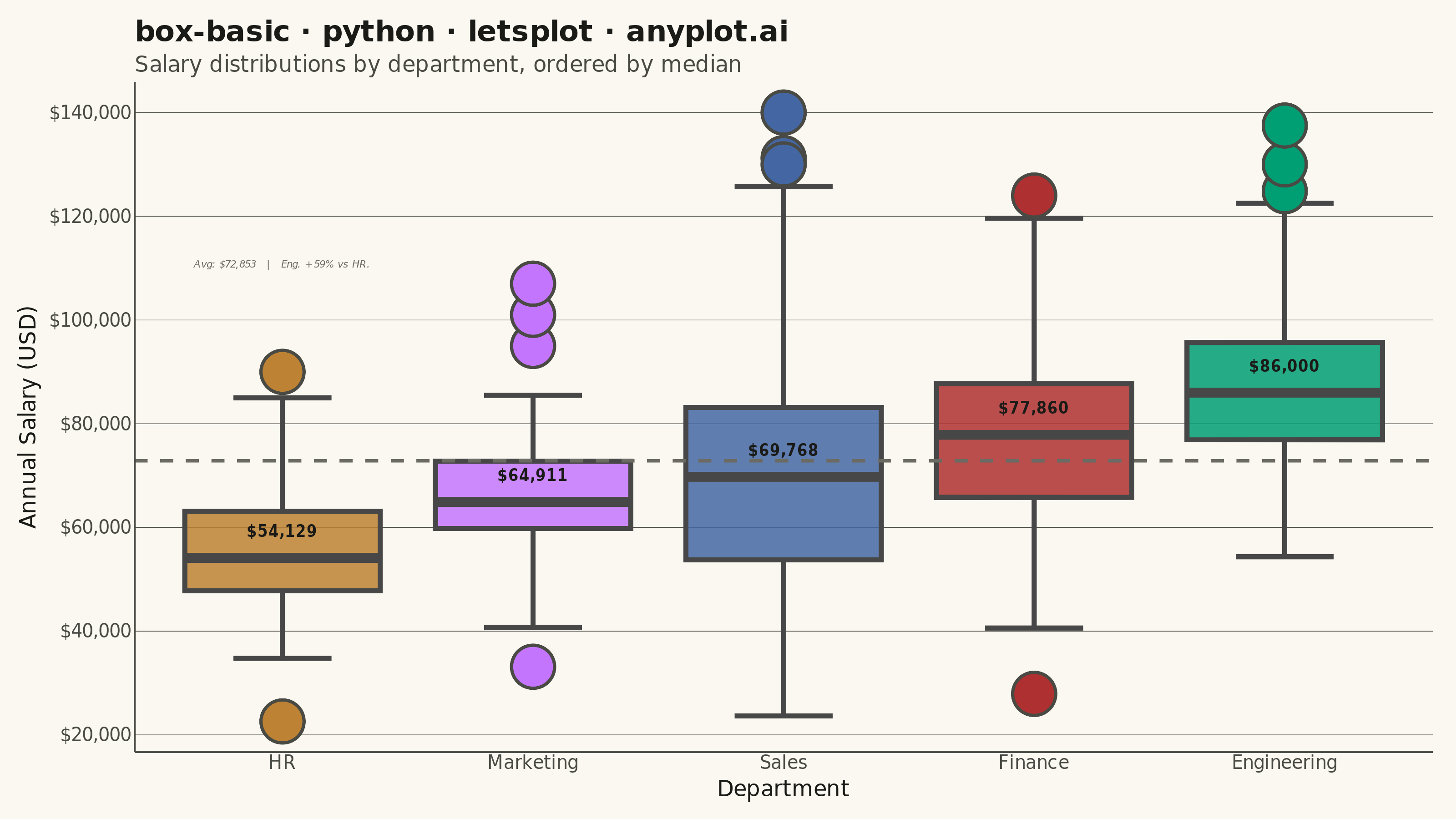
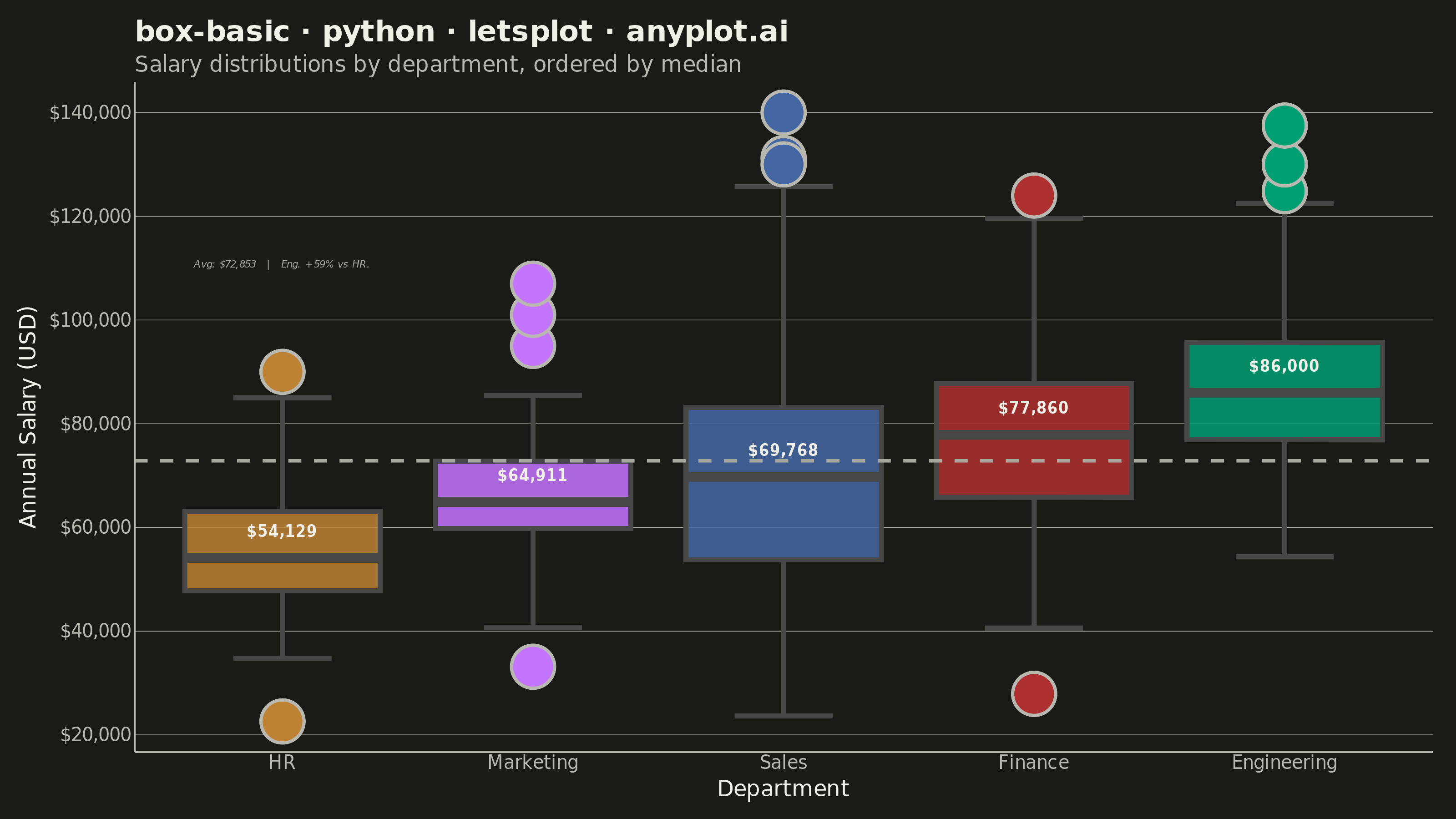
A box plot (box-and-whisker plot) showing the distribution of numerical data through quartiles. Displays the median, first and third quartiles as a box, with whiskers extending to show the data range. Essential for comparing distributions across categories and identifying outliers.
""" anyplot.ai
box-basic: Basic Box Plot
Library: letsplot 4.10.1 | Python 3.13.13
Quality: 89/100 | Updated: 2026-05-28
"""

import os

import numpy as np
import pandas as pd
from lets_plot import (
    LetsPlot,
    aes,
    as_discrete,
    element_blank,
    element_line,
    element_rect,
    element_text,
    geom_boxplot,
    geom_hline,
    geom_text,
    ggplot,
    ggsave,
    ggsize,
    labs,
    layer_tooltips,
    scale_fill_manual,
    scale_y_continuous,
    theme,
    theme_classic,
)


LetsPlot.setup_html()

# Theme tokens
THEME = os.getenv("ANYPLOT_THEME", "light")
PAGE_BG = "#FAF8F1" if THEME == "light" else "#1A1A17"
ELEVATED_BG = "#FFFDF6" if THEME == "light" else "#242420"
INK = "#1A1A17" if THEME == "light" else "#F0EFE8"
INK_SOFT = "#4A4A44" if THEME == "light" else "#B8B7B0"
INK_MUTED = "#6B6A63" if THEME == "light" else "#A8A79F"

IMPRINT_PALETTE = ["#009E73", "#C475FD", "#4467A3", "#BD8233", "#AE3030"]

# Data
np.random.seed(42)
distributions = {
    "Engineering": (85000, 15000),
    "Marketing": (65000, 12000),
    "Sales": (70000, 20000),
    "HR": (55000, 10000),
    "Finance": (75000, 14000),
}

data = []
for cat, (mean, std) in distributions.items():
    n = np.random.randint(50, 100)
    values = np.random.normal(mean, std, n)
    outliers = np.array([mean + 2.5 * std, mean + 3.0 * std, mean + 3.5 * std])
    values = np.concatenate([values, outliers])
    data.extend([(cat, v) for v in values])

df = pd.DataFrame(data, columns=["department", "salary"])

# Median labels per box
medians = df.groupby("department")["salary"].median().reset_index()
medians.columns = ["department", "median_salary"]
medians["label"] = medians["median_salary"].apply(lambda x: f"${x:,.0f}")

# Overall mean reference line
overall_mean = df["salary"].mean()

# Insight: highest vs lowest median department
sorted_medians = medians.sort_values("median_salary")
low_dept = sorted_medians.iloc[0]["department"]
high_dept = sorted_medians.iloc[-1]["department"]
pct_diff = (sorted_medians.iloc[-1]["median_salary"] - sorted_medians.iloc[0]["median_salary"]) / sorted_medians.iloc[
    0
]["median_salary"]

# Annotation placed in HR column (lowest data range) well above its outliers (~$90k max)
annot_df = pd.DataFrame(
    {
        "department": ["HR"],
        "y": [overall_mean + 38000],
        "lbl": [f"Avg: ${overall_mean:,.0f}   |   {high_dept[:3]}. +{pct_diff:.0%} vs {low_dept[:3]}."],
    }
)

# Plot
title = "box-basic · python · letsplot · anyplot.ai"

plot = (
    ggplot(df, aes(x=as_discrete("department", order=1, order_by="..middle.."), y="salary", fill="department"))
    + geom_boxplot(
        alpha=0.85,
        size=1.2,
        outlier_size=2.5,
        outlier_shape=21,
        outlier_color=INK_SOFT,
        width=0.78,
        tooltips=layer_tooltips()
        .title("@department")
        .line("Median|$@{..middle..}")
        .line("Q1|$@{..lower..}")
        .line("Q3|$@{..upper..}")
        .line("Min|$@{..ymin..}")
        .line("Max|$@{..ymax..}"),
    )
    + scale_fill_manual(values=IMPRINT_PALETTE)
    + geom_text(
        aes(x="department", y="median_salary", label="label"),
        data=medians,
        size=4,
        color=INK,
        fontface="bold",
        nudge_y=5000,
        inherit_aes=False,
    )
    + geom_hline(yintercept=overall_mean, color=INK_MUTED, size=0.8, linetype="dashed")
    + geom_text(
        aes(x="department", y="y", label="lbl"),
        data=annot_df,
        size=3,
        color=INK_MUTED,
        fill="transparent",
        fontface="italic",
        inherit_aes=False,
    )
    + scale_y_continuous(format="${,.0f}")
    + labs(
        x="Department",
        y="Annual Salary (USD)",
        title=title,
        subtitle="Salary distributions by department, ordered by median",
    )
    + theme_classic()
    + theme(
        plot_background=element_rect(fill=PAGE_BG, color=PAGE_BG),
        panel_background=element_rect(fill=PAGE_BG, color="transparent"),
        plot_title=element_text(size=16, color=INK, face="bold"),
        plot_subtitle=element_text(size=12, color=INK_SOFT),
        axis_title=element_text(size=12, color=INK),
        axis_text=element_text(size=10, color=INK_SOFT),
        axis_ticks=element_blank(),
        axis_line=element_blank(),
        axis_line_x=element_line(color=INK_SOFT),
        axis_line_y=element_line(color=INK_SOFT),
        panel_grid_major_x=element_blank(),
        panel_grid_minor=element_blank(),
        panel_grid_major_y=element_line(color=INK_SOFT, size=0.3),
        panel_border=element_blank(),
        legend_position="none",
        plot_margin=[10, 10, 10, 10],
    )
    + ggsize(800, 450)
)

# Save
ggsave(plot, f"plot-{THEME}.png", path=".", scale=4)
ggsave(plot, f"plot-{THEME}.html", path=".")
Runnable source as JSON, for any HTTP client: https://api.anyplot.ai/specs/box-basic/letsplot/code. Any spec id and library id listed in llms-full.txt fit the same URL shape; every URL below is complete and callable.
{
  "spec_id": "box-basic",
  "language": "python",
  "library": "letsplot",
  "page": "https://anyplot.ai/box-basic/python/letsplot",
  "hub": "https://anyplot.ai/box-basic",
  "code_json": "https://api.anyplot.ai/specs/box-basic/letsplot/code",
  "spec_json": "https://api.anyplot.ai/specs/box-basic",
  "render_light_png": "https://storage.googleapis.com/anyplot-images/plots/box-basic/python/letsplot/plot-light.png",
  "render_dark_png": "https://storage.googleapis.com/anyplot-images/plots/box-basic/python/letsplot/plot-dark.png",
  "interactive_light_html": "https://storage.googleapis.com/anyplot-images/plots/box-basic/python/letsplot/plot-light.html",
  "interactive_dark_html": "https://storage.googleapis.com/anyplot-images/plots/box-basic/python/letsplot/plot-dark.html",
  "quality_score": 89.0,
  "license": "MIT",
  "guide": "https://anyplot.ai/llms.txt"
}
Part of Basic Box Plot on anyplot.ai.