The same plot in 14 other libraries — JavaScript: Chart.js, D3.js, Apache ECharts, MUI X Charts; Python: Altair, Bokeh, lets-plot, Matplotlib, Plotly, plotnine, Pygal, Seaborn; R: ggplot2; Julia: Makie.jl. Compare all 15 side by side: Basic Box Plot in Python, R, Julia and JavaScript.
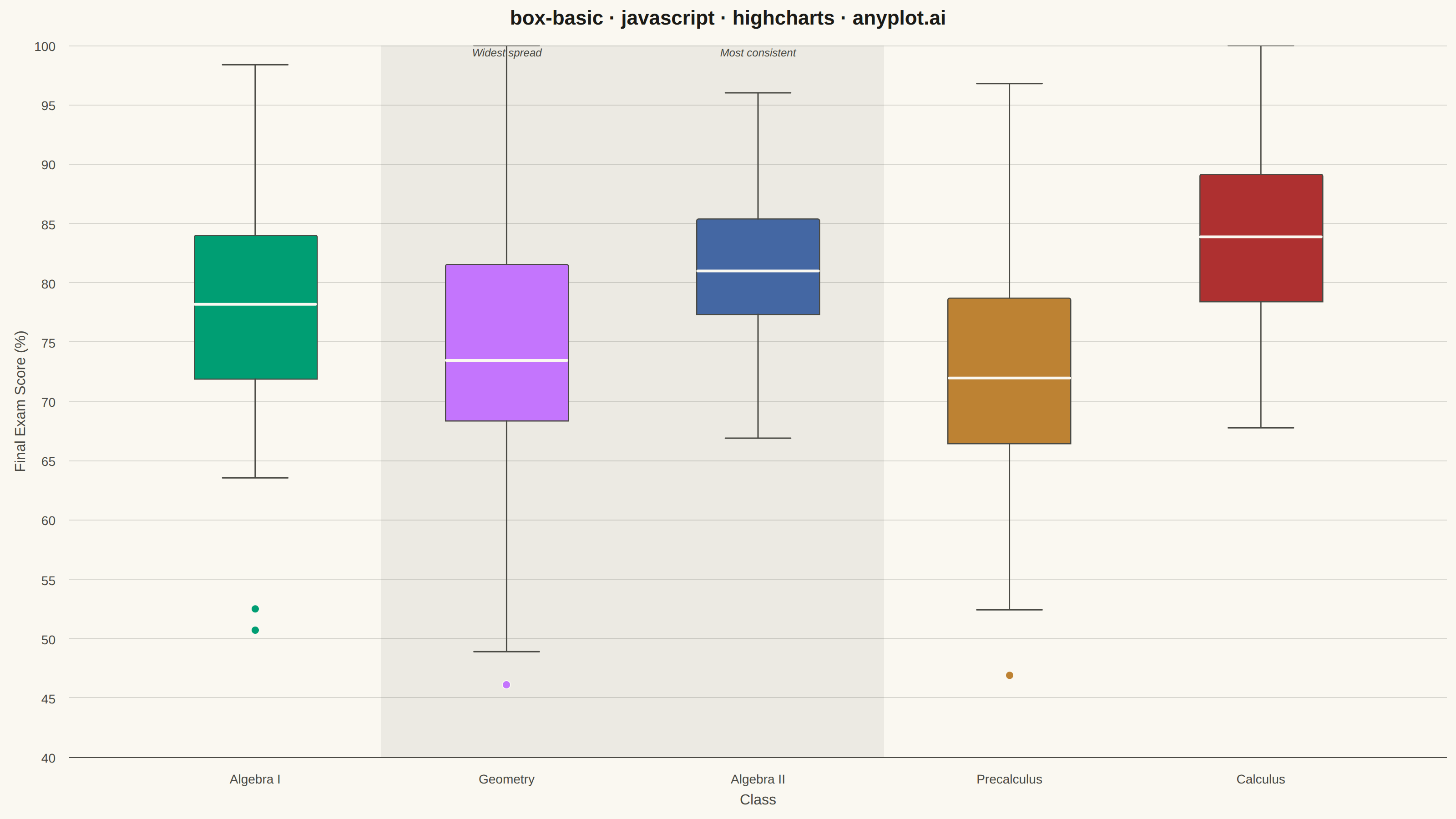
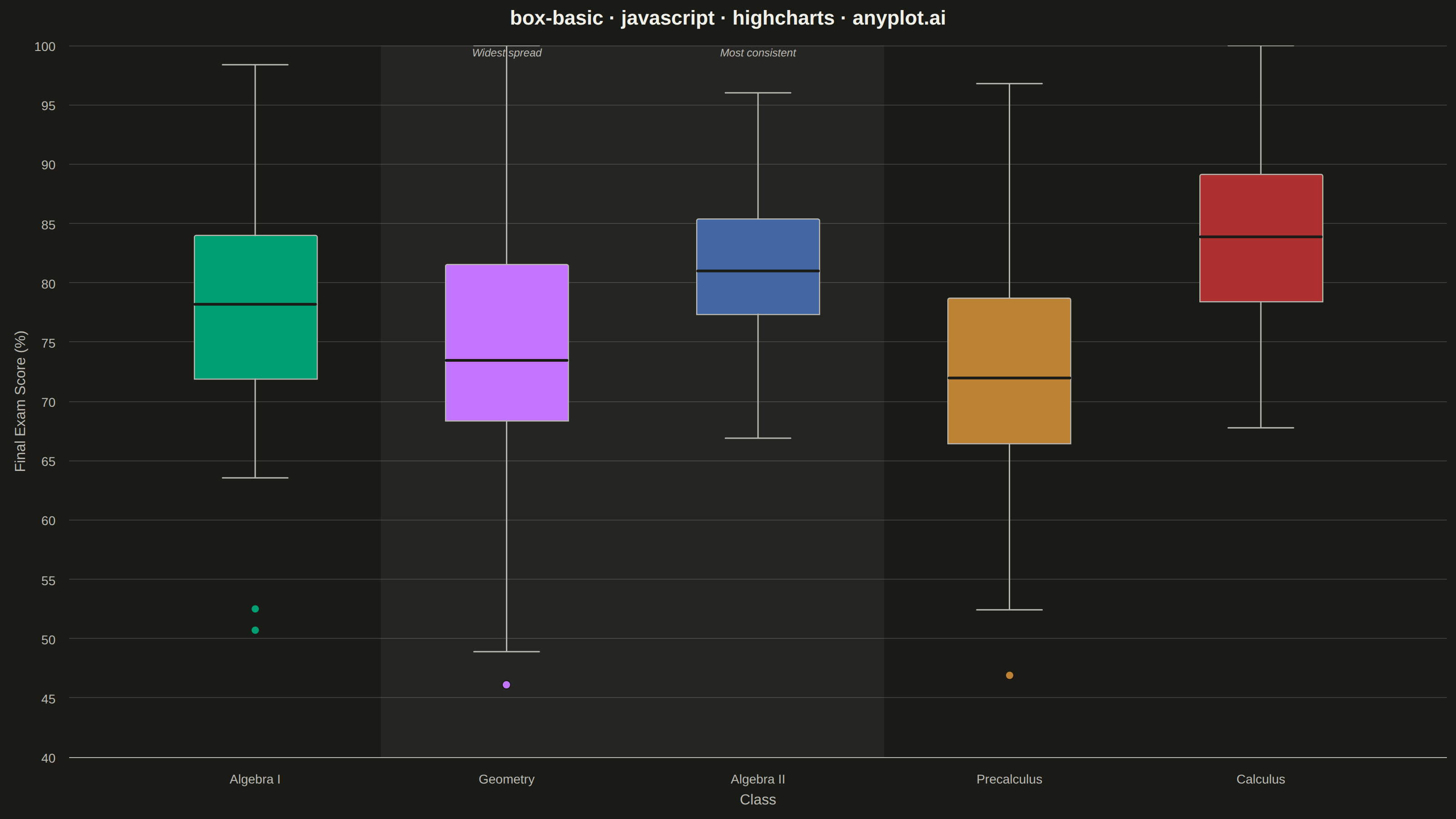
A box plot (box-and-whisker plot) showing the distribution of numerical data through quartiles. Displays the median, first and third quartiles as a box, with whiskers extending to show the data range. Essential for comparing distributions across categories and identifying outliers.
// anyplot.ai
// box-basic: Basic Box Plot
// Library: highcharts 12.6.0 | JavaScript 22.23.2
// Quality: 94/100 | Created: 2026-08-24

// The core bundle (no highcharts-more) has no "boxplot" series type, so the box
// is built from two stacked "column" series (an invisible floor up to Q1, then
// a visible box from Q1 to Q3, colorByPoint from the Imprint palette). Whiskers
// and the median are drawn as two extra core "line" series (null-separated
// segments, one per category) rather than custom chart.renderer shapes — this
// Highcharts build paints renderer.path() additions behind the column bars
// they overlap, but a normal series defined after the box series always layers
// on top, which is what a median mark sitting inside the box needs.
const t = window.ANYPLOT_TOKENS;

// --- Data (in-memory, deterministic LCG) ------------------------------------
let seed = 42;
function lcg() {
  seed = (seed * 1103515245 + 12345) & 0x7fffffff;
  return seed / 0x7fffffff;
}
function randNormal(mean, std) {
  const u1 = Math.max(lcg(), 1e-9);
  const u2 = lcg();
  const z = Math.sqrt(-2 * Math.log(u1)) * Math.cos(2 * Math.PI * u2);
  return mean + z * std;
}
function quartile(sorted, q) {
  const pos = (sorted.length - 1) * q;
  const base = Math.floor(pos);
  const rest = pos - base;
  return sorted[base + 1] !== undefined
    ? sorted[base] + rest * (sorted[base + 1] - sorted[base])
    : sorted[base];
}
function boxStats(values) {
  const sorted = [...values].sort((a, b) => a - b);
  const q1 = quartile(sorted, 0.25);
  const median = quartile(sorted, 0.5);
  const q3 = quartile(sorted, 0.75);
  const iqr = q3 - q1;
  const lowerFence = q1 - 1.5 * iqr;
  const upperFence = q3 + 1.5 * iqr;
  const inRange = sorted.filter((v) => v >= lowerFence && v <= upperFence);
  return {
    q1,
    median,
    q3,
    whiskerLow: inRange[0],
    whiskerHigh: inRange[inRange.length - 1],
    outliers: sorted.filter((v) => v < lowerFence || v > upperFence),
  };
}

const classes = [
  { name: "Algebra I", mean: 78, std: 9, n: 65 },
  { name: "Geometry", mean: 74, std: 11, n: 72 },
  { name: "Algebra II", mean: 81, std: 7, n: 58 },
  { name: "Precalculus", mean: 71, std: 13, n: 80 },
  { name: "Calculus", mean: 85, std: 8, n: 54 },
];
const categories = classes.map((c) => c.name);
const stats = {};
classes.forEach((c) => {
  const scores = Array.from({ length: c.n }, () =>
    Math.min(100, Math.max(0, randNormal(c.mean, c.std)))
  );
  stats[c.name] = boxStats(scores);
});

// Zoom the axis to the data's actual spread instead of forcing a 0 baseline —
// the stacked-column technique below still stacks from a true 0 threshold
// internally, so this only crops the (invisible) empty space beneath it.
const allBounds = classes.flatMap((c) => [
  stats[c.name].whiskerLow,
  stats[c.name].whiskerHigh,
  ...stats[c.name].outliers,
]);
const yMin = Math.max(0, Math.floor((Math.min(...allBounds) - 5) / 5) * 5);
const yMax = Math.min(100, Math.ceil((Math.max(...allBounds) + 5) / 5) * 5);

// Storytelling: call out the widest- and tightest-spread classes via
// core-Highcharts xAxis.plotBands + label (no annotations module needed) —
// computed from the data, not hardcoded, so the highlight stays correct if
// the class parameters above change.
const spreads = categories.map((c) => stats[c].whiskerHigh - stats[c].whiskerLow);
const widestIdx = spreads.indexOf(Math.max(...spreads));
const tightestIdx = spreads.indexOf(Math.min(...spreads));

// Whiskers (box edge → fence) and caps, one null-separated "line" series for
// every category so a single series draws all the disconnected segments.
// Every entry (including gaps) carries an explicit x so a mixed array of real
// points and null-y gap markers can't be re-bucketed by an auto pointStart/
// pointInterval index — only the y:null gaps break the connecting line.
const capHalf = 0.13;
const whiskerData = categories.flatMap((c, i) => {
  const s = stats[c];
  return [
    { x: i, y: s.q3 }, { x: i, y: s.whiskerHigh }, { x: i, y: null },
    { x: i - capHalf, y: s.whiskerHigh }, { x: i + capHalf, y: s.whiskerHigh }, { x: i, y: null },
    { x: i, y: s.q1 }, { x: i, y: s.whiskerLow }, { x: i, y: null },
    { x: i - capHalf, y: s.whiskerLow }, { x: i + capHalf, y: s.whiskerLow }, { x: i, y: null },
  ];
});
// Median line spans the same half-width as the box itself (matches the
// pointPadding/groupPadding below), drawn as its own series so it renders on
// top of the box fill instead of being covered by it.
const boxHalf = 0.24;
const medianData = categories.flatMap((c, i) => [
  { x: i - boxHalf, y: stats[c].median },
  { x: i + boxHalf, y: stats[c].median },
  { x: i, y: null },
]);

// --- Chart -------------------------------------------------------------------
Highcharts.chart("container", {
  chart: {
    type: "column",
    backgroundColor: "transparent",
    animation: false,
    style: { fontFamily: "inherit" },
  },
  credits: { enabled: false },
  colors: t.palette,
  title: {
    text: "box-basic · javascript · highcharts · anyplot.ai",
    style: { color: t.ink, fontSize: "22px", fontWeight: "600" },
  },
  xAxis: {
    categories,
    lineColor: t.inkSoft,
    tickColor: t.inkSoft,
    labels: { style: { color: t.inkSoft, fontSize: "14px" } },
    title: { text: "Class", style: { color: t.inkSoft, fontSize: "16px" } },
    plotBands: [
      {
        from: widestIdx - 0.5,
        to: widestIdx + 0.5,
        color: `${t.inkSoft}14`,
        label: {
          text: "Widest spread",
          align: "center",
          verticalAlign: "top",
          y: 12,
          style: { color: t.inkSoft, fontSize: "12px", fontStyle: "italic" },
        },
      },
      {
        from: tightestIdx - 0.5,
        to: tightestIdx + 0.5,
        color: `${t.inkSoft}14`,
        label: {
          text: "Most consistent",
          align: "center",
          verticalAlign: "top",
          y: 12,
          style: { color: t.inkSoft, fontSize: "12px", fontStyle: "italic" },
        },
      },
    ],
  },
  yAxis: {
    min: yMin,
    max: yMax,
    reversedStacks: false, // keep series[0] (invisible floor) at the bottom of the stack
    title: { text: "Final Exam Score (%)", style: { color: t.inkSoft, fontSize: "16px" } },
    gridLineColor: t.grid,
    labels: { style: { color: t.inkSoft, fontSize: "14px" } },
  },
  legend: { enabled: false },
  tooltip: { outside: false },
  plotOptions: {
    column: {
      stacking: "normal",
      pointPadding: 0.12,
      groupPadding: 0.18,
      borderRadius: 0,
      animation: false,
    },
    series: { animation: false },
  },
  series: [
    {
      name: "Floor",
      data: categories.map((c) => +stats[c].q1.toFixed(2)),
      color: "transparent",
      borderWidth: 0,
      enableMouseTracking: false,
      showInLegend: false,
    },
    {
      name: "Interquartile range",
      data: categories.map((c) => +(stats[c].q3 - stats[c].q1).toFixed(2)),
      colorByPoint: true,
      borderColor: t.inkSoft,
      borderWidth: 1.25,
      borderRadius: 2,
      showInLegend: false,
      tooltip: {
        pointFormatter: function () {
          const s = stats[categories[this.index]];
          return (
            `<b>${categories[this.index]}</b><br/>` +
            `Max: ${s.whiskerHigh.toFixed(1)}<br/>Q3: ${s.q3.toFixed(1)}<br/>` +
            `Median: ${s.median.toFixed(1)}<br/>Q1: ${s.q1.toFixed(1)}<br/>` +
            `Min: ${s.whiskerLow.toFixed(1)}`
          );
        },
      },
    },
    {
      type: "line",
      name: "Whiskers",
      data: whiskerData,
      color: t.inkSoft,
      lineWidth: 1.5,
      linecap: "round",
      marker: { enabled: false },
      enableMouseTracking: false,
      showInLegend: false,
    },
    {
      type: "line",
      name: "Median",
      data: medianData,
      color: t.pageBg,
      lineWidth: 3,
      marker: { enabled: false },
      enableMouseTracking: false,
      showInLegend: false,
    },
    {
      type: "scatter",
      name: "Outliers",
      data: classes.flatMap((c, i) =>
        stats[c.name].outliers.map((value) => ({
          x: i,
          y: +value.toFixed(1),
          color: t.palette[i % t.palette.length],
        }))
      ),
      marker: { radius: 4.5, symbol: "circle", lineWidth: 1, lineColor: t.pageBg, fillOpacity: 0.85 },
      showInLegend: false,
      tooltip: { pointFormat: "Outlier: <b>{point.y:.1f}</b>" },
    },
  ],
});
Runnable source as JSON, for any HTTP client: https://api.anyplot.ai/specs/box-basic/highcharts/code. Any spec id and library id listed in llms-full.txt fit the same URL shape; every URL below is complete and callable.
{
  "spec_id": "box-basic",
  "language": "javascript",
  "library": "highcharts",
  "page": "https://anyplot.ai/box-basic/javascript/highcharts",
  "hub": "https://anyplot.ai/box-basic",
  "code_json": "https://api.anyplot.ai/specs/box-basic/highcharts/code",
  "spec_json": "https://api.anyplot.ai/specs/box-basic",
  "render_light_png": "https://storage.googleapis.com/anyplot-images/plots/box-basic/javascript/highcharts/plot-light.png",
  "render_dark_png": "https://storage.googleapis.com/anyplot-images/plots/box-basic/javascript/highcharts/plot-dark.png",
  "interactive_light_html": "https://storage.googleapis.com/anyplot-images/plots/box-basic/javascript/highcharts/plot-light.html",
  "interactive_dark_html": "https://storage.googleapis.com/anyplot-images/plots/box-basic/javascript/highcharts/plot-dark.html",
  "quality_score": 94.0,
  "license": "MIT",
  "guide": "https://anyplot.ai/llms.txt"
}
Part of Basic Box Plot on anyplot.ai.