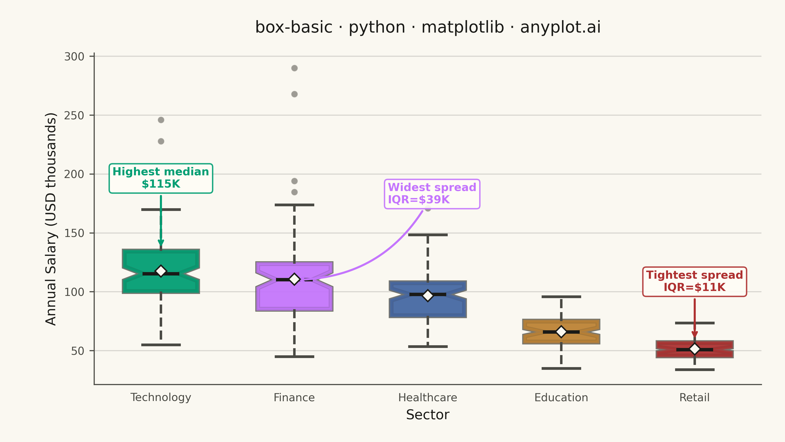
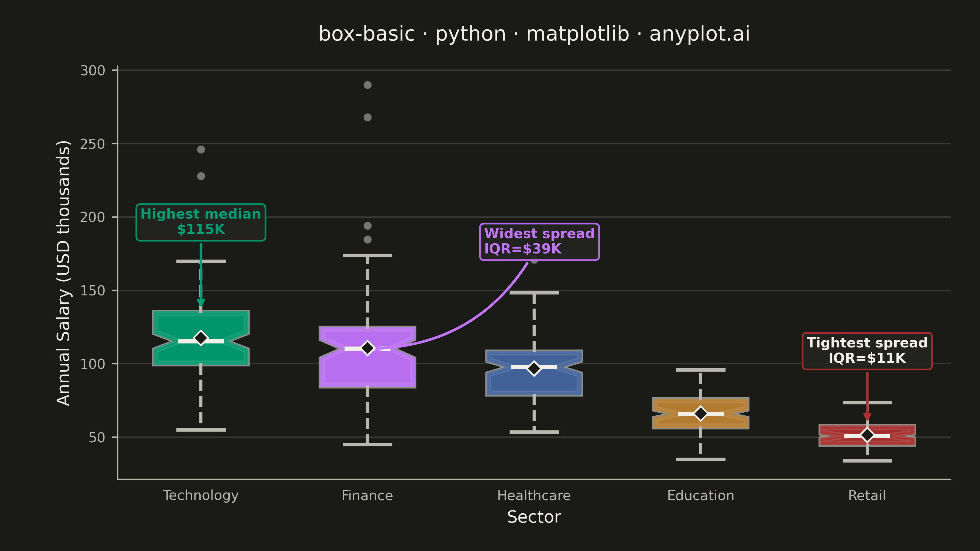
A box plot (box-and-whisker plot) showing the distribution of numerical data through quartiles. Displays the median, first and third quartiles as a box, with whiskers extending to show the data range. Essential for comparing distributions across categories and identifying outliers.
""" anyplot.ai
box-basic: Basic Box Plot
Library: matplotlib 3.10.9 | Python 3.13.13
Quality: 91/100 | Updated: 2026-05-28
"""

import os
import sys


# Prevent this file (named matplotlib.py) from shadowing the installed matplotlib package
_here = os.path.dirname(os.path.abspath(__file__))
sys.path = [p for p in sys.path if os.path.realpath(p or ".") != _here]
del _here

import matplotlib.patheffects as pe
import matplotlib.pyplot as plt
import numpy as np


# Theme tokens
THEME = os.getenv("ANYPLOT_THEME", "light")
PAGE_BG = "#FAF8F1" if THEME == "light" else "#1A1A17"
ELEVATED_BG = "#FFFDF6" if THEME == "light" else "#242420"
INK = "#1A1A17" if THEME == "light" else "#F0EFE8"
INK_SOFT = "#4A4A44" if THEME == "light" else "#B8B7B0"
INK_MUTED = "#6B6A63" if THEME == "light" else "#A8A79F"

IMPRINT_PALETTE = ["#009E73", "#C475FD", "#4467A3", "#BD8233", "#AE3030", "#2ABCCD", "#954477", "#99B314"]

# Data — annual salary distributions (USD thousands) across five job sectors
np.random.seed(42)
sectors = ["Technology", "Finance", "Healthcare", "Education", "Retail"]
salary_data = [
    np.clip(np.random.normal(118, 28, 80), 55, 260),  # Technology: high, moderate spread
    np.clip(np.random.normal(108, 35, 75), 45, 300),  # Finance: high, wide spread
    np.clip(np.random.normal(94, 20, 85), 42, 200),  # Healthcare: moderate, tight
    np.clip(np.random.normal(66, 14, 70), 35, 120),  # Education: lower, narrow
    np.clip(np.random.normal(50, 11, 65), 28, 95),  # Retail: lowest, tight
]

# Inject deliberate outliers for feature coverage
salary_data[0] = np.append(salary_data[0], [228, 246])  # Tech: senior engineers
salary_data[1] = np.append(salary_data[1], [268, 290, 47])  # Finance: top earners + entry-level

# Plot
fig, ax = plt.subplots(figsize=(8, 4.5), dpi=400, facecolor=PAGE_BG)
ax.set_facecolor(PAGE_BG)

bp = ax.boxplot(
    salary_data,
    tick_labels=sectors,
    patch_artist=True,
    widths=0.55,
    showmeans=True,
    notch=True,
    meanprops={"marker": "D", "markerfacecolor": PAGE_BG, "markeredgecolor": INK, "markersize": 6, "zorder": 5},
    flierprops={
        "marker": "o",
        "markerfacecolor": INK_MUTED,
        "markersize": 5,
        "alpha": 0.65,
        "markeredgecolor": PAGE_BG,
        "markeredgewidth": 0.5,
    },
    medianprops={"color": INK, "linewidth": 2.5},
    whiskerprops={"linewidth": 1.8, "color": INK_SOFT, "linestyle": "--"},
    capprops={"linewidth": 2.0, "color": INK_SOFT},
)

# Apply Imprint palette colors to boxes with theme-adaptive path effect depth
for patch, color in zip(bp["boxes"], IMPRINT_PALETTE[:5], strict=False):
    patch.set_facecolor(color)
    patch.set_alpha(0.75)
    patch.set_edgecolor(color)
    patch.set_linewidth(2.0)
    patch.set_path_effects([pe.withStroke(linewidth=3.5, foreground=INK_SOFT)])

# Compute stats for data-driven annotations
iqrs = [np.percentile(d, 75) - np.percentile(d, 25) for d in salary_data]
medians = [np.median(d) for d in salary_data]
q3s = [np.percentile(d, 75) for d in salary_data]

tightest_idx = int(np.argmin(iqrs))
widest_idx = int(np.argmax(iqrs))
best_idx = int(np.argmax(medians))

# Annotation — highest median salary (Technology, directly above box)
ax.annotate(
    f"Highest median\n${medians[best_idx]:.0f}K",
    xy=(best_idx + 1, q3s[best_idx] + 1),
    xytext=(best_idx + 1, q3s[best_idx] + 52),
    fontsize=8,
    fontweight="bold",
    color=IMPRINT_PALETTE[best_idx],
    ha="center",
    va="bottom",
    arrowprops={"arrowstyle": "->", "color": IMPRINT_PALETTE[best_idx], "lw": 1.5},
    bbox={"boxstyle": "round,pad=0.3", "facecolor": ELEVATED_BG, "edgecolor": IMPRINT_PALETTE[best_idx], "alpha": 0.9},
)

# Annotation — widest IQR (Finance, placed higher to clear Healthcare box region)
ax.annotate(
    f"Widest spread\nIQR=${iqrs[widest_idx]:.0f}K",
    xy=(widest_idx + 1, medians[widest_idx]),
    xytext=(widest_idx + 1.7, medians[widest_idx] + 65),
    fontsize=8,
    fontweight="bold",
    color=IMPRINT_PALETTE[widest_idx],
    ha="left",
    arrowprops={
        "arrowstyle": "->",
        "connectionstyle": "arc3,rad=-0.3",
        "color": IMPRINT_PALETTE[widest_idx],
        "lw": 1.5,
    },
    bbox={
        "boxstyle": "round,pad=0.3",
        "facecolor": ELEVATED_BG,
        "edgecolor": IMPRINT_PALETTE[widest_idx],
        "alpha": 0.9,
    },
)

# Annotation — tightest IQR (Retail, placed directly above Retail's box)
# Placed at x=tightest_idx+1 (same column as Retail) so it cannot overlap Healthcare (x=3).
# Use INK text color in dark theme: #AE3030 on dark elevated bg has marginal contrast.
_tight_text_color = INK if THEME == "dark" else IMPRINT_PALETTE[tightest_idx]
ax.annotate(
    f"Tightest spread\nIQR=${iqrs[tightest_idx]:.0f}K",
    xy=(tightest_idx + 1, q3s[tightest_idx] + 1),
    xytext=(tightest_idx + 1, q3s[tightest_idx] + 42),
    fontsize=8,
    fontweight="bold",
    color=_tight_text_color,
    ha="center",
    va="bottom",
    arrowprops={"arrowstyle": "->", "color": IMPRINT_PALETTE[tightest_idx], "lw": 1.5},
    bbox={
        "boxstyle": "round,pad=0.3",
        "facecolor": ELEVATED_BG,
        "edgecolor": IMPRINT_PALETTE[tightest_idx],
        "alpha": 0.9,
    },
)

# Style
title = "box-basic · python · matplotlib · anyplot.ai"
title_fontsize = max(8, round(12 * 67 / len(title))) if len(title) > 67 else 12

ax.set_xlabel("Sector", fontsize=10, color=INK)
ax.set_ylabel("Annual Salary (USD thousands)", fontsize=10, color=INK)
ax.set_title(
    title,
    fontsize=title_fontsize,
    fontweight="medium",
    color=INK,
    pad=15,
    path_effects=[pe.withStroke(linewidth=3, foreground=PAGE_BG)],
)
ax.tick_params(axis="both", labelsize=8, colors=INK_SOFT, labelcolor=INK_SOFT)
ax.tick_params(axis="x", length=0, pad=6)
ax.yaxis.grid(True, alpha=0.15, linewidth=0.8, color=INK)
ax.set_axisbelow(True)
ax.spines["top"].set_visible(False)
ax.spines["right"].set_visible(False)
ax.spines["left"].set_color(INK_SOFT)
ax.spines["bottom"].set_color(INK_SOFT)

fig.subplots_adjust(left=0.12, right=0.97, top=0.88, bottom=0.13)

# Save
plt.savefig(f"plot-{THEME}.png", dpi=400, facecolor=PAGE_BG)
Runnable source as JSON, for any HTTP client: https://api.anyplot.ai/specs/box-basic/matplotlib/code. Any spec id and library id listed in llms-full.txt fit the same URL shape; every URL below is complete and callable.
{
  "spec_id": "box-basic",
  "language": "python",
  "library": "matplotlib",
  "page": "https://anyplot.ai/box-basic/python/matplotlib",
  "hub": "https://anyplot.ai/box-basic",
  "code_json": "https://api.anyplot.ai/specs/box-basic/matplotlib/code",
  "spec_json": "https://api.anyplot.ai/specs/box-basic",
  "render_light_png": "https://storage.googleapis.com/anyplot-images/plots/box-basic/python/matplotlib/plot-light.png",
  "render_dark_png": "https://storage.googleapis.com/anyplot-images/plots/box-basic/python/matplotlib/plot-dark.png",
  "quality_score": 91.0,
  "license": "MIT",
  "guide": "https://anyplot.ai/llms.txt"
}
Part of Basic Box Plot on anyplot.ai.