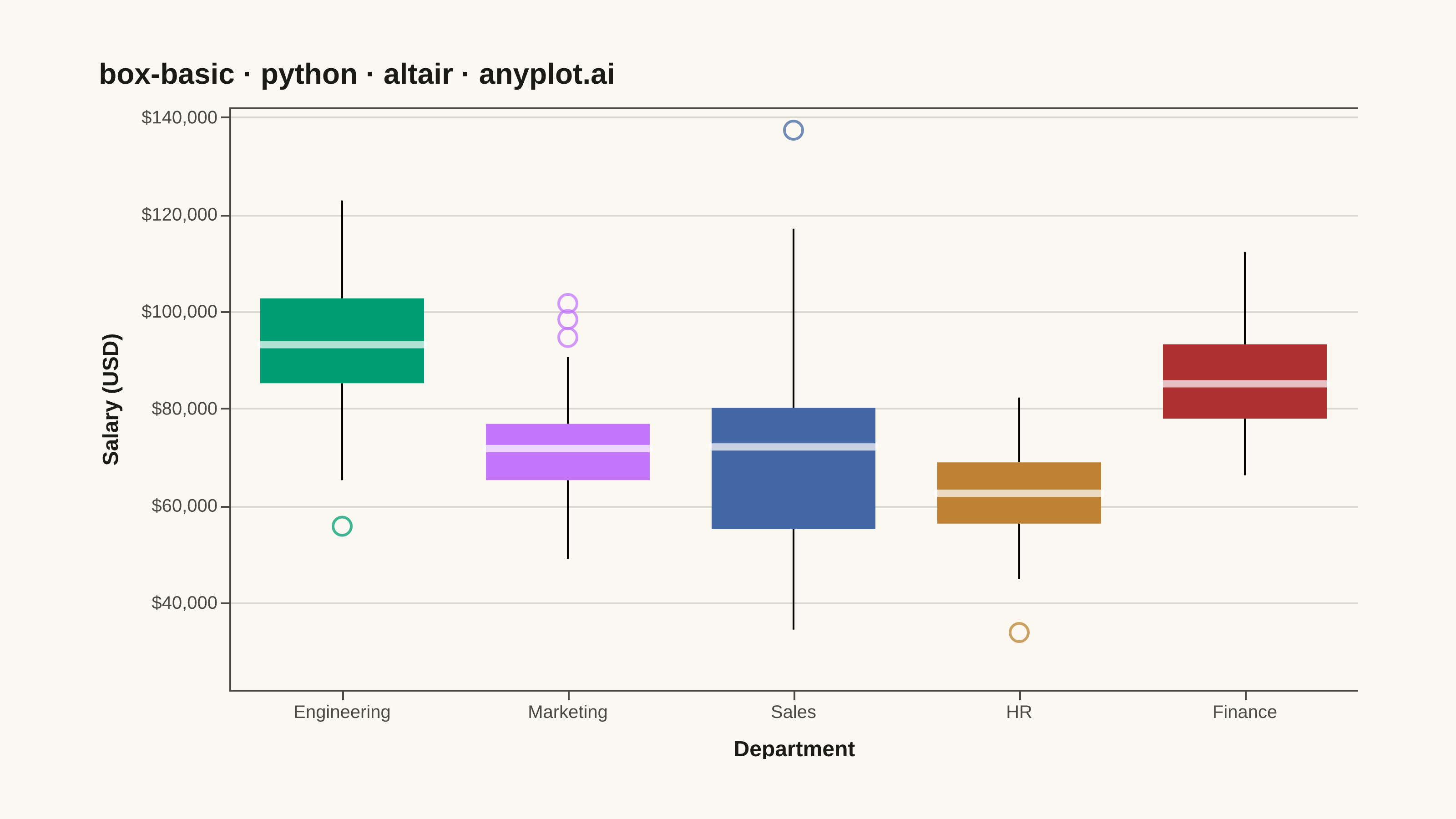
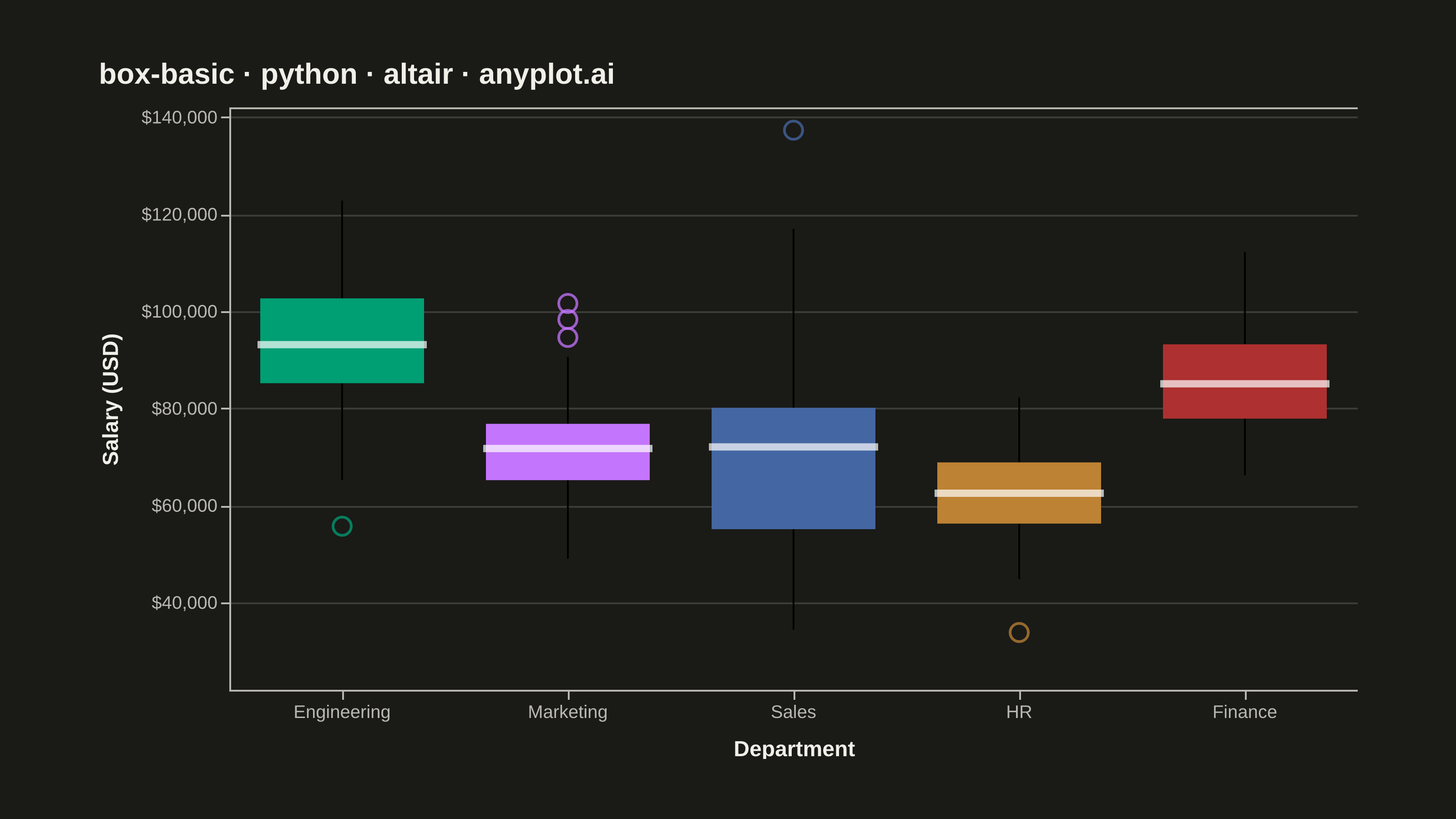
A box plot (box-and-whisker plot) showing the distribution of numerical data through quartiles. Displays the median, first and third quartiles as a box, with whiskers extending to show the data range. Essential for comparing distributions across categories and identifying outliers.
""" anyplot.ai
box-basic: Basic Box Plot
Library: altair 6.1.0 | Python 3.13.13
Quality: 87/100 | Updated: 2026-05-28
"""

import os

import altair as alt
import numpy as np
import pandas as pd
from PIL import Image


# Theme tokens
THEME = os.getenv("ANYPLOT_THEME", "light")
PAGE_BG = "#FAF8F1" if THEME == "light" else "#1A1A17"
ELEVATED_BG = "#FFFDF6" if THEME == "light" else "#242420"
INK = "#1A1A17" if THEME == "light" else "#F0EFE8"
INK_SOFT = "#4A4A44" if THEME == "light" else "#B8B7B0"

IMPRINT_PALETTE = ["#009E73", "#C475FD", "#4467A3", "#BD8233", "#AE3030", "#2ABCCD", "#954477", "#99B314"]

# Data — salary distributions across five departments
np.random.seed(42)
departments = ["Engineering", "Marketing", "Sales", "HR", "Finance"]
params = {
    "Engineering": (95000, 15000, 80),
    "Marketing": (72000, 12000, 65),
    "Sales": (68000, 18000, 90),
    "HR": (63000, 9000, 55),
    "Finance": (85000, 13000, 70),
}

records = []
for dept, (mean, std, n) in params.items():
    salaries = np.random.normal(mean, std, n)
    salaries = np.clip(salaries, 25000, None)
    for s in salaries:
        records.append({"Department": dept, "Salary": round(s, -2)})

df = pd.DataFrame(records)

# Annotation — Engineering has the highest median salary
eng_median = df[df["Department"] == "Engineering"]["Salary"].median()
annotation_df = pd.DataFrame(
    [{"Department": "Engineering", "Salary": 138000, "Label": f"highest median  ${eng_median:,.0f}"}]
)

# Plot
title = "box-basic · python · altair · anyplot.ai"

boxplot = (
    alt.Chart(df)
    .mark_boxplot(
        size=90,
        median={"stroke": "white", "strokeWidth": 3},
        outliers={"size": 100, "strokeWidth": 1.5, "opacity": 0.75},
    )
    .encode(
        x=alt.X("Department:N", title="Department", sort=departments, axis=alt.Axis(labelAngle=0, titlePadding=10)),
        y=alt.Y(
            "Salary:Q",
            title="Salary (USD)",
            scale=alt.Scale(domain=[22000, 142000]),
            axis=alt.Axis(format="$,.0f", tickCount=7, titlePadding=10),
        ),
        color=alt.Color("Department:N", scale=alt.Scale(domain=departments, range=IMPRINT_PALETTE), legend=None),
        tooltip=[
            alt.Tooltip("Department:N"),
            alt.Tooltip("median(Salary):Q", title="Median", format="$,.0f"),
            alt.Tooltip("q1(Salary):Q", title="Q1", format="$,.0f"),
            alt.Tooltip("q3(Salary):Q", title="Q3", format="$,.0f"),
        ],
    )
)

annotation = (
    alt.Chart(annotation_df)
    .mark_text(align="center", baseline="middle", color="#009E73", fontSize=10, fontWeight="bold")
    .encode(x=alt.X("Department:N", sort=departments), y=alt.Y("Salary:Q"), text="Label:N")
)

chart = (
    alt.layer(boxplot, annotation)
    .properties(
        width=620,
        height=320,
        background=PAGE_BG,
        padding={"left": 0, "right": 0, "top": 0, "bottom": 0},
        title=alt.Title(title, fontSize=16, anchor="start", offset=10),
    )
    .configure_view(fill=PAGE_BG, stroke=None)
    .configure_axis(
        domainColor=INK_SOFT,
        tickColor=INK_SOFT,
        gridColor=INK,
        gridOpacity=0.15,
        labelColor=INK_SOFT,
        titleColor=INK,
        labelFontSize=10,
        titleFontSize=12,
    )
    .configure_title(color=INK)
    .configure_legend(
        fillColor=ELEVATED_BG,
        strokeColor=INK_SOFT,
        labelColor=INK_SOFT,
        titleColor=INK,
        labelFontSize=10,
        titleFontSize=10,
    )
)

# Save PNG
chart.save(f"plot-{THEME}.png", scale_factor=4.0)

# Pad to exact canvas target (3200 × 1800)
TW, TH = 3200, 1800
_img = Image.open(f"plot-{THEME}.png").convert("RGB")
_w, _h = _img.size
if _w > TW or _h > TH:
    raise SystemExit(
        f"altair vl-convert produced {_w}×{_h}, exceeds target {TW}×{TH}. "
        f"Shrink chart .properties(width=, height=) values and re-render."
    )
if _w < TW or _h < TH:
    _canvas = Image.new("RGB", (TW, TH), PAGE_BG)
    _canvas.paste(_img, ((TW - _w) // 2, (TH - _h) // 2))
    _canvas.save(f"plot-{THEME}.png")

# Save HTML
chart.save(f"plot-{THEME}.html")
Runnable source as JSON, for any HTTP client: https://api.anyplot.ai/specs/box-basic/altair/code. Any spec id and library id listed in llms-full.txt fit the same URL shape; every URL below is complete and callable.
{
  "spec_id": "box-basic",
  "language": "python",
  "library": "altair",
  "page": "https://anyplot.ai/box-basic/python/altair",
  "hub": "https://anyplot.ai/box-basic",
  "code_json": "https://api.anyplot.ai/specs/box-basic/altair/code",
  "spec_json": "https://api.anyplot.ai/specs/box-basic",
  "render_light_png": "https://storage.googleapis.com/anyplot-images/plots/box-basic/python/altair/plot-light.png",
  "render_dark_png": "https://storage.googleapis.com/anyplot-images/plots/box-basic/python/altair/plot-dark.png",
  "interactive_light_html": "https://storage.googleapis.com/anyplot-images/plots/box-basic/python/altair/plot-light.html",
  "interactive_dark_html": "https://storage.googleapis.com/anyplot-images/plots/box-basic/python/altair/plot-dark.html",
  "quality_score": 87.0,
  "license": "MIT",
  "guide": "https://anyplot.ai/llms.txt"
}
Part of Basic Box Plot on anyplot.ai.