The same plot in 14 other libraries — JavaScript: Chart.js, Apache ECharts, Highcharts, MUI X Charts; Python: Altair, Bokeh, lets-plot, Matplotlib, Plotly, plotnine, Pygal, Seaborn; R: ggplot2; Julia: Makie.jl. Compare all 15 side by side: Basic Bump Chart in Python, R, Julia and JavaScript.
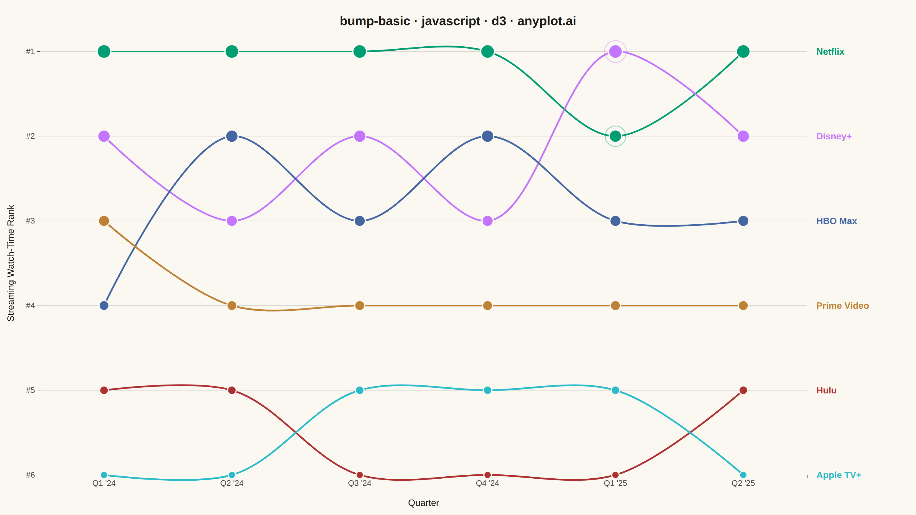
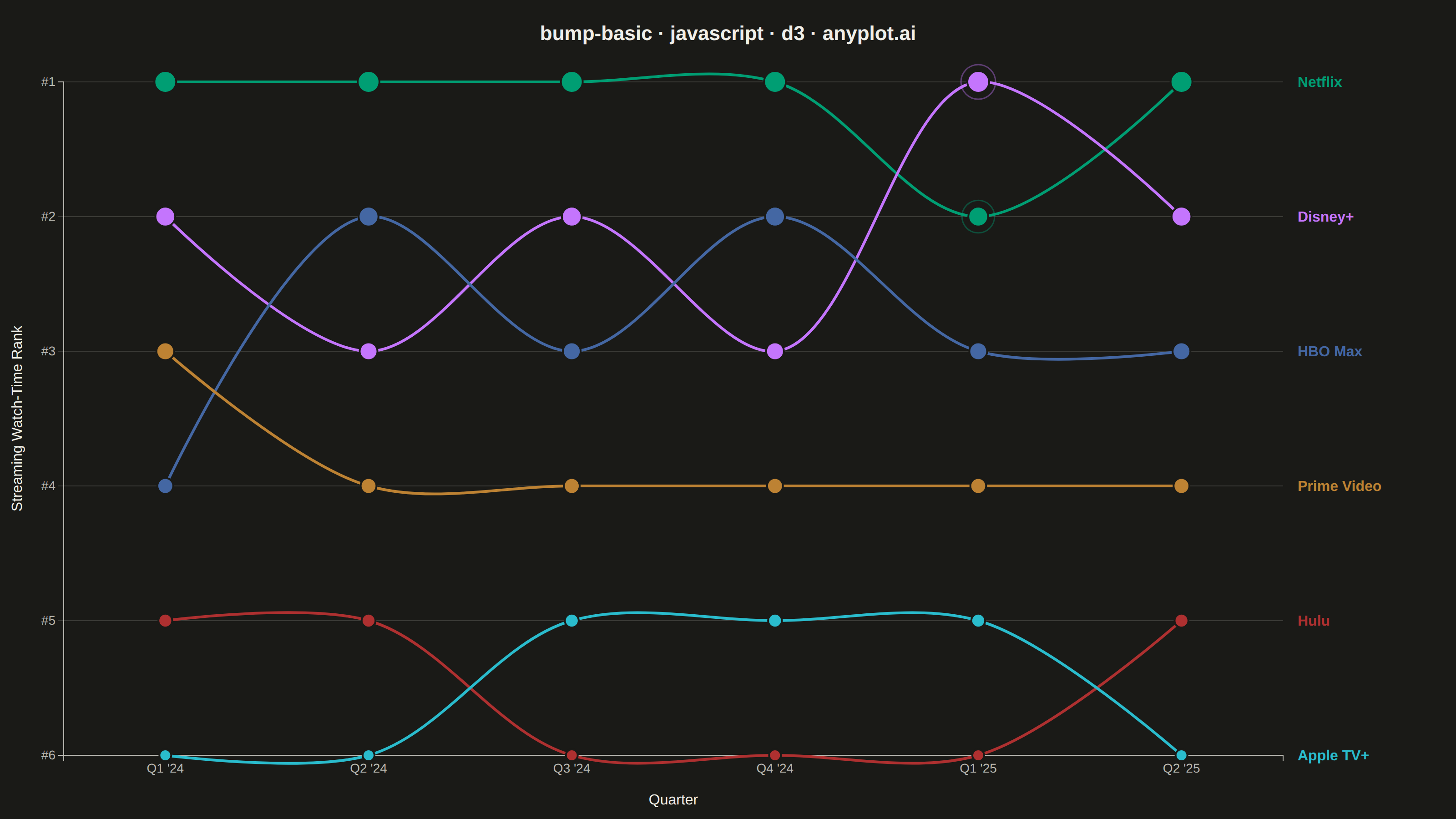
A bump chart visualizes how rankings change over time by plotting rank positions and connecting them with lines. Unlike line charts that show values, bump charts focus specifically on ordinal rankings, making it easy to track position changes, overtakes, and rank stability across time periods.
// anyplot.ai
// bump-basic: Basic Bump Chart
// Library: d3 7.9.0 | JavaScript 22.23.2
// Quality: 90/100 | Created: 2026-08-24

const t = window.ANYPLOT_TOKENS;
const { width, height } = window.ANYPLOT_SIZE;
const margin = { top: 90, right: 190, bottom: 70, left: 70 };
const iw = width - margin.left - margin.right;
const ih = height - margin.top - margin.bottom;

// --- Data: streaming platform rank by share of watch time, quarterly -------
const quarters = ["Q1 '24", "Q2 '24", "Q3 '24", "Q4 '24", "Q1 '25", "Q2 '25"];
const rankings = [
  { entity: "Netflix", ranks: [1, 1, 1, 1, 2, 1] },
  { entity: "Disney+", ranks: [2, 3, 2, 3, 1, 2] },
  { entity: "HBO Max", ranks: [4, 2, 3, 2, 3, 3] },
  { entity: "Prime Video", ranks: [3, 4, 4, 4, 4, 4] },
  { entity: "Hulu", ranks: [5, 5, 6, 6, 6, 5] },
  { entity: "Apple TV+", ranks: [6, 6, 5, 5, 5, 6] },
];
const numEntities = rankings.length;

// --- SVG mount ---------------------------------------------------------------
const svg = d3.select("#container").append("svg").attr("width", width).attr("height", height);
const g = svg.append("g").attr("transform", `translate(${margin.left},${margin.top})`);

// --- Scales -------------------------------------------------------------------
const x = d3.scalePoint().domain(quarters).range([0, iw]).padding(0.5);
const y = d3.scaleLinear().domain([1, numEntities]).range([0, ih]);
const color = d3.scaleOrdinal().domain(rankings.map((d) => d.entity)).range(t.palette);

// --- Horizontal rank gridlines -------------------------------------------------
g.selectAll(".rank-grid")
  .data(d3.range(1, numEntities + 1))
  .join("line")
  .attr("x1", 0)
  .attr("x2", iw)
  .attr("y1", (r) => y(r))
  .attr("y2", (r) => y(r))
  .attr("stroke", t.grid)
  .attr("stroke-width", 1);

// --- Axes -----------------------------------------------------------------------
const xAxis = g.append("g").attr("transform", `translate(0,${ih})`).call(d3.axisBottom(x));
const yAxis = g
  .append("g")
  .call(d3.axisLeft(y).tickValues(d3.range(1, numEntities + 1)).tickFormat((r) => `#${r}`));
for (const ax of [xAxis, yAxis]) {
  ax.selectAll("text").attr("fill", t.inkSoft).style("font-size", "14px");
  ax.selectAll("line").attr("stroke", t.grid);
  ax.select(".domain").attr("stroke", t.inkSoft);
}

// --- Bump lines -------------------------------------------------------------
const line = d3
  .line()
  .x((d, i) => x(quarters[i]))
  .y((d) => y(d))
  .curve(d3.curveCatmullRom.alpha(0.8));

g.selectAll(".bump-line")
  .data(rankings)
  .join("path")
  .attr("fill", "none")
  .attr("stroke", (d) => color(d.entity))
  .attr("stroke-width", 3)
  .attr("stroke-linecap", "round")
  .attr("d", (d) => line(d.ranks));

// --- Flattened {entity, period, rank} join, used by both the crossover
// halo and the markers below ---------------------------------------------------
const flat = rankings.flatMap((d) => d.ranks.map((rank, i) => ({ entity: d.entity, period: quarters[i], rank })));

// --- Crossover emphasis — subtle halo on the Netflix/Disney+ #1 swap ---------
const crossoverPeriod = "Q1 '25";
const crossoverEntities = ["Netflix", "Disney+"];
g.selectAll(".crossover-ring")
  .data(flat.filter((d) => d.period === crossoverPeriod && crossoverEntities.includes(d.entity)))
  .join("circle")
  .attr("cx", (d) => x(d.period))
  .attr("cy", (d) => y(d.rank))
  .attr("r", (d) => 12 - (d.rank - 1) * 1.1 + 7)
  .attr("fill", "none")
  .attr("stroke", (d) => color(d.entity))
  .attr("stroke-width", 1.5)
  .attr("stroke-opacity", 0.4);

// --- Markers — radius encodes rank prominence (rank 1 largest) ---------------
g.selectAll(".dot")
  .data(flat)
  .join("circle")
  .attr("cx", (d) => x(d.period))
  .attr("cy", (d) => y(d.rank))
  .attr("r", (d) => 12 - (d.rank - 1) * 1.1)
  .attr("fill", (d) => color(d.entity))
  .attr("stroke", t.pageBg)
  .attr("stroke-width", 2);

// --- End-of-line entity labels (redundant encoding alongside color) ----------
g.selectAll(".end-label")
  .data(rankings)
  .join("text")
  .attr("x", iw + 16)
  .attr("y", (d) => y(d.ranks[d.ranks.length - 1]))
  .attr("dy", "0.35em")
  .attr("fill", (d) => color(d.entity))
  .style("font-size", "16px")
  .style("font-weight", "600")
  .text((d) => d.entity);

// --- Title --------------------------------------------------------------------
svg
  .append("text")
  .attr("x", width / 2)
  .attr("y", 44)
  .attr("text-anchor", "middle")
  .attr("fill", t.ink)
  .style("font-size", "22px")
  .style("font-weight", "600")
  .text("bump-basic · javascript · d3 · anyplot.ai");

// --- Axis titles ----------------------------------------------------------------
svg
  .append("text")
  .attr("x", margin.left + iw / 2)
  .attr("y", height - 16)
  .attr("text-anchor", "middle")
  .attr("fill", t.ink)
  .style("font-size", "16px")
  .text("Quarter");

svg
  .append("text")
  .attr("transform", `translate(24, ${margin.top + ih / 2}) rotate(-90)`)
  .attr("text-anchor", "middle")
  .attr("fill", t.ink)
  .style("font-size", "16px")
  .text("Streaming Watch-Time Rank");
Runnable source as JSON, for any HTTP client: https://api.anyplot.ai/specs/bump-basic/d3/code. Any spec id and library id listed in llms-full.txt fit the same URL shape; every URL below is complete and callable.
{
  "spec_id": "bump-basic",
  "language": "javascript",
  "library": "d3",
  "page": "https://anyplot.ai/bump-basic/javascript/d3",
  "hub": "https://anyplot.ai/bump-basic",
  "code_json": "https://api.anyplot.ai/specs/bump-basic/d3/code",
  "spec_json": "https://api.anyplot.ai/specs/bump-basic",
  "render_light_png": "https://storage.googleapis.com/anyplot-images/plots/bump-basic/javascript/d3/plot-light.png",
  "render_dark_png": "https://storage.googleapis.com/anyplot-images/plots/bump-basic/javascript/d3/plot-dark.png",
  "interactive_light_html": "https://storage.googleapis.com/anyplot-images/plots/bump-basic/javascript/d3/plot-light.html",
  "interactive_dark_html": "https://storage.googleapis.com/anyplot-images/plots/bump-basic/javascript/d3/plot-dark.html",
  "quality_score": 90.0,
  "license": "MIT",
  "guide": "https://anyplot.ai/llms.txt"
}
Part of Basic Bump Chart on anyplot.ai.