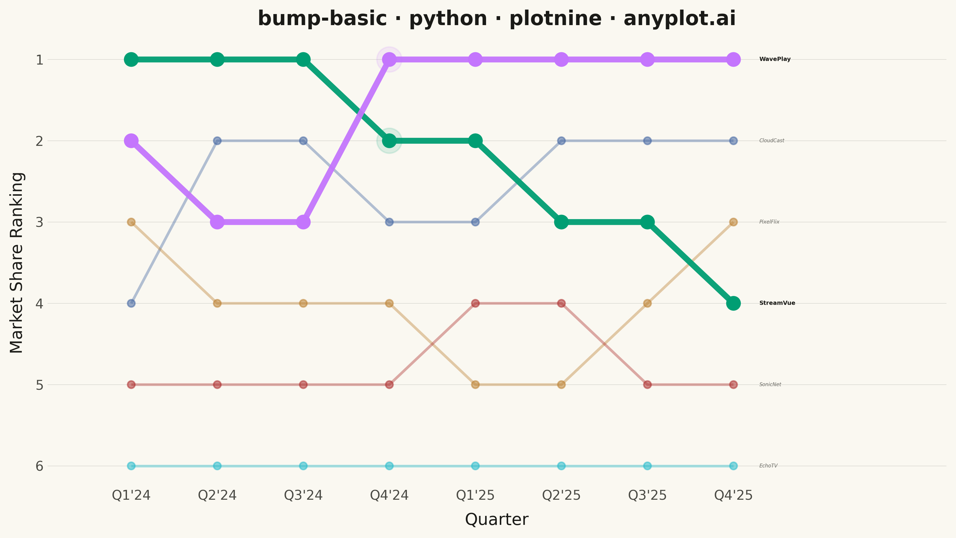
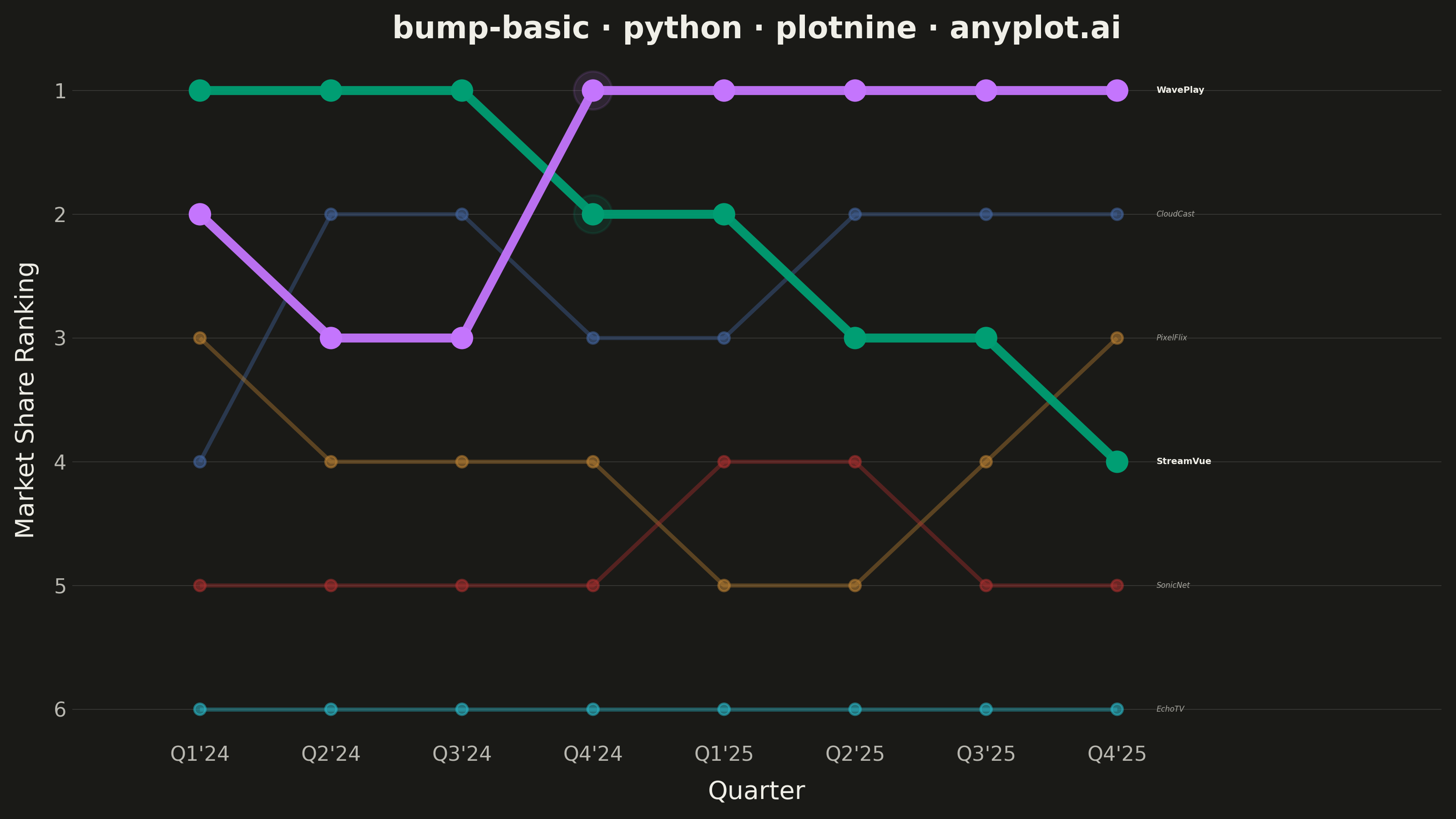
A bump chart visualizes how rankings change over time by plotting rank positions and connecting them with lines. Unlike line charts that show values, bump charts focus specifically on ordinal rankings, making it easy to track position changes, overtakes, and rank stability across time periods.
""" anyplot.ai
bump-basic: Basic Bump Chart
Library: plotnine 0.15.4 | Python 3.13.13
Quality: 90/100 | Updated: 2026-05-29
"""

import os

import pandas as pd
from plotnine import (
    aes,
    element_blank,
    element_line,
    element_rect,
    element_text,
    geom_line,
    geom_point,
    geom_text,
    ggplot,
    labs,
    scale_color_manual,
    scale_x_continuous,
    scale_y_reverse,
    theme,
    theme_minimal,
)


# Theme tokens — Imprint palette, theme-adaptive chrome
THEME = os.getenv("ANYPLOT_THEME", "light")
PAGE_BG = "#FAF8F1" if THEME == "light" else "#1A1A17"
ELEVATED_BG = "#FFFDF6" if THEME == "light" else "#242420"
INK = "#1A1A17" if THEME == "light" else "#F0EFE8"
INK_SOFT = "#4A4A44" if THEME == "light" else "#B8B7B0"
INK_MUTED = "#6B6A63" if THEME == "light" else "#A8A79F"

# Imprint categorical palette (hybrid-v3 sort order)
IMPRINT = ["#009E73", "#C475FD", "#4467A3", "#BD8233", "#AE3030", "#2ABCCD"]

# Data — Streaming platform market share rankings over 8 quarters
platforms = ["StreamVue", "WavePlay", "CloudCast", "PixelFlix", "SonicNet", "EchoTV"]
quarters = ["Q1'24", "Q2'24", "Q3'24", "Q4'24", "Q1'25", "Q2'25", "Q3'25", "Q4'25"]
n_periods = len(quarters)

rankings = {
    "StreamVue": [1, 1, 1, 2, 2, 3, 3, 4],
    "WavePlay": [2, 3, 3, 1, 1, 1, 1, 1],
    "CloudCast": [4, 2, 2, 3, 3, 2, 2, 2],
    "PixelFlix": [3, 4, 4, 4, 5, 5, 4, 3],
    "SonicNet": [5, 5, 5, 5, 4, 4, 5, 5],
    "EchoTV": [6, 6, 6, 6, 6, 6, 6, 6],
}

rows = []
for platform, ranks in rankings.items():
    for i, rank in enumerate(ranks):
        rows.append({"platform": platform, "quarter": quarters[i], "qnum": i + 1, "rank": rank})
df = pd.DataFrame(rows)

df_end = df[df["qnum"] == n_periods].copy()

# Visual hierarchy: protagonist entities vs supporting cast
protagonists = ["StreamVue", "WavePlay"]
supporting = ["CloudCast", "PixelFlix", "SonicNet", "EchoTV"]

df_hero = df[df["platform"].isin(protagonists)]
df_support = df[df["platform"].isin(supporting)]

# Crossover emphasis at Q4'24 where WavePlay overtakes StreamVue
df_crossover = pd.DataFrame(
    [{"qnum": 4, "rank": 1, "platform": "WavePlay"}, {"qnum": 4, "rank": 2, "platform": "StreamVue"}]
)

# Imprint palette mapped to each platform (canonical order, position 1 = brand green first)
palette = {
    "StreamVue": IMPRINT[0],  # brand green #009E73
    "WavePlay": IMPRINT[1],  # lavender #C475FD
    "CloudCast": IMPRINT[2],  # blue #4467A3
    "PixelFlix": IMPRINT[3],  # ochre #BD8233
    "SonicNet": IMPRINT[4],  # matte red #AE3030
    "EchoTV": IMPRINT[5],  # cyan #2ABCCD
}

title = "bump-basic · python · plotnine · anyplot.ai"

# Plot — layered rendering for visual hierarchy (protagonist/supporting distinction)
plot = (
    ggplot(df, aes(x="qnum", y="rank", color="platform", group="platform"))
    # Supporting lines: thin, muted
    + geom_line(data=df_support, size=0.9, alpha=0.4)
    + geom_point(data=df_support, size=2.0, alpha=0.55)
    # Protagonist lines: bold and saturated
    + geom_line(data=df_hero, size=2.0, alpha=0.95)
    + geom_point(data=df_hero, size=4.0, alpha=1.0)
    # Crossover halo at Q4'24
    + geom_point(data=df_crossover, size=8, alpha=0.12)
    # End labels — bold for protagonists, italic for supporting
    + geom_text(
        aes(label="platform"),
        data=df_end[df_end["platform"].isin(protagonists)],
        nudge_x=0.3,
        ha="left",
        size=3.5,
        fontweight="bold",
        color=INK,
    )
    + geom_text(
        aes(label="platform"),
        data=df_end[df_end["platform"].isin(supporting)],
        nudge_x=0.3,
        ha="left",
        size=3.0,
        fontstyle="italic",
        color=INK_MUTED,
    )
    + scale_y_reverse(breaks=range(1, len(platforms) + 1))
    + scale_x_continuous(breaks=range(1, n_periods + 1), labels=quarters, limits=(0.5, n_periods + 2))
    + scale_color_manual(values=palette)
    + labs(x="Quarter", y="Market Share Ranking", title=title)
    + theme_minimal()
    + theme(
        figure_size=(8, 4.5),
        text=element_text(size=7, color=INK_SOFT),
        axis_title=element_text(size=10, color=INK),
        axis_text=element_text(size=8, color=INK_SOFT),
        axis_text_x=element_text(rotation=0),
        plot_title=element_text(size=12, weight="bold", color=INK),
        panel_grid_major_x=element_blank(),
        panel_grid_minor=element_blank(),
        panel_grid_major_y=element_line(alpha=0.15, size=0.3, color=INK),
        panel_background=element_rect(fill=PAGE_BG, color="none"),
        plot_background=element_rect(fill=PAGE_BG, color=PAGE_BG),
        legend_position="none",
        legend_background=element_rect(fill=ELEVATED_BG, color=INK_SOFT),
    )
)

plot.save(f"plot-{THEME}.png", dpi=400, width=8, height=4.5, units="in")
Runnable source as JSON, for any HTTP client: https://api.anyplot.ai/specs/bump-basic/plotnine/code. Any spec id and library id listed in llms-full.txt fit the same URL shape; every URL below is complete and callable.
{
  "spec_id": "bump-basic",
  "language": "python",
  "library": "plotnine",
  "page": "https://anyplot.ai/bump-basic/python/plotnine",
  "hub": "https://anyplot.ai/bump-basic",
  "code_json": "https://api.anyplot.ai/specs/bump-basic/plotnine/code",
  "spec_json": "https://api.anyplot.ai/specs/bump-basic",
  "render_light_png": "https://storage.googleapis.com/anyplot-images/plots/bump-basic/python/plotnine/plot-light.png",
  "render_dark_png": "https://storage.googleapis.com/anyplot-images/plots/bump-basic/python/plotnine/plot-dark.png",
  "quality_score": 90.0,
  "license": "MIT",
  "guide": "https://anyplot.ai/llms.txt"
}
Part of Basic Bump Chart on anyplot.ai.