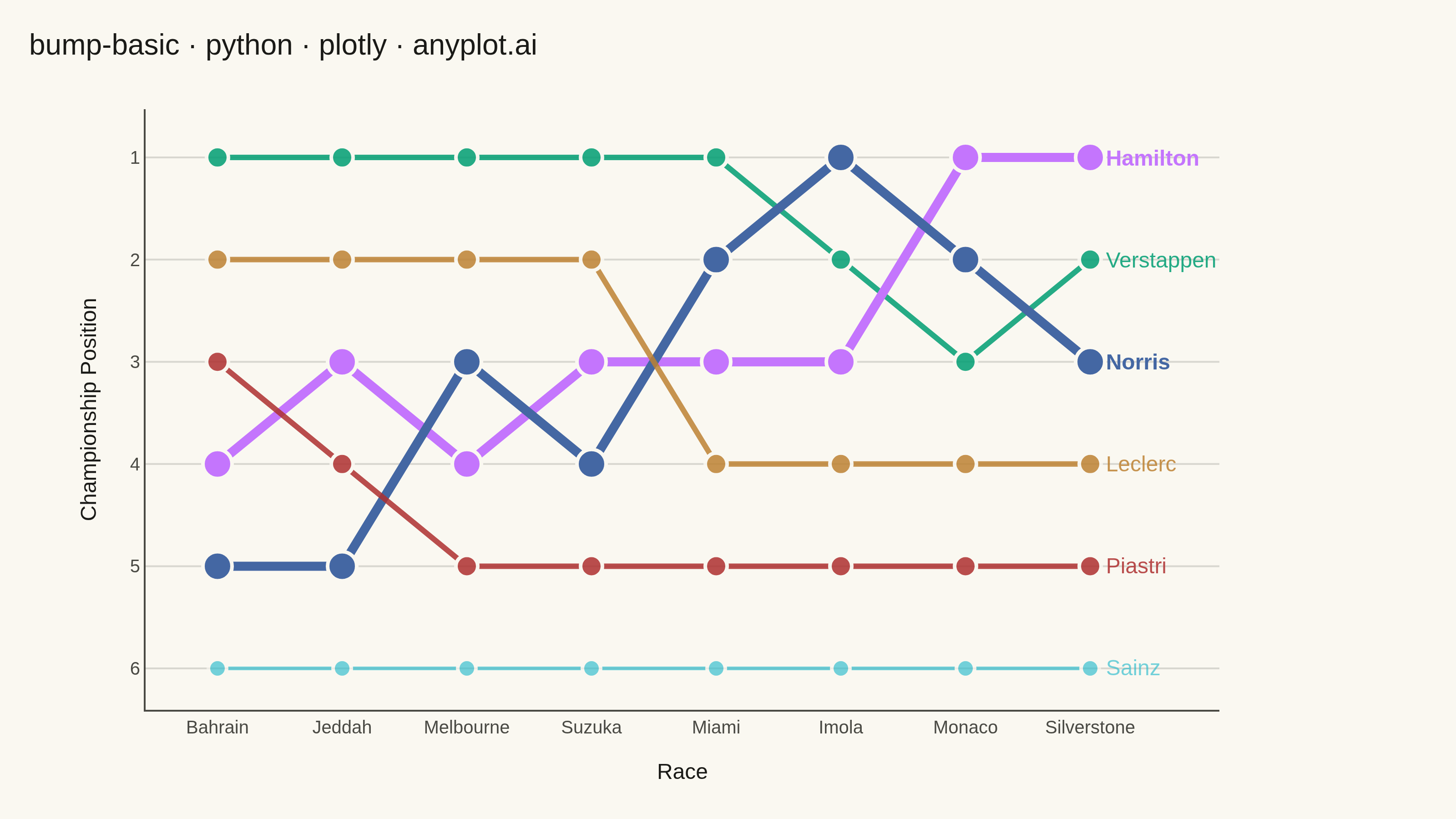
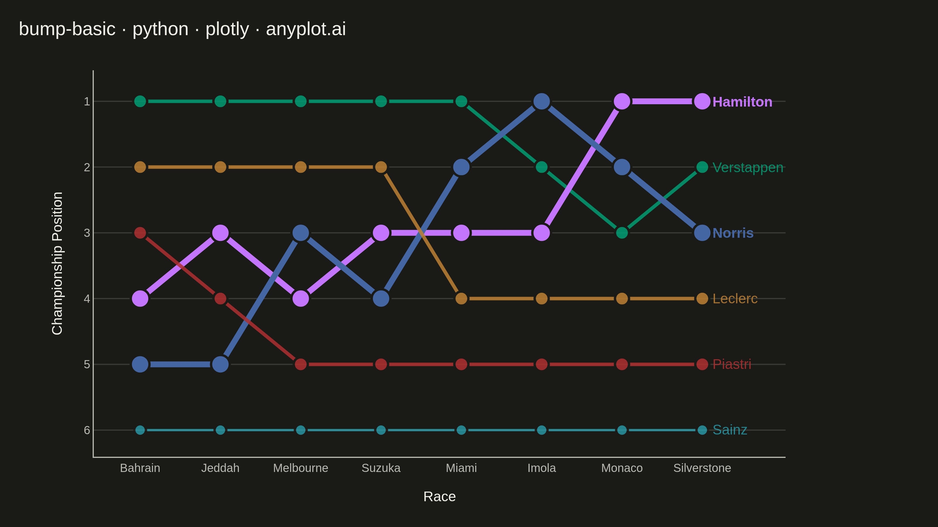
A bump chart visualizes how rankings change over time by plotting rank positions and connecting them with lines. Unlike line charts that show values, bump charts focus specifically on ordinal rankings, making it easy to track position changes, overtakes, and rank stability across time periods.
""" anyplot.ai
bump-basic: Basic Bump Chart
Library: plotly 6.7.0 | Python 3.13.13
Quality: 91/100 | Updated: 2026-05-29
"""

import os

import plotly.graph_objects as go


# Theme tokens — Imprint palette chrome
THEME = os.getenv("ANYPLOT_THEME", "light")
PAGE_BG = "#FAF8F1" if THEME == "light" else "#1A1A17"
ELEVATED_BG = "#FFFDF6" if THEME == "light" else "#242420"
INK = "#1A1A17" if THEME == "light" else "#F0EFE8"
INK_SOFT = "#4A4A44" if THEME == "light" else "#B8B7B0"
GRID = "rgba(26,26,23,0.15)" if THEME == "light" else "rgba(240,239,232,0.15)"

# Imprint categorical palette positions 1-6
IMPRINT_PALETTE = ["#009E73", "#C475FD", "#4467A3", "#BD8233", "#AE3030", "#2ABCCD"]

# Data - Formula 1 driver standings over a season
drivers = ["Verstappen", "Hamilton", "Norris", "Leclerc", "Piastri", "Sainz"]
races = ["Bahrain", "Jeddah", "Melbourne", "Suzuka", "Miami", "Imola", "Monaco", "Silverstone"]

rankings = {
    "Verstappen": [1, 1, 1, 1, 1, 2, 3, 2],
    "Hamilton": [4, 3, 4, 3, 3, 3, 1, 1],
    "Norris": [5, 5, 3, 4, 2, 1, 2, 3],
    "Leclerc": [2, 2, 2, 2, 4, 4, 4, 4],
    "Piastri": [3, 4, 5, 5, 5, 5, 5, 5],
    "Sainz": [6, 6, 6, 6, 6, 6, 6, 6],
}

colors = {d: IMPRINT_PALETTE[i] for i, d in enumerate(drivers)}

# Visual hierarchy — emphasize dynamic storylines, mute stable ones
rank_changes = {d: max(r) - min(r) for d, r in rankings.items()}
line_widths = {d: 5 if rank_changes[d] >= 3 else 3 if rank_changes[d] >= 2 else 2 for d in drivers}
marker_sizes = {d: 16 if rank_changes[d] >= 3 else 12 if rank_changes[d] >= 2 else 10 for d in drivers}
opacities = {d: 1.0 if rank_changes[d] >= 3 else 0.85 if rank_changes[d] >= 2 else 0.65 for d in drivers}

# Figure
fig = go.Figure()

for driver in drivers:
    ranks = rankings[driver]
    color = colors[driver]
    fig.add_trace(
        go.Scatter(
            x=races,
            y=ranks,
            mode="lines+markers",
            name=driver,
            line={"width": line_widths[driver], "color": color},
            marker={"size": marker_sizes[driver], "color": color, "line": {"width": 2, "color": PAGE_BG}},
            opacity=opacities[driver],
            showlegend=False,
            hovertemplate="<b>%{text}</b><br>%{x}: P%{y}<extra></extra>",
            text=[driver] * len(races),
        )
    )
    # End-of-line label — bold for high-movement drivers
    fig.add_annotation(
        x=races[-1],
        y=ranks[-1],
        text=f"  <b>{driver}</b>" if rank_changes[driver] >= 3 else f"  {driver}",
        showarrow=False,
        xanchor="left",
        font={"size": 12, "color": color},
        opacity=opacities[driver],
    )

# Layout with inverted Y-axis (rank 1 at top)
title = "bump-basic · python · plotly · anyplot.ai"
fig.update_layout(
    autosize=False,
    paper_bgcolor=PAGE_BG,
    plot_bgcolor=PAGE_BG,
    title={"text": title, "font": {"size": 16, "color": INK}, "x": 0.02, "xanchor": "left"},
    xaxis={
        "title": {"text": "Race", "font": {"size": 12, "color": INK}},
        "tickfont": {"size": 10, "color": INK_SOFT},
        "showgrid": False,
        "linecolor": INK_SOFT,
        "tickcolor": INK_SOFT,
    },
    yaxis={
        "title": {"text": "Championship Position", "font": {"size": 12, "color": INK}},
        "tickfont": {"size": 10, "color": INK_SOFT},
        "autorange": "reversed",
        "tickmode": "linear",
        "tick0": 1,
        "dtick": 1,
        "gridcolor": GRID,
        "gridwidth": 1,
        "showgrid": True,
        "zeroline": False,
        "linecolor": INK_SOFT,
    },
    margin={"r": 130, "t": 60, "l": 80, "b": 60},
    hoverlabel={"font_size": 12, "bgcolor": ELEVATED_BG, "bordercolor": INK_SOFT},
    font={"color": INK},
)

# PNG — static export at exact 3200×1800 canvas
fig.write_image(f"plot-{THEME}.png", width=800, height=450, scale=4)

# HTML — add range slider for race-by-race exploration (interactive only)
fig.update_xaxes(rangeslider={"visible": True, "bgcolor": ELEVATED_BG, "bordercolor": INK_SOFT, "thickness": 0.06})
fig.write_html(f"plot-{THEME}.html", include_plotlyjs="cdn", config={"scrollZoom": True, "displayModeBar": True})
Runnable source as JSON, for any HTTP client: https://api.anyplot.ai/specs/bump-basic/plotly/code. Any spec id and library id listed in llms-full.txt fit the same URL shape; every URL below is complete and callable.
{
  "spec_id": "bump-basic",
  "language": "python",
  "library": "plotly",
  "page": "https://anyplot.ai/bump-basic/python/plotly",
  "hub": "https://anyplot.ai/bump-basic",
  "code_json": "https://api.anyplot.ai/specs/bump-basic/plotly/code",
  "spec_json": "https://api.anyplot.ai/specs/bump-basic",
  "render_light_png": "https://storage.googleapis.com/anyplot-images/plots/bump-basic/python/plotly/plot-light.png",
  "render_dark_png": "https://storage.googleapis.com/anyplot-images/plots/bump-basic/python/plotly/plot-dark.png",
  "interactive_light_html": "https://storage.googleapis.com/anyplot-images/plots/bump-basic/python/plotly/plot-light.html",
  "interactive_dark_html": "https://storage.googleapis.com/anyplot-images/plots/bump-basic/python/plotly/plot-dark.html",
  "quality_score": 91.0,
  "license": "MIT",
  "guide": "https://anyplot.ai/llms.txt"
}
Part of Basic Bump Chart on anyplot.ai.