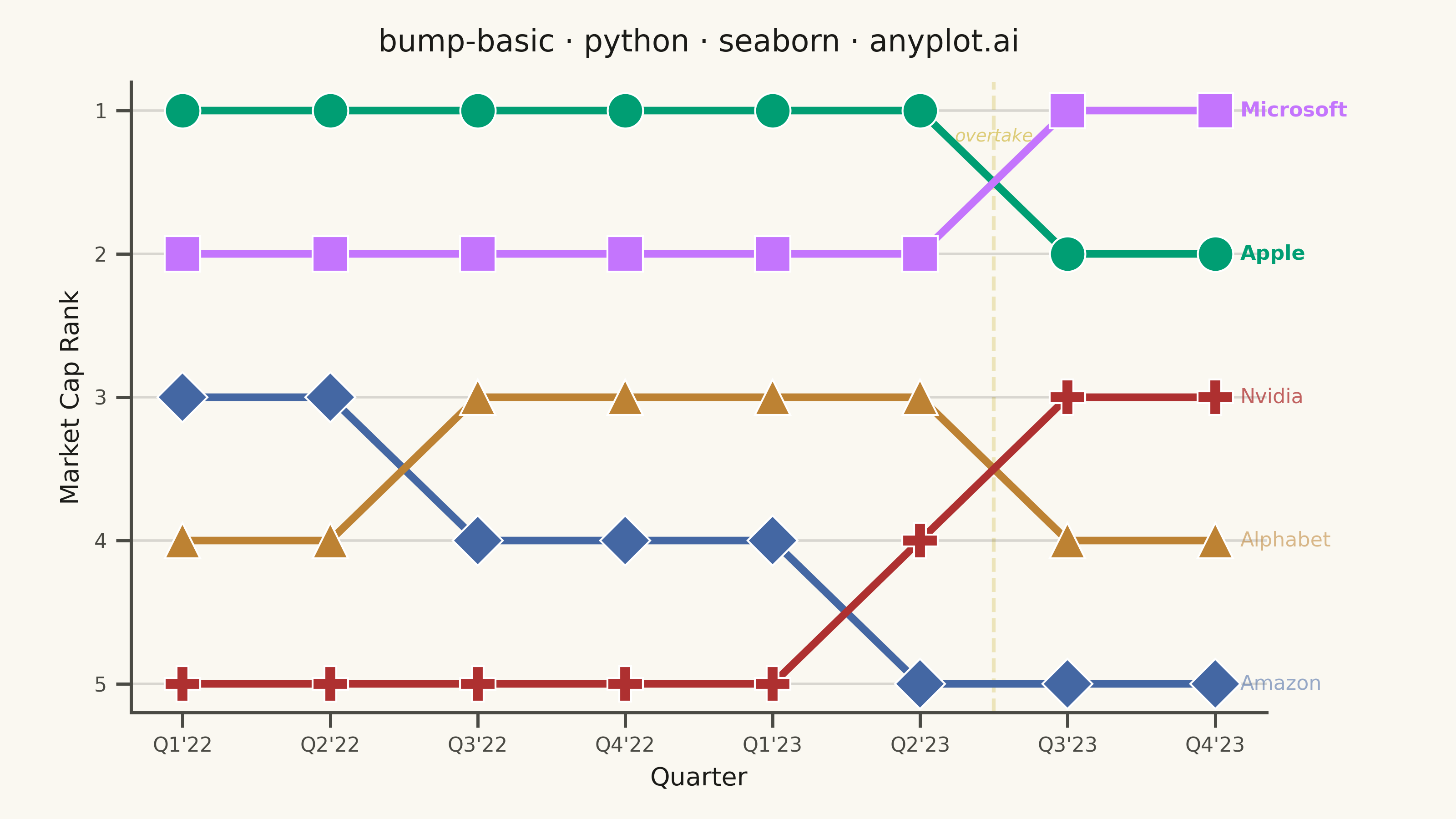
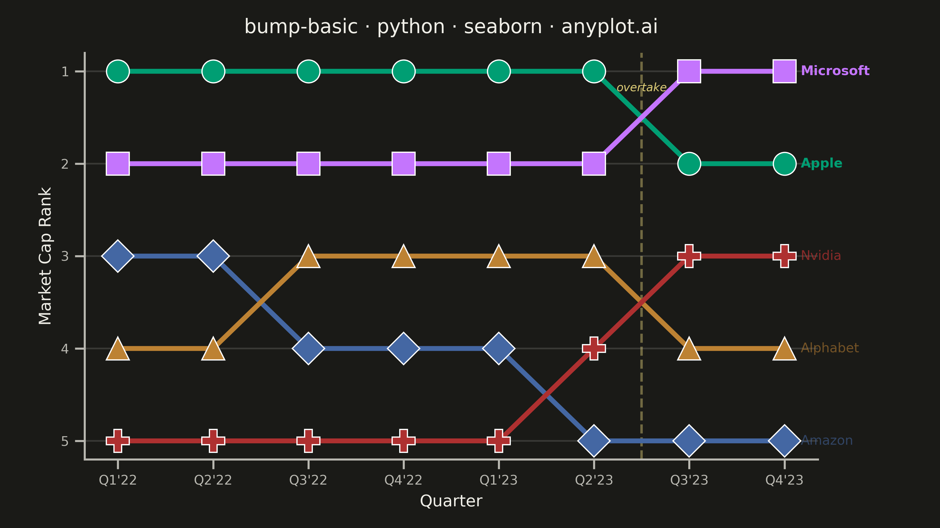
A bump chart visualizes how rankings change over time by plotting rank positions and connecting them with lines. Unlike line charts that show values, bump charts focus specifically on ordinal rankings, making it easy to track position changes, overtakes, and rank stability across time periods.
""" anyplot.ai
bump-basic: Basic Bump Chart
Library: seaborn 0.13.2 | Python 3.13.13
Quality: 90/100 | Updated: 2026-05-29
"""

import os

import matplotlib.pyplot as plt
import pandas as pd
import seaborn as sns


# Theme tokens
THEME = os.getenv("ANYPLOT_THEME", "light")
PAGE_BG = "#FAF8F1" if THEME == "light" else "#1A1A17"
ELEVATED_BG = "#FFFDF6" if THEME == "light" else "#242420"
INK = "#1A1A17" if THEME == "light" else "#F0EFE8"
INK_SOFT = "#4A4A44" if THEME == "light" else "#B8B7B0"
ANYPLOT_AMBER = "#DDCC77"

# Imprint palette — 8 hues, canonical order, first series always #009E73
IMPRINT_PALETTE = ["#009E73", "#C475FD", "#4467A3", "#BD8233", "#AE3030", "#2ABCCD", "#954477", "#99B314"]

# Data — Tech company market cap rankings by quarter (2022–2023)
companies = ["Apple", "Microsoft", "Amazon", "Alphabet", "Nvidia"]
quarters = ["Q1'22", "Q2'22", "Q3'22", "Q4'22", "Q1'23", "Q2'23", "Q3'23", "Q4'23"]

ranks_data = {
    "Apple": [1, 1, 1, 1, 1, 1, 2, 2],
    "Microsoft": [2, 2, 2, 2, 2, 2, 1, 1],
    "Amazon": [3, 3, 4, 4, 4, 5, 5, 5],
    "Alphabet": [4, 4, 3, 3, 3, 3, 4, 4],
    "Nvidia": [5, 5, 5, 5, 5, 4, 3, 3],
}

rows = []
for company, r_list in ranks_data.items():
    for q, r in zip(quarters, r_list, strict=False):
        rows.append({"Company": company, "Quarter": q, "Rank": r})
df = pd.DataFrame(rows)

# Theme-adaptive seaborn setup
sns.set_theme(
    style="ticks",
    rc={
        "figure.facecolor": PAGE_BG,
        "axes.facecolor": PAGE_BG,
        "axes.edgecolor": INK_SOFT,
        "axes.labelcolor": INK,
        "text.color": INK,
        "xtick.color": INK_SOFT,
        "ytick.color": INK_SOFT,
        "grid.color": INK,
        "grid.alpha": 0.15,
        "legend.facecolor": ELEVATED_BG,
        "legend.edgecolor": INK_SOFT,
    },
)

palette = IMPRINT_PALETTE[: len(companies)]
markers = {"Apple": "o", "Microsoft": "s", "Amazon": "D", "Alphabet": "^", "Nvidia": "P"}

# Figure-level relplot — leverages seaborn's FacetGrid API for layout control
g = sns.relplot(
    data=df,
    x="Quarter",
    y="Rank",
    hue="Company",
    style="Company",
    markers=markers,
    dashes=False,
    markersize=14,
    linewidth=3,
    palette=palette,
    hue_order=companies,
    sort=False,
    kind="line",
    height=4.5,
    aspect=16 / 9,
    legend=False,
)
g.figure.set_dpi(400)
g.figure.set_facecolor(PAGE_BG)

ax = g.axes[0, 0]
ax.set_facecolor(PAGE_BG)

# Rank 1 at top
ax.invert_yaxis()
ax.set_yticks([1, 2, 3, 4, 5])
ax.xaxis.grid(False)
ax.yaxis.grid(True)
sns.despine(ax=ax)

# Alpha hierarchy — de-emphasize lower final-ranked companies
final_ranks = {c: ranks_data[c][-1] for c in companies}
for line in ax.get_lines():
    label = line.get_label()
    if label in final_ranks:
        fr = final_ranks[label]
        line.set_alpha(1.0 if fr <= 2 else (0.75 if fr == 3 else 0.55))

# Crossing highlight — Apple/Microsoft overtake between Q2'23 (idx 5) and Q3'23 (idx 6)
# Categorical x-axis maps quarters to integer positions 0–7
CROSSING_X = 5.5
ax.axvline(x=CROSSING_X, color=ANYPLOT_AMBER, alpha=0.45, linewidth=1.5, linestyle="--", zorder=0)
# Label near rank 1 (top of inverted y-axis) where Apple/Microsoft cross
# ax.get_xaxis_transform(): x=data coords, y=axes fraction (1=top of display)
ax.text(
    CROSSING_X,
    0.90,
    "overtake",
    fontsize=7,
    color=ANYPLOT_AMBER,
    ha="center",
    va="bottom",
    style="italic",
    transform=ax.get_xaxis_transform(),
)

# Style
title = "bump-basic · python · seaborn · anyplot.ai"
ax.set_title(title, fontsize=12, fontweight="medium", color=INK, pad=12)
ax.set_xlabel("Quarter", fontsize=10, color=INK)
ax.set_ylabel("Market Cap Rank", fontsize=10, color=INK)
ax.tick_params(axis="both", labelsize=8, colors=INK_SOFT)

# End-of-line labels replacing legend
n_quarters = len(quarters)
for i, company in enumerate(companies):
    rank = ranks_data[company][-1]
    fr = rank
    alpha_val = 1.0 if fr <= 2 else (0.75 if fr == 3 else 0.55)
    ax.annotate(
        company,
        xy=(n_quarters - 1, rank),
        xytext=(10, 0),
        textcoords="offset points",
        fontsize=8,
        fontweight="bold" if rank <= 2 else "normal",
        color=palette[i],
        va="center",
        alpha=alpha_val,
    )

g.figure.subplots_adjust(left=0.09, right=0.87, top=0.90, bottom=0.13)
plt.savefig(f"plot-{THEME}.png", dpi=400, facecolor=PAGE_BG)
Runnable source as JSON, for any HTTP client: https://api.anyplot.ai/specs/bump-basic/seaborn/code. Any spec id and library id listed in llms-full.txt fit the same URL shape; every URL below is complete and callable.
{
  "spec_id": "bump-basic",
  "language": "python",
  "library": "seaborn",
  "page": "https://anyplot.ai/bump-basic/python/seaborn",
  "hub": "https://anyplot.ai/bump-basic",
  "code_json": "https://api.anyplot.ai/specs/bump-basic/seaborn/code",
  "spec_json": "https://api.anyplot.ai/specs/bump-basic",
  "render_light_png": "https://storage.googleapis.com/anyplot-images/plots/bump-basic/python/seaborn/plot-light.png",
  "render_dark_png": "https://storage.googleapis.com/anyplot-images/plots/bump-basic/python/seaborn/plot-dark.png",
  "quality_score": 90.0,
  "license": "MIT",
  "guide": "https://anyplot.ai/llms.txt"
}
Part of Basic Bump Chart on anyplot.ai.