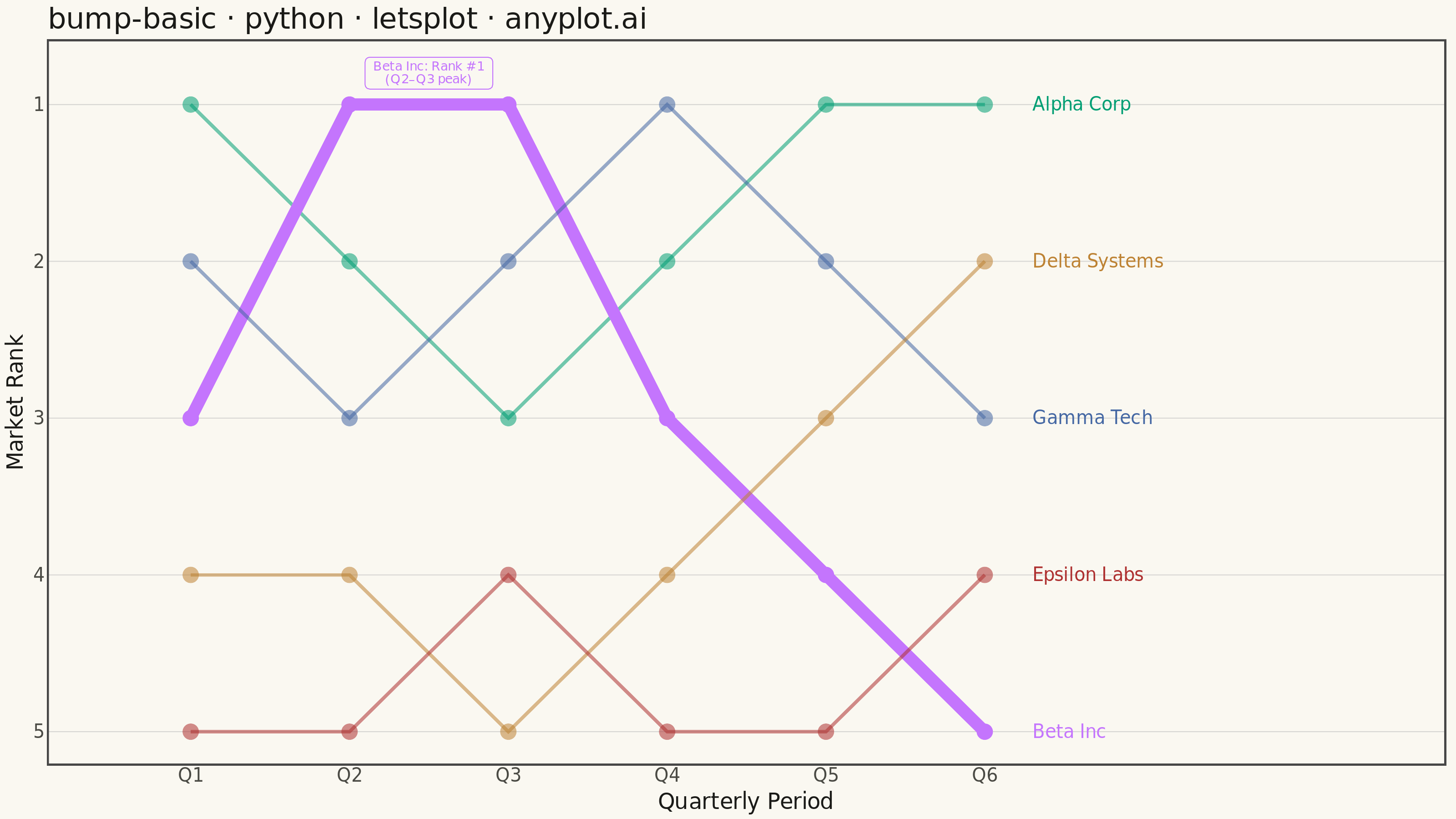
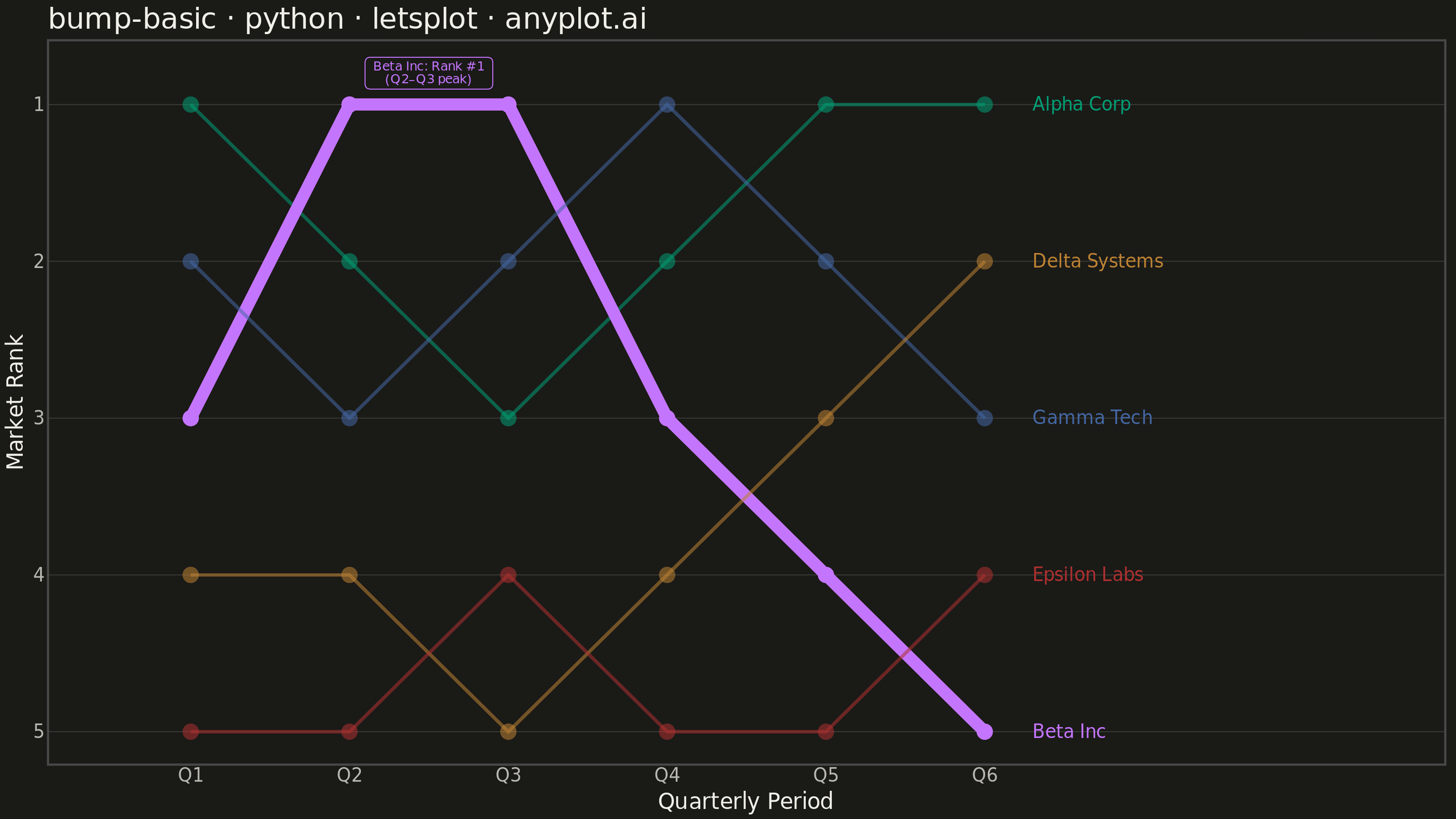
A bump chart visualizes how rankings change over time by plotting rank positions and connecting them with lines. Unlike line charts that show values, bump charts focus specifically on ordinal rankings, making it easy to track position changes, overtakes, and rank stability across time periods.
""" anyplot.ai
bump-basic: Basic Bump Chart
Library: letsplot 4.10.1 | Python 3.13.13
Quality: 87/100 | Updated: 2026-05-29
"""

import os

import pandas as pd
from lets_plot import (
    LetsPlot,
    aes,
    element_blank,
    element_line,
    element_rect,
    element_text,
    geom_label,
    geom_line,
    geom_point,
    geom_text,
    ggplot,
    ggsave,
    ggsize,
    labs,
    layer_tooltips,
    scale_alpha_manual,
    scale_color_manual,
    scale_size_manual,
    scale_x_continuous,
    scale_y_reverse,
    theme,
    theme_minimal,
)


LetsPlot.setup_html()

# Theme tokens — Imprint palette chrome
THEME = os.getenv("ANYPLOT_THEME", "light")
PAGE_BG = "#FAF8F1" if THEME == "light" else "#1A1A17"
INK = "#1A1A17" if THEME == "light" else "#F0EFE8"
INK_SOFT = "#4A4A44" if THEME == "light" else "#B8B7B0"
# Approximate 15% opacity grid: blend INK into PAGE_BG at 15%
GRID_COLOR = "#D7D6D3" if THEME == "light" else "#3A3935"

# Imprint categorical palette — canonical order, 5 series
IMPRINT_PALETTE = ["#009E73", "#C475FD", "#4467A3", "#BD8233", "#AE3030"]

# Data - Tech company market share rankings over 6 quarters
# Story: Alpha Corp reclaims top; Beta Inc meteoric rise then collapse;
# Gamma Tech volatile; Delta Systems steady climber; Epsilon Labs at the bottom
data = {
    "entity": (
        ["Alpha Corp"] * 6 + ["Beta Inc"] * 6 + ["Gamma Tech"] * 6 + ["Delta Systems"] * 6 + ["Epsilon Labs"] * 6
    ),
    "period": ["Q1", "Q2", "Q3", "Q4", "Q5", "Q6"] * 5,
    "period_num": [1, 2, 3, 4, 5, 6] * 5,
    "rank": [
        1,
        2,
        3,
        2,
        1,
        1,  # Alpha Corp — drops mid-year, reclaims #1
        3,
        1,
        1,
        3,
        4,
        5,  # Beta Inc — meteoric rise to #1, then collapses
        2,
        3,
        2,
        1,
        2,
        3,  # Gamma Tech — volatile, briefly reaches #1 in Q4
        4,
        4,
        5,
        4,
        3,
        2,  # Delta Systems — steady climber from bottom half
        5,
        5,
        4,
        5,
        5,
        4,  # Epsilon Labs — mostly bottom, slight improvement
    ],
}
df = pd.DataFrame(data)

# Hero entity: Beta Inc has the most dramatic arc — emphasize via mapped aesthetics
hero = "Beta Inc"
HERO_COLOR = IMPRINT_PALETTE[1]  # lavender — Beta Inc's Imprint color
df["role"] = df["entity"].apply(lambda x: "hero" if x == hero else "rest")
df_labels = df[df["period_num"] == 6].copy()

# Annotation dataframe — highlight Beta Inc's peak reign (Q2–Q3) using geom_label
df_annot = pd.DataFrame({"period_num": [2.5], "rank": [0.8], "label": ["Beta Inc: Rank #1\n(Q2–Q3 peak)"]})

# Tooltip config for the interactive HTML output
tooltip_cfg = layer_tooltips().title("@entity").line("@|@period").line("Rank|@rank")

# Title length: 44 chars < 67 baseline → keep default size 16
title = "bump-basic · python · letsplot · anyplot.ai"

plot = (
    ggplot(df, aes(x="period_num", y="rank", color="entity", group="entity"))
    # Lines: dramatic size/alpha split — hero 3.0 vs rest 0.8 for unmistakable focal point
    + geom_line(aes(size="role", alpha="role"), tooltips=tooltip_cfg)
    # Dots at each rank position; alpha mapped for hero prominence
    + geom_point(aes(alpha="role"), size=4, tooltips=tooltip_cfg)
    # End-of-line entity labels — entity color inherited from global aes
    + geom_text(aes(label="entity"), data=df_labels, nudge_x=0.3, hjust=0, size=5)
    # Peak annotation via geom_label — letsplot's labeled text box with background fill
    + geom_label(
        aes(x="period_num", y="rank", label="label"),
        data=df_annot,
        color=HERO_COLOR,
        fill=PAGE_BG,
        size=3.5,
        hjust=0.5,
        inherit_aes=False,
        label_size=0.5,
    )
    + scale_y_reverse(breaks=[1, 2, 3, 4, 5])
    + scale_x_continuous(breaks=[1, 2, 3, 4, 5, 6], labels=["Q1", "Q2", "Q3", "Q4", "Q5", "Q6"], limits=[0.5, 8.5])
    + scale_color_manual(values=IMPRINT_PALETTE)
    + scale_size_manual(name="", values={"hero": 3.0, "rest": 0.8}, guide="none")
    + scale_alpha_manual(name="", values={"hero": 1.0, "rest": 0.55}, guide="none")
    + labs(x="Quarterly Period", y="Market Rank", title=title)
    + theme_minimal()
    + theme(
        plot_title=element_text(size=16, color=INK),
        axis_title=element_text(size=12, color=INK),
        axis_text=element_text(size=10, color=INK_SOFT),
        axis_line=element_line(color=INK_SOFT),
        axis_ticks=element_blank(),
        legend_position="none",
        # Y-axis grid only — cleaner look for bump charts
        panel_grid_major_x=element_blank(),
        panel_grid_minor_x=element_blank(),
        panel_grid_major_y=element_line(color=GRID_COLOR, size=0.5),
        panel_grid_minor_y=element_blank(),
        plot_background=element_rect(fill=PAGE_BG, color=PAGE_BG),
        panel_background=element_rect(fill=PAGE_BG),
    )
    + ggsize(800, 450)
)

# Save PNG (scale=4 → 3200×1800 px) and HTML (interactive tooltips)
ggsave(plot, f"plot-{THEME}.png", path=".", scale=4)
ggsave(plot, f"plot-{THEME}.html", path=".")
Runnable source as JSON, for any HTTP client: https://api.anyplot.ai/specs/bump-basic/letsplot/code. Any spec id and library id listed in llms-full.txt fit the same URL shape; every URL below is complete and callable.
{
  "spec_id": "bump-basic",
  "language": "python",
  "library": "letsplot",
  "page": "https://anyplot.ai/bump-basic/python/letsplot",
  "hub": "https://anyplot.ai/bump-basic",
  "code_json": "https://api.anyplot.ai/specs/bump-basic/letsplot/code",
  "spec_json": "https://api.anyplot.ai/specs/bump-basic",
  "render_light_png": "https://storage.googleapis.com/anyplot-images/plots/bump-basic/python/letsplot/plot-light.png",
  "render_dark_png": "https://storage.googleapis.com/anyplot-images/plots/bump-basic/python/letsplot/plot-dark.png",
  "interactive_light_html": "https://storage.googleapis.com/anyplot-images/plots/bump-basic/python/letsplot/plot-light.html",
  "interactive_dark_html": "https://storage.googleapis.com/anyplot-images/plots/bump-basic/python/letsplot/plot-dark.html",
  "quality_score": 87.0,
  "license": "MIT",
  "guide": "https://anyplot.ai/llms.txt"
}
Part of Basic Bump Chart on anyplot.ai.