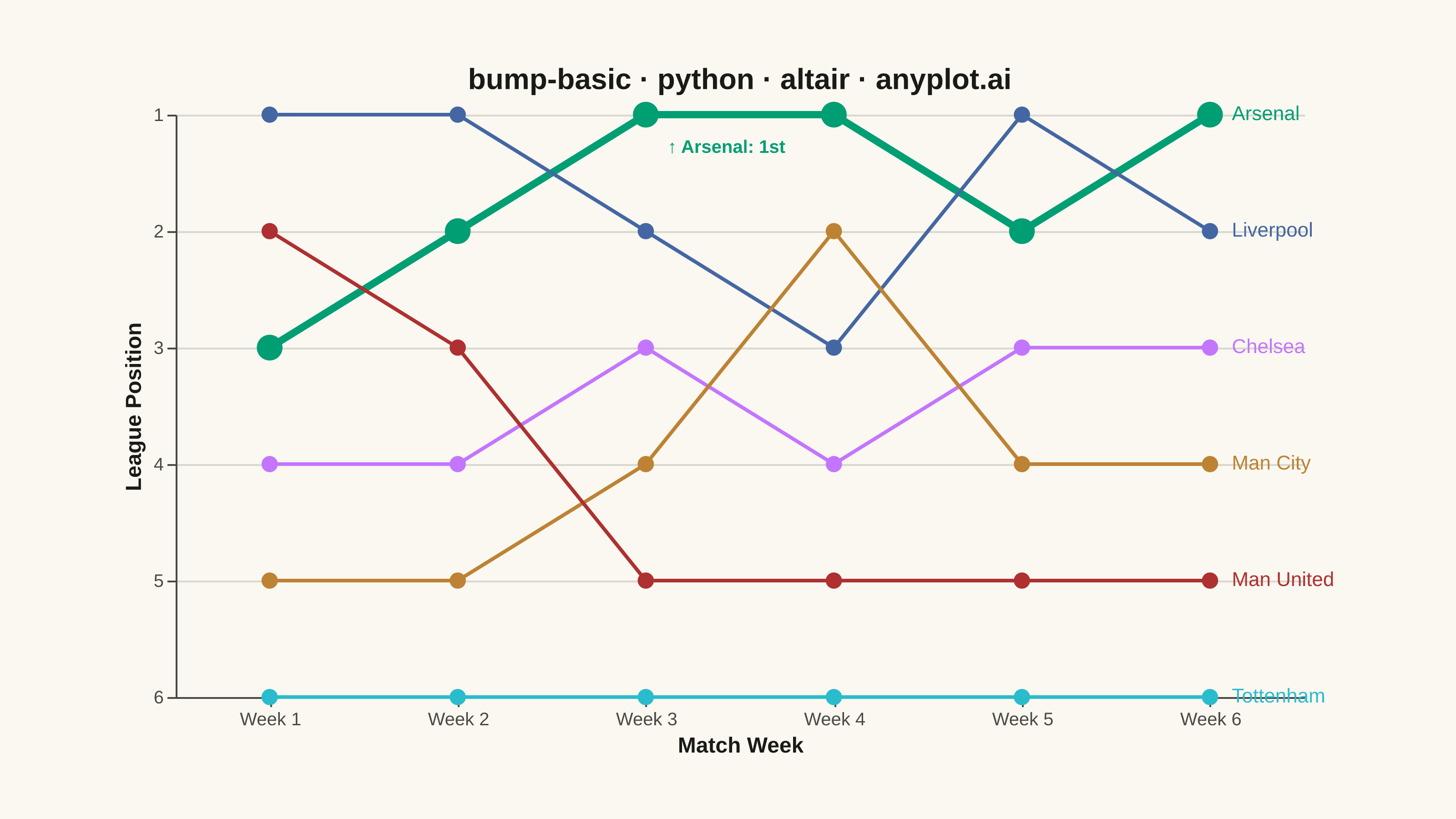
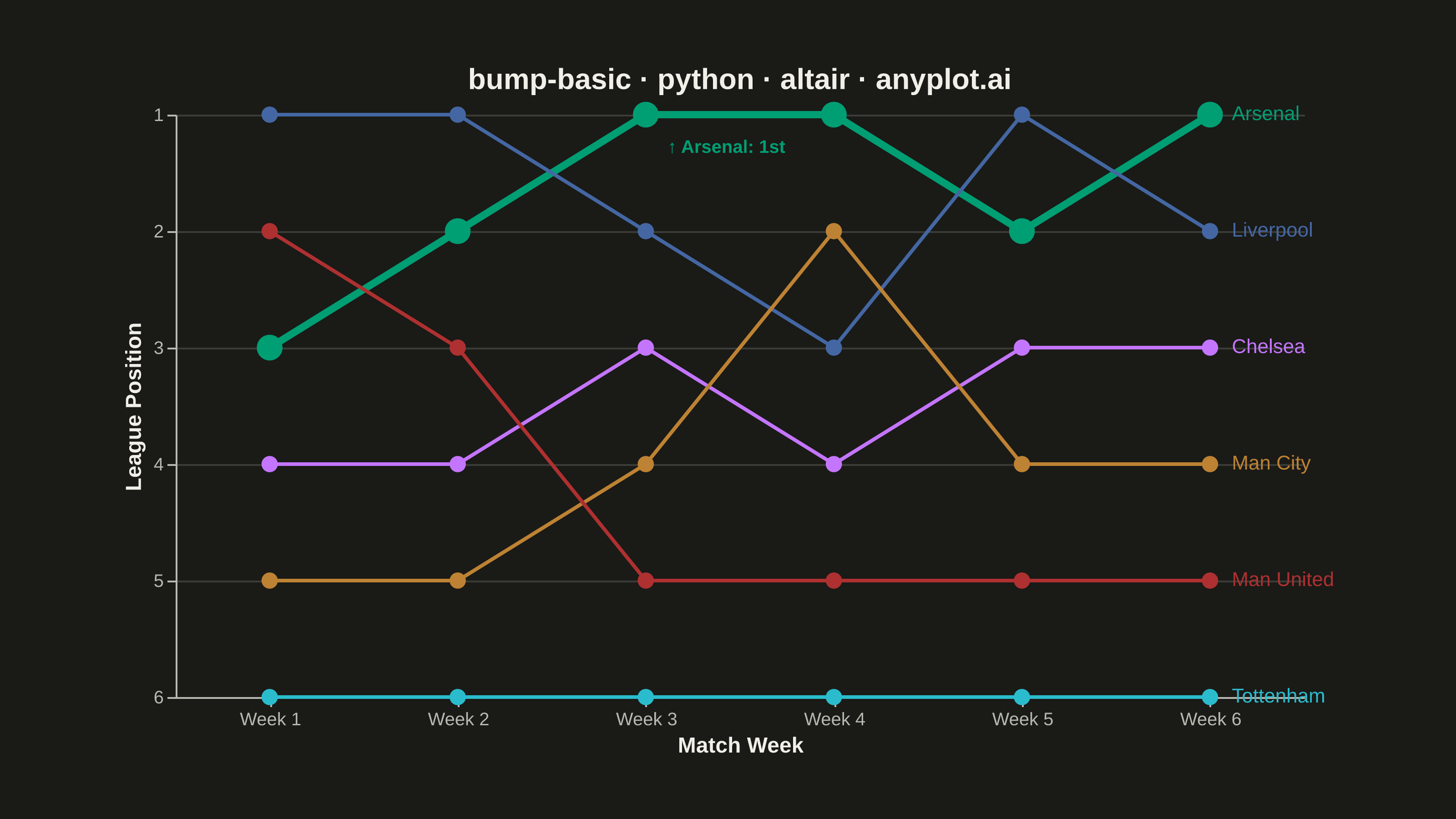
A bump chart visualizes how rankings change over time by plotting rank positions and connecting them with lines. Unlike line charts that show values, bump charts focus specifically on ordinal rankings, making it easy to track position changes, overtakes, and rank stability across time periods.
""" anyplot.ai
bump-basic: Basic Bump Chart
Library: altair 6.1.0 | Python 3.13.13
Quality: 90/100 | Updated: 2026-05-29
"""

import os
import sys


# Prevent self-import: this file is named altair.py; remove the script directory
# from sys.path so `import altair` finds the installed package, not this file.
_this_dir = os.path.dirname(os.path.abspath(__file__))
sys.path = [p for p in sys.path if not p or os.path.abspath(p) != _this_dir]

import altair as alt
import pandas as pd
from PIL import Image


# Theme tokens — Imprint palette chrome
THEME = os.getenv("ANYPLOT_THEME", "light")
PAGE_BG = "#FAF8F1" if THEME == "light" else "#1A1A17"
ELEVATED_BG = "#FFFDF6" if THEME == "light" else "#242420"
INK = "#1A1A17" if THEME == "light" else "#F0EFE8"
INK_SOFT = "#4A4A44" if THEME == "light" else "#B8B7B0"

# Imprint categorical palette (hybrid-v3 order) — first series always #009E73
IMPRINT_PALETTE = ["#009E73", "#C475FD", "#4467A3", "#BD8233", "#AE3030", "#2ABCCD"]

# Data — Premier League standings over 6 match weeks (deterministic)
teams = ["Arsenal", "Chelsea", "Liverpool", "Man City", "Man United", "Tottenham"]
weeks = ["Week 1", "Week 2", "Week 3", "Week 4", "Week 5", "Week 6"]
ranks = [
    # Arsenal: starts 3rd, rises to 1st — featured narrative
    3,
    2,
    1,
    1,
    2,
    1,
    # Chelsea: mid-table consistency
    4,
    4,
    3,
    4,
    3,
    3,
    # Liverpool: starts 1st, drops mid-season, recovers
    1,
    1,
    2,
    3,
    1,
    2,
    # Man City: volatile mid-table
    5,
    5,
    4,
    2,
    4,
    4,
    # Man United: declines from 2nd to 5th
    2,
    3,
    5,
    5,
    5,
    5,
    # Tottenham: bottom position throughout
    6,
    6,
    6,
    6,
    6,
    6,
]

df = pd.DataFrame({"Team": [t for t in teams for _ in weeks], "Week": weeks * len(teams), "Rank": ranks})

# Interactive highlight on hover — distinctive Altair capability
highlight = alt.selection_point(fields=["Team"], on="pointerover")

# Arsenal predicate for visual hierarchy (data storytelling)
is_arsenal = alt.datum.Team == "Arsenal"

# Lines — Arsenal emphasized with thicker stroke
lines = (
    alt.Chart(df)
    .mark_line()
    .encode(
        x=alt.X("Week:O", title="Match Week", axis=alt.Axis(labelAngle=0)),
        y=alt.Y(
            "Rank:Q",
            title="League Position",
            scale=alt.Scale(domain=[1, 6], reverse=True),
            axis=alt.Axis(tickMinStep=1, values=[1, 2, 3, 4, 5, 6]),
        ),
        color=alt.Color("Team:N", scale=alt.Scale(domain=teams, range=IMPRINT_PALETTE), legend=None),
        strokeWidth=alt.condition(is_arsenal, alt.value(4), alt.value(2)),
        opacity=alt.condition(highlight, alt.value(1.0), alt.value(0.3)),
    )
    .add_params(highlight)
)

# Points — Arsenal gets larger markers for emphasis
points = (
    alt.Chart(df)
    .mark_point(filled=True)
    .encode(
        x=alt.X("Week:O"),
        y=alt.Y("Rank:Q", scale=alt.Scale(domain=[1, 6], reverse=True)),
        color=alt.Color("Team:N", scale=alt.Scale(domain=teams, range=IMPRINT_PALETTE)),
        size=alt.condition(is_arsenal, alt.value(200), alt.value(80)),
        opacity=alt.condition(highlight, alt.value(1.0), alt.value(0.3)),
        tooltip=["Team:N", "Week:O", "Rank:Q"],
    )
)

# End-of-line labels — direct identification replacing legend
last_week = df[df["Week"] == "Week 6"]
labels = (
    alt.Chart(last_week)
    .mark_text(align="left", dx=12, fontSize=11)
    .encode(
        x=alt.X("Week:O"),
        y=alt.Y("Rank:Q", scale=alt.Scale(domain=[1, 6], reverse=True)),
        text="Team:N",
        color=alt.Color("Team:N", scale=alt.Scale(domain=teams, range=IMPRINT_PALETTE)),
    )
)

# Callout annotation — Arsenal reaches 1st at Week 3 (data storytelling)
annotation_df = pd.DataFrame({"Week": ["Week 3"], "Rank": [1], "label": ["↑ Arsenal: 1st"]})
annotation = (
    alt.Chart(annotation_df)
    .mark_text(align="left", dx=12, dy=18, fontSize=10, fontWeight="bold", color="#009E73")
    .encode(x=alt.X("Week:O"), y=alt.Y("Rank:Q", scale=alt.Scale(domain=[1, 6], reverse=True)), text="label:N")
)

title = "bump-basic · python · altair · anyplot.ai"
chart = (
    (lines + points + labels + annotation)
    .properties(width=620, height=320, background=PAGE_BG, title=alt.Title(title, fontSize=16))
    .configure_view(fill=PAGE_BG, strokeWidth=0)
    .configure_axis(
        domainColor=INK_SOFT,
        tickColor=INK_SOFT,
        gridColor=INK,
        gridOpacity=0.15,
        labelColor=INK_SOFT,
        titleColor=INK,
        labelFontSize=10,
        titleFontSize=12,
    )
    .configure_title(color=INK)
    .configure_legend(fillColor=ELEVATED_BG, strokeColor=INK_SOFT, labelColor=INK_SOFT, titleColor=INK)
)

chart.save(f"plot-{THEME}.png", scale_factor=4.0)

# Pad-only to exact 3200×1800 target (do NOT crop — AR-09)
TW, TH = 3200, 1800
_img = Image.open(f"plot-{THEME}.png").convert("RGB")
_w, _h = _img.size
if _w > TW or _h > TH:
    raise SystemExit(
        f"altair vl-convert produced {_w}×{_h}, exceeds target {TW}×{TH}. "
        f"Shrink chart .properties(width=, height=) values and re-render."
    )
if _w < TW or _h < TH:
    _canvas = Image.new("RGB", (TW, TH), PAGE_BG)
    _canvas.paste(_img, ((TW - _w) // 2, (TH - _h) // 2))
    _canvas.save(f"plot-{THEME}.png")

chart.save(f"plot-{THEME}.html")
Runnable source as JSON, for any HTTP client: https://api.anyplot.ai/specs/bump-basic/altair/code. Any spec id and library id listed in llms-full.txt fit the same URL shape; every URL below is complete and callable.
{
  "spec_id": "bump-basic",
  "language": "python",
  "library": "altair",
  "page": "https://anyplot.ai/bump-basic/python/altair",
  "hub": "https://anyplot.ai/bump-basic",
  "code_json": "https://api.anyplot.ai/specs/bump-basic/altair/code",
  "spec_json": "https://api.anyplot.ai/specs/bump-basic",
  "render_light_png": "https://storage.googleapis.com/anyplot-images/plots/bump-basic/python/altair/plot-light.png",
  "render_dark_png": "https://storage.googleapis.com/anyplot-images/plots/bump-basic/python/altair/plot-dark.png",
  "interactive_light_html": "https://storage.googleapis.com/anyplot-images/plots/bump-basic/python/altair/plot-light.html",
  "interactive_dark_html": "https://storage.googleapis.com/anyplot-images/plots/bump-basic/python/altair/plot-dark.html",
  "quality_score": 90.0,
  "license": "MIT",
  "guide": "https://anyplot.ai/llms.txt"
}
Part of Basic Bump Chart on anyplot.ai.