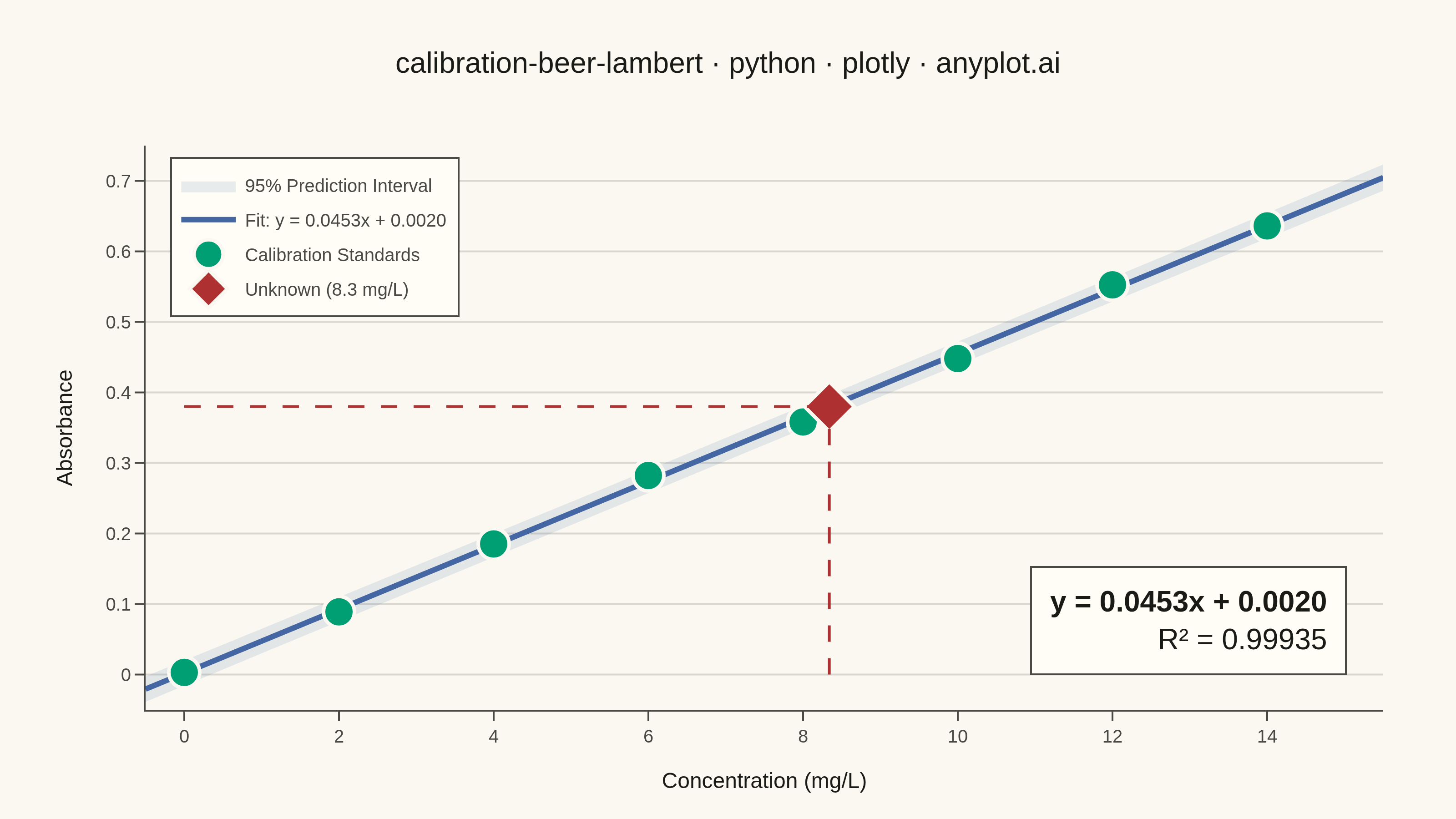
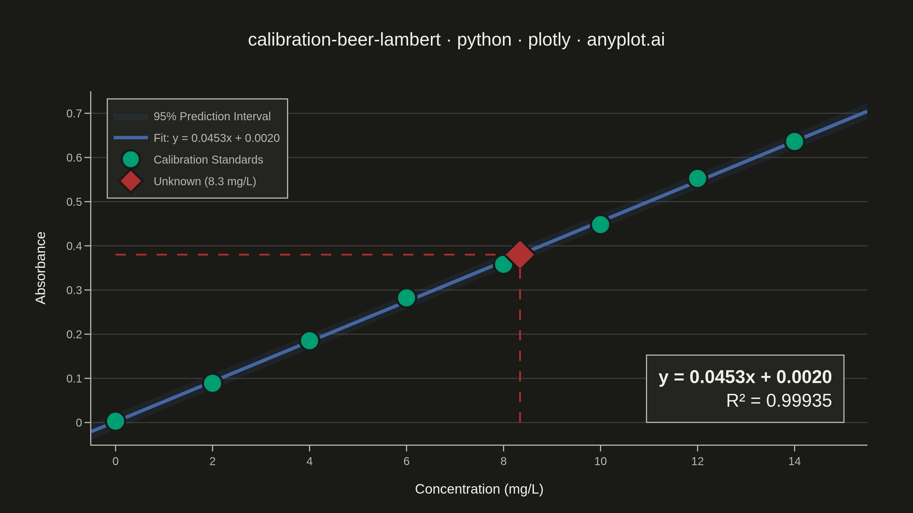
A calibration curve plotting absorbance versus concentration following Beer-Lambert law (A = εlc). Measured calibration standards are shown as scatter points with a linear regression fit line. The regression equation (y = mx + b) and R² value are displayed on the plot. An example unknown sample is marked with dashed lines extending to both axes, demonstrating how the curve is used to determine concentration from a measured absorbance. This plot is fundamental in analytical chemistry for quantitative spectrophotometric analysis.
""" anyplot.ai
calibration-beer-lambert: Beer-Lambert Calibration Curve
Library: plotly 6.7.0 | Python 3.13.13
Quality: 91/100 | Updated: 2026-06-03
"""

import os

import numpy as np
import plotly.graph_objects as go


# Theme tokens (Imprint palette — see prompts/default-style-guide.md)
THEME = os.getenv("ANYPLOT_THEME", "light")
PAGE_BG = "#FAF8F1" if THEME == "light" else "#1A1A17"
ELEVATED_BG = "#FFFDF6" if THEME == "light" else "#242420"
INK = "#1A1A17" if THEME == "light" else "#F0EFE8"
INK_SOFT = "#4A4A44" if THEME == "light" else "#B8B7B0"
GRID = "rgba(26,26,23,0.15)" if THEME == "light" else "rgba(240,239,232,0.15)"

# Imprint palette — positions used
BRAND = "#009E73"  # calibration standards — position 1, always first series
BLUE = "#4467A3"  # regression line — position 3
RED = "#AE3030"  # unknown sample — semantic anchor for focal/reference point

# Data - UV-Vis spectrophotometry calibration standards
np.random.seed(42)
concentration = np.array([0.0, 2.0, 4.0, 6.0, 8.0, 10.0, 12.0, 14.0])
molar_absorptivity = 0.045
absorbance_true = molar_absorptivity * concentration
absorbance = absorbance_true + np.random.normal(0, 0.008, len(concentration))
absorbance[0] = 0.003

# Linear regression
slope, intercept = np.polyfit(concentration, absorbance, 1)
absorbance_pred = slope * concentration + intercept
ss_res = np.sum((absorbance - absorbance_pred) ** 2)
ss_tot = np.sum((absorbance - np.mean(absorbance)) ** 2)
r_squared = 1 - ss_res / ss_tot

# Regression line and 95% prediction interval
conc_fit = np.linspace(-0.5, 15.5, 200)
abs_fit = slope * conc_fit + intercept
n = len(concentration)
conc_mean = np.mean(concentration)
mse = ss_res / (n - 2)
se_pred = np.sqrt(mse * (1 + 1 / n + (conc_fit - conc_mean) ** 2 / np.sum((concentration - conc_mean) ** 2)))
t_crit = 2.447  # t-critical for 95% two-sided, df=6 (pre-computed)
pred_upper = abs_fit + t_crit * se_pred
pred_lower = abs_fit - t_crit * se_pred

# Unknown sample
unknown_absorbance = 0.38
unknown_concentration = (unknown_absorbance - intercept) / slope

# Title — 55 chars, below 67-char baseline → default fontsize applies
title = "calibration-beer-lambert · python · plotly · anyplot.ai"
title_fontsize = round(16 * min(1.0, 67 / len(title)))

# Plot
fig = go.Figure()

# 95% prediction interval band
fig.add_trace(
    go.Scatter(
        x=np.concatenate([conc_fit, conc_fit[::-1]]),
        y=np.concatenate([pred_upper, pred_lower[::-1]]),
        fill="toself",
        fillcolor="rgba(68,103,163,0.12)",
        line={"color": "rgba(0,0,0,0)"},
        name="95% Prediction Interval",
        showlegend=True,
        hoverinfo="skip",
    )
)

# Regression line
fig.add_trace(
    go.Scatter(
        x=conc_fit,
        y=abs_fit,
        mode="lines",
        name=f"Fit: y = {slope:.4f}x + {intercept:.4f}",
        line={"color": BLUE, "width": 3},
        hovertemplate="Conc: %{x:.2f} mg/L<br>Predicted Abs: %{y:.4f}<extra></extra>",
    )
)

# Calibration standards
fig.add_trace(
    go.Scatter(
        x=concentration,
        y=absorbance,
        mode="markers",
        name="Calibration Standards",
        marker={"size": 17, "color": BRAND, "line": {"color": PAGE_BG, "width": 2}, "symbol": "circle"},
        hovertemplate="<b>Standard %{pointNumber}</b><br>Concentration: %{x:.1f} mg/L<br>Absorbance: %{y:.4f}<extra></extra>",
    )
)

# Unknown sample point
fig.add_trace(
    go.Scatter(
        x=[unknown_concentration],
        y=[unknown_absorbance],
        mode="markers",
        name=f"Unknown ({unknown_concentration:.1f} mg/L)",
        marker={"size": 21, "color": RED, "line": {"color": PAGE_BG, "width": 2}, "symbol": "diamond"},
        hovertemplate="<b>Unknown Sample</b><br>Concentration: %{x:.2f} mg/L<br>Absorbance: %{y:.4f}<extra></extra>",
    )
)

# Dashed guide lines from unknown sample to both axes
fig.add_shape(
    type="line",
    x0=unknown_concentration,
    y0=0,
    x1=unknown_concentration,
    y1=unknown_absorbance,
    line={"color": RED, "width": 1.5, "dash": "dash"},
)
fig.add_shape(
    type="line",
    x0=0,
    y0=unknown_absorbance,
    x1=unknown_concentration,
    y1=unknown_absorbance,
    line={"color": RED, "width": 1.5, "dash": "dash"},
)

# Regression equation and R² annotation — placed in lower-right area clear of legend
fig.add_annotation(
    x=0.97,
    y=0.06,
    xref="paper",
    yref="paper",
    text=f"<b>y = {slope:.4f}x + {intercept:.4f}</b><br>R² = {r_squared:.5f}",
    showarrow=False,
    font={"size": 16, "color": INK, "family": "Arial, sans-serif"},
    bgcolor=ELEVATED_BG,
    bordercolor=INK_SOFT,
    borderwidth=1,
    borderpad=10,
    align="right",
    xanchor="right",
    yanchor="bottom",
)

# Layout
fig.update_layout(
    autosize=False,
    paper_bgcolor=PAGE_BG,
    plot_bgcolor=PAGE_BG,
    font={"color": INK},
    title={
        "text": title,
        "font": {"size": title_fontsize, "color": INK, "family": "Arial, sans-serif"},
        "x": 0.5,
        "xanchor": "center",
    },
    xaxis={
        "title": {"text": "Concentration (mg/L)", "font": {"size": 12, "color": INK}},
        "tickfont": {"size": 10, "color": INK_SOFT},
        "range": [-0.5, 15.5],
        "showgrid": False,
        "zeroline": False,
        "linecolor": INK_SOFT,
        "linewidth": 1,
        "ticks": "outside",
        "tickcolor": INK_SOFT,
    },
    yaxis={
        "title": {"text": "Absorbance", "font": {"size": 12, "color": INK}},
        "tickfont": {"size": 10, "color": INK_SOFT},
        "range": [-0.05, 0.75],
        "gridcolor": GRID,
        "gridwidth": 1,
        "zeroline": False,
        "linecolor": INK_SOFT,
        "linewidth": 1,
        "ticks": "outside",
        "tickcolor": INK_SOFT,
    },
    legend={
        "font": {"size": 10, "color": INK_SOFT},
        "x": 0.02,
        "y": 0.98,
        "xanchor": "left",
        "yanchor": "top",
        "bgcolor": ELEVATED_BG,
        "bordercolor": INK_SOFT,
        "borderwidth": 1,
    },
    margin={"l": 80, "r": 40, "t": 80, "b": 60},
)

# Save — landscape 3200×1800 (width=800, height=450, scale=4)
fig.write_image(f"plot-{THEME}.png", width=800, height=450, scale=4)
fig.write_html(f"plot-{THEME}.html", include_plotlyjs="cdn")
Runnable source as JSON, for any HTTP client: https://api.anyplot.ai/specs/calibration-beer-lambert/plotly/code. Any spec id and library id listed in llms-full.txt fit the same URL shape; every URL below is complete and callable.
{
  "spec_id": "calibration-beer-lambert",
  "language": "python",
  "library": "plotly",
  "page": "https://anyplot.ai/calibration-beer-lambert/python/plotly",
  "hub": "https://anyplot.ai/calibration-beer-lambert",
  "code_json": "https://api.anyplot.ai/specs/calibration-beer-lambert/plotly/code",
  "spec_json": "https://api.anyplot.ai/specs/calibration-beer-lambert",
  "render_light_png": "https://storage.googleapis.com/anyplot-images/plots/calibration-beer-lambert/python/plotly/plot-light.png",
  "render_dark_png": "https://storage.googleapis.com/anyplot-images/plots/calibration-beer-lambert/python/plotly/plot-dark.png",
  "interactive_light_html": "https://storage.googleapis.com/anyplot-images/plots/calibration-beer-lambert/python/plotly/plot-light.html",
  "interactive_dark_html": "https://storage.googleapis.com/anyplot-images/plots/calibration-beer-lambert/python/plotly/plot-dark.html",
  "quality_score": 91.0,
  "license": "MIT",
  "guide": "https://anyplot.ai/llms.txt"
}
Part of Beer-Lambert Calibration Curve on anyplot.ai.