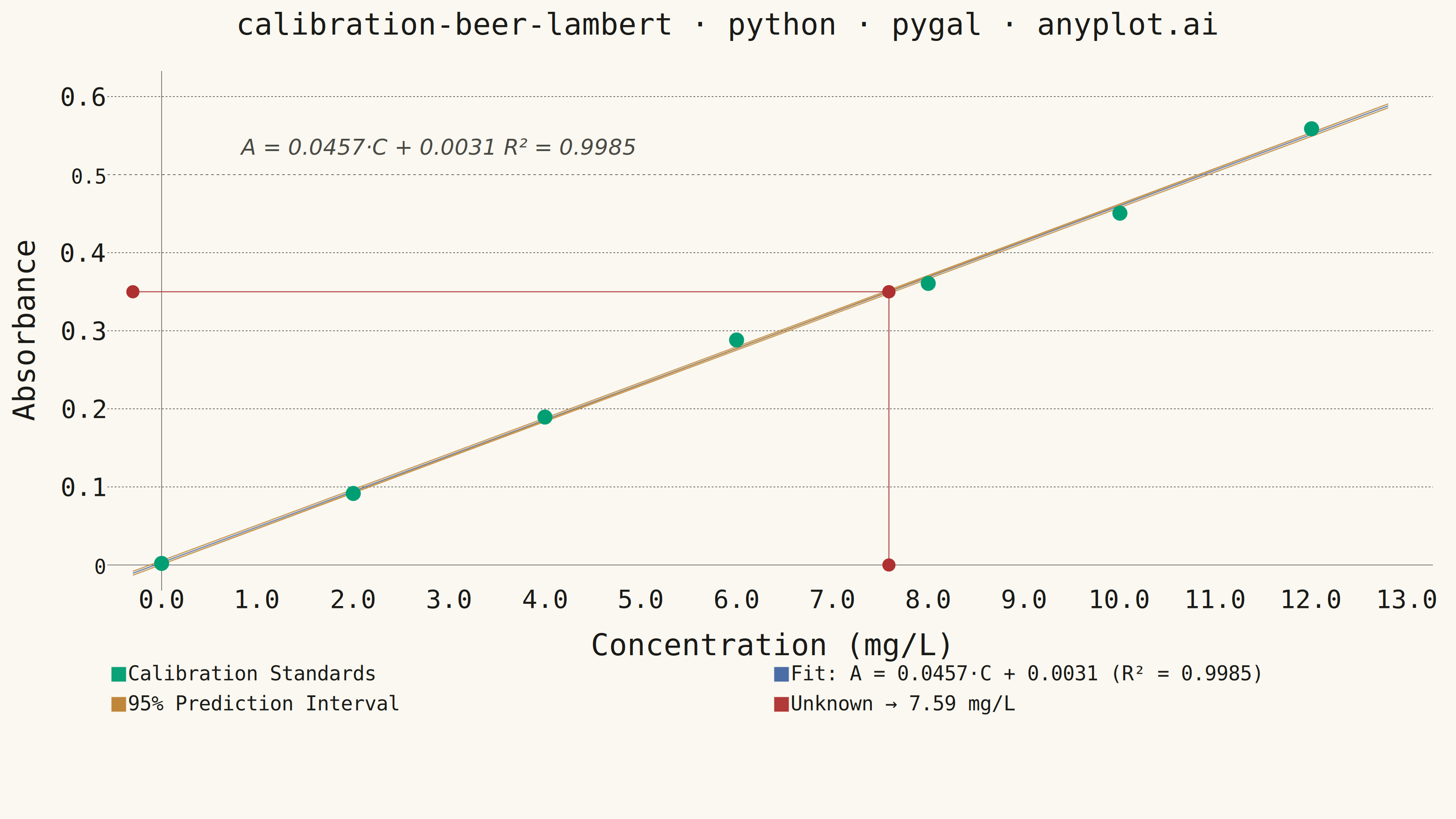
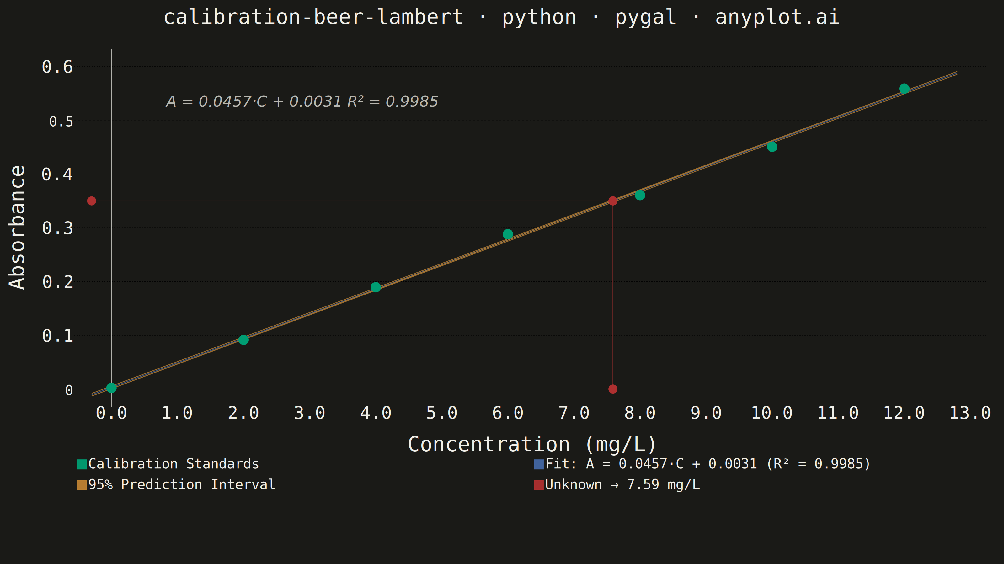
A calibration curve plotting absorbance versus concentration following Beer-Lambert law (A = εlc). Measured calibration standards are shown as scatter points with a linear regression fit line. The regression equation (y = mx + b) and R² value are displayed on the plot. An example unknown sample is marked with dashed lines extending to both axes, demonstrating how the curve is used to determine concentration from a measured absorbance. This plot is fundamental in analytical chemistry for quantitative spectrophotometric analysis.
""" anyplot.ai
calibration-beer-lambert: Beer-Lambert Calibration Curve
Library: pygal 3.1.0 | Python 3.13.13
Quality: 85/100 | Updated: 2026-06-03
"""

import os
import sys


# Remove this script's directory from sys.path so the installed pygal package
# is found instead of this file (both share the name "pygal.py" / "pygal")
_script_dir = os.path.dirname(os.path.abspath(__file__))
sys.path = [p for p in sys.path if os.path.abspath(p) != _script_dir and p != ""]
os.chdir(_script_dir)  # ensure output files land in the implementation directory

import cairosvg
import numpy as np
import pygal
from pygal.style import Style
from scipy import stats


# Theme tokens — Imprint palette
THEME = os.getenv("ANYPLOT_THEME", "light")
PAGE_BG = "#FAF8F1" if THEME == "light" else "#1A1A17"
INK = "#1A1A17" if THEME == "light" else "#F0EFE8"
INK_SOFT = "#4A4A44" if THEME == "light" else "#B8B7B0"
INK_MUTED = "#6B6A63" if THEME == "light" else "#A8A79F"

# Imprint categorical palette — first series always brand green
IMPRINT_PALETTE = ("#009E73", "#C475FD", "#4467A3", "#BD8233", "#AE3030", "#2ABCCD", "#954477", "#99B314")
BRAND = IMPRINT_PALETTE[0]  # #009E73 — calibration standards (first series)
BLUE = IMPRINT_PALETTE[2]  # #4467A3 — regression fit line
OCHRE = IMPRINT_PALETTE[3]  # #BD8233 — 95% prediction interval band
RED = IMPRINT_PALETTE[4]  # #AE3030 — unknown sample (semantic: determination result)

# Data: copper sulfate calibration standards at 810 nm
np.random.seed(42)
concentration = np.array([0.0, 2.0, 4.0, 6.0, 8.0, 10.0, 12.0])
true_absorbance = 0.045 * concentration + 0.003
noise = np.random.normal(0, 0.010, len(concentration))
absorbance = true_absorbance + noise
absorbance[0] = 0.002

# Linear regression
slope, intercept, r_value, p_value, std_err = stats.linregress(concentration, absorbance)
r_squared = r_value**2

# Regression line
conc_fit = np.linspace(-0.3, 12.8, 100)
abs_fit = slope * conc_fit + intercept

# 95% prediction interval
n = len(concentration)
conc_mean = np.mean(concentration)
se_fit = std_err * np.sqrt(1 + 1 / n + (conc_fit - conc_mean) ** 2 / np.sum((concentration - conc_mean) ** 2))
t_crit = stats.t.ppf(0.975, n - 2)
upper_band = abs_fit + t_crit * se_fit
lower_band = abs_fit - t_crit * se_fit

# Unknown sample determination
unknown_absorbance = 0.350
unknown_concentration = (unknown_absorbance - intercept) / slope

# Title with dynamic font size scaling (shrink only when longer than 67-char baseline)
title = "calibration-beer-lambert · python · pygal · anyplot.ai"
title_font_size = max(44, round(66 * (67 / len(title)))) if len(title) > 67 else 66

# Custom Style with Imprint palette and theme-adaptive chrome
custom_style = Style(
    background=PAGE_BG,
    plot_background=PAGE_BG,
    foreground=INK,
    foreground_strong=INK,
    foreground_subtle=INK_MUTED,
    colors=(BRAND, BLUE, OCHRE, RED),
    title_font_size=title_font_size,
    label_font_size=56,
    major_label_font_size=44,
    legend_font_size=44,
    value_font_size=36,
    stroke_width=2.5,
    opacity=0.95,
    opacity_hover=1.0,
)

# Remove chart border box and axis lines for cleaner look
border_css = (
    "inline:"
    ".chart-background { stroke: none !important; fill: none !important; }"
    " .axis > .line { stroke: transparent !important; }"
    " .plot > .background { stroke: none !important; }"
)

# Chart
chart = pygal.XY(
    style=custom_style,
    width=3200,
    height=1800,
    title=title,
    x_title="Concentration (mg/L)",
    y_title="Absorbance",
    show_dots=True,
    dots_size=16,
    show_x_guides=False,
    show_y_guides=True,
    xrange=(-0.3, 13.0),
    range=(-0.02, 0.62),
    legend_at_bottom=True,
    legend_at_bottom_columns=2,
    legend_box_size=30,
    truncate_legend=-1,
    margin=50,
    margin_top=80,
    margin_bottom=240,
    tooltip_fancy_mode=True,
    tooltip_border_radius=8,
    print_labels=False,
    x_value_formatter=lambda x: f"{x:.1f}",
    y_value_formatter=lambda y: f"{y:.3f}",
    css=["file://style.css", "file://graph.css", border_css],
)

# Calibration standards with interactive tooltips
std_points = [
    {"value": (float(c), float(a)), "label": f"Standard {i + 1}: {c:.1f} mg/L, A = {a:.4f}"}
    for i, (c, a) in enumerate(zip(concentration, absorbance, strict=False))
]
chart.add("Calibration Standards", std_points, stroke=False, dots_size=16)

# Regression fit line
fit_points = [
    {"value": (float(x), float(y)), "label": f"Fit: A = {slope:.4f} × {x:.1f} + {intercept:.4f} = {y:.4f}"}
    for x, y in zip(conc_fit, abs_fit, strict=False)
]
chart.add(
    f"Fit: A = {slope:.4f}·C + {intercept:.4f} (R² = {r_squared:.4f})",
    fit_points,
    show_dots=False,
    stroke_style={"width": 5},
)

# 95% prediction interval — thicker strokes for clear visual band
pi_points = [
    {"value": (float(x), float(y)), "label": f"Upper 95% PI: {y:.4f} at C = {x:.1f}"}
    for x, y in zip(conc_fit, upper_band, strict=False)
]
pi_points.append(None)
pi_points.extend(
    {"value": (float(x), float(y)), "label": f"Lower 95% PI: {y:.4f} at C = {x:.1f}"}
    for x, y in zip(conc_fit, lower_band, strict=False)
)
chart.add("95% Prediction Interval", pi_points, show_dots=False, stroke_style={"width": 9}, stroke_dasharray="8,4")

# Unknown sample crosshair — horizontal then vertical dashed lines with None gap
unknown_points = [
    {"value": (-0.3, unknown_absorbance), "label": f"Unknown: A = {unknown_absorbance:.3f}"},
    {
        "value": (float(unknown_concentration), unknown_absorbance),
        "label": f"Intersection: C = {unknown_concentration:.2f} mg/L",
    },
    None,
    {"value": (float(unknown_concentration), unknown_absorbance), "label": f"C = {unknown_concentration:.2f} mg/L"},
    {"value": (float(unknown_concentration), 0.0), "label": f"Determined: {unknown_concentration:.2f} mg/L"},
]
chart.add(
    f"Unknown → {unknown_concentration:.2f} mg/L",
    unknown_points,
    stroke_dasharray="14,7",
    dots_size=14,
    stroke_style={"width": 4},
)

# Render to SVG, inject regression equation as in-plot text annotation, then convert to PNG
chart.render_to_file(f"plot-{THEME}-tmp.svg")
with open(f"plot-{THEME}-tmp.svg", encoding="utf-8") as f:
    svg_str = f.read()
os.remove(f"plot-{THEME}-tmp.svg")

# Inject equation annotation into the upper-left plot area (above the calibration trend)
# SVG position tuned for 3200×1800 with margins: data coords (x≈0.4, y≈0.54) map here
eq_label = f"A = {slope:.4f}·C + {intercept:.4f}   R² = {r_squared:.4f}"
annotation_svg = (
    f'<text x="530" y="340" '
    f'font-size="48" font-family="sans-serif" font-style="italic" '
    f'fill="{INK_SOFT}">{eq_label}</text>'
)
svg_annotated = svg_str.replace("</svg>", f"{annotation_svg}\n</svg>")

# Save PNG with injected annotation
cairosvg.svg2png(
    bytestring=svg_annotated.encode("utf-8"), write_to=f"plot-{THEME}.png", output_width=3200, output_height=1800
)

# Save interactive HTML (original SVG + pygal JS interactivity)
with open(f"plot-{THEME}.html", "wb") as f:
    f.write(chart.render())
Runnable source as JSON, for any HTTP client: https://api.anyplot.ai/specs/calibration-beer-lambert/pygal/code. Any spec id and library id listed in llms-full.txt fit the same URL shape; every URL below is complete and callable.
{
  "spec_id": "calibration-beer-lambert",
  "language": "python",
  "library": "pygal",
  "page": "https://anyplot.ai/calibration-beer-lambert/python/pygal",
  "hub": "https://anyplot.ai/calibration-beer-lambert",
  "code_json": "https://api.anyplot.ai/specs/calibration-beer-lambert/pygal/code",
  "spec_json": "https://api.anyplot.ai/specs/calibration-beer-lambert",
  "render_light_png": "https://storage.googleapis.com/anyplot-images/plots/calibration-beer-lambert/python/pygal/plot-light.png",
  "render_dark_png": "https://storage.googleapis.com/anyplot-images/plots/calibration-beer-lambert/python/pygal/plot-dark.png",
  "interactive_light_html": "https://storage.googleapis.com/anyplot-images/plots/calibration-beer-lambert/python/pygal/plot-light.html",
  "interactive_dark_html": "https://storage.googleapis.com/anyplot-images/plots/calibration-beer-lambert/python/pygal/plot-dark.html",
  "quality_score": 85.0,
  "license": "MIT",
  "guide": "https://anyplot.ai/llms.txt"
}
Part of Beer-Lambert Calibration Curve on anyplot.ai.