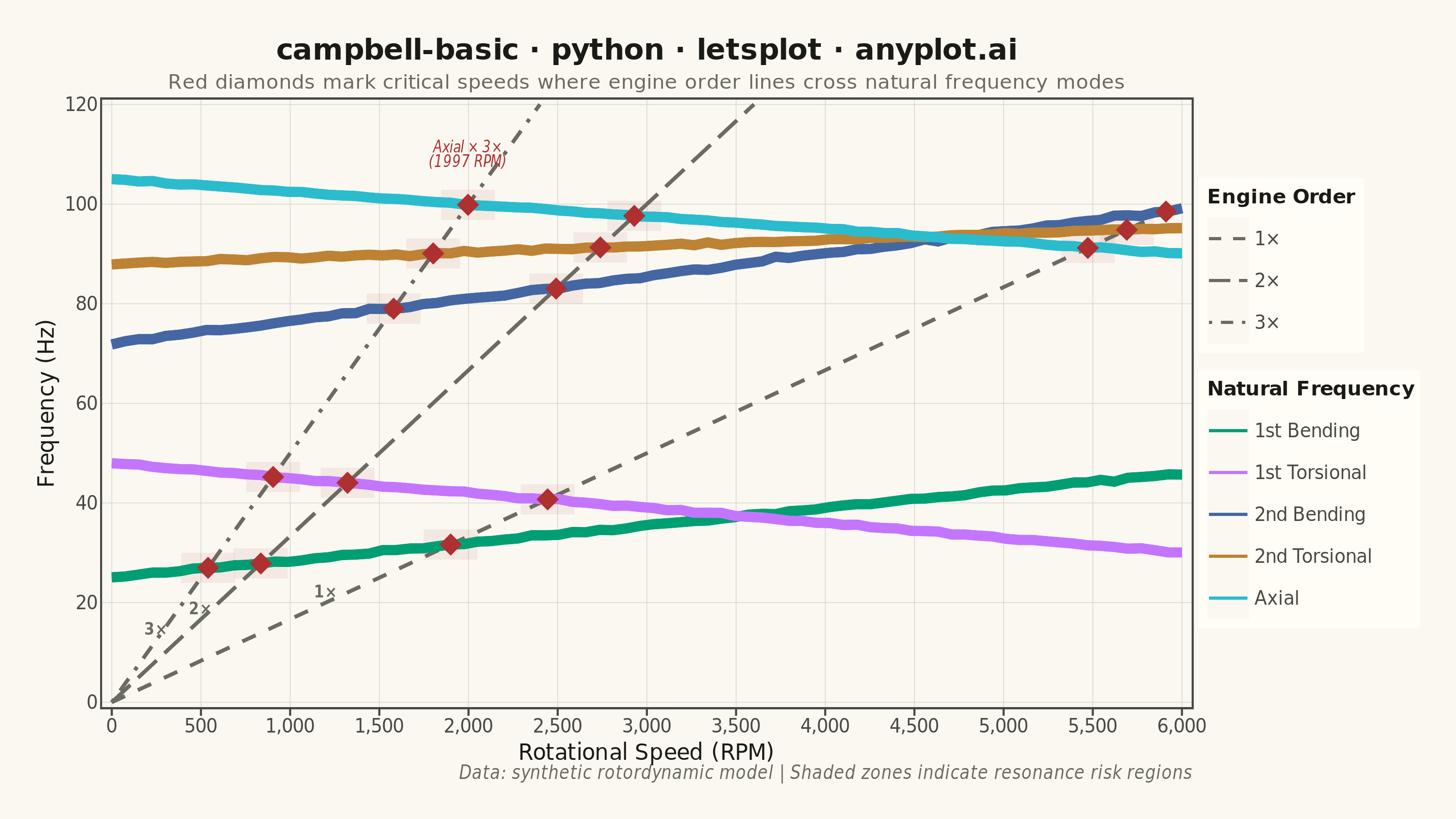
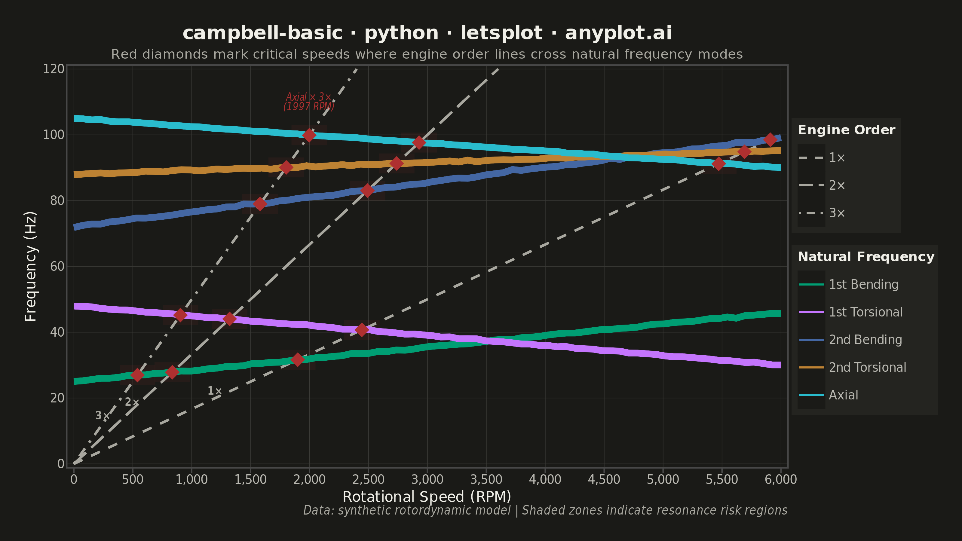
A Campbell Diagram (also called an interference diagram) plots natural frequencies against rotational speed to identify critical speeds and resonance conditions in rotating machinery. It overlays engine order excitation lines (diagonal lines from the origin) on top of natural frequency curves, with intersections marking critical speeds where resonance may occur. This visualization is essential for ensuring safe operating ranges in turbomachinery, automotive powertrains, and other rotating equipment.
""" anyplot.ai
campbell-basic: Campbell Diagram
Library: letsplot 4.10.1 | Python 3.13.13
Quality: 88/100 | Updated: 2026-05-28
"""

import os

import numpy as np
import pandas as pd
from lets_plot import *


LetsPlot.setup_html()

# Theme tokens
THEME = os.getenv("ANYPLOT_THEME", "light")
PAGE_BG = "#FAF8F1" if THEME == "light" else "#1A1A17"
ELEVATED_BG = "#FFFDF6" if THEME == "light" else "#242420"
INK = "#1A1A17" if THEME == "light" else "#F0EFE8"
INK_SOFT = "#4A4A44" if THEME == "light" else "#B8B7B0"
INK_MUTED = "#6B6A63" if THEME == "light" else "#A8A79F"
GRID_COLOR = "#D8D7D0" if THEME == "light" else "#3A3A36"

IMPRINT_PALETTE = ["#009E73", "#C475FD", "#4467A3", "#BD8233", "#AE3030", "#2ABCCD", "#954477", "#99B314"]
# Modes: positions 1,2,3,4,6 — skip #AE3030 (pos 5), reserved for critical markers
MODE_COLORS = [IMPRINT_PALETTE[0], IMPRINT_PALETTE[1], IMPRINT_PALETTE[2], IMPRINT_PALETTE[3], IMPRINT_PALETTE[5]]
CRIT_COLOR = IMPRINT_PALETTE[4]  # #AE3030 — semantic: danger/resonance risk

# Data
np.random.seed(42)
speed_rpm = np.linspace(0, 6000, 80)
max_freq = 120

# Natural frequencies with pronounced speed-dependent variation (gyroscopic effects)
modes = {
    "1st Bending": 25 + 0.0035 * speed_rpm + np.random.normal(0, 0.15, 80),
    "1st Torsional": 48 - 0.0030 * speed_rpm + np.random.normal(0, 0.12, 80),
    "2nd Bending": 72 + 0.0045 * speed_rpm + np.random.normal(0, 0.18, 80),
    "2nd Torsional": 88 + 0.0012 * speed_rpm + np.random.normal(0, 0.14, 80),
    "Axial": 105 - 0.0025 * speed_rpm + np.random.normal(0, 0.10, 80),
}
mode_order = list(modes.keys())

modes_df = pd.concat(
    [pd.DataFrame({"Speed": speed_rpm, "Frequency": freq, "Mode": name}) for name, freq in modes.items()],
    ignore_index=True,
)

# Engine order excitation lines (freq = order × RPM / 60)
orders = [1, 2, 3]
order_labels = ["1×", "2×", "3×"]

eo_df = pd.concat(
    [
        pd.DataFrame(
            {
                "Speed": np.linspace(0, min(6000, max_freq * 60 / o), 80),
                "Frequency": o * np.linspace(0, min(6000, max_freq * 60 / o), 80) / 60,
                "Order": lbl,
            }
        )
        for o, lbl in zip(orders, order_labels)
    ],
    ignore_index=True,
)

# Critical speeds: intersections of EO lines with mode curves
critical_rows = []
for order, olabel in zip(orders, order_labels):
    eo_at = order * speed_rpm / 60
    for mname, mfreq in modes.items():
        diff = eo_at - mfreq
        for idx in np.where(np.diff(np.sign(diff)))[0]:
            t = abs(diff[idx]) / (abs(diff[idx]) + abs(diff[idx + 1]))
            cs = speed_rpm[idx] + t * (speed_rpm[idx + 1] - speed_rpm[idx])
            cf = order * cs / 60
            if cf <= max_freq:
                critical_rows.append({"Speed": cs, "Frequency": cf, "Intersection": f"{mname} × {olabel}"})
crit_df = pd.DataFrame(critical_rows)

# Resonance risk zones around critical speeds
zone_df = pd.DataFrame(
    [
        {"xmin": r["Speed"] - 150, "xmax": r["Speed"] + 150, "ymin": r["Frequency"] - 3, "ymax": r["Frequency"] + 3}
        for _, r in crit_df.iterrows()
    ]
)

# EO direct labels: positioned below mode curves (< 25 Hz) in low-RPM region
eo_label_df = pd.DataFrame(
    [
        {"Speed": 1200, "Frequency": 1 * 1200 / 60 + 2, "Label": "1×"},
        {"Speed": 500, "Frequency": 2 * 500 / 60 + 2, "Label": "2×"},
        {"Speed": 250, "Frequency": 3 * 250 / 60 + 2, "Label": "3×"},
    ]
)

# Annotation for the highest-frequency critical speed (resonance risk highlight)
danger_idx = crit_df["Frequency"].idxmax()
danger_row = crit_df.loc[danger_idx]
annot_df = pd.DataFrame(
    [
        {
            "Speed": danger_row["Speed"],
            "Frequency": danger_row["Frequency"] + 10,
            "Label": f"{danger_row['Intersection']}\n({int(danger_row['Speed'])} RPM)",
        }
    ]
)

# Plot
plot = (
    ggplot()
    + geom_rect(
        data=zone_df,
        mapping=aes(xmin="xmin", xmax="xmax", ymin="ymin", ymax="ymax"),
        fill=CRIT_COLOR,
        alpha=0.08,
        color="transparent",
    )
    + geom_line(data=eo_df, mapping=aes(x="Speed", y="Frequency", linetype="Order"), color=INK_MUTED, size=0.9)
    + geom_line(
        data=modes_df,
        mapping=aes(x="Speed", y="Frequency", color="Mode"),
        size=2.5,
        tooltips=layer_tooltips()
        .line("@{Mode}")
        .line("Speed|@{Speed} RPM")
        .line("Freq|@{Frequency} Hz")
        .format("Speed", ",.0f")
        .format("Frequency", ".1f"),
    )
    + geom_point(
        data=crit_df,
        mapping=aes(x="Speed", y="Frequency"),
        color=CRIT_COLOR,
        fill=CRIT_COLOR,
        size=8,
        shape=18,
        tooltips=layer_tooltips()
        .title("Critical Speed")
        .line("@{Intersection}")
        .line("Speed|@{Speed} RPM")
        .line("Freq|@{Frequency} Hz")
        .format("Speed", ",.0f")
        .format("Frequency", ".1f"),
    )
    + geom_text(
        data=eo_label_df, mapping=aes(x="Speed", y="Frequency", label="Label"), color=INK_MUTED, size=4, fontface="bold"
    )
    + geom_text(
        data=annot_df,
        mapping=aes(x="Speed", y="Frequency", label="Label"),
        color=CRIT_COLOR,
        size=4,
        fontface="italic",
        hjust=0.5,
    )
    + scale_color_manual(name="Natural Frequency", values=MODE_COLORS, limits=mode_order)
    + scale_linetype_manual(name="Engine Order", values=["dashed", "longdash", "dotdash"], limits=order_labels)
    + scale_y_continuous(limits=[0, max_freq], expand=[0.01, 0])
    + scale_x_continuous(limits=[0, 6000], expand=[0.01, 0], format=",d")
    + guides(linetype=guide_legend(override_aes={"color": INK_MUTED}))
    + labs(
        title="campbell-basic · python · letsplot · anyplot.ai",
        subtitle="Red diamonds mark critical speeds where engine order lines cross natural frequency modes",
        x="Rotational Speed (RPM)",
        y="Frequency (Hz)",
        caption="Data: synthetic rotordynamic model | Shaded zones indicate resonance risk regions",
    )
    + theme(
        plot_background=element_rect(fill=PAGE_BG, color=PAGE_BG),
        panel_background=element_rect(fill=PAGE_BG),
        panel_grid_major=element_line(color=GRID_COLOR, size=0.4),
        panel_grid_minor=element_blank(),
        panel_border=element_blank(),
        axis_line=element_line(color=INK_SOFT, size=0.5),
        axis_title=element_text(color=INK, size=12),
        axis_text=element_text(color=INK_SOFT, size=10),
        plot_title=element_text(color=INK, size=16, face="bold", hjust=0.5),
        plot_subtitle=element_text(color=INK_MUTED, size=11, hjust=0.5),
        plot_caption=element_text(color=INK_MUTED, size=10, face="italic"),
        legend_position="right",
        legend_background=element_rect(fill=ELEVATED_BG, color=INK_SOFT),
        legend_text=element_text(color=INK_SOFT, size=10),
        legend_title=element_text(color=INK, size=11, face="bold"),
        plot_margin=[20, 20, 20, 20],
    )
    + ggsize(800, 450)
)

# Save
ggsave(plot, f"plot-{THEME}.png", path=".", scale=4)
ggsave(plot, f"plot-{THEME}.html", path=".")
Runnable source as JSON, for any HTTP client: https://api.anyplot.ai/specs/campbell-basic/letsplot/code. Any spec id and library id listed in llms-full.txt fit the same URL shape; every URL below is complete and callable.
{
  "spec_id": "campbell-basic",
  "language": "python",
  "library": "letsplot",
  "page": "https://anyplot.ai/campbell-basic/python/letsplot",
  "hub": "https://anyplot.ai/campbell-basic",
  "code_json": "https://api.anyplot.ai/specs/campbell-basic/letsplot/code",
  "spec_json": "https://api.anyplot.ai/specs/campbell-basic",
  "render_light_png": "https://storage.googleapis.com/anyplot-images/plots/campbell-basic/python/letsplot/plot-light.png",
  "render_dark_png": "https://storage.googleapis.com/anyplot-images/plots/campbell-basic/python/letsplot/plot-dark.png",
  "interactive_light_html": "https://storage.googleapis.com/anyplot-images/plots/campbell-basic/python/letsplot/plot-light.html",
  "interactive_dark_html": "https://storage.googleapis.com/anyplot-images/plots/campbell-basic/python/letsplot/plot-dark.html",
  "quality_score": 88.0,
  "license": "MIT",
  "guide": "https://anyplot.ai/llms.txt"
}
Part of Campbell Diagram on anyplot.ai.