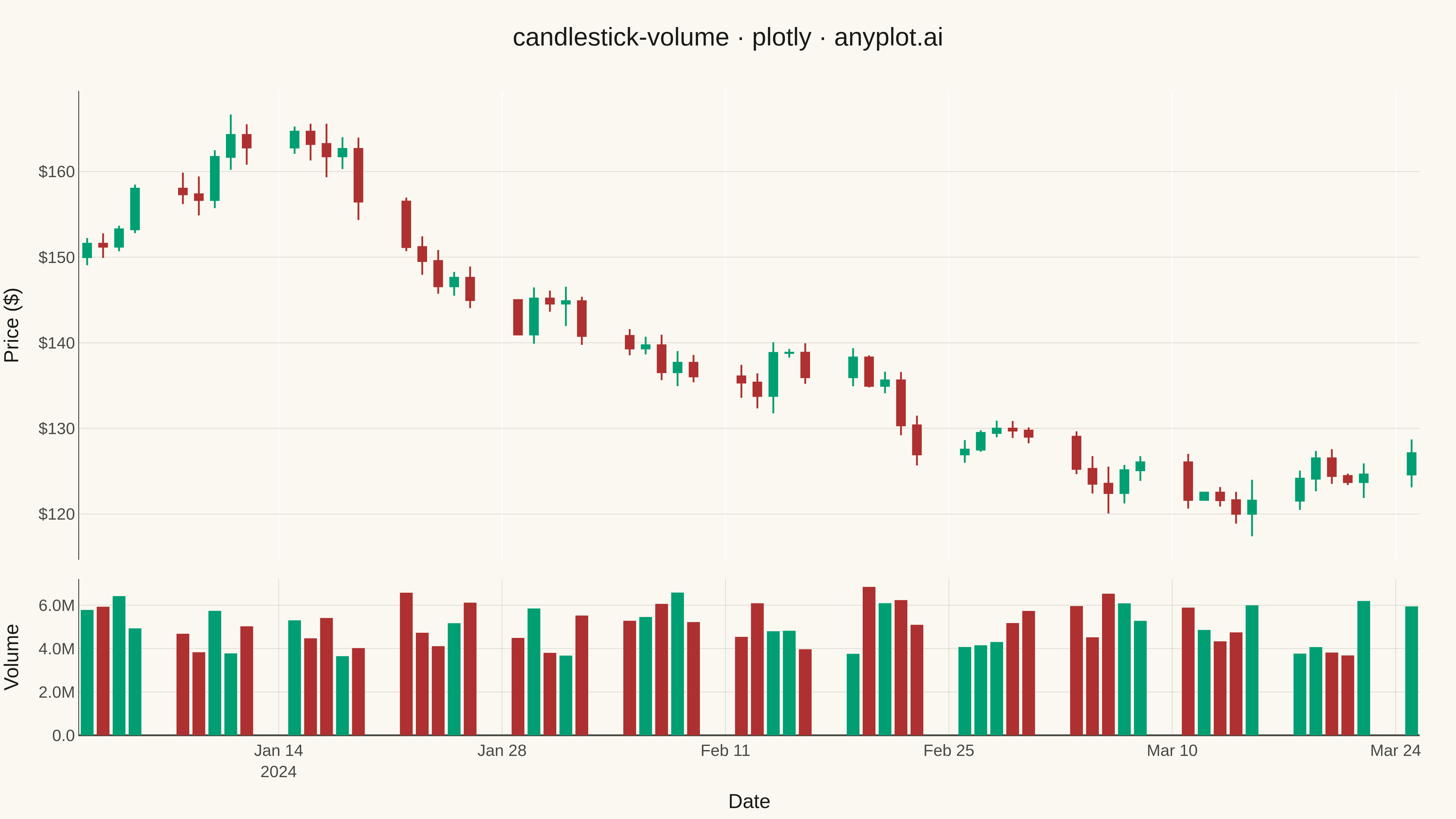
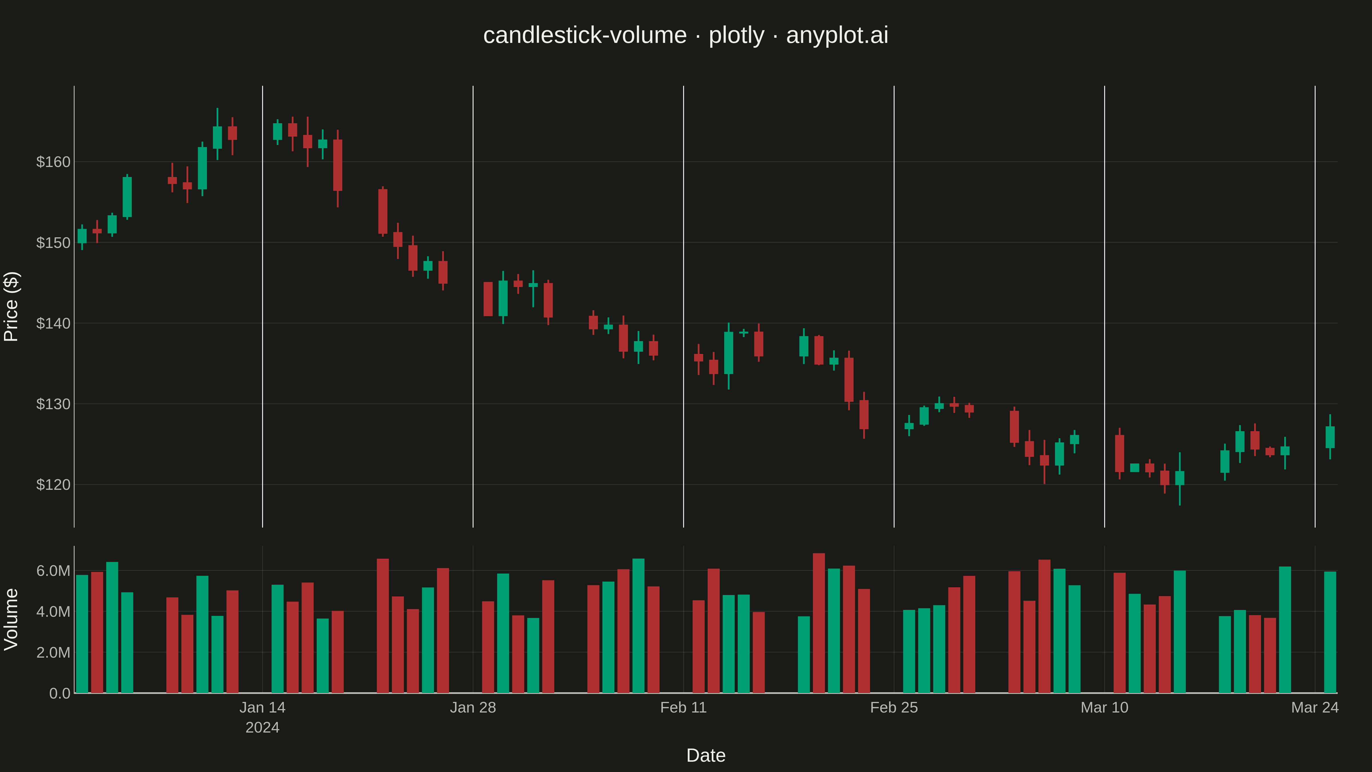
A professional candlestick chart combining OHLC (open, high, low, close) price data with volume bars in a synchronized lower pane. The dual-pane layout presents price action in the main chart with corresponding trading volume below, sharing a common time axis. This format is the standard for technical analysis platforms, enabling traders to correlate price movements with trading activity and identify volume-confirmed trends or reversals.
""" anyplot.ai
candlestick-volume: Stock Candlestick Chart with Volume
Library: plotly 6.7.0 | Python 3.13.13
Quality: 88/100 | Updated: 2026-05-16
"""

import os

import numpy as np
import pandas as pd
import plotly.graph_objects as go
from plotly.subplots import make_subplots


# Theme tokens
THEME = os.getenv("ANYPLOT_THEME", "light")
PAGE_BG = "#FAF8F1" if THEME == "light" else "#1A1A17"
INK = "#1A1A17" if THEME == "light" else "#F0EFE8"
INK_SOFT = "#4A4A44" if THEME == "light" else "#B8B7B0"
GRID = "rgba(26,26,23,0.10)" if THEME == "light" else "rgba(240,239,232,0.10)"

COLOR_UP = "#009E73"  # Okabe-Ito position 1 (brand green)
COLOR_DOWN = "#AE3030"  # imprint red — down days

# Data - Generate 60 trading days of realistic OHLC + volume data
np.random.seed(42)
n_days = 60
dates = pd.date_range("2024-01-02", periods=n_days, freq="B")  # Business days

# Start price and generate random walk
start_price = 150.0
returns = np.random.normal(0.0005, 0.02, n_days)
prices = start_price * np.cumprod(1 + returns)

# Generate OHLC from close prices
close = prices
open_prices = np.roll(close, 1)
open_prices[0] = start_price

# Generate high/low with realistic intraday range
daily_range = np.abs(np.random.normal(0.015, 0.008, n_days)) * close
high = np.maximum(open_prices, close) + daily_range * np.random.uniform(0.3, 0.7, n_days)
low = np.minimum(open_prices, close) - daily_range * np.random.uniform(0.3, 0.7, n_days)

# Volume with correlation to price movement (higher volume on bigger moves)
base_volume = 5_000_000
price_change = np.abs(close - open_prices) / open_prices
volume = base_volume * (1 + 3 * price_change) * np.random.uniform(0.7, 1.3, n_days)
volume = volume.astype(int)

# Determine up/down days for coloring
is_up = close >= open_prices
colors = [COLOR_UP if up else COLOR_DOWN for up in is_up]

# Create subplot with shared x-axis
# Price pane: 75% height, Volume pane: 25% height
fig = make_subplots(rows=2, cols=1, shared_xaxes=True, vertical_spacing=0.03, row_heights=[0.75, 0.25])

# Add candlestick chart
fig.add_trace(
    go.Candlestick(
        x=dates,
        open=open_prices,
        high=high,
        low=low,
        close=close,
        increasing={"line": {"color": COLOR_UP, "width": 2}, "fillcolor": COLOR_UP},
        decreasing={"line": {"color": COLOR_DOWN, "width": 2}, "fillcolor": COLOR_DOWN},
        name="Price",
        showlegend=False,
    ),
    row=1,
    col=1,
)

# Add volume bars
fig.add_trace(
    go.Bar(x=dates, y=volume, marker={"color": colors, "line": {"width": 0}}, name="Volume", showlegend=False),
    row=2,
    col=1,
)

# Update layout for professional appearance
fig.update_layout(
    title={
        "text": "candlestick-volume · plotly · anyplot.ai",
        "font": {"size": 28, "color": INK},
        "x": 0.5,
        "xanchor": "center",
    },
    paper_bgcolor=PAGE_BG,
    plot_bgcolor=PAGE_BG,
    font={"color": INK},
    hovermode="x unified",
    # Add crosshair cursor
    xaxis={
        "showspikes": True,
        "spikemode": "across",
        "spikesnap": "cursor",
        "spikecolor": INK_SOFT,
        "spikethickness": 1,
        "spikedash": "solid",
    },
    xaxis2={
        "showspikes": True,
        "spikemode": "across",
        "spikesnap": "cursor",
        "spikecolor": INK_SOFT,
        "spikethickness": 1,
        "spikedash": "solid",
    },
    yaxis={
        "showspikes": True,
        "spikemode": "across",
        "spikesnap": "cursor",
        "spikecolor": INK_SOFT,
        "spikethickness": 1,
        "spikedash": "solid",
    },
    yaxis2={
        "showspikes": True,
        "spikemode": "across",
        "spikesnap": "cursor",
        "spikecolor": INK_SOFT,
        "spikethickness": 1,
        "spikedash": "solid",
    },
    # Disable range slider
    xaxis_rangeslider_visible=False,
    # Margins for proper spacing
    margin={"l": 80, "r": 40, "t": 100, "b": 60},
)

# Update axes styling
fig.update_xaxes(
    title={"text": "Date", "font": {"size": 22, "color": INK}},
    tickfont={"size": 18, "color": INK_SOFT},
    gridcolor=GRID,
    gridwidth=1,
    linecolor=INK_SOFT,
    zerolinecolor=INK_SOFT,
    row=2,
    col=1,
)

fig.update_yaxes(
    title={"text": "Price ($)", "font": {"size": 22, "color": INK}},
    tickfont={"size": 18, "color": INK_SOFT},
    tickformat="$.0f",
    gridcolor=GRID,
    gridwidth=1,
    linecolor=INK_SOFT,
    zerolinecolor=INK_SOFT,
    row=1,
    col=1,
)

fig.update_yaxes(
    title={"text": "Volume", "font": {"size": 22, "color": INK}},
    tickfont={"size": 18, "color": INK_SOFT},
    tickformat=".2s",
    gridcolor=GRID,
    gridwidth=1,
    linecolor=INK_SOFT,
    zerolinecolor=INK_SOFT,
    row=2,
    col=1,
)

# Hide x-axis title on price pane
fig.update_xaxes(title=None, row=1, col=1)

# Save as PNG and HTML
fig.write_image(f"plot-{THEME}.png", width=1600, height=900, scale=3)
fig.write_html(f"plot-{THEME}.html", include_plotlyjs="cdn")
Runnable source as JSON, for any HTTP client: https://api.anyplot.ai/specs/candlestick-volume/plotly/code. Any spec id and library id listed in llms-full.txt fit the same URL shape; every URL below is complete and callable.
{
  "spec_id": "candlestick-volume",
  "language": "python",
  "library": "plotly",
  "page": "https://anyplot.ai/candlestick-volume/python/plotly",
  "hub": "https://anyplot.ai/candlestick-volume",
  "code_json": "https://api.anyplot.ai/specs/candlestick-volume/plotly/code",
  "spec_json": "https://api.anyplot.ai/specs/candlestick-volume",
  "render_light_png": "https://storage.googleapis.com/anyplot-images/plots/candlestick-volume/python/plotly/plot-light.png",
  "render_dark_png": "https://storage.googleapis.com/anyplot-images/plots/candlestick-volume/python/plotly/plot-dark.png",
  "interactive_light_html": "https://storage.googleapis.com/anyplot-images/plots/candlestick-volume/python/plotly/plot-light.html",
  "interactive_dark_html": "https://storage.googleapis.com/anyplot-images/plots/candlestick-volume/python/plotly/plot-dark.html",
  "quality_score": 88.0,
  "license": "MIT",
  "guide": "https://anyplot.ai/llms.txt"
}
Part of Stock Candlestick Chart with Volume on anyplot.ai.