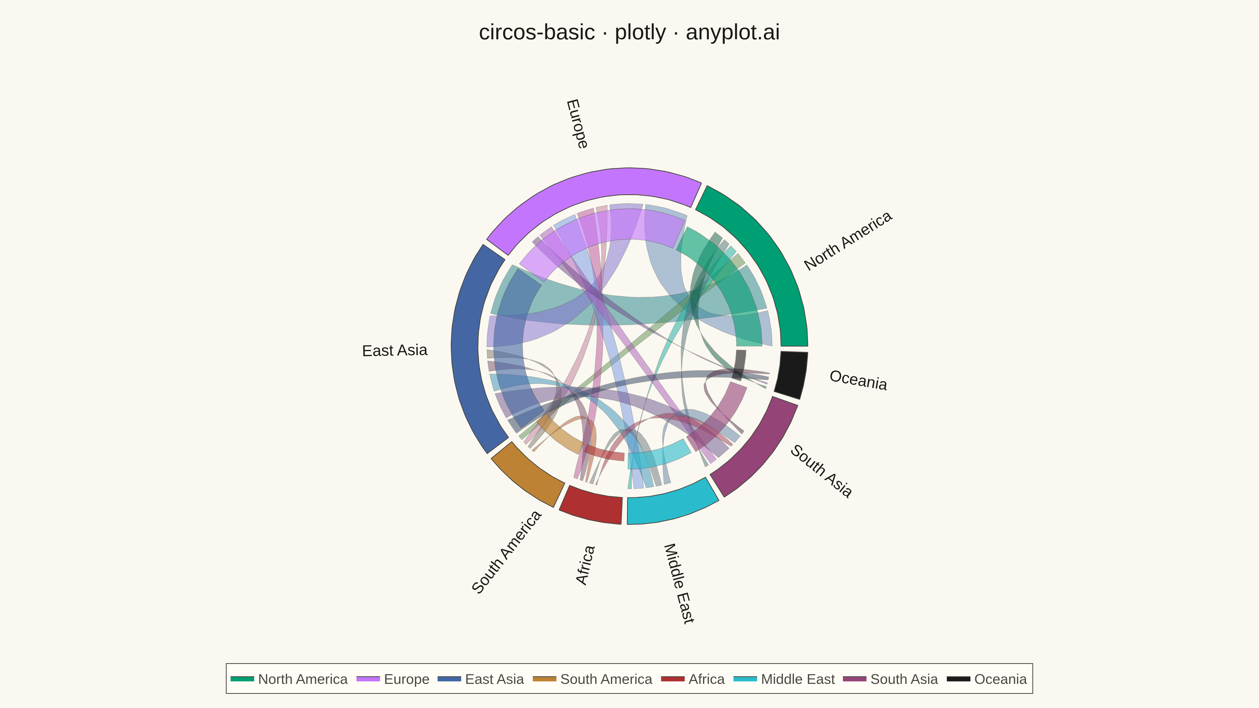
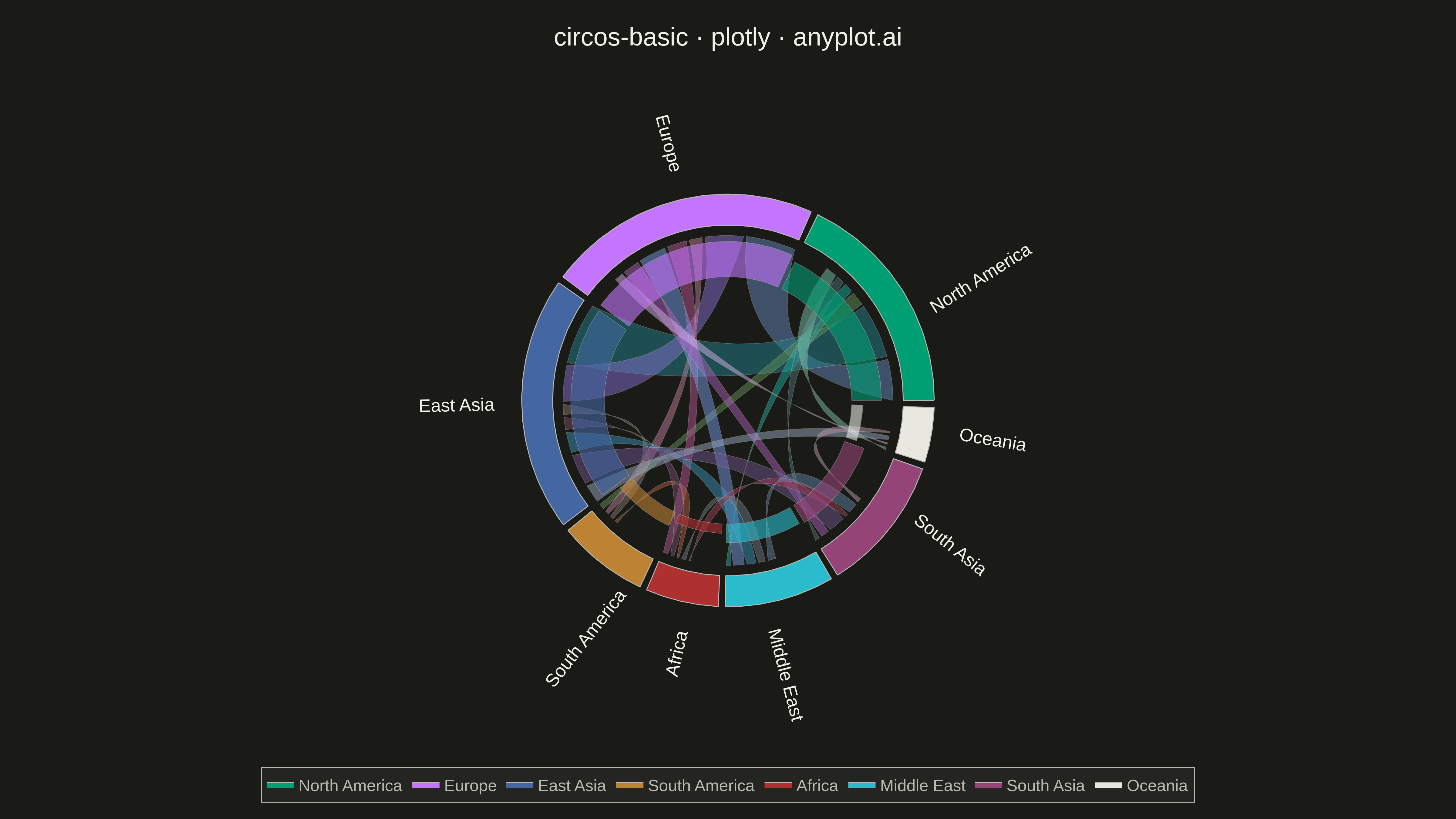
A Circos plot is a circular visualization that displays data on concentric tracks arranged around a circle, with ribbons or arcs connecting related segments across the circular layout. Originally designed for genomic data visualization, it excels at showing relationships between segments while simultaneously displaying multiple data attributes on different tracks. The circular arrangement makes efficient use of space and reveals patterns in complex relational data.
""" anyplot.ai
circos-basic: Circos Plot
Library: plotly 6.7.0 | Python 3.13.13
Quality: 91/100 | Updated: 2026-05-15
"""

import os
import sys


# Prioritize venv's site-packages over current directory
if sys.prefix not in sys.path:
    import site

    site_packages = site.getsitepackages()
    if isinstance(site_packages, list):
        sys.path = site_packages + sys.path
    else:
        sys.path.insert(0, site_packages)

import numpy as np
import plotly.graph_objects as go


# Theme tokens
THEME = os.getenv("ANYPLOT_THEME", "light")
PAGE_BG = "#FAF8F1" if THEME == "light" else "#1A1A17"
ELEVATED_BG = "#FFFDF6" if THEME == "light" else "#242420"
INK = "#1A1A17" if THEME == "light" else "#F0EFE8"
INK_SOFT = "#4A4A44" if THEME == "light" else "#B8B7B0"

# Okabe-Ito palette with first series as brand
IMPRINT = [
    "#009E73",  # bluish green (brand)
    "#C475FD",  # vermillion
    "#4467A3",  # blue
    "#BD8233",  # reddish purple
    "#AE3030",  # orange
    "#2ABCCD",  # sky blue
    "#954477",  # yellow
    "#1A1A1A" if THEME == "light" else "#E8E8E0",  # neutral
]

# Data: Trade flows between regions
np.random.seed(42)

segments = ["North America", "Europe", "East Asia", "South America", "Africa", "Middle East", "South Asia", "Oceania"]
n_segments = len(segments)

# Segment sizes (proportional to economic importance)
segment_sizes = np.array([25, 30, 28, 10, 8, 12, 15, 6])
segment_sizes = segment_sizes / segment_sizes.sum() * 360

# Connection matrix (trade flow values)
connections = np.array(
    [
        [0, 45, 60, 15, 5, 10, 8, 12],
        [40, 0, 35, 12, 18, 25, 15, 8],
        [55, 38, 0, 10, 12, 20, 30, 18],
        [12, 10, 8, 0, 8, 3, 4, 5],
        [6, 20, 10, 10, 0, 15, 6, 2],
        [12, 28, 22, 4, 12, 0, 18, 5],
        [10, 18, 35, 5, 8, 22, 0, 8],
        [15, 10, 22, 6, 3, 6, 10, 0],
    ]
)

# Calculate segment positions on circle
gap = 2
total_gap = gap * n_segments
available = 360 - total_gap
segment_angles = segment_sizes / segment_sizes.sum() * available

start_angles = np.zeros(n_segments)
for i in range(1, n_segments):
    start_angles[i] = start_angles[i - 1] + segment_angles[i - 1] + gap

fig = go.Figure()

# Radii for visualization layers
outer_r = 1.0
inner_r = 0.85
ribbon_inner = 0.80
track_r_outer = 0.78
track_r_inner = 0.60

# Draw outer segments (arcs)
for i in range(n_segments):
    theta_start = start_angles[i]
    theta_end = theta_start + segment_angles[i]

    theta = np.linspace(np.radians(theta_start), np.radians(theta_end), 50)
    theta_rev = theta[::-1]

    x_outer = outer_r * np.cos(theta)
    y_outer = outer_r * np.sin(theta)

    x_inner = inner_r * np.cos(theta_rev)
    y_inner = inner_r * np.sin(theta_rev)

    x_arc = np.concatenate([x_outer, x_inner, [x_outer[0]]])
    y_arc = np.concatenate([y_outer, y_inner, [y_outer[0]]])

    fig.add_trace(
        go.Scatter(
            x=x_arc,
            y=y_arc,
            fill="toself",
            fillcolor=IMPRINT[i],
            line={"color": INK_SOFT, "width": 1},
            name=segments[i],
            hoverinfo="name",
            showlegend=True,
        )
    )

    # Add segment labels
    mid_angle = np.radians((theta_start + theta_end) / 2)
    label_r = outer_r + 0.12
    label_x = label_r * np.cos(mid_angle)
    label_y = label_r * np.sin(mid_angle)

    text_angle = (theta_start + theta_end) / 2
    if 90 < text_angle < 270:
        text_angle = text_angle - 180

    mid_deg = (theta_start + theta_end) / 2
    if 45 < mid_deg < 135:
        xanchor = "center"
        yanchor = "bottom"
    elif 225 < mid_deg < 315:
        xanchor = "center"
        yanchor = "top"
    elif mid_deg <= 45 or mid_deg >= 315:
        xanchor = "left"
        yanchor = "middle"
    else:
        xanchor = "right"
        yanchor = "middle"

    fig.add_annotation(
        x=label_x,
        y=label_y,
        text=segments[i],
        showarrow=False,
        font={"size": 20, "color": INK},
        textangle=-text_angle,
        xanchor=xanchor,
        yanchor=yanchor,
    )

# Draw ribbons (connections between segments)
mid_angles = start_angles + segment_angles / 2
segment_positions = np.zeros(n_segments)

for i in range(n_segments):
    for j in range(i + 1, n_segments):
        if connections[i, j] > 5:
            max_conn = connections.max()
            width_i = (connections[i, j] / max_conn) * segment_angles[i] * 0.3
            width_j = (connections[i, j] / max_conn) * segment_angles[j] * 0.3

            theta_i_start = start_angles[i] + segment_positions[i]
            theta_i_end = theta_i_start + width_i
            segment_positions[i] += width_i + 1

            theta_j_start = start_angles[j] + segment_positions[j]
            theta_j_end = theta_j_start + width_j
            segment_positions[j] += width_j + 1

            n_points = 30

            theta_src = np.linspace(np.radians(theta_i_start), np.radians(theta_i_end), 10)
            x_src = ribbon_inner * np.cos(theta_src)
            y_src = ribbon_inner * np.sin(theta_src)

            theta_tgt = np.linspace(np.radians(theta_j_start), np.radians(theta_j_end), 10)
            x_tgt = ribbon_inner * np.cos(theta_tgt)
            y_tgt = ribbon_inner * np.sin(theta_tgt)

            t = np.linspace(0, 1, n_points)

            cp1_x, cp1_y = 0.2 * x_src[-1], 0.2 * y_src[-1]
            cp2_x, cp2_y = 0.2 * x_tgt[0], 0.2 * y_tgt[0]

            curve1_x = (1 - t) ** 2 * x_src[-1] + 2 * (1 - t) * t * cp1_x + t**2 * x_tgt[0]
            curve1_y = (1 - t) ** 2 * y_src[-1] + 2 * (1 - t) * t * cp1_y + t**2 * y_tgt[0]

            cp3_x, cp3_y = 0.2 * x_tgt[-1], 0.2 * y_tgt[-1]
            cp4_x, cp4_y = 0.2 * x_src[0], 0.2 * y_src[0]

            curve2_x = (1 - t) ** 2 * x_tgt[-1] + 2 * (1 - t) * t * cp3_x + t**2 * x_src[0]
            curve2_y = (1 - t) ** 2 * y_tgt[-1] + 2 * (1 - t) * t * cp3_y + t**2 * y_src[0]

            x_ribbon = np.concatenate([x_src, curve1_x, x_tgt, curve2_x, [x_src[0]]])
            y_ribbon = np.concatenate([y_src, curve1_y, y_tgt, curve2_y, [y_src[0]]])

            # Blend colors inline
            c1 = IMPRINT[i]
            c2 = IMPRINT[j]
            r1, g1, b1 = int(c1[1:3], 16), int(c1[3:5], 16), int(c1[5:7], 16)
            r2, g2, b2 = int(c2[1:3], 16), int(c2[3:5], 16), int(c2[5:7], 16)
            r = int(r1 * 0.5 + r2 * 0.5)
            g = int(g1 * 0.5 + g2 * 0.5)
            b = int(b1 * 0.5 + b2 * 0.5)
            ribbon_color = f"#{r:02x}{g:02x}{b:02x}"

            fig.add_trace(
                go.Scatter(
                    x=x_ribbon,
                    y=y_ribbon,
                    fill="toself",
                    fillcolor=ribbon_color,
                    opacity=0.5,
                    line={"color": INK_SOFT, "width": 0.5},
                    hoverinfo="text",
                    hovertext=f"{segments[i]} ↔ {segments[j]}: {connections[i, j]}",
                    showlegend=False,
                )
            )

# Draw inner track (data bars)
track_values = np.array([0.8, 0.95, 0.9, 0.4, 0.25, 0.5, 0.55, 0.3])

for i in range(n_segments):
    theta_start = start_angles[i]
    theta_end = theta_start + segment_angles[i]

    theta = np.linspace(np.radians(theta_start), np.radians(theta_end), 30)
    theta_rev = theta[::-1]

    height = track_r_inner + (track_r_outer - track_r_inner) * track_values[i]

    x_outer = height * np.cos(theta)
    y_outer = height * np.sin(theta)
    x_inner = track_r_inner * np.cos(theta_rev)
    y_inner = track_r_inner * np.sin(theta_rev)

    x_bar = np.concatenate([x_outer, x_inner, [x_outer[0]]])
    y_bar = np.concatenate([y_outer, y_inner, [y_outer[0]]])

    fig.add_trace(
        go.Scatter(
            x=x_bar,
            y=y_bar,
            fill="toself",
            fillcolor=IMPRINT[i],
            opacity=0.6,
            line={"color": INK_SOFT, "width": 0.5},
            hoverinfo="text",
            hovertext=f"{segments[i]} GDP Index: {track_values[i]:.2f}",
            showlegend=False,
        )
    )

# Update layout with theme-adaptive colors
fig.update_layout(
    title={"text": "circos-basic · plotly · anyplot.ai", "font": {"size": 28, "color": INK}, "x": 0.5, "xanchor": "center"},
    showlegend=True,
    legend={
        "orientation": "h",
        "yanchor": "bottom",
        "y": -0.15,
        "xanchor": "center",
        "x": 0.5,
        "font": {"size": 18, "color": INK_SOFT},
        "bgcolor": ELEVATED_BG,
        "bordercolor": INK_SOFT,
        "borderwidth": 1,
    },
    xaxis={"showgrid": False, "zeroline": False, "showticklabels": False, "range": [-1.5, 1.5], "scaleanchor": "y", "scaleratio": 1},
    yaxis={"showgrid": False, "zeroline": False, "showticklabels": False, "range": [-1.5, 1.5]},
    plot_bgcolor=PAGE_BG,
    paper_bgcolor=PAGE_BG,
    margin={"l": 50, "r": 50, "t": 100, "b": 120},
)

script_dir = os.path.dirname(os.path.abspath(__file__))
fig.write_image(os.path.join(script_dir, f"plot-{THEME}.png"), width=1600, height=900, scale=3)
fig.write_html(os.path.join(script_dir, f"plot-{THEME}.html"), include_plotlyjs="cdn")
Runnable source as JSON, for any HTTP client: https://api.anyplot.ai/specs/circos-basic/plotly/code. Any spec id and library id listed in llms-full.txt fit the same URL shape; every URL below is complete and callable.
{
  "spec_id": "circos-basic",
  "language": "python",
  "library": "plotly",
  "page": "https://anyplot.ai/circos-basic/python/plotly",
  "hub": "https://anyplot.ai/circos-basic",
  "code_json": "https://api.anyplot.ai/specs/circos-basic/plotly/code",
  "spec_json": "https://api.anyplot.ai/specs/circos-basic",
  "render_light_png": "https://storage.googleapis.com/anyplot-images/plots/circos-basic/python/plotly/plot-light.png",
  "render_dark_png": "https://storage.googleapis.com/anyplot-images/plots/circos-basic/python/plotly/plot-dark.png",
  "interactive_light_html": "https://storage.googleapis.com/anyplot-images/plots/circos-basic/python/plotly/plot-light.html",
  "interactive_dark_html": "https://storage.googleapis.com/anyplot-images/plots/circos-basic/python/plotly/plot-dark.html",
  "quality_score": 91.0,
  "license": "MIT",
  "guide": "https://anyplot.ai/llms.txt"
}
Part of Circos Plot on anyplot.ai.