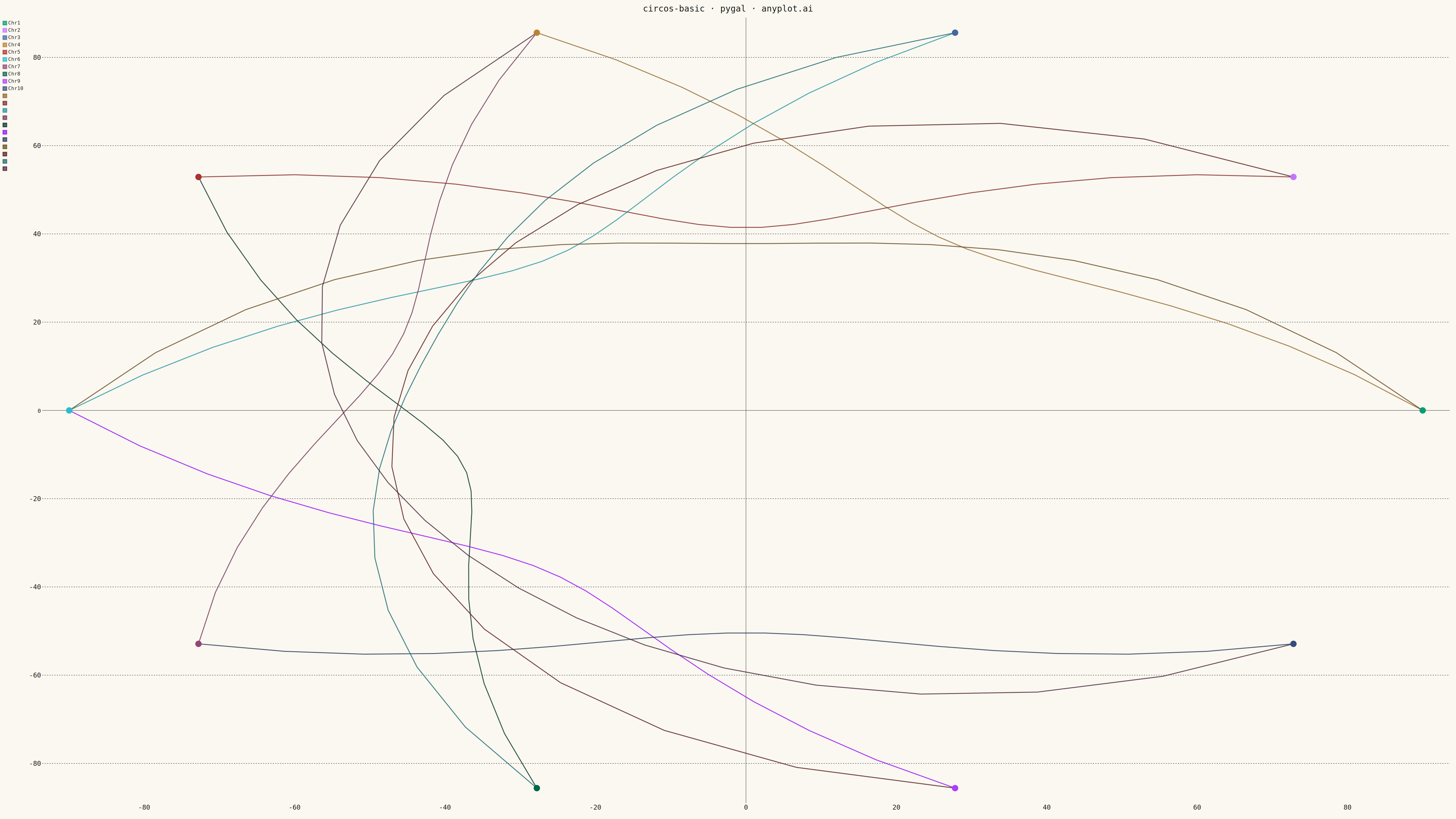
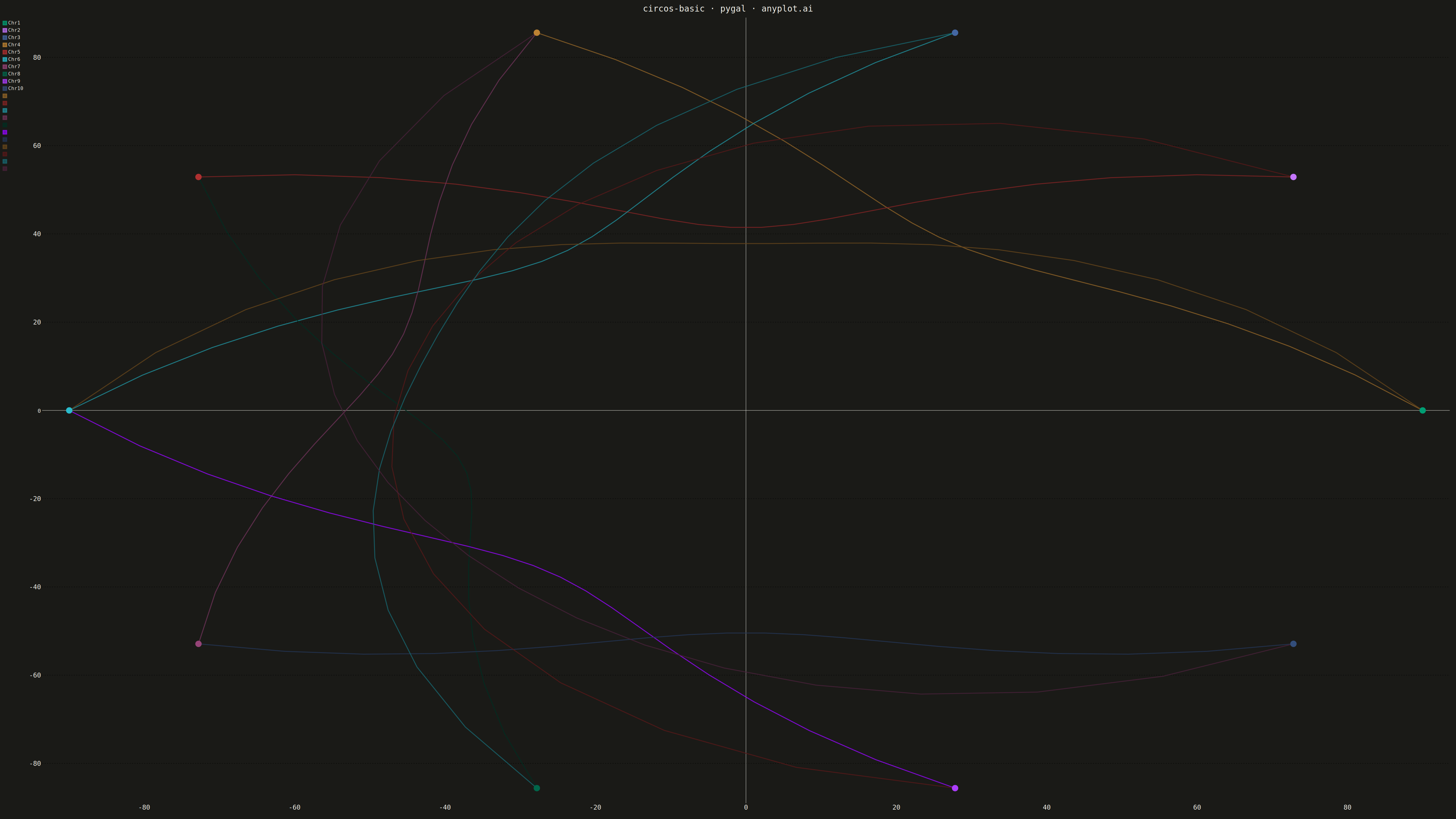
The same plot in 14 other libraries — Python: Altair, Bokeh, lets-plot, Matplotlib, Plotly, plotnine, Seaborn; R: ggplot2; Julia: Makie.jl; JavaScript: Chart.js, D3.js, Apache ECharts, Highcharts, MUI X Charts. Compare all 15 side by side: Circos Plot in Python, R, Julia and JavaScript.
A Circos plot is a circular visualization that displays data on concentric tracks arranged around a circle, with ribbons or arcs connecting related segments across the circular layout. Originally designed for genomic data visualization, it excels at showing relationships between segments while simultaneously displaying multiple data attributes on different tracks. The circular arrangement makes efficient use of space and reveals patterns in complex relational data.
""" anyplot.ai
circos-basic: Circos Plot
Library: pygal 3.1.0 | Python 3.13.13
Quality: 91/100 | Created: 2026-05-15
"""

import math
import os
import sys

import numpy as np


# Handle the name conflict: load pygal from site-packages first
# Remove current directory from path to prevent the script from shadowing pygal module
original_path = sys.path.copy()
if "" in sys.path:
    sys.path.remove("")
if "." in sys.path:
    sys.path.remove(".")

# Now safe to import pygal
import pygal
from pygal.style import Style


# Restore path for other operations
sys.path = original_path


THEME = os.getenv("ANYPLOT_THEME", "light")
PAGE_BG = "#FAF8F1" if THEME == "light" else "#1A1A17"
INK = "#1A1A17" if THEME == "light" else "#F0EFE8"
INK_MUTED = "#6B6A63" if THEME == "light" else "#A8A79F"

IMPRINT = ("#009E73", "#C475FD", "#4467A3", "#BD8233", "#AE3030", "#2ABCCD", "#954477")

custom_style = Style(
    background=PAGE_BG,
    plot_background=PAGE_BG,
    foreground=INK,
    foreground_strong=INK,
    foreground_subtle=INK_MUTED,
    colors=IMPRINT,
    title_font_size=28,
    label_font_size=22,
    major_label_font_size=18,
    legend_font_size=16,
    value_font_size=14,
    stroke_width=3,
)

# Data: genomic segments with inter-chromosomal connections
np.random.seed(42)
segments = ["Chr1", "Chr2", "Chr3", "Chr4", "Chr5", "Chr6", "Chr7", "Chr8", "Chr9", "Chr10"]
n_segments = len(segments)

# Calculate angle for each segment
segment_angles = np.linspace(0, 2 * np.pi, n_segments, endpoint=False)

# Create XY scatter plot arranged in circle
chart = pygal.XY(
    style=custom_style,
    width=4800,
    height=2700,
    title="circos-basic · pygal · anyplot.ai",
    x_title="",
    y_title="",
    show_legend=True,
    dots_size=6,
    stroke_style={"width": 3},
)

chart.x_labels = []
chart.y_labels = []

outer_radius = 90

# Create segment points on outer circle
segment_points = []
for i, (angle, segment) in enumerate(zip(segment_angles, segments)):
    x = outer_radius * math.cos(angle)
    y = outer_radius * math.sin(angle)
    segment_points.append((x, y, segment, IMPRINT[i % len(IMPRINT)]))

# Add segment positions as points
for x, y, segment, _color in segment_points:
    chart.add(segment, [(x, y)], dots_size=10, allow_interruptions=True)

# Create connections between segments
connections = [
    (0, 3, 45),
    (1, 4, 60),
    (2, 5, 55),
    (3, 6, 40),
    (4, 7, 65),
    (5, 8, 50),
    (6, 9, 35),
    (0, 5, 70),
    (1, 8, 48),
    (2, 7, 52),
    (3, 9, 38),
]

# Create arc points for connections
for source_idx, target_idx, magnitude in connections:
    source_x, source_y, _, _ = segment_points[source_idx]
    target_x, target_y, _, _ = segment_points[target_idx]

    curve_factor = 0.3 + (magnitude / 100) * 0.4
    inner_radius = outer_radius * (1 - curve_factor)

    arc_points = []
    for t in np.linspace(0, 1, 20):
        angle_interp = segment_angles[source_idx] * (1 - t) + segment_angles[target_idx] * t
        radius_t = outer_radius - ((outer_radius - inner_radius) * 4 * t * (1 - t))
        x = radius_t * math.cos(angle_interp)
        y = radius_t * math.sin(angle_interp)
        arc_points.append((x, y))

    chart.add("", arc_points, show_legend=False, dots_size=0, allow_interruptions=True)

# Render outputs
chart.render_to_png(f"plot-{THEME}.png")

with open(f"plot-{THEME}.html", "wb") as f:
    f.write(chart.render())
Runnable source as JSON, for any HTTP client: https://api.anyplot.ai/specs/circos-basic/pygal/code. Any spec id and library id listed in llms-full.txt fit the same URL shape; every URL below is complete and callable.
{
  "spec_id": "circos-basic",
  "language": "python",
  "library": "pygal",
  "page": "https://anyplot.ai/circos-basic/python/pygal",
  "hub": "https://anyplot.ai/circos-basic",
  "code_json": "https://api.anyplot.ai/specs/circos-basic/pygal/code",
  "spec_json": "https://api.anyplot.ai/specs/circos-basic",
  "render_light_png": "https://storage.googleapis.com/anyplot-images/plots/circos-basic/python/pygal/plot-light.png",
  "render_dark_png": "https://storage.googleapis.com/anyplot-images/plots/circos-basic/python/pygal/plot-dark.png",
  "interactive_light_html": "https://storage.googleapis.com/anyplot-images/plots/circos-basic/python/pygal/plot-light.html",
  "interactive_dark_html": "https://storage.googleapis.com/anyplot-images/plots/circos-basic/python/pygal/plot-dark.html",
  "quality_score": 91.0,
  "license": "MIT",
  "guide": "https://anyplot.ai/llms.txt"
}
Part of Circos Plot on anyplot.ai.