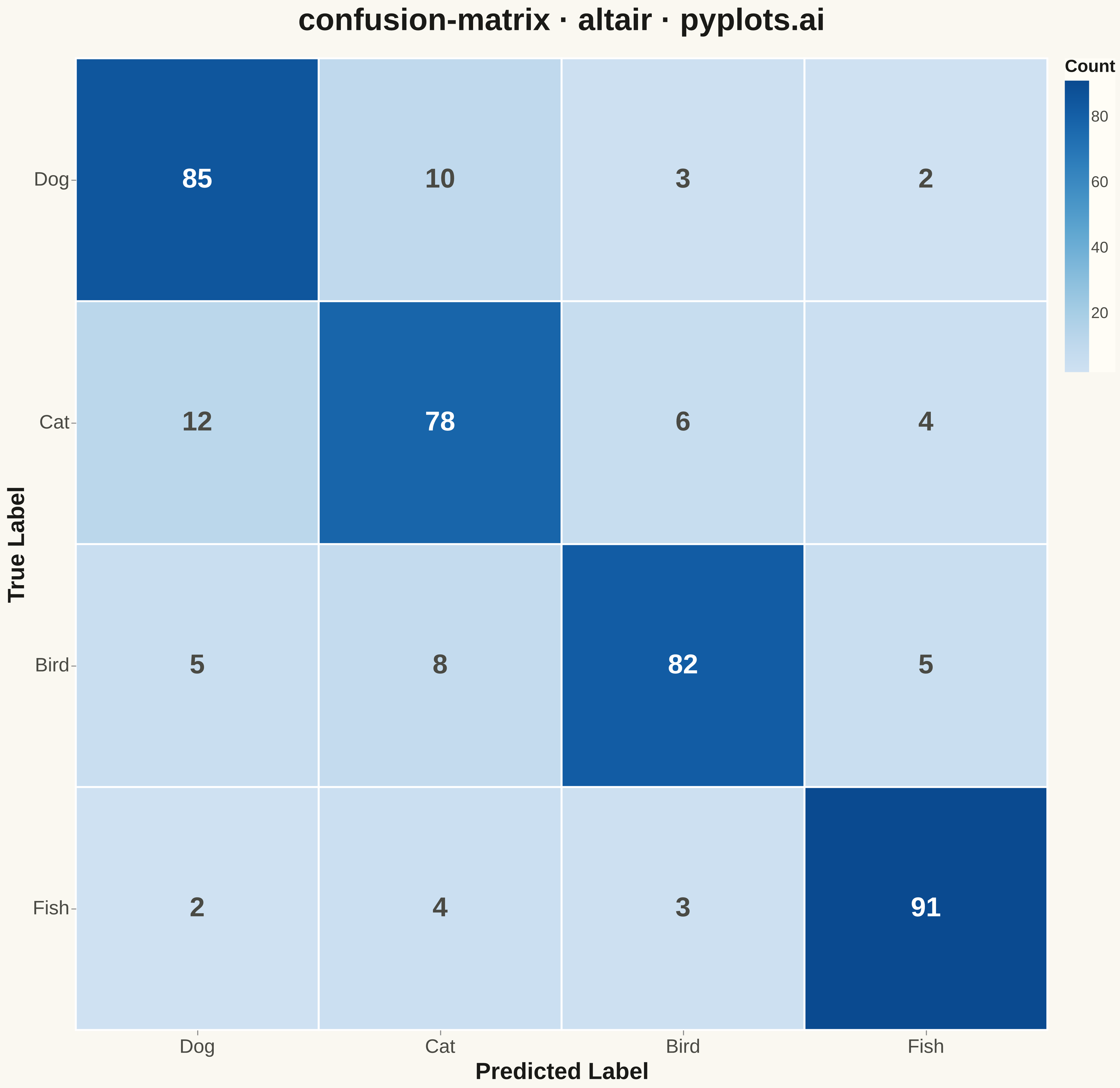
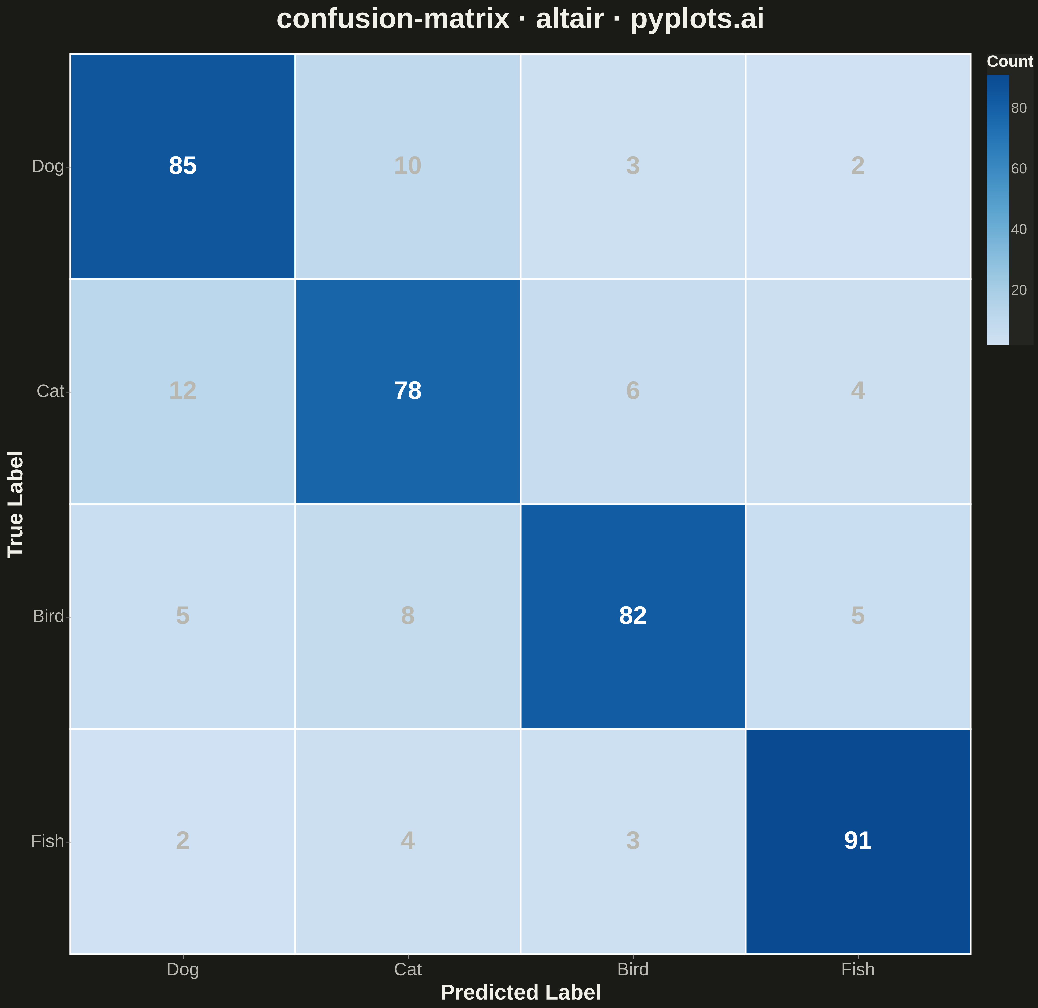
A specialized heatmap visualization for evaluating classification model performance, displaying the counts or proportions of predicted vs actual class labels. The confusion matrix reveals true positives, false positives, true negatives, and false negatives at a glance, making it essential for understanding model behavior, identifying class imbalances, and diagnosing specific misclassification patterns.
""" anyplot.ai
confusion-matrix: Confusion Matrix Heatmap
Library: altair 6.1.0 | Python 3.13.13
Quality: 72/100 | Updated: 2026-05-09
"""

import altair as alt
import numpy as np
import pandas as pd


# Data - Multi-class classification results
np.random.seed(42)
class_names = ["Dog", "Cat", "Bird", "Fish"]
n_classes = len(class_names)

# Create a realistic confusion matrix with clear patterns
# Most predictions on diagonal (correct), some off-diagonal (errors)
confusion = np.array(
    [
        [85, 10, 3, 2],  # Dogs: mostly correct, some confused with cats
        [12, 78, 6, 4],  # Cats: mostly correct, some confused with dogs
        [5, 8, 82, 5],  # Birds: mostly correct, some confusion
        [2, 4, 3, 91],  # Fish: very distinct, high accuracy
    ]
)

# Create long-form DataFrame for Altair
rows = []
for i, true_class in enumerate(class_names):
    for j, pred_class in enumerate(class_names):
        rows.append(
            {
                "True Label": true_class,
                "Predicted Label": pred_class,
                "Count": confusion[i, j],
            }
        )

df = pd.DataFrame(rows)

# Base heatmap with rectangles
base = alt.Chart(df).encode(
    x=alt.X("Predicted Label:N", sort=class_names, axis=alt.Axis(labelAngle=0, labelFontSize=20, titleFontSize=24)),
    y=alt.Y("True Label:N", sort=class_names, axis=alt.Axis(labelFontSize=20, titleFontSize=24)),
)

# Heatmap cells
heatmap = base.mark_rect(stroke="white", strokeWidth=2).encode(
    color=alt.Color(
        "Count:Q",
        scale=alt.Scale(scheme="blues"),
        legend=alt.Legend(title="Count", titleFontSize=18, labelFontSize=16, gradientLength=300, gradientThickness=25),
    )
)

# Text annotations - white on dark cells, dark on light cells
text = base.mark_text(fontSize=28, fontWeight="bold").encode(
    text="Count:Q", color=alt.condition(alt.datum.Count > 50, alt.value("white"), alt.value("#306998"))
)

# Combine heatmap and text
chart = (
    (heatmap + text)
    .properties(
        width=1000,
        height=1000,
        title=alt.Title("confusion-matrix · altair · pyplots.ai", fontSize=32, anchor="middle", offset=20),
    )
    .configure_view(strokeWidth=0)
    .configure_axis(domainWidth=0)
)

# Save as PNG (1000 * 3.6 = 3600 for square format)
chart.save("plot.png", scale_factor=3.6)

# Save interactive HTML version
chart.save("plot.html")
Runnable source as JSON, for any HTTP client: https://api.anyplot.ai/specs/confusion-matrix/altair/code. Any spec id and library id listed in llms-full.txt fit the same URL shape; every URL below is complete and callable.
{
  "spec_id": "confusion-matrix",
  "language": "python",
  "library": "altair",
  "page": "https://anyplot.ai/confusion-matrix/python/altair",
  "hub": "https://anyplot.ai/confusion-matrix",
  "code_json": "https://api.anyplot.ai/specs/confusion-matrix/altair/code",
  "spec_json": "https://api.anyplot.ai/specs/confusion-matrix",
  "render_light_png": "https://storage.googleapis.com/anyplot-images/plots/confusion-matrix/python/altair/plot-light.png",
  "render_dark_png": "https://storage.googleapis.com/anyplot-images/plots/confusion-matrix/python/altair/plot-dark.png",
  "interactive_light_html": "https://storage.googleapis.com/anyplot-images/plots/confusion-matrix/python/altair/plot-light.html",
  "interactive_dark_html": "https://storage.googleapis.com/anyplot-images/plots/confusion-matrix/python/altair/plot-dark.html",
  "quality_score": 72.0,
  "license": "MIT",
  "guide": "https://anyplot.ai/llms.txt"
}
Part of Confusion Matrix Heatmap on anyplot.ai.