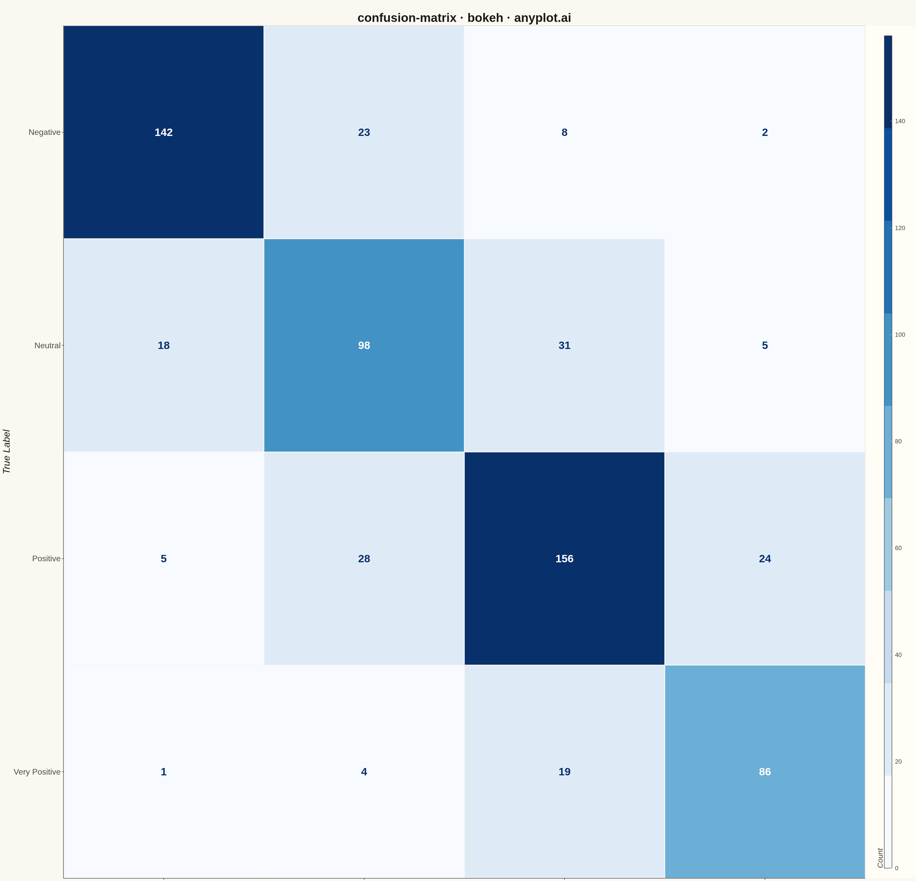
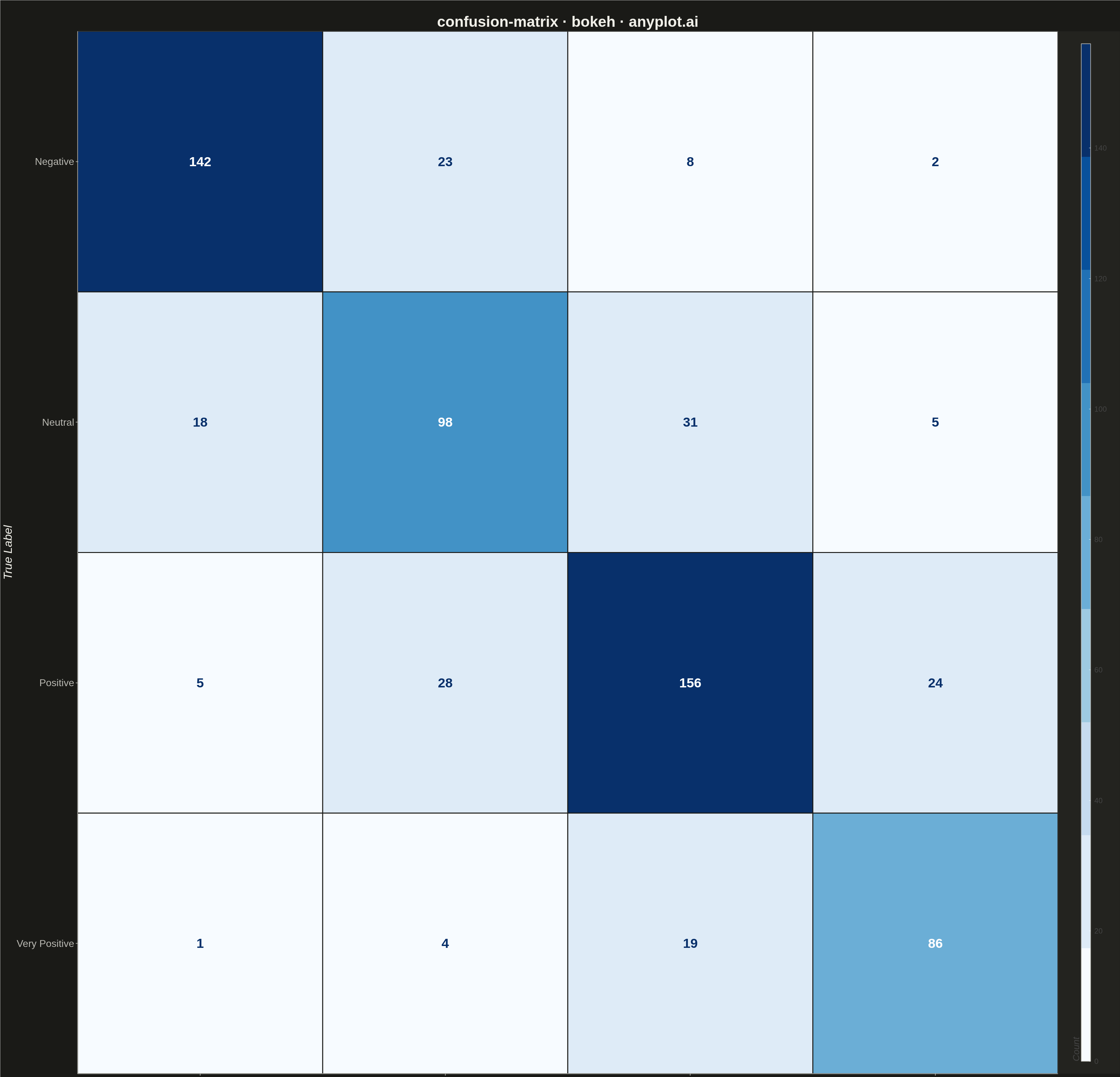
A specialized heatmap visualization for evaluating classification model performance, displaying the counts or proportions of predicted vs actual class labels. The confusion matrix reveals true positives, false positives, true negatives, and false negatives at a glance, making it essential for understanding model behavior, identifying class imbalances, and diagnosing specific misclassification patterns.
""" anyplot.ai
confusion-matrix: Confusion Matrix Heatmap
Library: bokeh 3.9.0 | Python 3.13.13
Quality: 84/100 | Updated: 2026-05-09
"""

import os
import time
from pathlib import Path

import numpy as np
from bokeh.io import output_file, save
from bokeh.models import ColorBar, ColumnDataSource, LabelSet, LinearColorMapper
from bokeh.plotting import figure
from bokeh.transform import transform
from selenium import webdriver
from selenium.webdriver.chrome.options import Options


THEME = os.getenv("ANYPLOT_THEME", "light")
PAGE_BG = "#FAF8F1" if THEME == "light" else "#1A1A17"
ELEVATED_BG = "#FFFDF6" if THEME == "light" else "#242420"
INK = "#1A1A17" if THEME == "light" else "#F0EFE8"
INK_SOFT = "#4A4A44" if THEME == "light" else "#B8B7B0"

# Data - Multi-class classification results for a sentiment analysis model
np.random.seed(42)

class_names = ["Negative", "Neutral", "Positive", "Very Positive"]

# Simulated confusion matrix with realistic patterns:
# - Good diagonal (correct predictions)
# - Adjacent classes more likely to be confused
# - Some class imbalance
confusion = np.array(
    [
        [142, 23, 8, 2],  # Negative: mostly correct, some confused with Neutral
        [18, 98, 31, 5],  # Neutral: often confused with adjacent classes
        [5, 28, 156, 24],  # Positive: good accuracy, some confusion with Neutral/Very Positive
        [1, 4, 19, 86],  # Very Positive: smaller class, good precision
    ]
)

# Prepare data for Bokeh heatmap using rect glyphs
x_coords = []
y_coords = []
values = []
text_labels = []

for i, true_class in enumerate(class_names):
    for j, pred_class in enumerate(class_names):
        x_coords.append(pred_class)
        y_coords.append(true_class)
        val = confusion[i, j]
        values.append(val)
        text_labels.append(str(val))

source = ColumnDataSource(data={"x": x_coords, "y": y_coords, "value": values, "text": text_labels})

# Color mapping - Blues sequential palette for counts
colors = ["#f7fbff", "#deebf7", "#c6dbef", "#9ecae1", "#6baed6", "#4292c6", "#2171b5", "#08519c", "#08306b"]
mapper = LinearColorMapper(palette=colors, low=0, high=max(values))

# Create figure - Square format works better for confusion matrices
p = figure(
    width=3600,
    height=3600,
    title="confusion-matrix · bokeh · anyplot.ai",
    x_range=class_names,
    y_range=list(reversed(class_names)),  # Reverse to have first class at top
    x_axis_label="Predicted Label",
    y_axis_label="True Label",
    tools="",
    toolbar_location=None,
)

# Draw heatmap cells using rect
p.rect(
    x="x",
    y="y",
    width=1,
    height=1,
    source=source,
    fill_color=transform("value", mapper),
    line_color=PAGE_BG,
    line_width=3,
)

# Add text annotations for cell values
# Calculate contrasting colors for text (white on dark, dark on light)
text_colors = []
for val in values:
    # Use white text on darker cells (higher values)
    if val > max(values) * 0.5:
        text_colors.append("#FFFFFF")
    else:
        text_colors.append("#08306b")

source.data["text_color"] = text_colors

labels = LabelSet(
    x="x",
    y="y",
    text="text",
    text_color="text_color",
    text_font_size="32pt",
    text_font_style="bold",
    text_align="center",
    text_baseline="middle",
    source=source,
)
p.add_layout(labels)

# Style the figure for large canvas and theme
p.title.text_font_size = "36pt"
p.title.text_font_style = "bold"
p.title.align = "center"
p.title.text_color = INK

p.xaxis.axis_label_text_font_size = "28pt"
p.yaxis.axis_label_text_font_size = "28pt"
p.xaxis.axis_label_text_color = INK
p.yaxis.axis_label_text_color = INK

p.xaxis.major_label_text_font_size = "24pt"
p.yaxis.major_label_text_font_size = "24pt"
p.xaxis.major_label_text_color = INK_SOFT
p.yaxis.major_label_text_color = INK_SOFT

# Axis styling
p.xaxis.axis_line_color = INK_SOFT
p.yaxis.axis_line_color = INK_SOFT
p.xaxis.axis_line_width = 2
p.yaxis.axis_line_width = 2
p.xaxis.major_tick_line_color = INK_SOFT
p.yaxis.major_tick_line_color = INK_SOFT
p.xaxis.major_tick_line_width = 2
p.yaxis.major_tick_line_width = 2

# Background colors
p.background_fill_color = PAGE_BG
p.border_fill_color = PAGE_BG
p.outline_line_color = INK_SOFT

# Remove grid for cleaner heatmap look
p.xgrid.grid_line_color = None
p.ygrid.grid_line_color = None

# Add colorbar
color_bar = ColorBar(
    color_mapper=mapper,
    location=(0, 0),
    title="Count",
    title_text_font_size="22pt",
    label_standoff=12,
    major_label_text_font_size="18pt",
    bar_line_color=INK_SOFT,
    bar_line_width=2,
    width=30,
    padding=40,
    background_fill_color=ELEVATED_BG,
)
p.add_layout(color_bar, "right")

# Adjust overall padding
p.min_border_left = 150
p.min_border_right = 150
p.min_border_top = 100
p.min_border_bottom = 150

# Save interactive HTML
output_file(f"plot-{THEME}.html")
save(p)

# Screenshot with headless Chrome using Selenium
W, H = 3600, 3600
opts = Options()
for arg in (
    "--headless=new",
    "--no-sandbox",
    "--disable-dev-shm-usage",
    "--disable-gpu",
    f"--window-size={W},{H}",
    "--hide-scrollbars",
):
    opts.add_argument(arg)
driver = webdriver.Chrome(options=opts)
driver.set_window_size(W, H)
driver.get(f"file://{Path(f'plot-{THEME}.html').resolve()}")
time.sleep(3)  # let bokeh's JS render the canvas
driver.save_screenshot(f"plot-{THEME}.png")
driver.quit()
Runnable source as JSON, for any HTTP client: https://api.anyplot.ai/specs/confusion-matrix/bokeh/code. Any spec id and library id listed in llms-full.txt fit the same URL shape; every URL below is complete and callable.
{
  "spec_id": "confusion-matrix",
  "language": "python",
  "library": "bokeh",
  "page": "https://anyplot.ai/confusion-matrix/python/bokeh",
  "hub": "https://anyplot.ai/confusion-matrix",
  "code_json": "https://api.anyplot.ai/specs/confusion-matrix/bokeh/code",
  "spec_json": "https://api.anyplot.ai/specs/confusion-matrix",
  "render_light_png": "https://storage.googleapis.com/anyplot-images/plots/confusion-matrix/python/bokeh/plot-light.png",
  "render_dark_png": "https://storage.googleapis.com/anyplot-images/plots/confusion-matrix/python/bokeh/plot-dark.png",
  "interactive_light_html": "https://storage.googleapis.com/anyplot-images/plots/confusion-matrix/python/bokeh/plot-light.html",
  "interactive_dark_html": "https://storage.googleapis.com/anyplot-images/plots/confusion-matrix/python/bokeh/plot-dark.html",
  "quality_score": 84.0,
  "license": "MIT",
  "guide": "https://anyplot.ai/llms.txt"
}
Part of Confusion Matrix Heatmap on anyplot.ai.