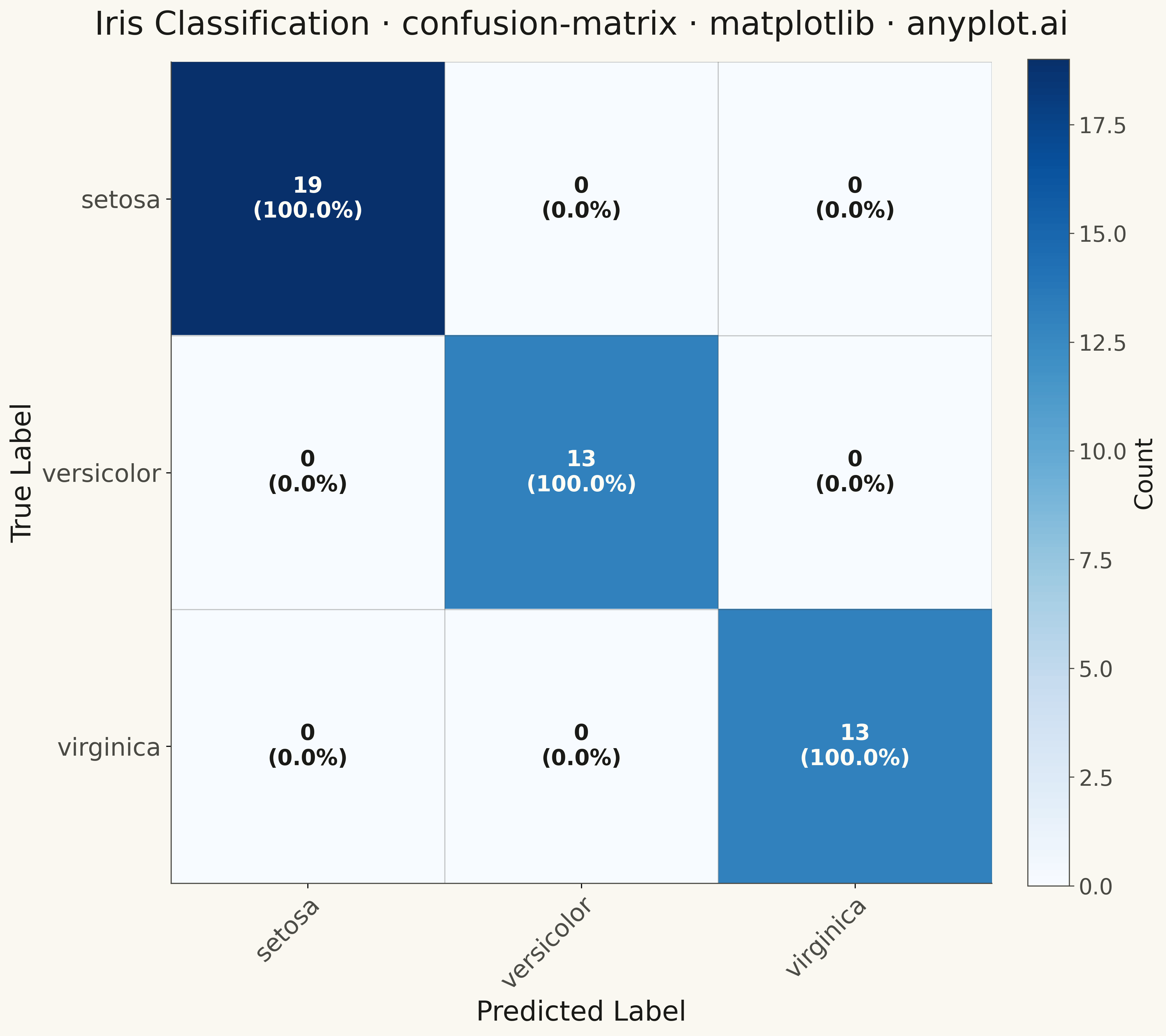
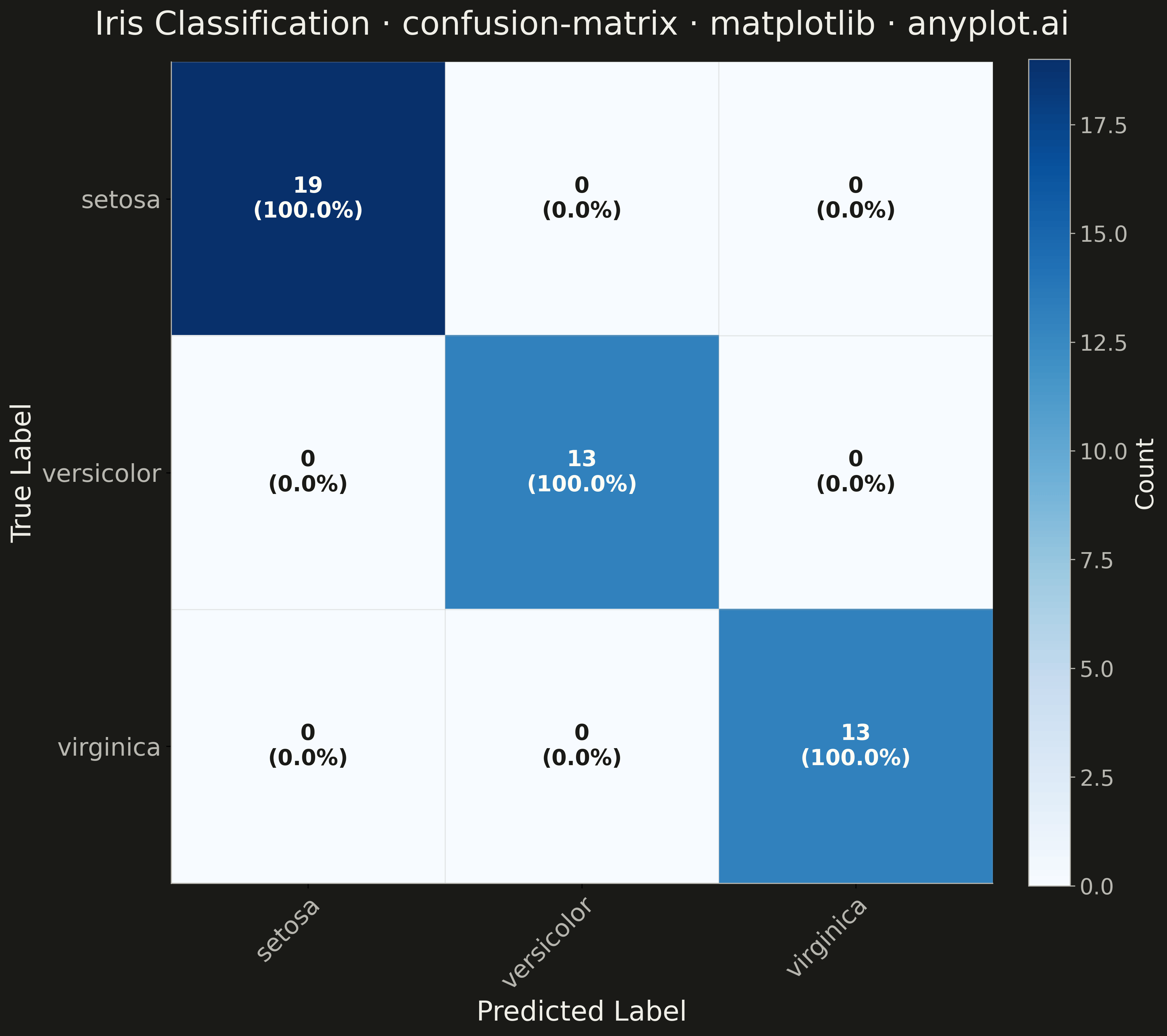
A specialized heatmap visualization for evaluating classification model performance, displaying the counts or proportions of predicted vs actual class labels. The confusion matrix reveals true positives, false positives, true negatives, and false negatives at a glance, making it essential for understanding model behavior, identifying class imbalances, and diagnosing specific misclassification patterns.
""" anyplot.ai
confusion-matrix: Confusion Matrix Heatmap
Library: matplotlib 3.10.9 | Python 3.13.13
Quality: 89/100 | Updated: 2026-05-09
"""

import os

import matplotlib.pyplot as plt
import numpy as np
from sklearn.datasets import load_iris
from sklearn.ensemble import RandomForestClassifier
from sklearn.model_selection import train_test_split


THEME = os.getenv("ANYPLOT_THEME", "light")
PAGE_BG = "#FAF8F1" if THEME == "light" else "#1A1A17"
ELEVATED_BG = "#FFFDF6" if THEME == "light" else "#242420"
INK = "#1A1A17" if THEME == "light" else "#F0EFE8"
INK_SOFT = "#4A4A44" if THEME == "light" else "#B8B7B0"
INK_MUTED = "#6B6A63" if THEME == "light" else "#A8A79F"

# Data - Iris classification
iris = load_iris()
X, y = iris.data, iris.target
class_names = iris.target_names

X_train, X_test, y_train, y_test = train_test_split(X, y, test_size=0.3, random_state=42)

# Train classifier
clf = RandomForestClassifier(random_state=42)
clf.fit(X_train, y_train)
y_pred = clf.predict(X_test)

# Build confusion matrix
n_classes = len(class_names)
confusion_matrix = np.zeros((n_classes, n_classes))
for true_label, pred_label in zip(y_test, y_pred, strict=True):
    confusion_matrix[true_label, pred_label] += 1

# Plot
fig, ax = plt.subplots(figsize=(12, 12), facecolor=PAGE_BG)
ax.set_facecolor(PAGE_BG)

# Create heatmap using Blues colormap
im = ax.imshow(confusion_matrix, cmap="Blues", aspect="equal")

# Add colorbar with theme-adaptive styling
cbar = ax.figure.colorbar(im, ax=ax, fraction=0.046, pad=0.04)
cbar.ax.tick_params(labelsize=16, colors=INK_SOFT)
cbar.ax.yaxis.set_tick_params(color=INK_SOFT)
cbar.set_label("Count", fontsize=18, color=INK)
for spine in cbar.ax.spines.values():
    spine.set_edgecolor(INK_SOFT)

# Set ticks and labels
ax.set_xticks(np.arange(n_classes))
ax.set_yticks(np.arange(n_classes))
ax.set_xticklabels(class_names, fontsize=18, color=INK_SOFT)
ax.set_yticklabels(class_names, fontsize=18, color=INK_SOFT)

# Rotate x-axis labels for readability
plt.setp(ax.get_xticklabels(), rotation=45, ha="right", rotation_mode="anchor")

# Annotate cells with counts and percentages
for i in range(n_classes):
    for j in range(n_classes):
        count = confusion_matrix[i, j]
        row_total = confusion_matrix[i, :].sum()
        if row_total > 0:
            percentage = count / row_total * 100
        else:
            percentage = 0

        # Choose text color based on background intensity
        text_color = "#FFFDF6" if count > confusion_matrix.max() * 0.5 else "#1A1A17"

        # Display count and percentage
        text = ax.text(
            j,
            i,
            f"{int(count)}\n({percentage:.1f}%)",
            ha="center",
            va="center",
            color=text_color,
            fontsize=16,
            fontweight="bold",
        )

# Grid lines between cells
ax.set_xticks(np.arange(n_classes + 1) - 0.5, minor=True)
ax.set_yticks(np.arange(n_classes + 1) - 0.5, minor=True)
ax.grid(which="minor", color=INK_SOFT, linestyle="-", linewidth=0.8, alpha=0.3)
ax.tick_params(which="minor", bottom=False, left=False)

# Spine styling
for spine in ("top", "right"):
    ax.spines[spine].set_visible(False)
for spine in ("left", "bottom"):
    ax.spines[spine].set_color(INK_SOFT)

# Labels and title
ax.set_xlabel("Predicted Label", fontsize=20, color=INK)
ax.set_ylabel("True Label", fontsize=20, color=INK)
ax.set_title(
    "Iris Classification · confusion-matrix · matplotlib · anyplot.ai",
    fontsize=24,
    fontweight="medium",
    color=INK,
    pad=20,
)

plt.tight_layout()
plt.savefig(f"plot-{THEME}.png", dpi=300, bbox_inches="tight", facecolor=PAGE_BG)
Runnable source as JSON, for any HTTP client: https://api.anyplot.ai/specs/confusion-matrix/matplotlib/code. Any spec id and library id listed in llms-full.txt fit the same URL shape; every URL below is complete and callable.
{
  "spec_id": "confusion-matrix",
  "language": "python",
  "library": "matplotlib",
  "page": "https://anyplot.ai/confusion-matrix/python/matplotlib",
  "hub": "https://anyplot.ai/confusion-matrix",
  "code_json": "https://api.anyplot.ai/specs/confusion-matrix/matplotlib/code",
  "spec_json": "https://api.anyplot.ai/specs/confusion-matrix",
  "render_light_png": "https://storage.googleapis.com/anyplot-images/plots/confusion-matrix/python/matplotlib/plot-light.png",
  "render_dark_png": "https://storage.googleapis.com/anyplot-images/plots/confusion-matrix/python/matplotlib/plot-dark.png",
  "quality_score": 89.0,
  "license": "MIT",
  "guide": "https://anyplot.ai/llms.txt"
}
Part of Confusion Matrix Heatmap on anyplot.ai.