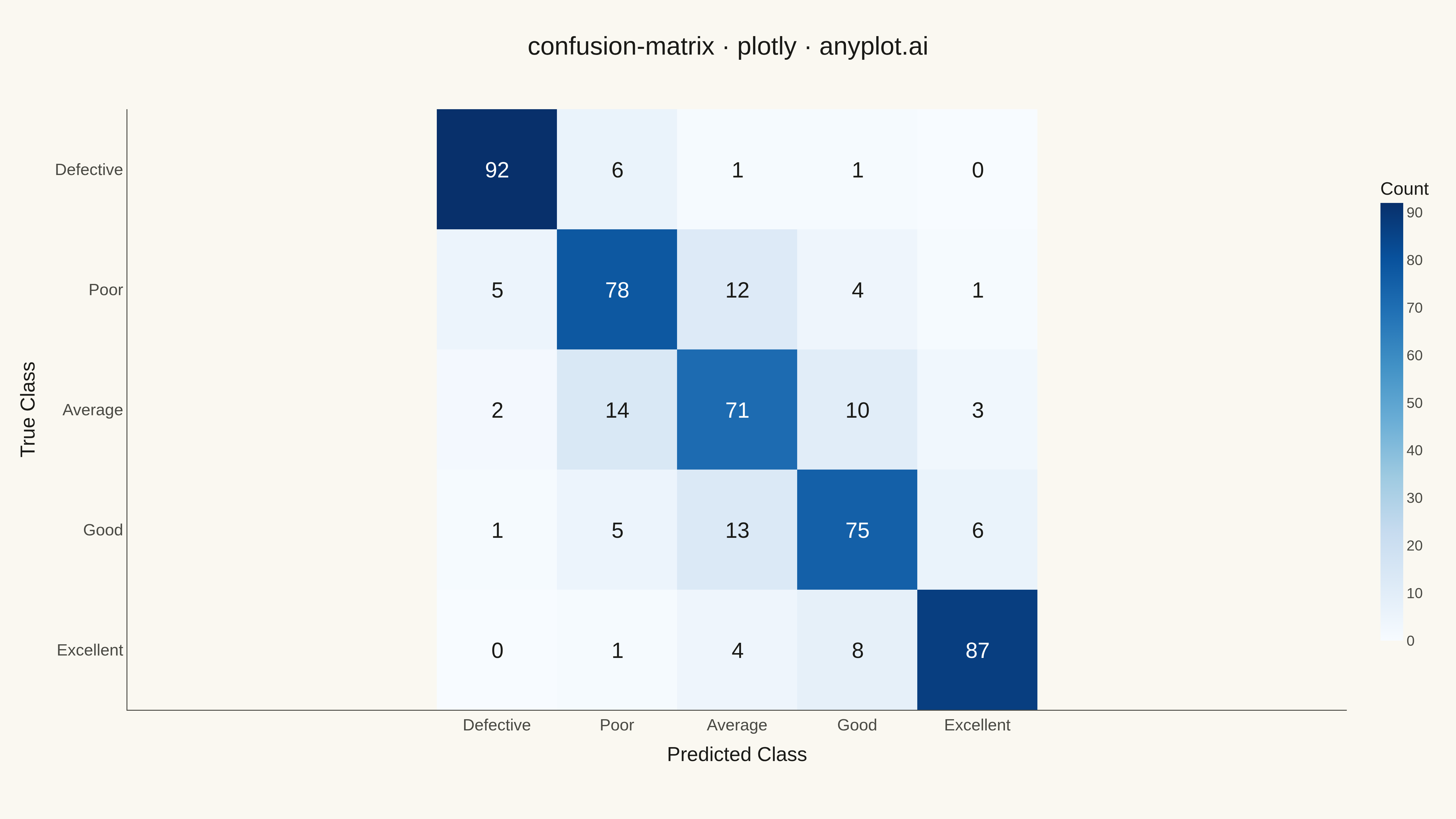
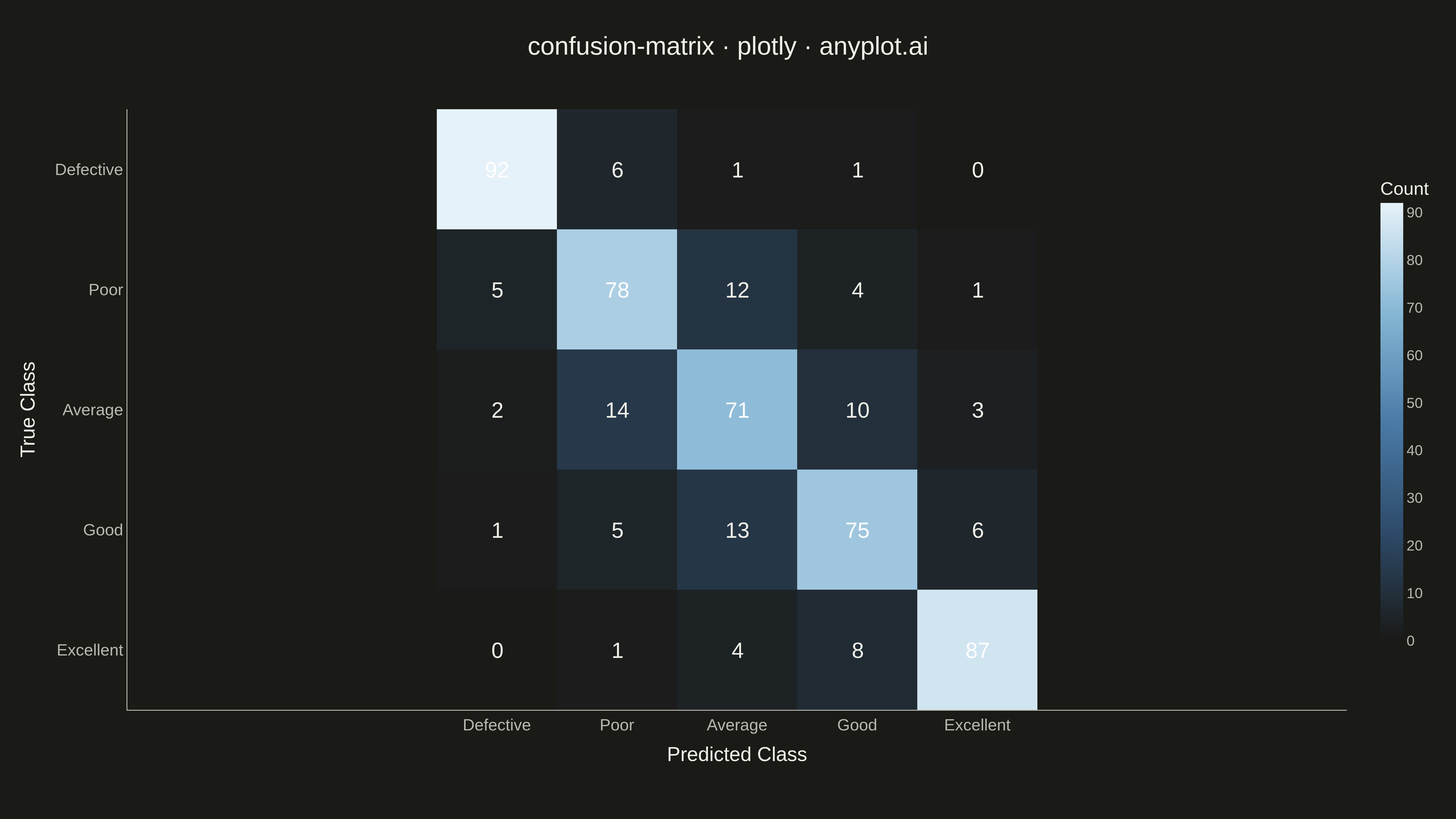
A specialized heatmap visualization for evaluating classification model performance, displaying the counts or proportions of predicted vs actual class labels. The confusion matrix reveals true positives, false positives, true negatives, and false negatives at a glance, making it essential for understanding model behavior, identifying class imbalances, and diagnosing specific misclassification patterns.
""" anyplot.ai
confusion-matrix: Confusion Matrix Heatmap
Library: plotly 6.7.0 | Python 3.13.13
Quality: 87/100 | Updated: 2026-05-09
"""

import os

import numpy as np
import plotly.graph_objects as go


# Theme tokens
THEME = os.getenv("ANYPLOT_THEME", "light")
PAGE_BG = "#FAF8F1" if THEME == "light" else "#1A1A17"
ELEVATED_BG = "#FFFDF6" if THEME == "light" else "#242420"
INK = "#1A1A17" if THEME == "light" else "#F0EFE8"
INK_SOFT = "#4A4A44" if THEME == "light" else "#B8B7B0"
GRID = "rgba(26,26,23,0.10)" if THEME == "light" else "rgba(240,239,232,0.10)"

# Data: Multi-class product quality classification (5 classes)
np.random.seed(42)
class_names = ["Defective", "Poor", "Average", "Good", "Excellent"]
n_classes = len(class_names)

# Create realistic confusion matrix for product quality classification
# A model that generally predicts well but sometimes confuses adjacent quality levels
confusion_matrix = np.array(
    [
        [92, 6, 1, 1, 0],  # Defective: almost always caught correctly
        [5, 78, 12, 4, 1],  # Poor: some confusion with Average
        [2, 14, 71, 10, 3],  # Average: scattered confusion across range
        [1, 5, 13, 75, 6],  # Good: mostly correct, some confused with Average/Excellent
        [0, 1, 4, 8, 87],  # Excellent: very reliable classification
    ]
)

# Create heatmap with theme-adaptive colors
fig = go.Figure(
    data=go.Heatmap(
        z=confusion_matrix,
        x=class_names,
        y=class_names,
        colorscale="Blues",
        showscale=True,
        colorbar=dict(
            title=dict(text="Count", font=dict(size=20, color=INK)),
            tickfont=dict(size=16, color=INK_SOFT),
            thickness=25,
            len=0.8,
            tickcolor=INK_SOFT,
        ),
        hovertemplate="True: %{y}<br>Predicted: %{x}<br>Count: %{z}<extra></extra>",
    )
)

# Add text annotations with theme-adaptive text color
annotations = []
for i in range(n_classes):
    for j in range(n_classes):
        value = confusion_matrix[i, j]
        text_color = "white" if value > 50 else INK_SOFT
        annotations.append(
            dict(
                x=class_names[j],
                y=class_names[i],
                text=str(value),
                font=dict(size=24, color=text_color),
                showarrow=False,
            )
        )

# Update layout with theme-adaptive styling
fig.update_layout(
    title=dict(text="confusion-matrix · plotly · anyplot.ai", font=dict(size=28, color=INK), x=0.5, xanchor="center"),
    xaxis=dict(
        title=dict(text="Predicted Class", font=dict(size=22, color=INK)),
        tickfont=dict(size=18, color=INK_SOFT),
        side="bottom",
        tickangle=0,
        showgrid=False,
        linecolor=INK_SOFT,
        zerolinecolor=INK_SOFT,
    ),
    yaxis=dict(
        title=dict(text="True Class", font=dict(size=22, color=INK)),
        tickfont=dict(size=18, color=INK_SOFT),
        autorange="reversed",
        showgrid=False,
        linecolor=INK_SOFT,
        zerolinecolor=INK_SOFT,
    ),
    annotations=annotations,
    paper_bgcolor=PAGE_BG,
    plot_bgcolor=PAGE_BG,
    margin=dict(l=140, r=120, t=120, b=120),
    font=dict(family="Arial, sans-serif", color=INK),
)

# Make cells square
fig.update_xaxes(scaleanchor="y", scaleratio=1)

# Save outputs
fig.write_image(f"plot-{THEME}.png", width=1600, height=900, scale=3)
fig.write_html(f"plot-{THEME}.html", include_plotlyjs="cdn")
Runnable source as JSON, for any HTTP client: https://api.anyplot.ai/specs/confusion-matrix/plotly/code. Any spec id and library id listed in llms-full.txt fit the same URL shape; every URL below is complete and callable.
{
  "spec_id": "confusion-matrix",
  "language": "python",
  "library": "plotly",
  "page": "https://anyplot.ai/confusion-matrix/python/plotly",
  "hub": "https://anyplot.ai/confusion-matrix",
  "code_json": "https://api.anyplot.ai/specs/confusion-matrix/plotly/code",
  "spec_json": "https://api.anyplot.ai/specs/confusion-matrix",
  "render_light_png": "https://storage.googleapis.com/anyplot-images/plots/confusion-matrix/python/plotly/plot-light.png",
  "render_dark_png": "https://storage.googleapis.com/anyplot-images/plots/confusion-matrix/python/plotly/plot-dark.png",
  "interactive_light_html": "https://storage.googleapis.com/anyplot-images/plots/confusion-matrix/python/plotly/plot-light.html",
  "interactive_dark_html": "https://storage.googleapis.com/anyplot-images/plots/confusion-matrix/python/plotly/plot-dark.html",
  "quality_score": 87.0,
  "license": "MIT",
  "guide": "https://anyplot.ai/llms.txt"
}
Part of Confusion Matrix Heatmap on anyplot.ai.