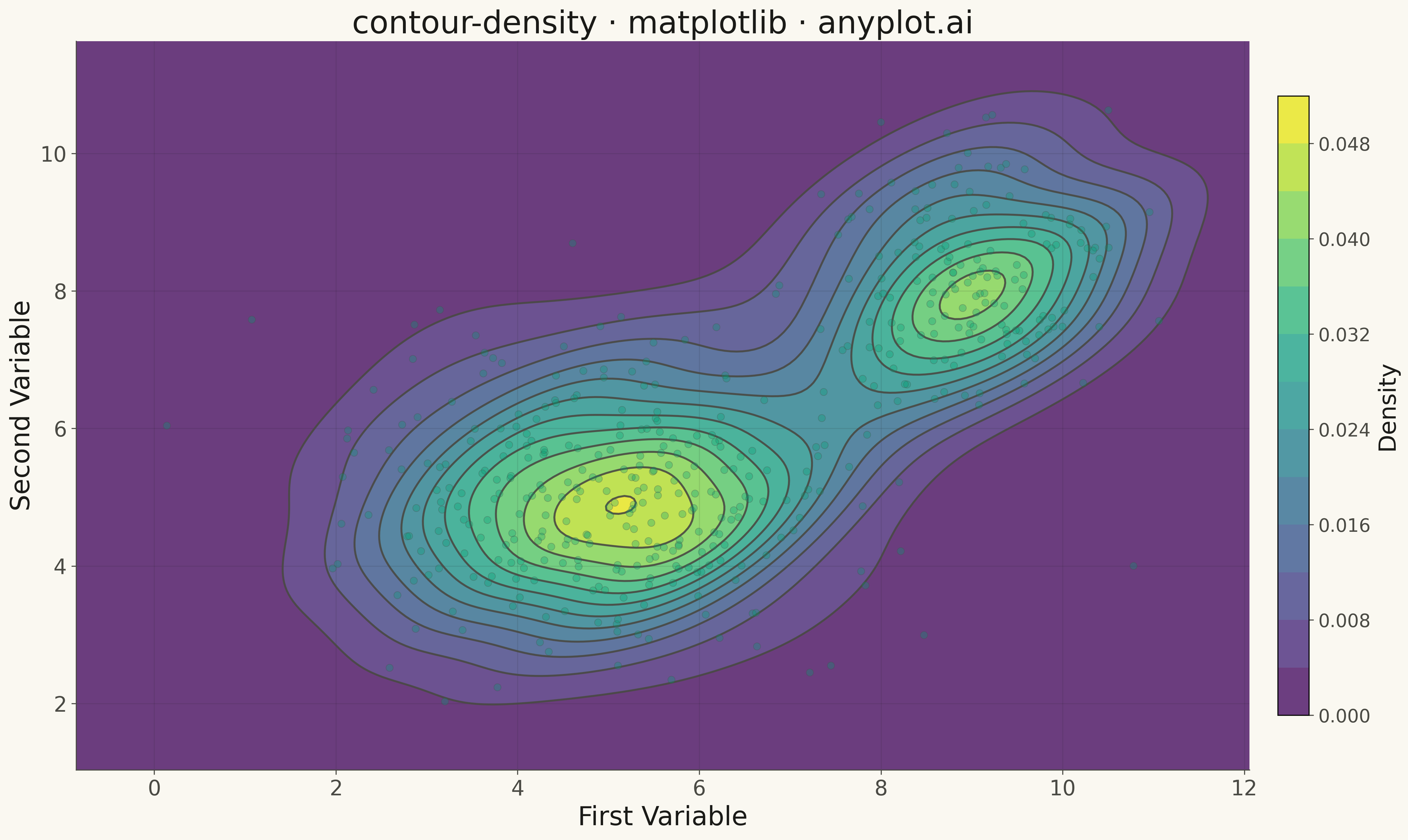
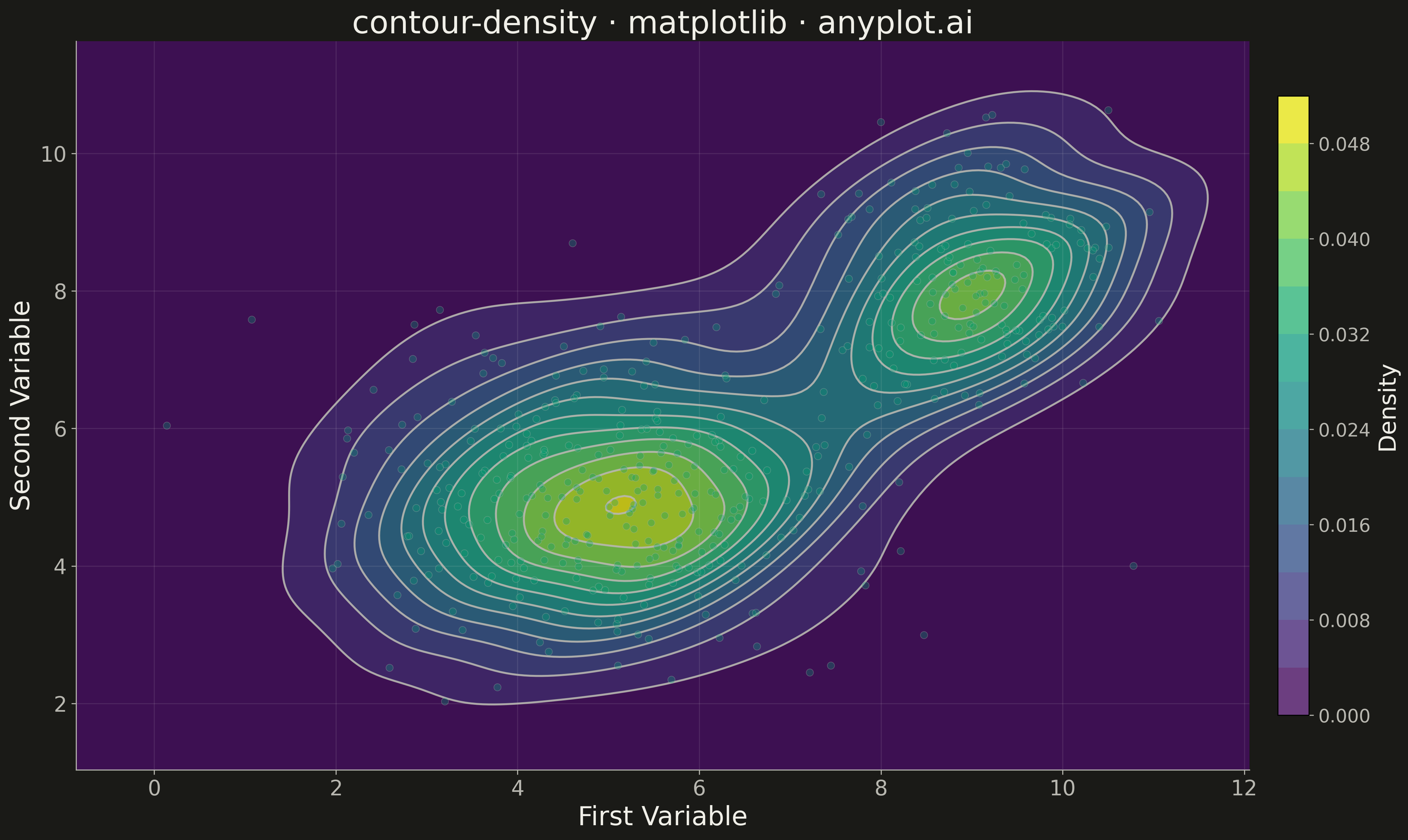
A density contour plot (also known as a 2D KDE contour plot) displays the concentration of points in a 2D scatter plot using contour lines. The contours connect points of equal density, revealing clusters, patterns, and the overall bivariate distribution shape.
""" anyplot.ai
contour-density: Density Contour Plot
Library: matplotlib 3.10.9 | Python 3.13.13
Quality: 79/100 | Updated: 2026-05-16
"""

import matplotlib.pyplot as plt
import numpy as np
from scipy import stats


# Data - bivariate distribution with two clusters
np.random.seed(42)

# Cluster 1: Main cluster centered around (5, 5)
n1 = 300
x1 = np.random.normal(5, 1.5, n1)
y1 = np.random.normal(5, 1.2, n1)

# Cluster 2: Secondary cluster centered around (9, 8)
n2 = 150
x2 = np.random.normal(9, 0.8, n2)
y2 = np.random.normal(8, 1.0, n2)

# Combine clusters
x = np.concatenate([x1, x2])
y = np.concatenate([y1, y2])

# Compute 2D kernel density estimation
xmin, xmax = x.min() - 1, x.max() + 1
ymin, ymax = y.min() - 1, y.max() + 1
xx, yy = np.mgrid[xmin:xmax:200j, ymin:ymax:200j]
positions = np.vstack([xx.ravel(), yy.ravel()])
values = np.vstack([x, y])
kernel = stats.gaussian_kde(values)
density = np.reshape(kernel(positions).T, xx.shape)

# Plot
fig, ax = plt.subplots(figsize=(16, 9))

# Filled contours for visual impact
contourf = ax.contourf(xx, yy, density, levels=12, cmap="Blues", alpha=0.8)

# Contour lines for clarity
contour = ax.contour(xx, yy, density, levels=12, colors="#306998", linewidths=1.5, alpha=0.9)

# Scatter plot overlay for context (smaller, semi-transparent points)
ax.scatter(x, y, s=30, alpha=0.3, color="#FFD43B", edgecolors="#306998", linewidths=0.5, zorder=5)

# Colorbar
cbar = plt.colorbar(contourf, ax=ax, shrink=0.85, pad=0.02)
cbar.set_label("Density", fontsize=18)
cbar.ax.tick_params(labelsize=14)

# Labels and styling
ax.set_xlabel("X Variable", fontsize=20)
ax.set_ylabel("Y Variable", fontsize=20)
ax.set_title("contour-density · matplotlib · pyplots.ai", fontsize=24)
ax.tick_params(axis="both", labelsize=16)
ax.grid(True, alpha=0.3, linestyle="--")

plt.tight_layout()
plt.savefig("plot.png", dpi=300, bbox_inches="tight")
Runnable source as JSON, for any HTTP client: https://api.anyplot.ai/specs/contour-density/matplotlib/code. Any spec id and library id listed in llms-full.txt fit the same URL shape; every URL below is complete and callable.
{
  "spec_id": "contour-density",
  "language": "python",
  "library": "matplotlib",
  "page": "https://anyplot.ai/contour-density/python/matplotlib",
  "hub": "https://anyplot.ai/contour-density",
  "code_json": "https://api.anyplot.ai/specs/contour-density/matplotlib/code",
  "spec_json": "https://api.anyplot.ai/specs/contour-density",
  "render_light_png": "https://storage.googleapis.com/anyplot-images/plots/contour-density/python/matplotlib/plot-light.png",
  "render_dark_png": "https://storage.googleapis.com/anyplot-images/plots/contour-density/python/matplotlib/plot-dark.png",
  "quality_score": 79.0,
  "license": "MIT",
  "guide": "https://anyplot.ai/llms.txt"
}
Part of Density Contour Plot on anyplot.ai.