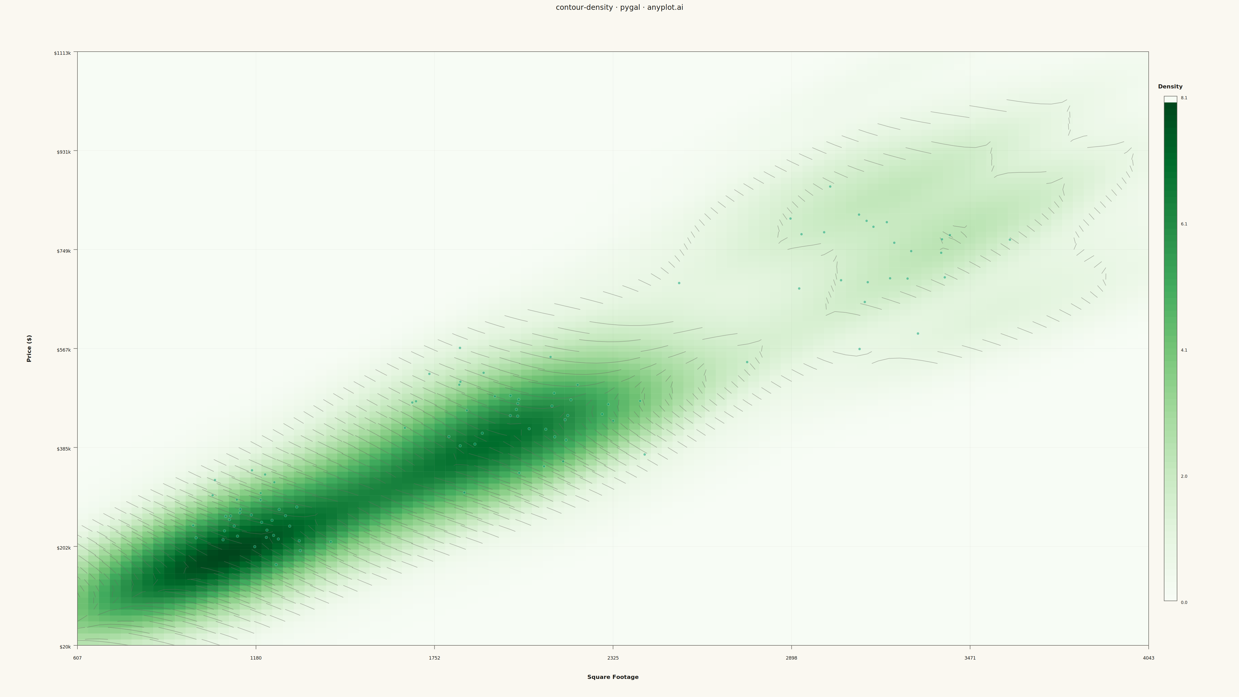
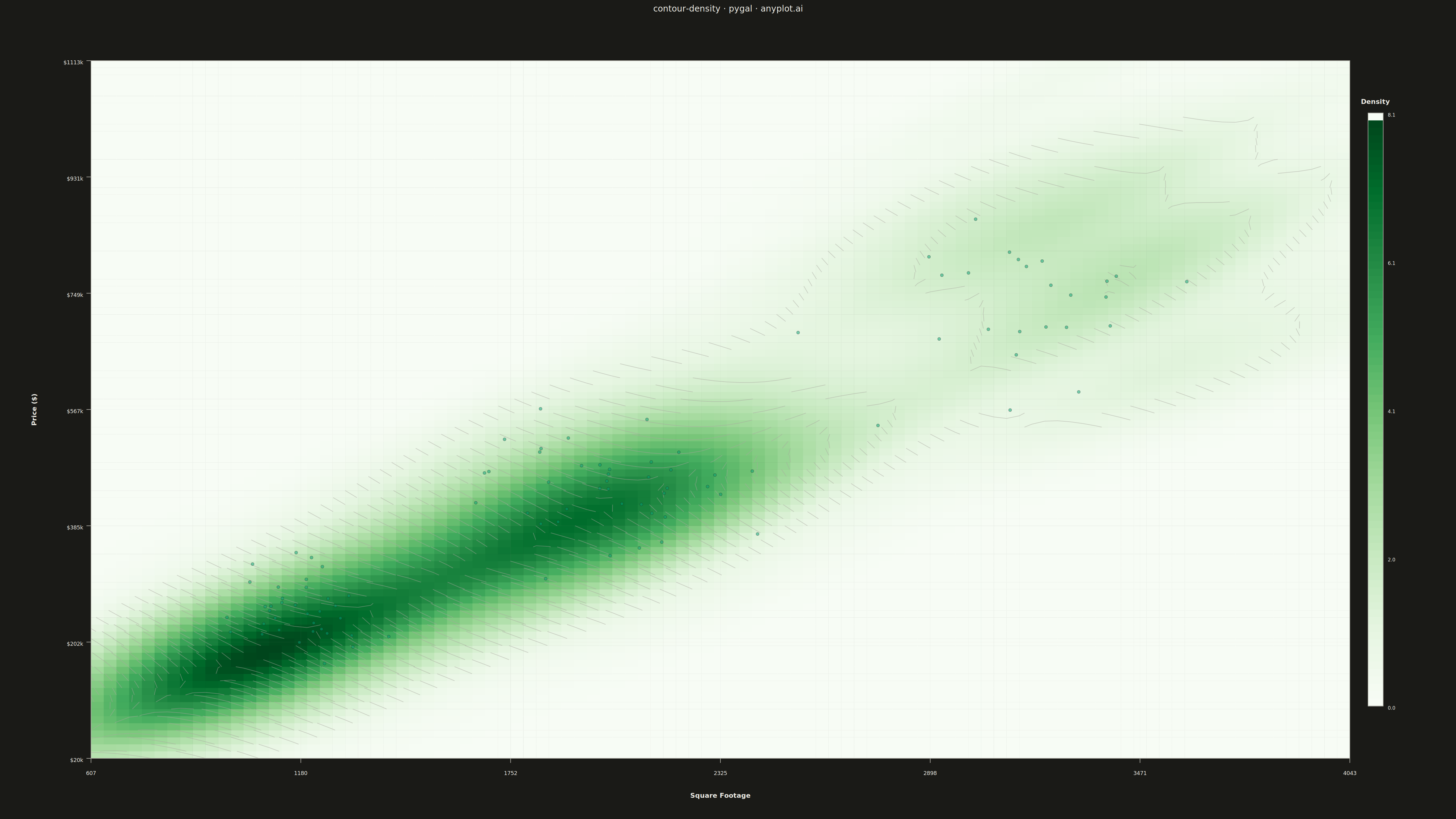
A density contour plot (also known as a 2D KDE contour plot) displays the concentration of points in a 2D scatter plot using contour lines. The contours connect points of equal density, revealing clusters, patterns, and the overall bivariate distribution shape.
""" anyplot.ai
contour-density: Density Contour Plot
Library: pygal 3.1.0 | Python 3.13.13
Quality: 60/100 | Updated: 2026-05-16
"""

import os
import sys
from pathlib import Path


# Remove script directory from path to avoid name collision with pygal package
_script_dir = str(Path(__file__).parent)
sys.path = [p for p in sys.path if p != _script_dir]

import cairosvg
import numpy as np
import pygal
from matplotlib.cm import Greens
from matplotlib.colors import to_hex
from pygal.style import Style
from scipy import stats


# Theme tokens
THEME = os.getenv("ANYPLOT_THEME", "light")
PAGE_BG = "#FAF8F1" if THEME == "light" else "#1A1A17"
INK = "#1A1A17" if THEME == "light" else "#F0EFE8"
INK_SOFT = "#4A4A44" if THEME == "light" else "#B8B7B0"
BRAND = "#009E73"

# Data: Bivariate distribution with clusters (house price vs square footage)
np.random.seed(42)

# Create realistic clustered data - real estate market with different property types
n_samples = 400

# Cluster 1: Starter homes (smaller, less expensive)
n1 = 140
x1 = np.random.normal(1200, 150, n1)  # Square footage
y1 = np.random.normal(250000, 40000, n1)  # Price ($)

# Cluster 2: Mid-range homes (medium size, moderate price)
n2 = 160
x2 = np.random.normal(2000, 200, n2)
y2 = np.random.normal(450000, 60000, n2)

# Cluster 3: Premium homes (larger, more expensive)
n3 = 100
x3 = np.random.normal(3200, 250, n3)
y3 = np.random.normal(750000, 100000, n3)

# Combine all data
x_data = np.concatenate([x1, x2, x3])
y_data = np.concatenate([y1, y2, y3])

# Compute 2D KDE (Kernel Density Estimation)
# Normalize data for better KDE computation
x_norm = (x_data - x_data.min()) / (x_data.max() - x_data.min())
y_norm = (y_data - y_data.min()) / (y_data.max() - y_data.min())

n_grid = 100
x_grid_norm = np.linspace(0, 1, n_grid)
y_grid_norm = np.linspace(0, 1, n_grid)
X_norm, Y_norm = np.meshgrid(x_grid_norm, y_grid_norm)
positions_norm = np.vstack([X_norm.ravel(), Y_norm.ravel()])

# Fit KDE on normalized data
values_norm = np.vstack([x_norm, y_norm])
kernel = stats.gaussian_kde(values_norm)
Z = np.reshape(kernel(positions_norm).T, X_norm.shape)

# Map back to original coordinates for visualization
x_min, x_max = x_data.min() - 200, x_data.max() + 200
y_min, y_max = y_data.min() - 100000, y_data.max() + 100000
X = x_grid_norm * (x_max - x_min) + x_min
Y = y_grid_norm * (y_max - y_min) + y_min

z_min, z_max = Z.min(), Z.max()


def interpolate_color(value, vmin, vmax):
    """Get color for value using Greens colormap."""
    if vmax == vmin:
        norm = 0.5
    else:
        norm = max(0, min(1, (value - vmin) / (vmax - vmin)))
    return to_hex(Greens(norm))


# Style for 4800x2700 canvas
custom_style = Style(
    background=PAGE_BG,
    plot_background=PAGE_BG,
    foreground=INK,
    foreground_strong=INK,
    foreground_subtle=INK_SOFT,
    colors=(BRAND,),
    title_font_size=28,
    legend_font_size=16,
    label_font_size=22,
    value_font_size=18,
    font_family="sans-serif",
)

# Create base XY chart
chart = pygal.XY(
    width=4800,
    height=2700,
    style=custom_style,
    title="contour-density · pygal · anyplot.ai",
    show_legend=False,
    margin=120,
    margin_top=200,
    margin_bottom=200,
    margin_left=300,
    margin_right=350,
    show_x_labels=False,
    show_y_labels=False,
    show_x_guides=False,
    show_y_guides=False,
    x_title="",
    y_title="",
)

# Plot dimensions (matching chart margins)
plot_x = 300
plot_y = 200
plot_width = 4800 - 300 - 350
plot_height = 2700 - 200 - 200

# Cell size
cell_w = plot_width / (n_grid - 1)
cell_h = plot_height / (n_grid - 1)

# Build SVG content
svg_parts = []

# Background for the plot area
svg_parts.append(
    f'<rect x="{plot_x}" y="{plot_y}" width="{plot_width}" height="{plot_height}" fill="{PAGE_BG}" stroke="none"/>'
)

# Draw filled density cells
for i in range(n_grid - 1):
    for j in range(n_grid - 1):
        # Average of 4 corners for cell color
        cell_val = (Z[i, j] + Z[i, j + 1] + Z[i + 1, j] + Z[i + 1, j + 1]) / 4
        color = interpolate_color(cell_val, z_min, z_max)
        cx = plot_x + j * cell_w
        cy = plot_y + plot_height - (i + 1) * cell_h
        svg_parts.append(
            f'<rect x="{cx:.1f}" y="{cy:.1f}" width="{cell_w + 0.5:.1f}" '
            f'height="{cell_h + 0.5:.1f}" fill="{color}" stroke="none"/>'
        )

# Draw contour lines using marching squares
n_contour_levels = 10
contour_levels = np.linspace(z_min + (z_max - z_min) * 0.1, z_max * 0.95, n_contour_levels)

for level in contour_levels:
    for i in range(n_grid - 1):
        for j in range(n_grid - 1):
            z00, z01 = Z[i, j], Z[i, j + 1]
            z10, z11 = Z[i + 1, j], Z[i + 1, j + 1]

            # Marching squares case
            case = 0
            if z00 >= level:
                case |= 1
            if z01 >= level:
                case |= 2
            if z11 >= level:
                case |= 4
            if z10 >= level:
                case |= 8

            if case == 0 or case == 15:
                continue

            # Cell position
            x0 = plot_x + j * cell_w
            y0 = plot_y + plot_height - (i + 1) * cell_h

            # Linear interpolation helper
            def lerp(v1, v2, lv):
                if abs(v2 - v1) < 1e-10:
                    return 0.5
                return (lv - v1) / (v2 - v1)

            # Edge midpoints
            left = (x0, y0 + cell_h * lerp(z00, z10, level))
            right = (x0 + cell_w, y0 + cell_h * lerp(z01, z11, level))
            top = (x0 + cell_w * lerp(z10, z11, level), y0 + cell_h)
            bottom = (x0 + cell_w * lerp(z00, z01, level), y0)

            segments = []
            if case in [1, 14]:
                segments.append((left, bottom))
            elif case in [2, 13]:
                segments.append((bottom, right))
            elif case in [3, 12]:
                segments.append((left, right))
            elif case in [4, 11]:
                segments.append((right, top))
            elif case == 5:
                segments.append((left, top))
                segments.append((bottom, right))
            elif case in [6, 9]:
                segments.append((bottom, top))
            elif case in [7, 8]:
                segments.append((left, top))
            elif case == 10:
                segments.append((left, bottom))
                segments.append((right, top))

            for (x1, y1), (x2, y2) in segments:
                svg_parts.append(
                    f'<line x1="{x1:.1f}" y1="{y1:.1f}" x2="{x2:.1f}" y2="{y2:.1f}" '
                    f'stroke="{INK_SOFT}" stroke-width="2" stroke-opacity="0.5"/>'
                )

# Add scatter points overlay (semi-transparent) for context
for px, py in zip(x_data[::4], y_data[::4], strict=True):
    sx = plot_x + (px - x_min) / (x_max - x_min) * plot_width
    sy = plot_y + plot_height - (py - y_min) / (y_max - y_min) * plot_height
    svg_parts.append(
        f'<circle cx="{sx:.1f}" cy="{sy:.1f}" r="5" fill="{BRAND}" stroke="{PAGE_BG}" stroke-width="1" opacity="0.5"/>'
    )

# Axis frame
svg_parts.append(
    f'<rect x="{plot_x}" y="{plot_y}" width="{plot_width}" height="{plot_height}" '
    f'fill="none" stroke="{INK_SOFT}" stroke-width="2"/>'
)

# Grid lines (optional, subtle)
n_grid_lines = 6
for i in range(1, n_grid_lines):
    frac = i / n_grid_lines
    # Vertical grid lines
    grid_x = plot_x + frac * plot_width
    svg_parts.append(
        f'<line x1="{grid_x:.1f}" y1="{plot_y}" x2="{grid_x:.1f}" y2="{plot_y + plot_height}" '
        f'stroke="{INK_SOFT}" stroke-width="1" stroke-opacity="0.1"/>'
    )
    # Horizontal grid lines
    grid_y = plot_y + frac * plot_height
    svg_parts.append(
        f'<line x1="{plot_x}" y1="{grid_y:.1f}" x2="{plot_x + plot_width}" y2="{grid_y:.1f}" '
        f'stroke="{INK_SOFT}" stroke-width="1" stroke-opacity="0.1"/>'
    )

# X-axis labels and ticks
n_x_ticks = 7
for i in range(n_x_ticks):
    frac = i / (n_x_ticks - 1)
    tick_x = plot_x + frac * plot_width
    tick_y = plot_y + plot_height
    val = x_min + frac * (x_max - x_min)
    svg_parts.append(
        f'<line x1="{tick_x:.1f}" y1="{tick_y}" x2="{tick_x:.1f}" y2="{tick_y + 15}" '
        f'stroke="{INK_SOFT}" stroke-width="2"/>'
    )
    svg_parts.append(
        f'<text x="{tick_x:.1f}" y="{tick_y + 55}" text-anchor="middle" fill="{INK_SOFT}" '
        f'style="font-size:18px;font-family:sans-serif">{val:.0f}</text>'
    )

# X-axis title
svg_parts.append(
    f'<text x="{plot_x + plot_width / 2}" y="{plot_y + plot_height + 130}" text-anchor="middle" '
    f'fill="{INK}" style="font-size:22px;font-weight:bold;font-family:sans-serif">Square Footage</text>'
)

# Y-axis labels and ticks
n_y_ticks = 7
for i in range(n_y_ticks):
    frac = i / (n_y_ticks - 1)
    tick_y = plot_y + plot_height - frac * plot_height
    tick_x = plot_x
    val = y_min + frac * (y_max - y_min)
    svg_parts.append(
        f'<line x1="{tick_x - 15}" y1="{tick_y:.1f}" x2="{tick_x}" y2="{tick_y:.1f}" '
        f'stroke="{INK_SOFT}" stroke-width="2"/>'
    )
    svg_parts.append(
        f'<text x="{tick_x - 25}" y="{tick_y + 12:.1f}" text-anchor="end" fill="{INK_SOFT}" '
        f'style="font-size:18px;font-family:sans-serif">${val / 1000:.0f}k</text>'
    )

# Y-axis title (rotated)
y_title_x = plot_x - 180
y_title_y = plot_y + plot_height / 2
svg_parts.append(
    f'<text x="{y_title_x}" y="{y_title_y}" text-anchor="middle" fill="{INK}" '
    f'style="font-size:22px;font-weight:bold;font-family:sans-serif" '
    f'transform="rotate(-90, {y_title_x}, {y_title_y})">Price ($)</text>'
)

# Colorbar
cb_width = 50
cb_height = plot_height * 0.85
cb_x = plot_x + plot_width + 60
cb_y = plot_y + (plot_height - cb_height) / 2

# Colorbar gradient
n_cb_segments = 80
seg_h = cb_height / n_cb_segments
for i in range(n_cb_segments):
    seg_val = z_max - (z_max - z_min) * i / (n_cb_segments - 1)
    seg_color = interpolate_color(seg_val, z_min, z_max)
    seg_y = cb_y + i * seg_h
    svg_parts.append(
        f'<rect x="{cb_x}" y="{seg_y:.1f}" width="{cb_width}" height="{seg_h + 1:.1f}" fill="{seg_color}"/>'
    )

# Colorbar border
svg_parts.append(
    f'<rect x="{cb_x}" y="{cb_y}" width="{cb_width}" height="{cb_height}" fill="none" '
    f'stroke="{INK_SOFT}" stroke-width="2"/>'
)

# Colorbar labels
n_cb_labels = 5
for i in range(n_cb_labels):
    frac = i / (n_cb_labels - 1)
    val = z_max - (z_max - z_min) * frac
    label_y = cb_y + frac * cb_height + 12
    svg_parts.append(
        f'<text x="{cb_x + cb_width + 15}" y="{label_y:.1f}" fill="{INK_SOFT}" '
        f'style="font-size:16px;font-family:sans-serif">{val:.1f}</text>'
    )

# Colorbar title
cb_title_x = cb_x + cb_width / 2
cb_title_y = cb_y - 30
svg_parts.append(
    f'<text x="{cb_title_x}" y="{cb_title_y}" text-anchor="middle" fill="{INK}" '
    f'style="font-size:22px;font-weight:bold;font-family:sans-serif">Density</text>'
)

# Combine all SVG parts
custom_svg = "\n".join(svg_parts)

# Add dummy data point (required by pygal)
chart.add("", [(0, 0)])

# Render base chart and inject custom SVG
base_svg = chart.render(is_unicode=True)

# Insert custom contour SVG before the closing </svg> tag
output_svg = base_svg.replace("</svg>", f"{custom_svg}\n</svg>")

# Save SVG
with open(f"plot-{THEME}.svg", "w", encoding="utf-8") as f:
    f.write(output_svg)

# Convert to PNG using cairosvg
cairosvg.svg2png(bytestring=output_svg.encode("utf-8"), write_to=f"plot-{THEME}.png")

# Save interactive HTML
html_content = f"""<!DOCTYPE html>
<html>
<head>
    <meta charset="utf-8">
    <title>contour-density - pygal</title>
    <style>
        body {{ margin: 0; display: flex; justify-content: center; align-items: center; min-height: 100vh; background: {PAGE_BG}; }}
        .chart {{ max-width: 100%; height: auto; }}
    </style>
</head>
<body>
    <figure class="chart">
        {output_svg}
    </figure>
</body>
</html>
"""

with open(f"plot-{THEME}.html", "w", encoding="utf-8") as f:
    f.write(html_content)
Runnable source as JSON, for any HTTP client: https://api.anyplot.ai/specs/contour-density/pygal/code. Any spec id and library id listed in llms-full.txt fit the same URL shape; every URL below is complete and callable.
{
  "spec_id": "contour-density",
  "language": "python",
  "library": "pygal",
  "page": "https://anyplot.ai/contour-density/python/pygal",
  "hub": "https://anyplot.ai/contour-density",
  "code_json": "https://api.anyplot.ai/specs/contour-density/pygal/code",
  "spec_json": "https://api.anyplot.ai/specs/contour-density",
  "render_light_png": "https://storage.googleapis.com/anyplot-images/plots/contour-density/python/pygal/plot-light.png",
  "render_dark_png": "https://storage.googleapis.com/anyplot-images/plots/contour-density/python/pygal/plot-dark.png",
  "interactive_light_html": "https://storage.googleapis.com/anyplot-images/plots/contour-density/python/pygal/plot-light.html",
  "interactive_dark_html": "https://storage.googleapis.com/anyplot-images/plots/contour-density/python/pygal/plot-dark.html",
  "quality_score": 60.0,
  "license": "MIT",
  "guide": "https://anyplot.ai/llms.txt"
}
Part of Density Contour Plot on anyplot.ai.