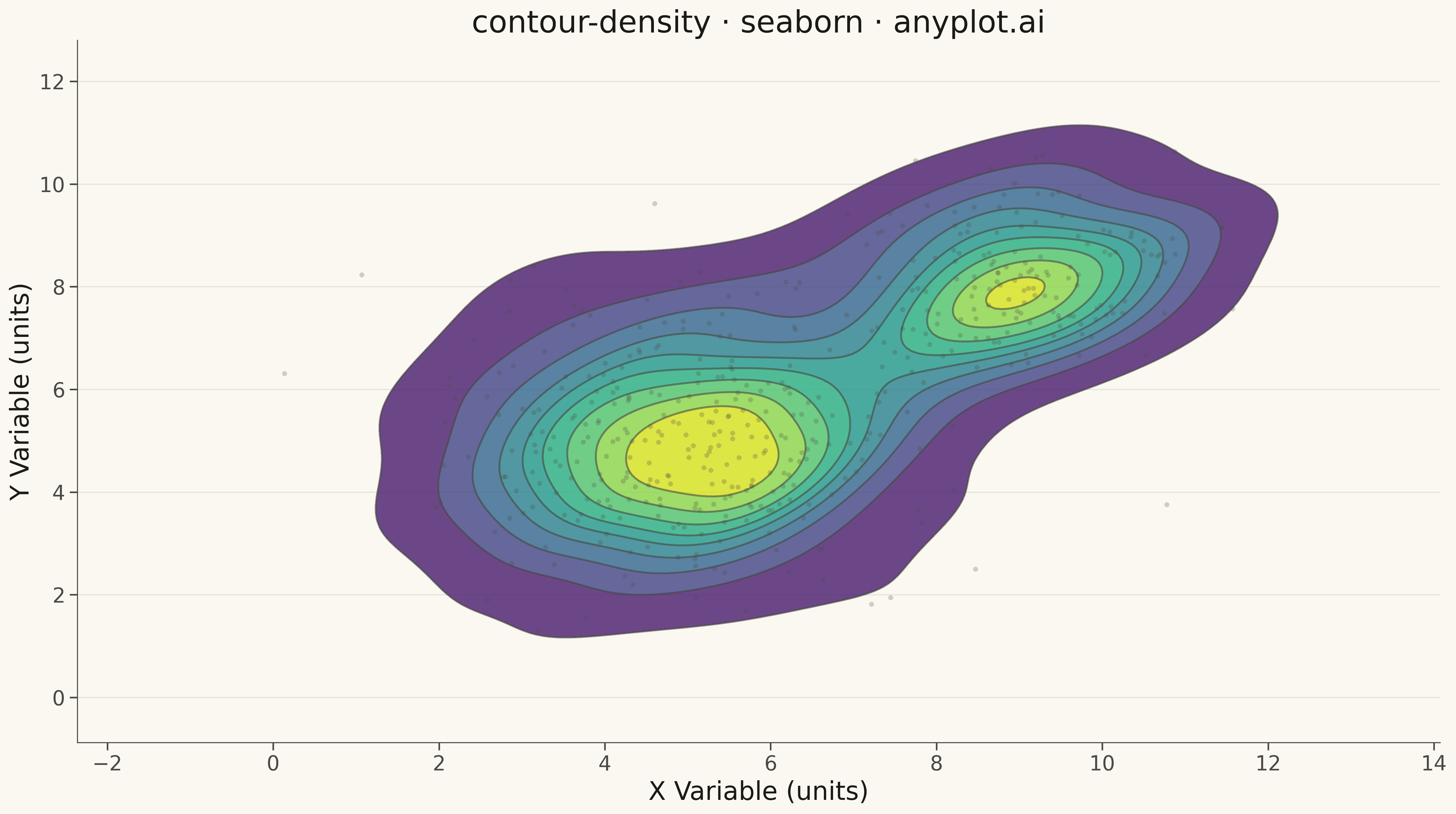
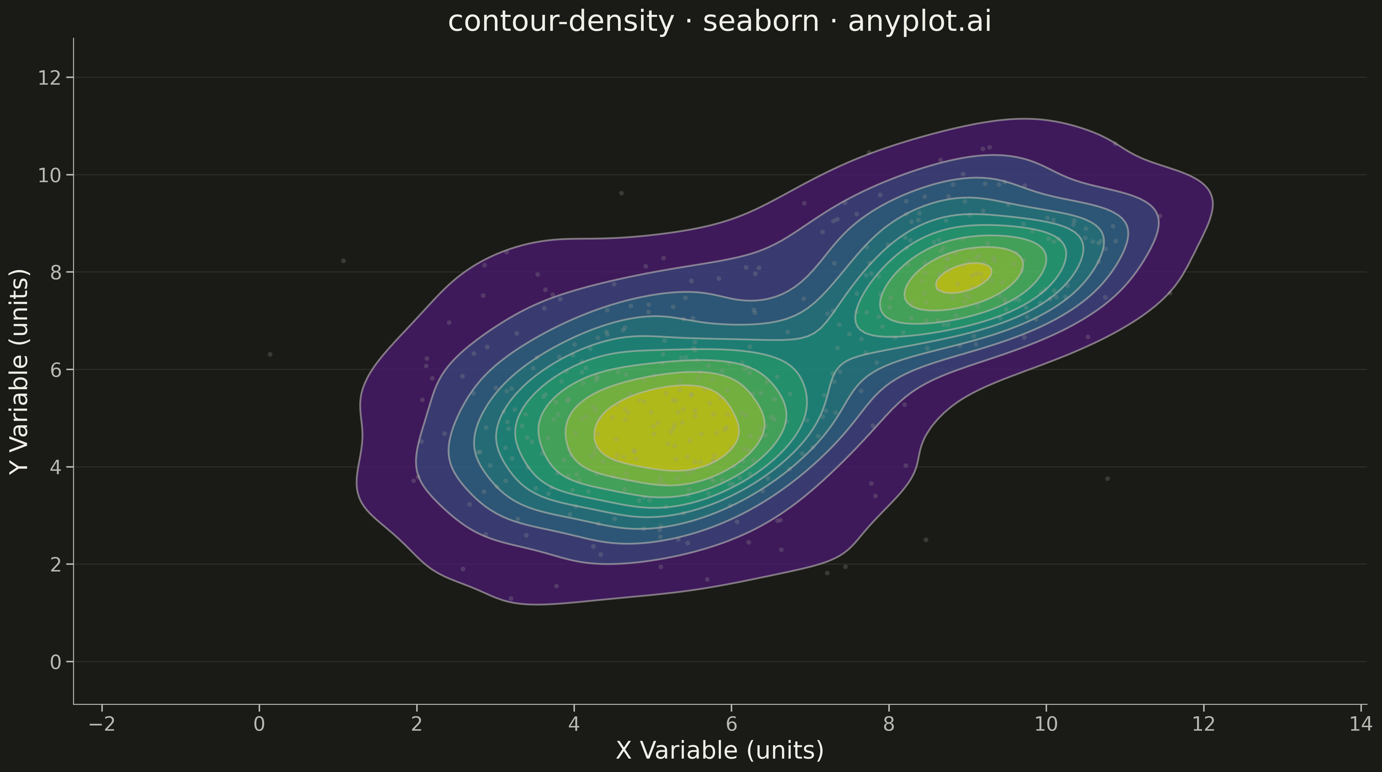
A density contour plot (also known as a 2D KDE contour plot) displays the concentration of points in a 2D scatter plot using contour lines. The contours connect points of equal density, revealing clusters, patterns, and the overall bivariate distribution shape.
""" anyplot.ai
contour-density: Density Contour Plot
Library: seaborn 0.13.2 | Python 3.13.13
Quality: 90/100 | Updated: 2026-05-16
"""

import os

import matplotlib.pyplot as plt
import numpy as np
import seaborn as sns


# Theme tokens (see prompts/default-style-guide.md)
THEME = os.getenv("ANYPLOT_THEME", "light")
PAGE_BG = "#FAF8F1" if THEME == "light" else "#1A1A17"
ELEVATED_BG = "#FFFDF6" if THEME == "light" else "#242420"
INK = "#1A1A17" if THEME == "light" else "#F0EFE8"
INK_SOFT = "#4A4A44" if THEME == "light" else "#B8B7B0"
INK_MUTED = "#6B6A63" if THEME == "light" else "#A8A79F"
SCATTER_COLOR = "#4A4A44" if THEME == "light" else "#9A9A94"

# Data - bivariate normal distributions with two clusters
np.random.seed(42)

# Main cluster
n1 = 300
x1 = np.random.normal(loc=5, scale=1.5, size=n1)
y1 = np.random.normal(loc=5, scale=1.5, size=n1)

# Secondary cluster
n2 = 150
x2 = np.random.normal(loc=9, scale=1.0, size=n2)
y2 = np.random.normal(loc=8, scale=1.0, size=n2)

# Combine clusters
x = np.concatenate([x1, x2])
y = np.concatenate([y1, y2])

# Configure seaborn theme with theme-adaptive colors
sns.set_theme(
    style="ticks",
    rc={
        "figure.facecolor": PAGE_BG,
        "axes.facecolor": PAGE_BG,
        "axes.edgecolor": INK_SOFT,
        "axes.labelcolor": INK,
        "text.color": INK,
        "xtick.color": INK_SOFT,
        "ytick.color": INK_SOFT,
        "grid.color": INK,
        "grid.alpha": 0.10,
    },
)

# Create figure
fig, ax = plt.subplots(figsize=(16, 9), facecolor=PAGE_BG)
ax.set_facecolor(PAGE_BG)

# Density contour plot using seaborn's kdeplot (filled with viridis)
sns.kdeplot(x=x, y=y, ax=ax, levels=10, fill=True, cmap="viridis", alpha=0.8)

# Add contour lines for clarity (using INK_SOFT for theme-adaptive color)
sns.kdeplot(x=x, y=y, ax=ax, levels=10, color=INK_SOFT, linewidths=1.5, alpha=0.6)

# Scatter plot overlay for context (theme-adaptive color, semi-transparent)
ax.scatter(x, y, s=15, color=SCATTER_COLOR, alpha=0.25, edgecolors="none")

# Styling
ax.set_xlabel("X Variable (units)", fontsize=20, color=INK)
ax.set_ylabel("Y Variable (units)", fontsize=20, color=INK)
ax.set_title("contour-density · seaborn · anyplot.ai", fontsize=24, fontweight="medium", color=INK)
ax.tick_params(axis="both", labelsize=16, colors=INK_SOFT)

# Remove top and right spines
ax.spines["top"].set_visible(False)
ax.spines["right"].set_visible(False)
for spine in ["left", "bottom"]:
    ax.spines[spine].set_color(INK_SOFT)
    ax.spines[spine].set_linewidth(0.8)

# Subtle grid
ax.yaxis.grid(True, alpha=0.10, linewidth=0.8, color=INK)

plt.tight_layout()
plt.savefig(f"plot-{THEME}.png", dpi=300, bbox_inches="tight", facecolor=PAGE_BG)
Runnable source as JSON, for any HTTP client: https://api.anyplot.ai/specs/contour-density/seaborn/code. Any spec id and library id listed in llms-full.txt fit the same URL shape; every URL below is complete and callable.
{
  "spec_id": "contour-density",
  "language": "python",
  "library": "seaborn",
  "page": "https://anyplot.ai/contour-density/python/seaborn",
  "hub": "https://anyplot.ai/contour-density",
  "code_json": "https://api.anyplot.ai/specs/contour-density/seaborn/code",
  "spec_json": "https://api.anyplot.ai/specs/contour-density",
  "render_light_png": "https://storage.googleapis.com/anyplot-images/plots/contour-density/python/seaborn/plot-light.png",
  "render_dark_png": "https://storage.googleapis.com/anyplot-images/plots/contour-density/python/seaborn/plot-dark.png",
  "quality_score": 90.0,
  "license": "MIT",
  "guide": "https://anyplot.ai/llms.txt"
}
Part of Density Contour Plot on anyplot.ai.